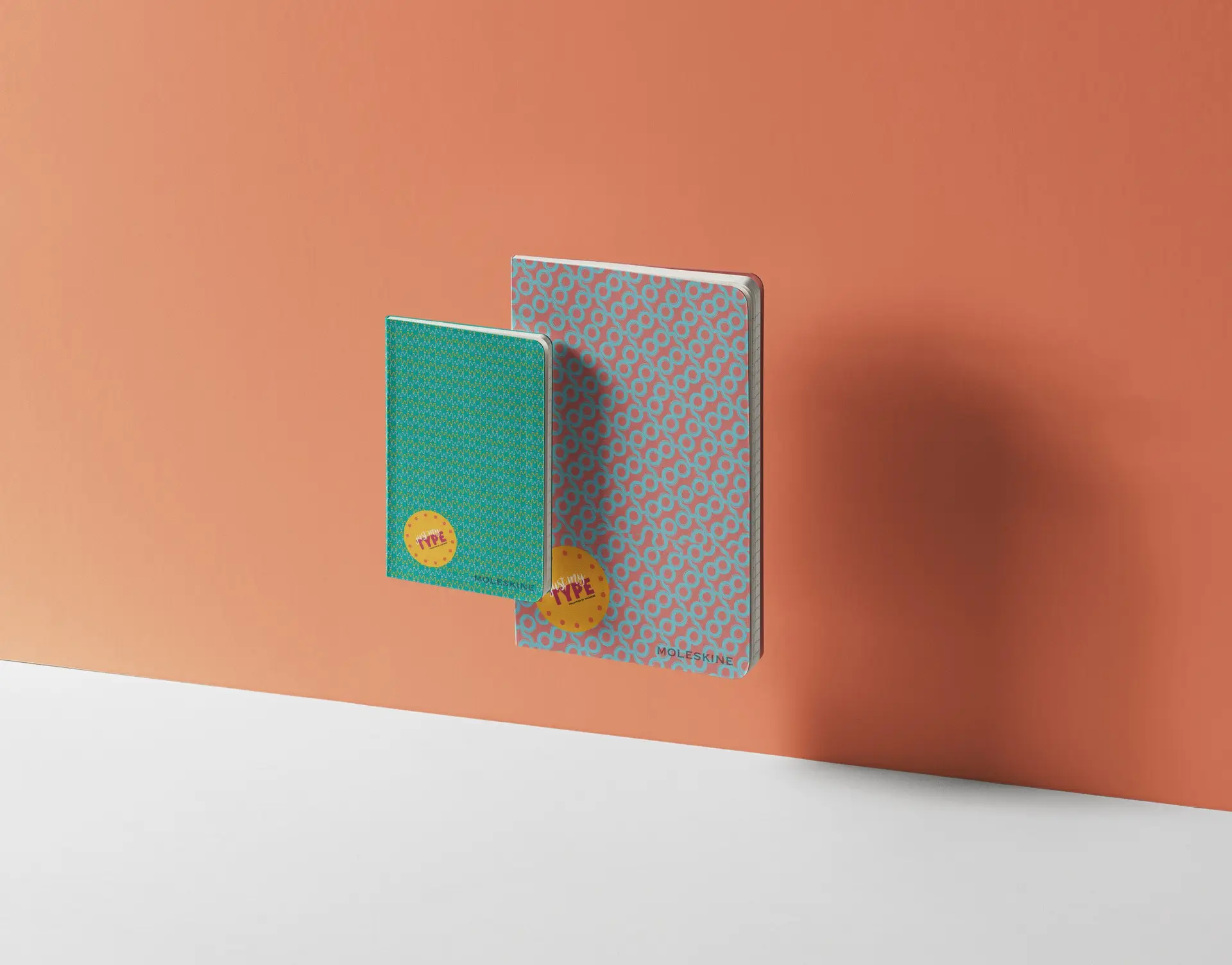
Conceptualize and build a brand around previously designed typographic patterns.
This project was actually taken from a typography exercise that I did in freshman year. We originally had to develop patterns using only type, and while one of them wasn’t too great, I’ve always loved the look of the ‘Q’ pattern. It was my professor this year that inspired me to create a notebook collection centered around typography, utilizing this ‘Q’ pattern among others.
A lot of this project was dependent on my first pattern. I couldn’t use the same font again, nor the same color palette or letter. I had to get creative, so I took to Dribble and Behance to muster up some inspiration. After playing around in Illustrator for a while, I came up with these patterns, which in a way can relate to the different side of my personalities, the side that is loud and bright, the side that is more feminine, and the side that has a great appreciation for the retro era.
Since these patterns are so busy, I chose to go rather simple with the logo, which helps to create a unified balance between elements.
I don’t think I ever would have thought to turn this simple, interesting type exercise into a full fledged notebook collection. A lot of the time, I think more about thinking and moving forward than back, and don’t really take the time to reconceptualize former work. I’d say the main thing I took away from this project is that just when you think you’ve stretched your ideas as far as you can, there is always a way to make it better. Just think outside the box a little.
*Disclaimer: I do not own the rights to the existing logos used in these designs. These were made on an educational basis.