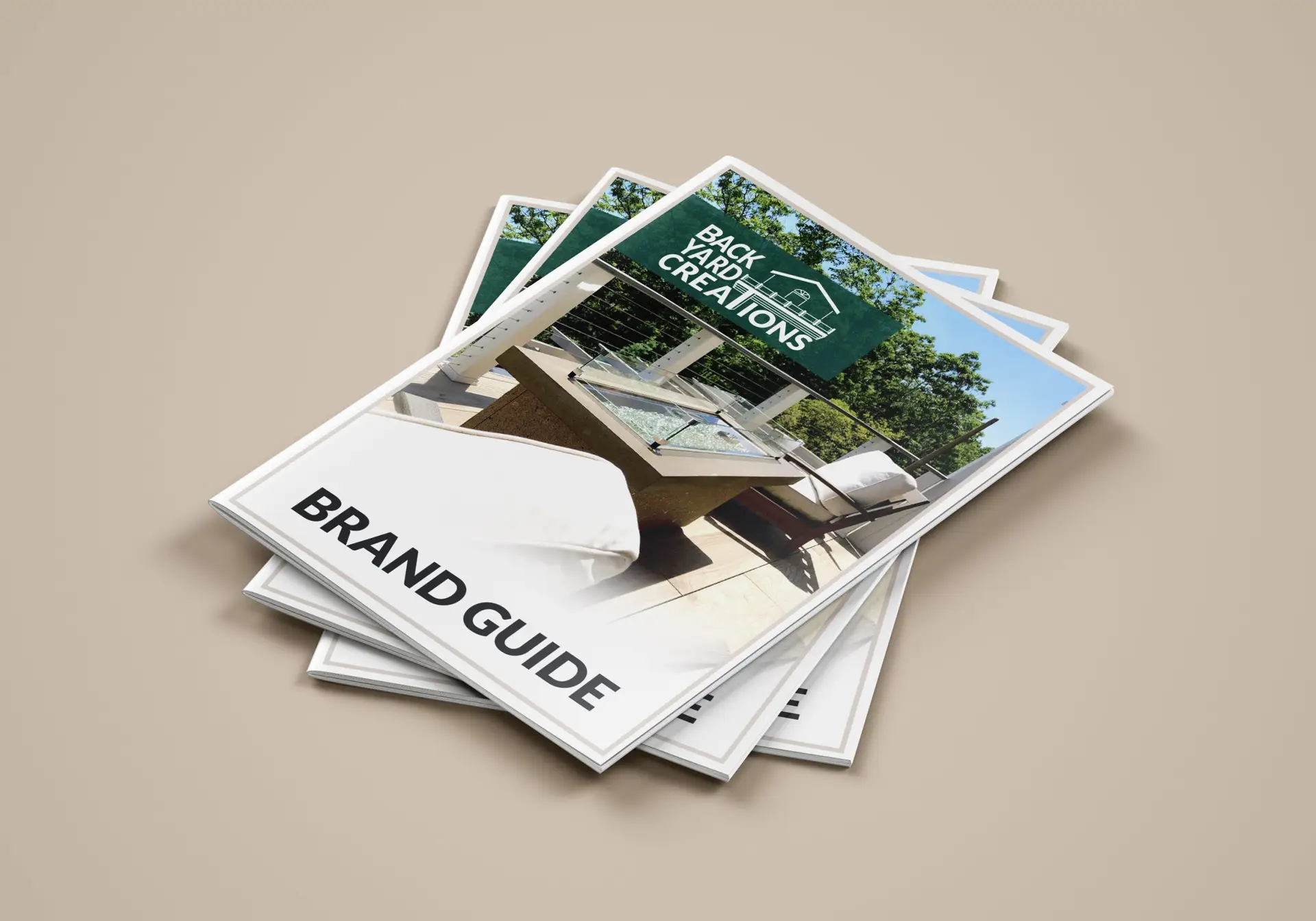
Using an extended logo design, create a set of brand guidelines for the company of the client in the form of an electronic book to illustrate the brand’s story, customers, and aesthetic.
In April of 2021, Backyard Creations (an outdoor living design and build company) reached out to seek my help in a complete brand redesign. Unsatisfied with their current logo and brand, BYC wanted to elevate their aesthetic to relate more with their business relationships and knowledgeable clientele. After participating in several design consultations with the team and their own designer, a logo was designed that brought a sophisticated, modern touch to the otherwise industrialized style of this trade. A company bases its entire brand off of its logo, and now that it was complete, I would be taking over the project. My big task was to create the brand guidelines that would ensure a seamless aesthetic company-wide.
Building this brand guide was essentially starting from scratch. They wanted to do away with their old style completely, save for a couple of colors and fonts. Starting with the guidelines themselves, I did some heavy research into brand guide documents and storytelling for this project. Not only would I be writing about this company’s brand, but I’d be writing about who they are, and telling the story of their success.
Hours and days of research and brainstorming led to the design decisions you see on these pages today. From the big, important components that you see in all brand guides (target audience, logos, typography, blah blah blah) to the small details, like making the color palette out of paint swatches.
The BYC team and I also had this great idea of creating an emblem for their products. We conceptualized a wood-burning iron of sorts that gives their product a permanent “seal of approval”. They really liked the look of the vector leaves used in the brand guide design; so much that they chose that graphic as the main component of the seal. Something simple yet sleek.
I really loved how this project came out. I think a lot of strong design decisions were made here, and that they really elevate BYC over their competitors. Their new brand aesthetic communicates that they mean business, and they’re the experts, on the up-and-up in outdoor living. Follow-ups will be made at a later date to see how the rebrand is working out.
Click the button below to be redirected to Issuu.com, where I’ve created a digital brand book to read through in more detail.
Visit their company website to read all about their experience, quality products, and the expert services that they offer.