
Develop an advertising campaign, related graphic deliverables, and a central information hub (website) to increase membership sales and awareness of the company.
Following the first quarantine of the COVID-19 pandemic, Varna Naik reached out to me for help with picking her business back up by the bootstraps. Based in Amherst, MA, InfinityED is a small business in the education industry. Working with students from Kindergarten to Graduate School, Varna and her team create learning plans based on student-specific need. With e-learning becoming the norm at the time and membership sales decreasing, Varna needed to advertise to the public that “hey, we’re still here, and we do online tutoring too!”.
Working closely with her and her team, we developed a campaign to increase company awareness and membership sales using digital deliverables. This was achieved through the use of social media advertisements across a multitude of platforms, as well as building an on-brand, user friendly website utilizing original illustrations and graphics to appeal to the target audience of the company.
Being that the company’s target audience was both parents and students, two alternating advertisements were created for social media; one in the perspective of a parent, and one in that of a student. We wanted to take both customers’ worries into consideration and reiterate that we are here for everyone.
Follow them on social media to stay up to date on the latest and greatest in non-profit education and sustainability.
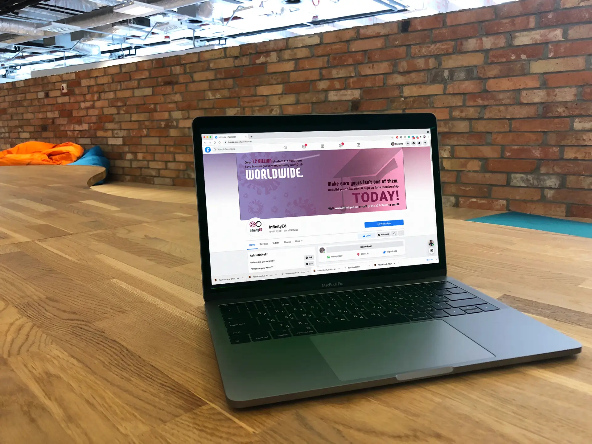
Campaign-specific header images were also developed for the company’s various social media pages. These focused on students bouncing back from e-learning struggles, and featured membership promotions.
Probably the largest portion of this project though, was designing the website. Starting with the bare bones of a just a footer and navigation menu, her web developer and I teamed up to create a buzzing, fun, eye-catching website as a centralized informational hub for potential customers. Featuring numerous web pages such as an about page, membership sales, and a “meet the tutors” page, this website not only communicates information well, but in an eye-catching, on-brand, friendly way.
This client project was definitely a test on my web design skills. While I’d done tons of website designs and prototypes for school, I had never done one for a real client prior to this. This involved a ton of research and even more of my time, but was totally worth it. To create a successful website that communicates the company’s tone and aesthetic effectively, and seeing it as a live website, out there on the real-life internet as opposed to a prototype, was, and still is a really spectacular feeling.