Develop a wayfinding system for an organization of your choosing, complete with icons, maps, and kiosks.
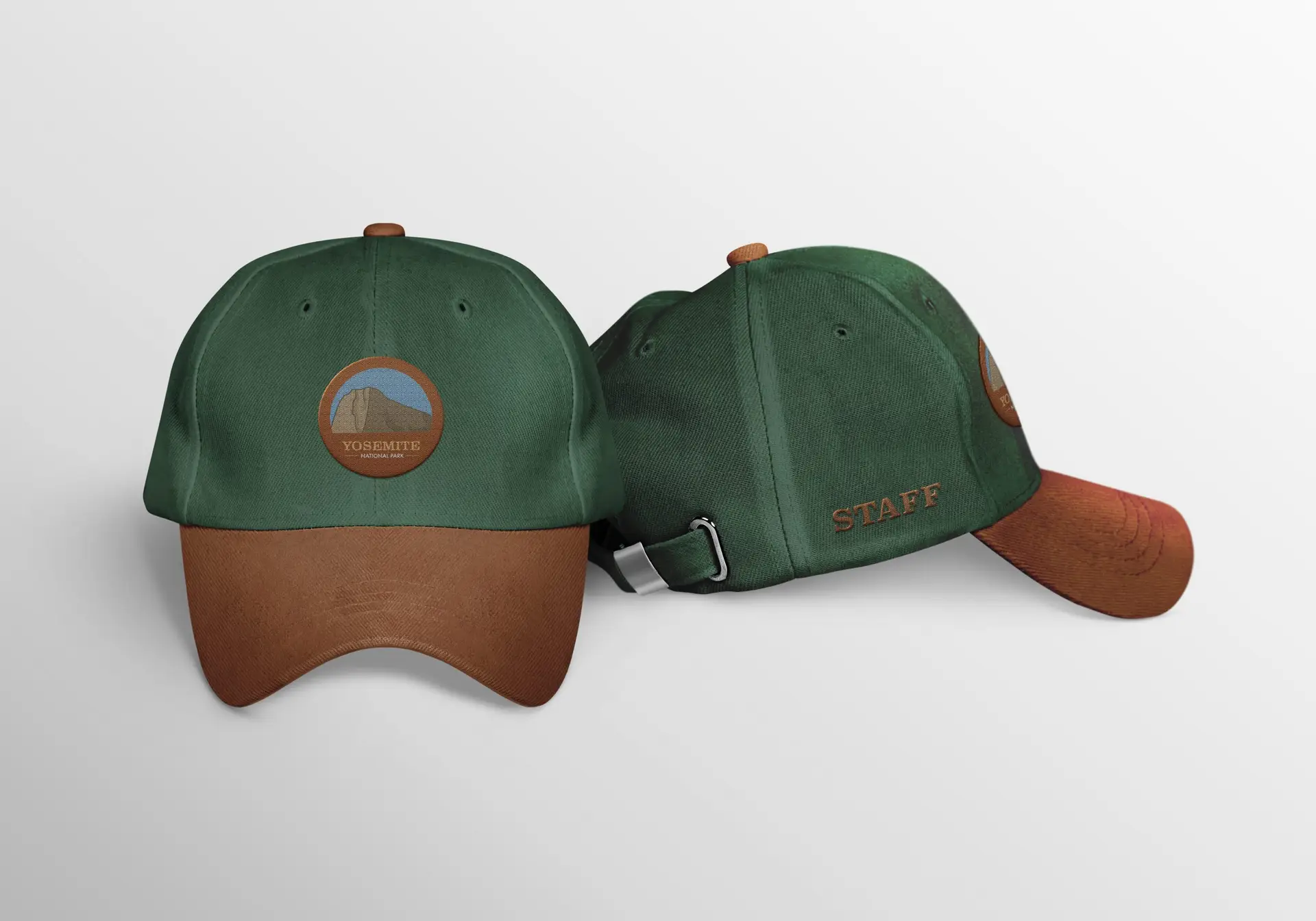
When developing this concept for a wayfinding system for Yosemite National Park, my first instinct was to keep the “nature” vibe they already had. National Parks are all about getting outside and enjoying the beauty the world has to offer, and to modernize that would be to diminish the entire feeling of the park. That being said, I decided to improve their logo to showcase their most popular attraction; El Capitan. The fonts and style I chose are reflective of the “natural” vibe I went with, adding just a tiny touch of modern by using Josefin Sans as a “secondary font” in the logo. As for the icons, I wanted to stay simple and minimal, but these are a work in progress. As they are right now, the restroom icon is far more detailed than the others; and I actually prefer them that way! I am in the process of revising these icons to fit more with the restroom icon.
Additionally, I have created a wayfinding kiosk for visitors to use to map out their travels throughout the park. When designing this part of the project, I took a lot of inspiration from the appearance of wishing wells. The kiosk is also a work in progress, as I would like to refine the details in this more. Lastly, I developed a couple apparel items, consisting of a t-shirt and a baseball cap boasting the new logo. Ideally, this would be for park staff to wear so that visitors can pick them out easily.
This project was definitely an interesting one, to say the least. I recall hitting a lot of roadblocks in the initial ideation of this work. I guess if I can take anything from this one, it’s that sometimes back to basics is best.