Using an extended logo design, create a set of brand guidelines for the company of the client in the form of an electronic book to illustrate the brand’s story, customers, and aesthetic.
Design Solution:
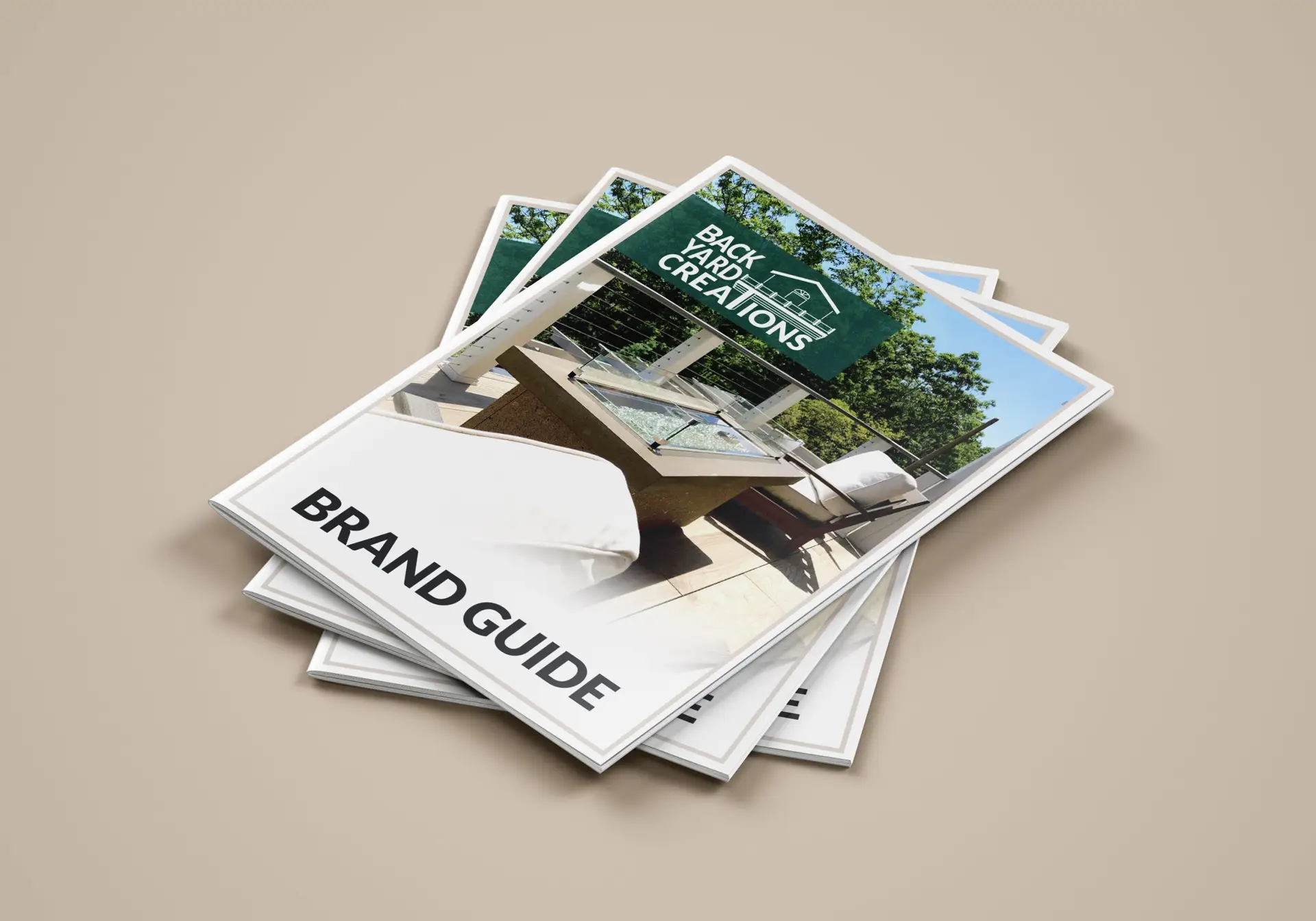
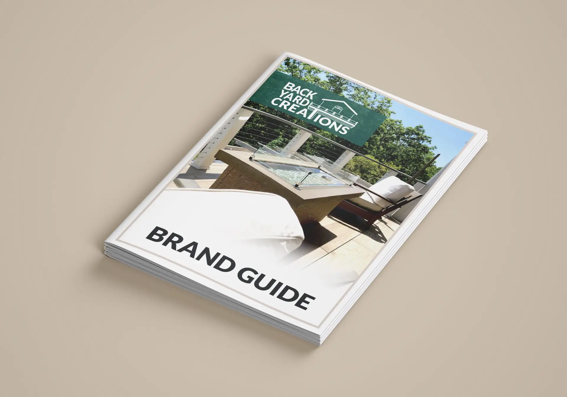
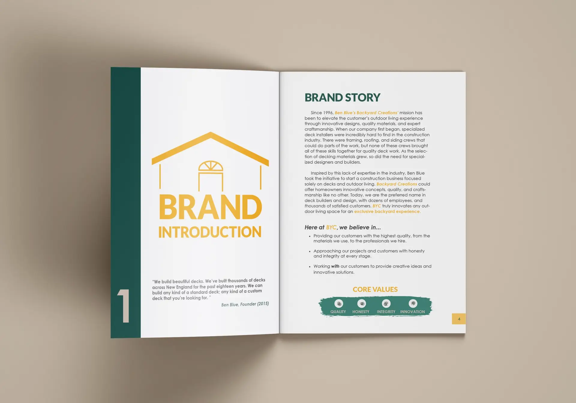
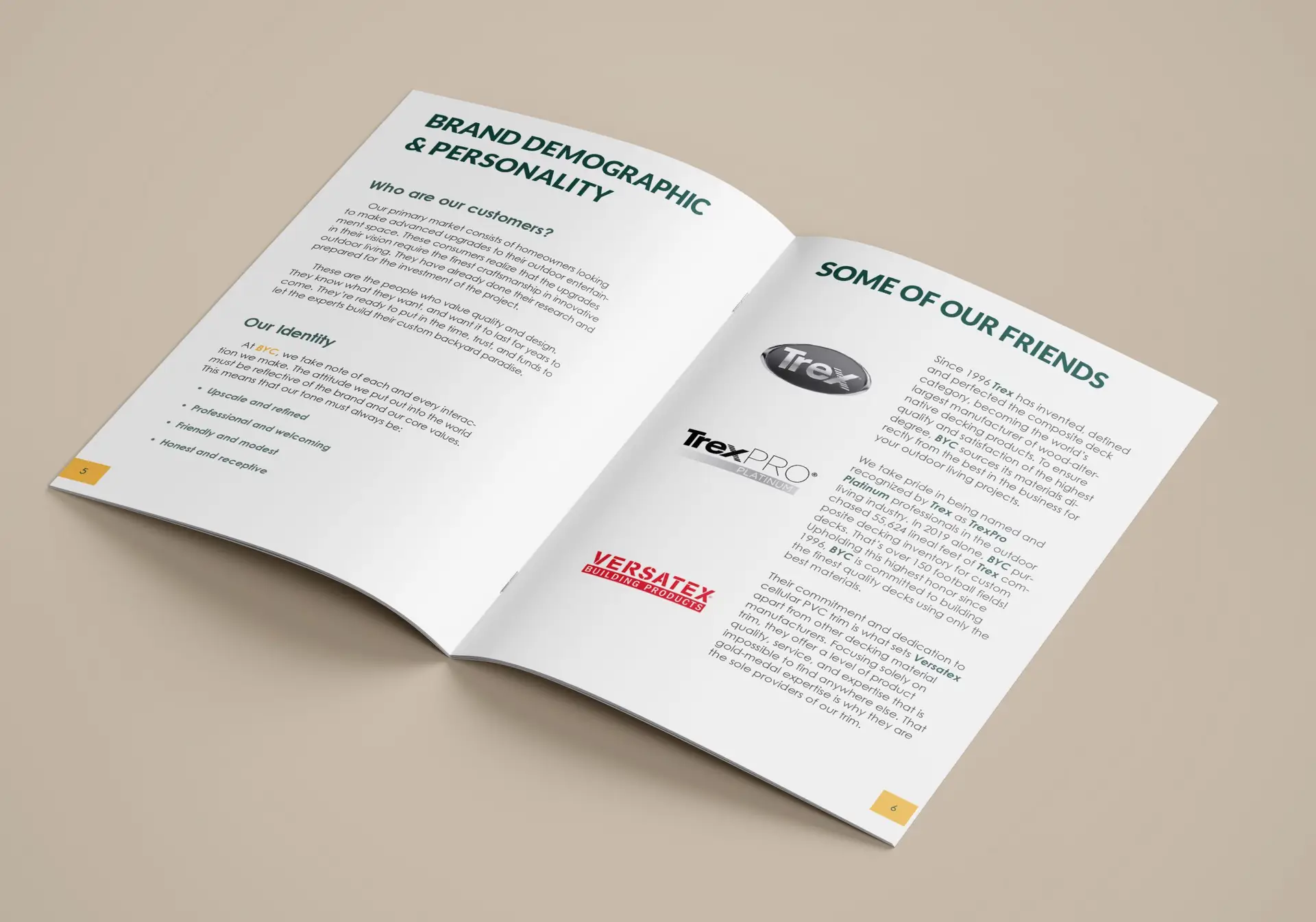
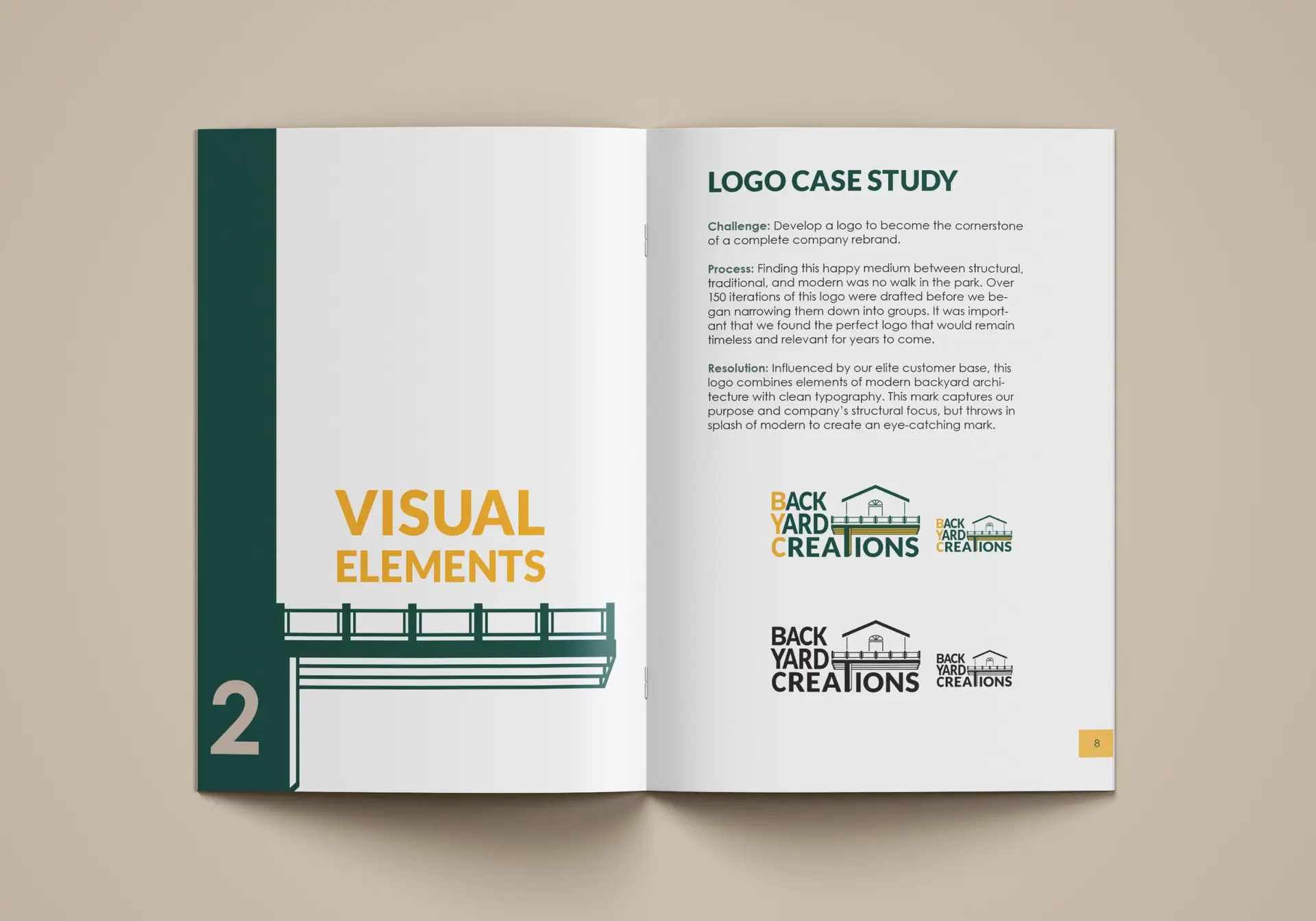
In April of 2021, Backyard Creations (an outdoor living design and build company) reached out to seek my help in a complete brand redesign. Unsatisfied with their current logo and brand, BYC wanted to elevate their aesthetic to relate more with their business relationships and knowledgeable clientele. After participating in several design consultations with the team and their own designer, a logo was designed that brought a sophisticated, modern touch to the otherwise industrialized style of this trade. A company bases its entire brand off of its logo, and now that it was complete, I would be taking over the project. My big task was to create the brand guidelines that would ensure a seamless aesthetic company-wide.
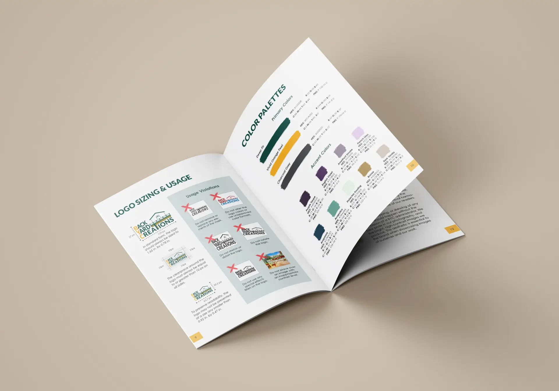
Building this brand guide was essentially starting from scratch. They wanted to do away with their old style completely, save for a couple of colors and fonts. Starting with the guidelines themselves, I did some heavy research into brand guide documents and storytelling for this project. Not only would I be writing about this company’s brand, but I’d be writing about who they are, and telling the story of their success.
Hours and days of research and brainstorming led to the design decisions you see on these pages today. From the big, important components that you see in all brand guides (target audience, logos, typography, blah blah blah) to the small details, like making the color palette out of paint swatches.
The BYC team and I also had this great idea of creating an emblem for their products. We conceptualized a wood-burning iron of sorts that gives their product a permanent “seal of approval”. They really liked the look of the vector leaves used in the brand guide design; so much that they chose that graphic as the main component of the seal. Something simple yet sleek.
Self-Reflection:
I really loved how this project came out. I think a lot of strong design decisions were made here, and that they really elevate BYC over their competitors. Their new brand aesthetic communicates that they mean business, and they’re the experts, on the up-and-up in outdoor living. Follow-ups will be made at a later date to see how the rebrand is working out.
View the Digital Publication
Click the button below to be redirected to Issuu.com, where I’ve created a digital brand book to read through in more detail.
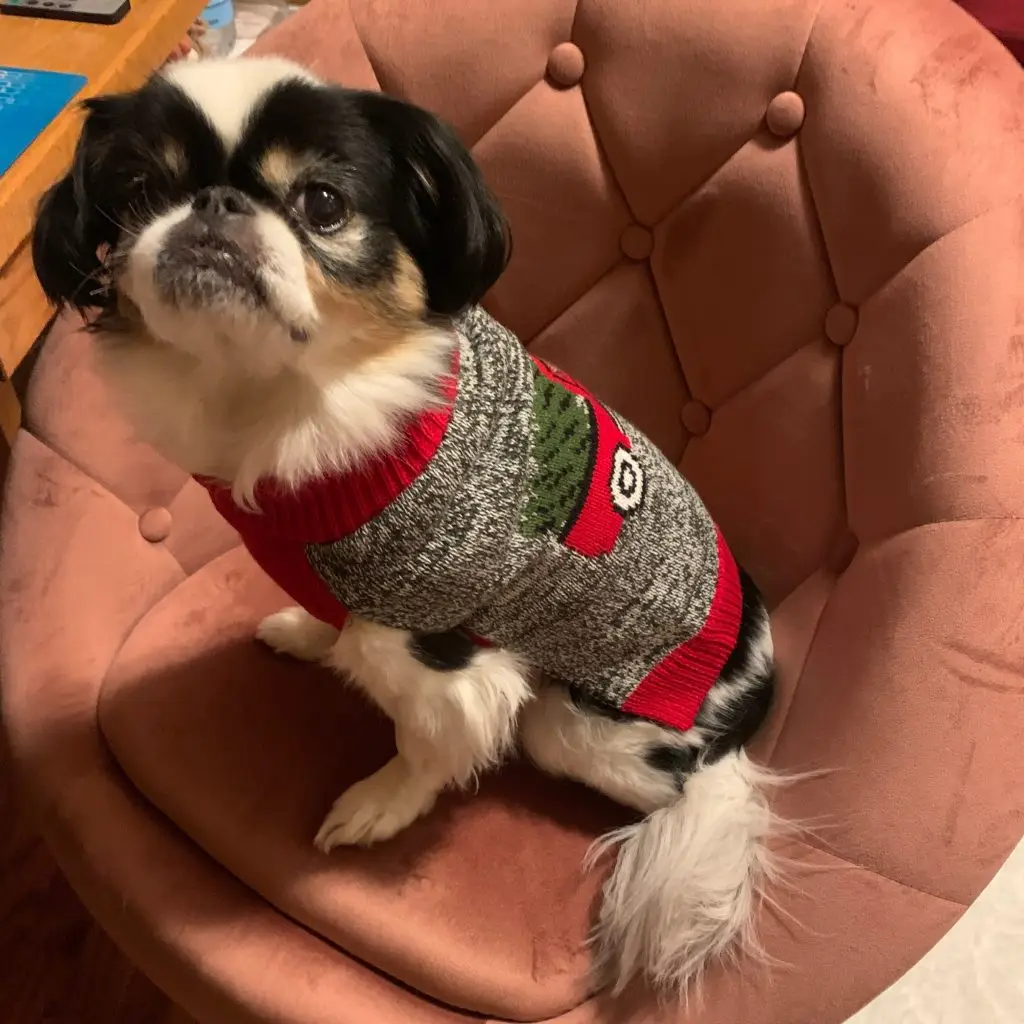
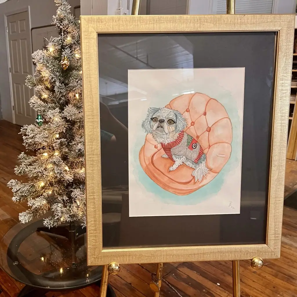
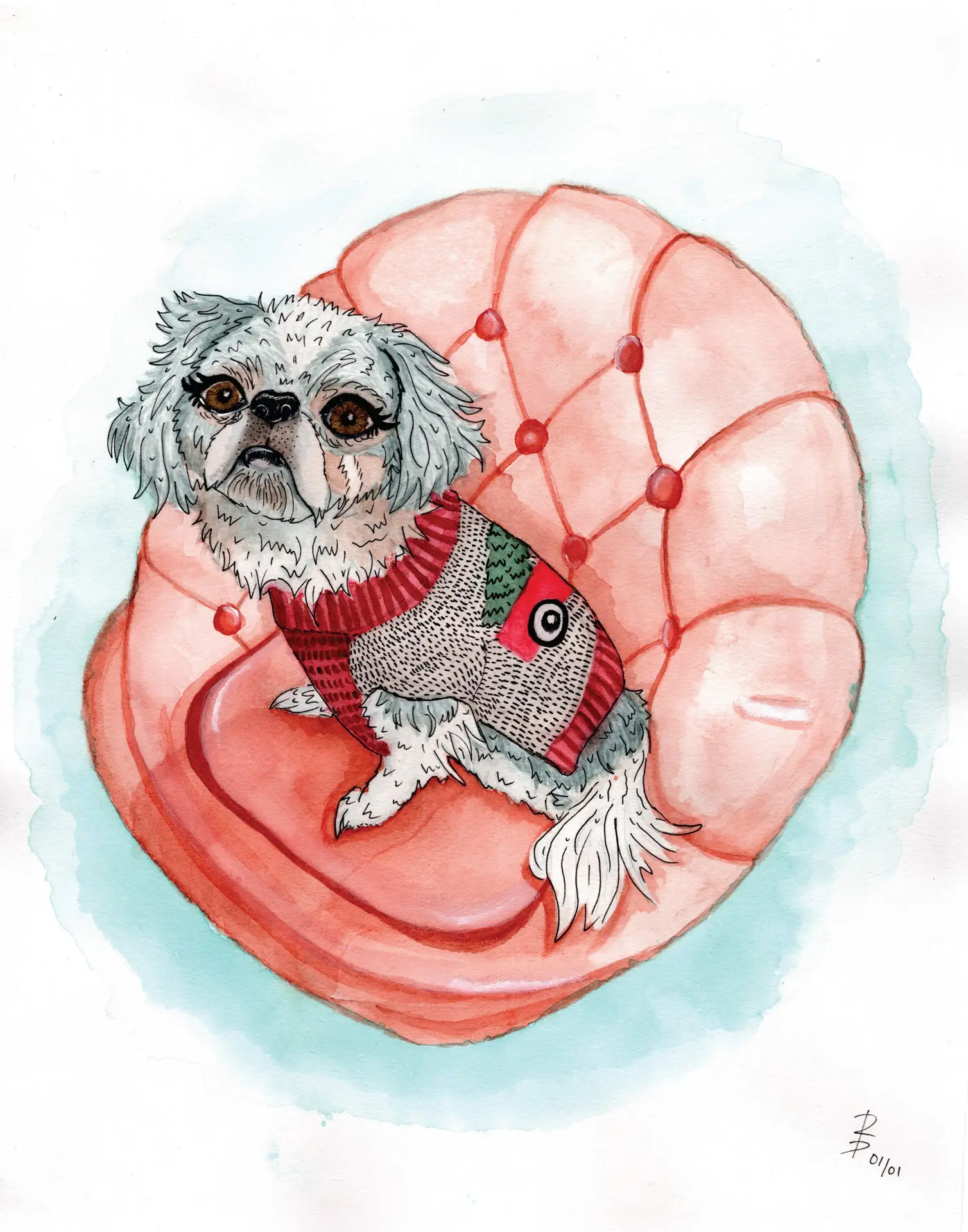
pet portrait | watercolor & ink on arches paper | 2021
This pet portrait was done in late 2021 as a commission piece. The client was looking for a rendition of his beloved Japanese Chin that captured the sass of this 13 year old little diva. Upon completion, I paired this piece with a white mat and gold frame to elevate the elegance of the portrait.
Interested in your own pet portrait?
Fill out the form below to submit a commission inquiry.
Stylized watercolor is the default for pet portraits; alterations will be discussed on a case-by-case basis. Commissions have a minimum turnaround time of 2-weeks.
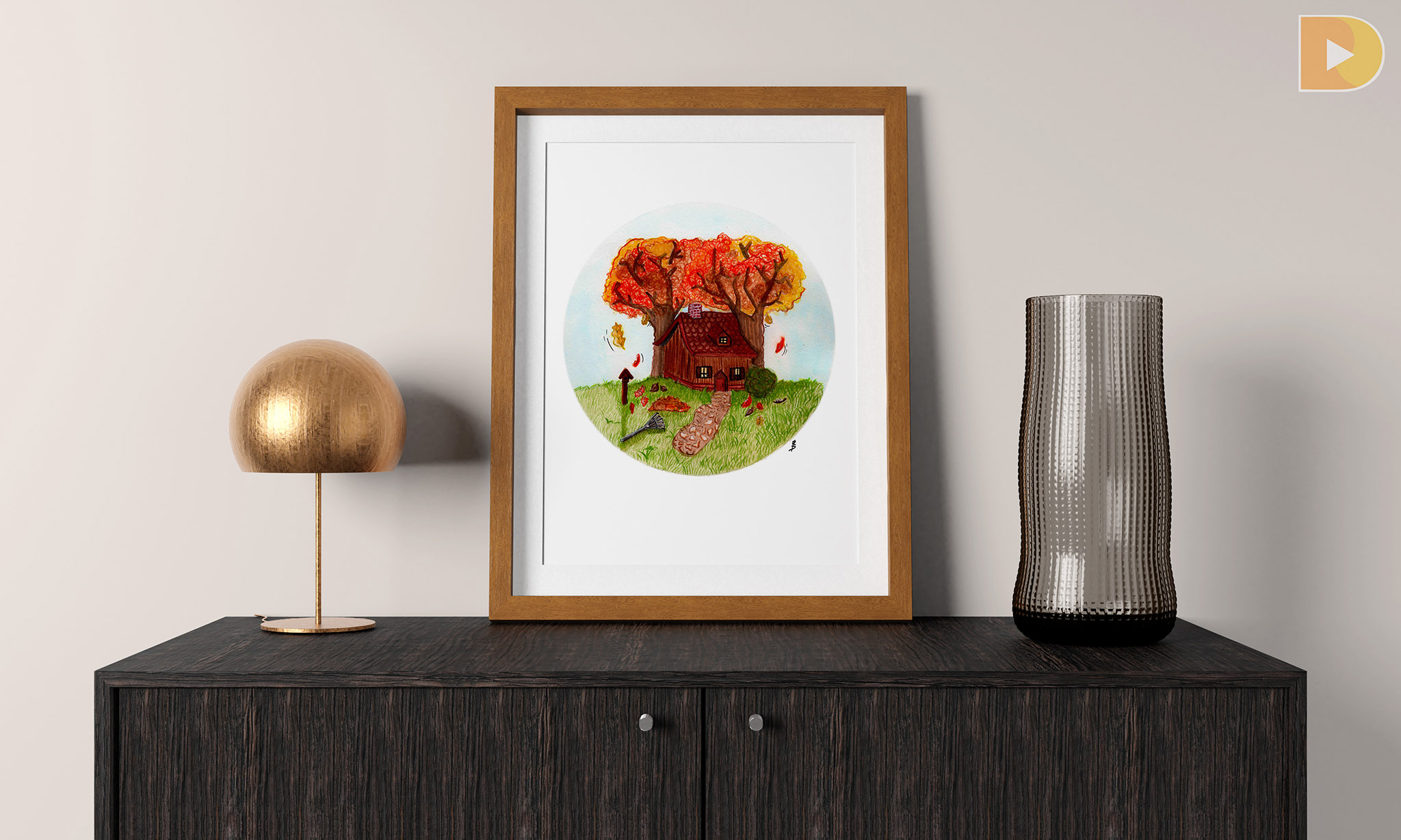
autumn cottage | watercolor on arches paper | 2021
In the spirit of the Thanksgiving holiday, I chose to create this painting of a dainty fall cottage using bright watercolor paints and pencils for detail. The idea for this piece came from a fall “snowglobe” concept that popped into my head one day. The trees were fun to do; the scribble-method is definitely one of those “looks terrible before it looks better” types but I love the way it came together. I could picture this style in a children’s storybook.
Develop various direct marketing materials to promote the addition of new academic programs introduced by the company for the upcoming year.
Design Solution:
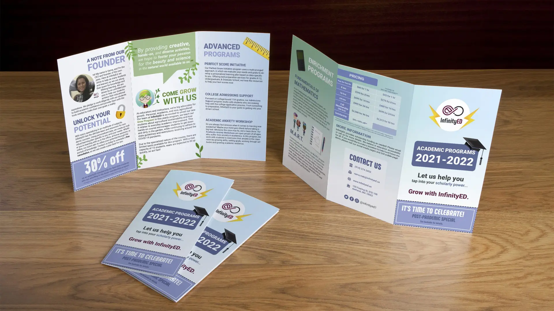
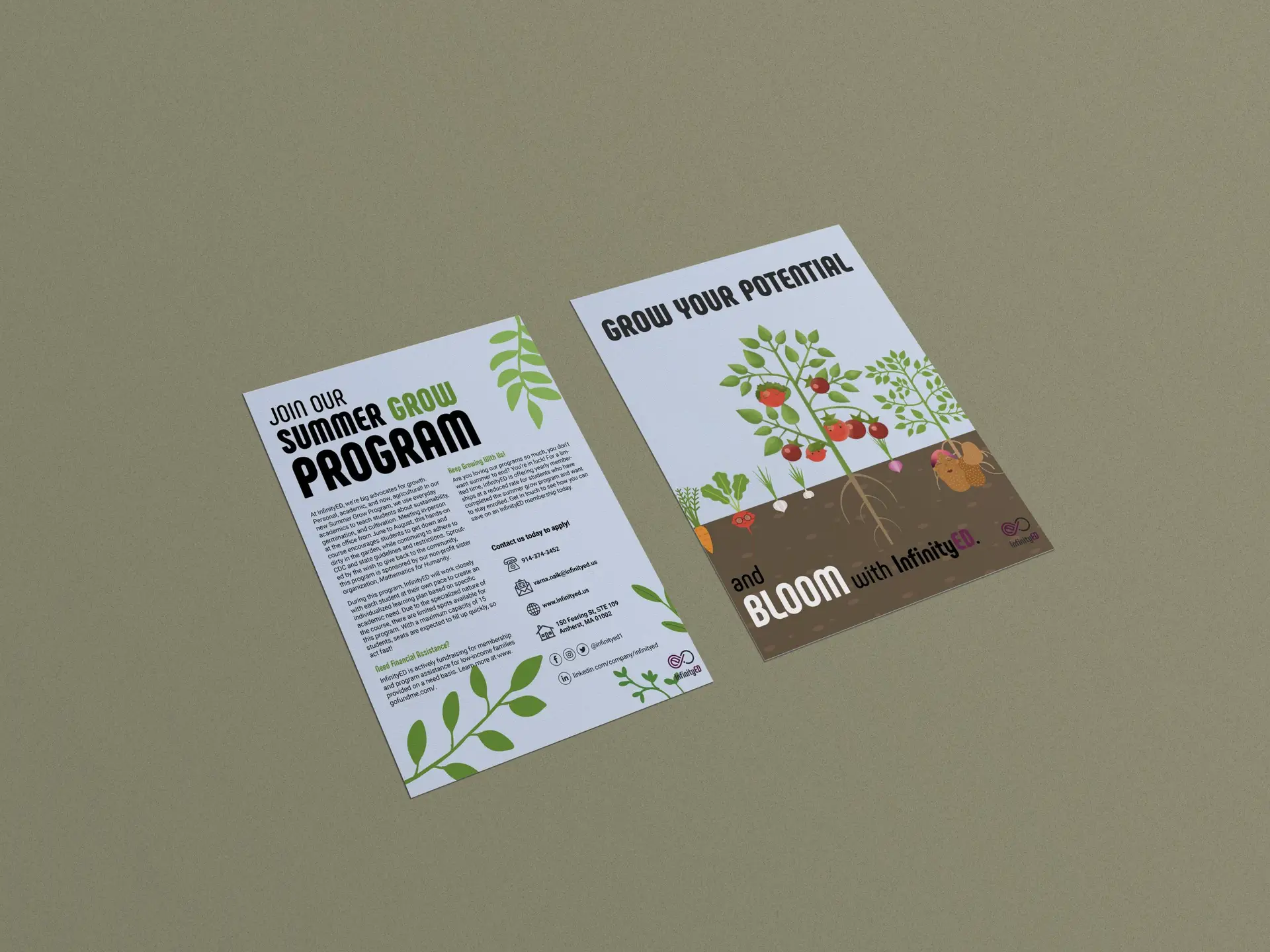
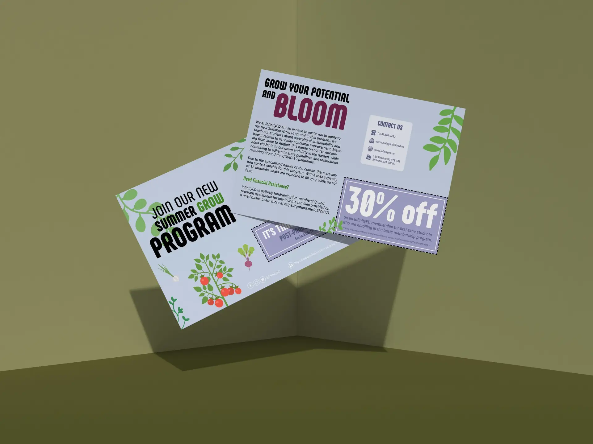
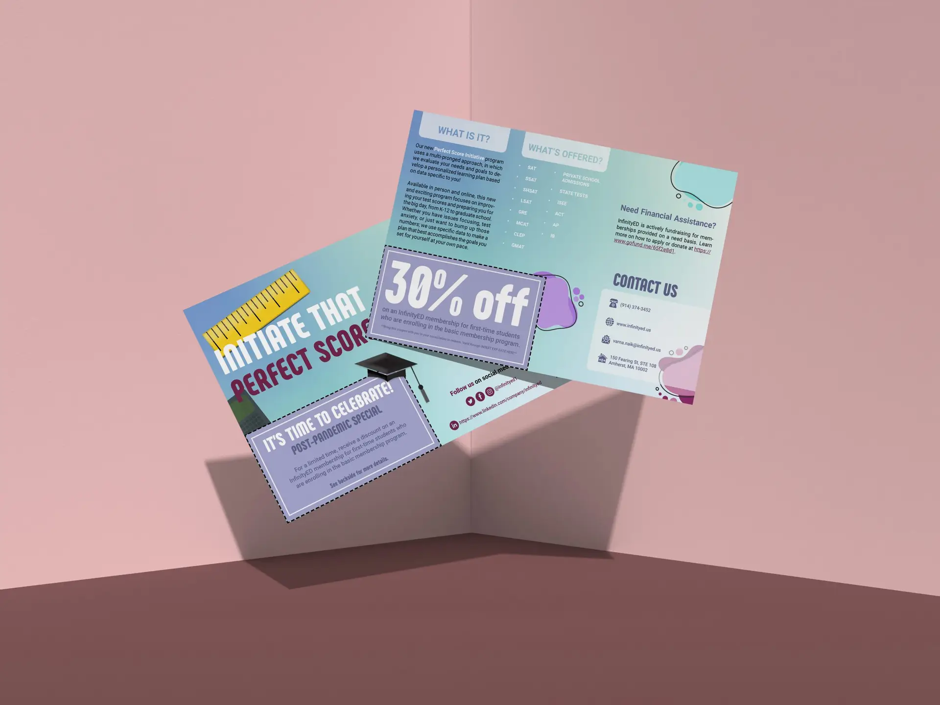
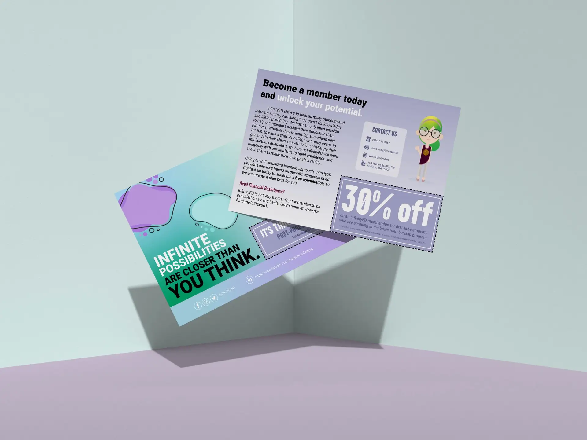
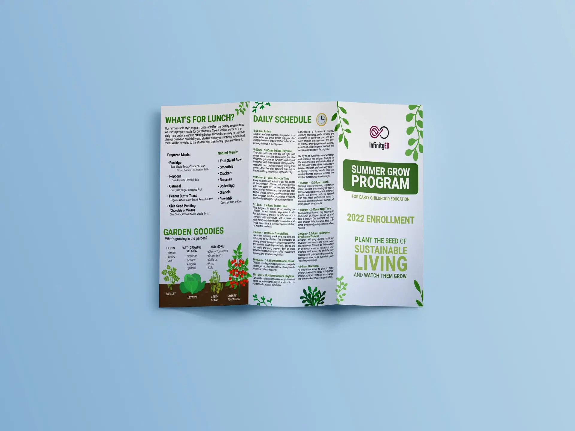
When my client reached out to do some updated marketing in the Spring of 2021, I was so excited to hit the ground running with this one. Expanding on the aesthetic that I created for the InfinityED brand previously, this project gave me the opportunity to create new graphics in the signature style (and have a lot of fun creating them!) If you look at some of the marketing materials for the Summer Grow Program, you’ll see some familiar faces from the last project we did… only this time, some of them have been transformed into plants! This idea was crafted to further promote the natural, agricultural basis of the program, while staying true to the roots (heh) of the program (i.e academics, mathematics etc).
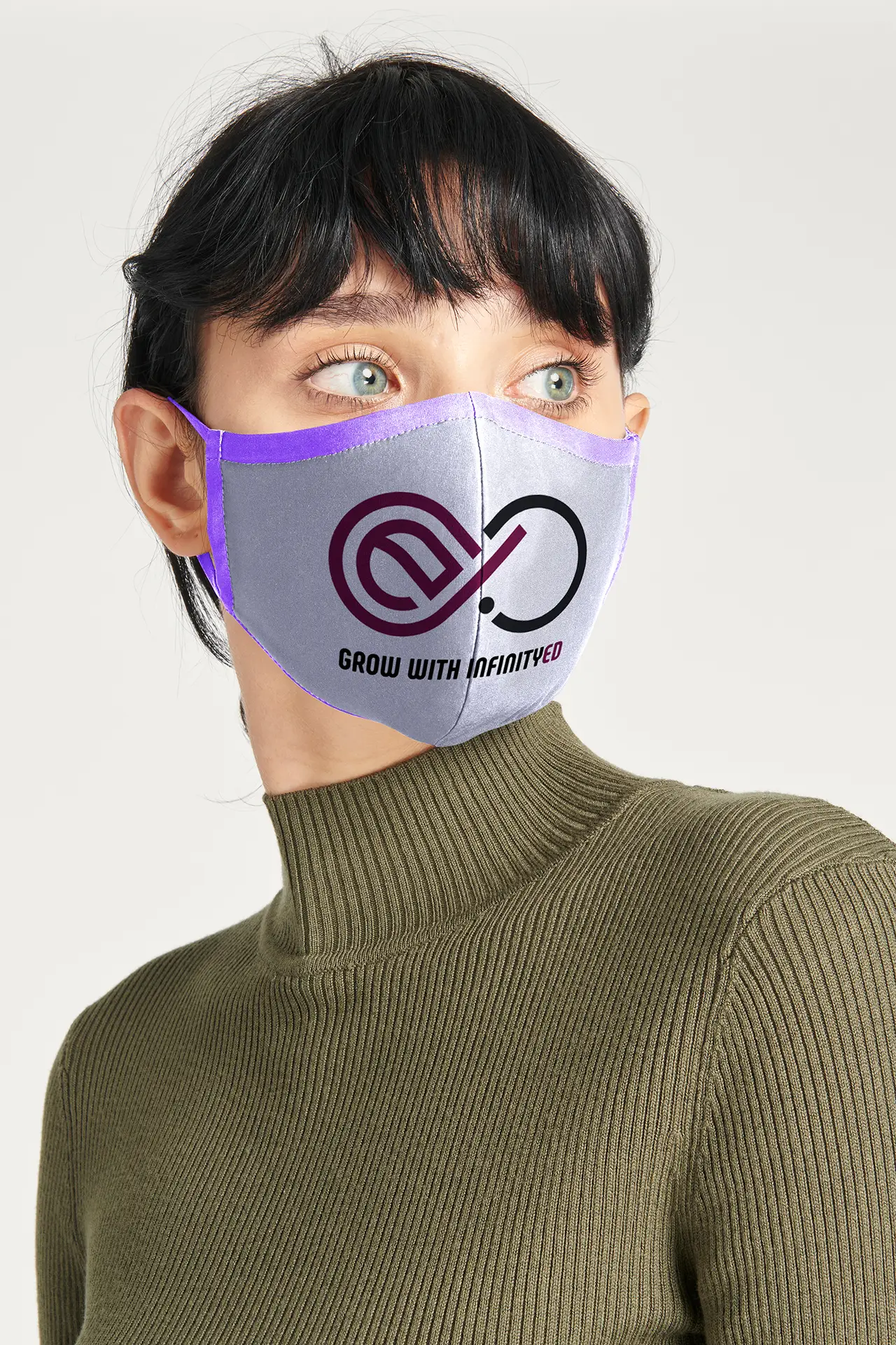
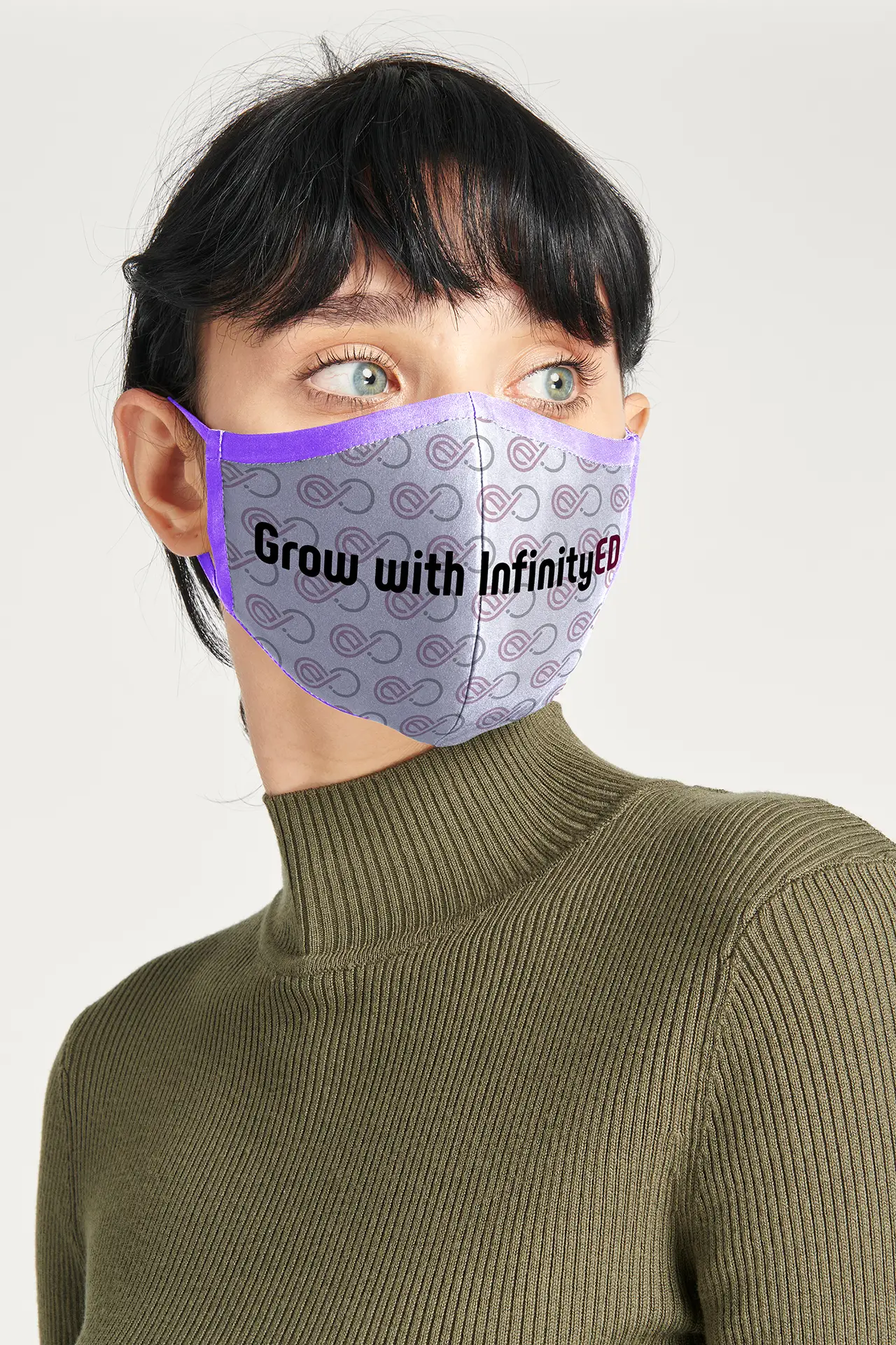
The masks were designed with comfortability in mind, as they would be worn primarily by staff during in-center learning sessions. Bearing this in mind, the design can’t be too over-the-top…you don’t want to distract your students! We achieved a happy-medium with these by keeping these materials on-brand through the graphics and color palette used, but still tried to stay relatively subtle, and not be too “in your face”.
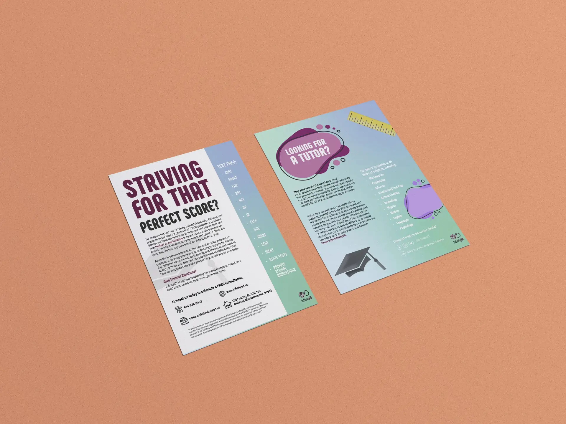
Quite possibly the most important part of the project was the academic brochure created to showcase all of the coming year’s programs. Previously, the Client didn’t have a central information hub on all of the programs offered, which can be very helpful to interested customers. Now, instead of calling the company to hear more about the programs, they are able to offer this convenient brochure outlining all the basic information needed for the consumer to make an informed decision.
Self-Reflection:
I always have a lot of fun with these projects with InfinityED. Having been working with them since the beginnings of the company (as it is now), it’s been incredibly rewarding to be a part of the process of building this brand up to what it is now, and having it take off. With so many other projects in the works with this Client, I’m so excited to see the great ideas and creativity within this brand grow.
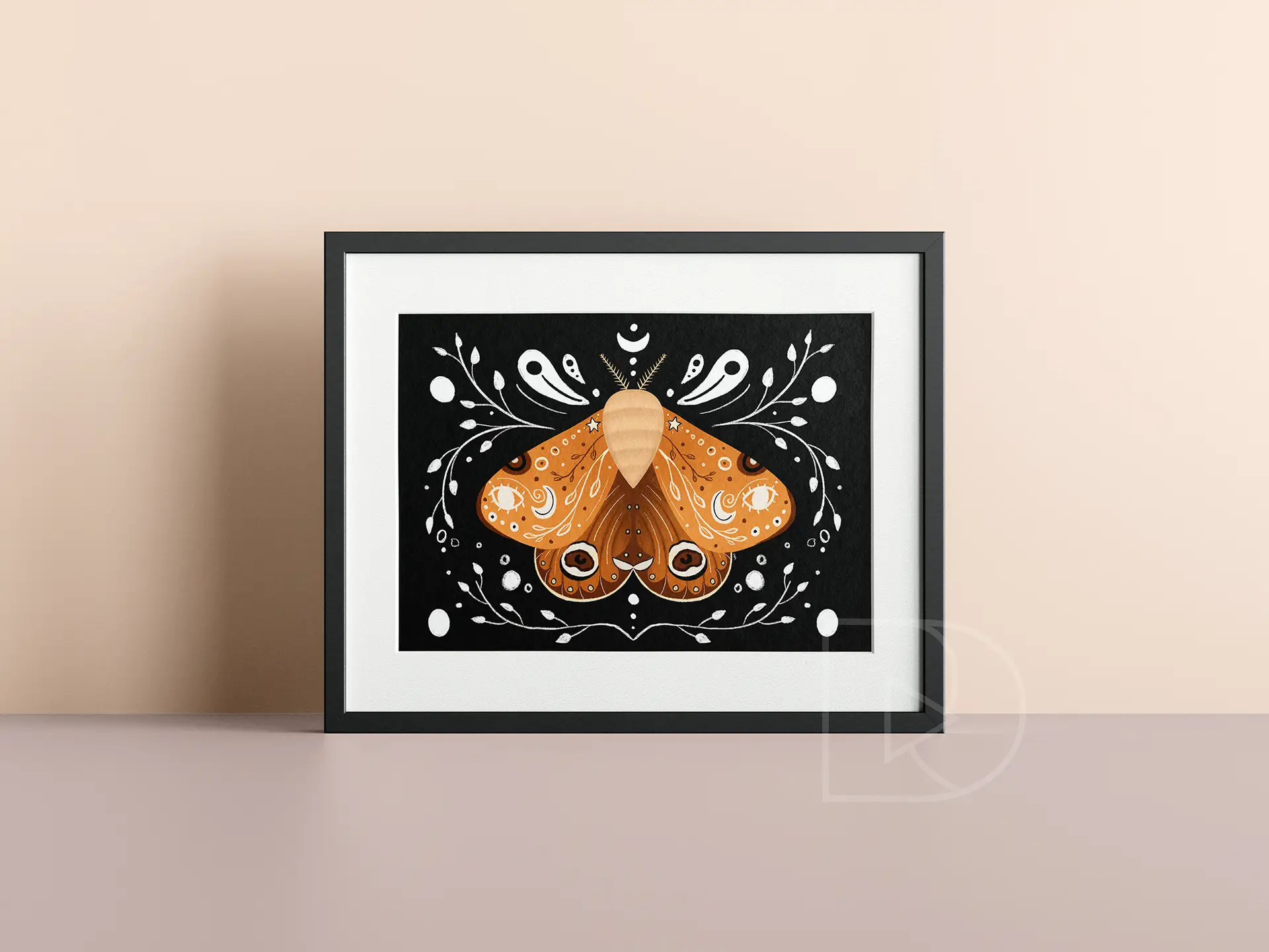
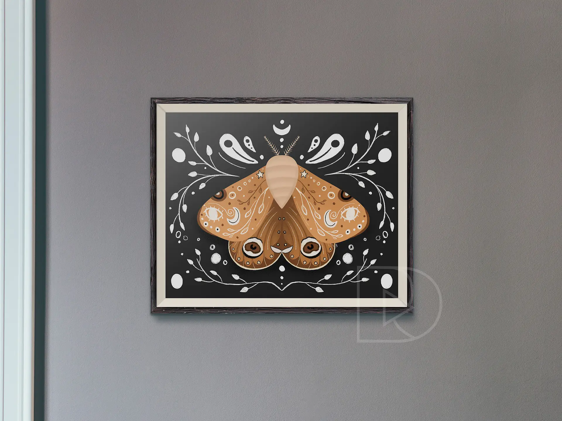
like a moth to flame...fueled by desire | digital illustration | 2021
This digital illustration of a moth draws inspiration from icons of divination and alchemy. Throughout various forms of media, we often see moths and other insects associated with positive magic. Using imagery from the black arts, this whimsical insect is representational of the bridge between horticulture and natural magic.


