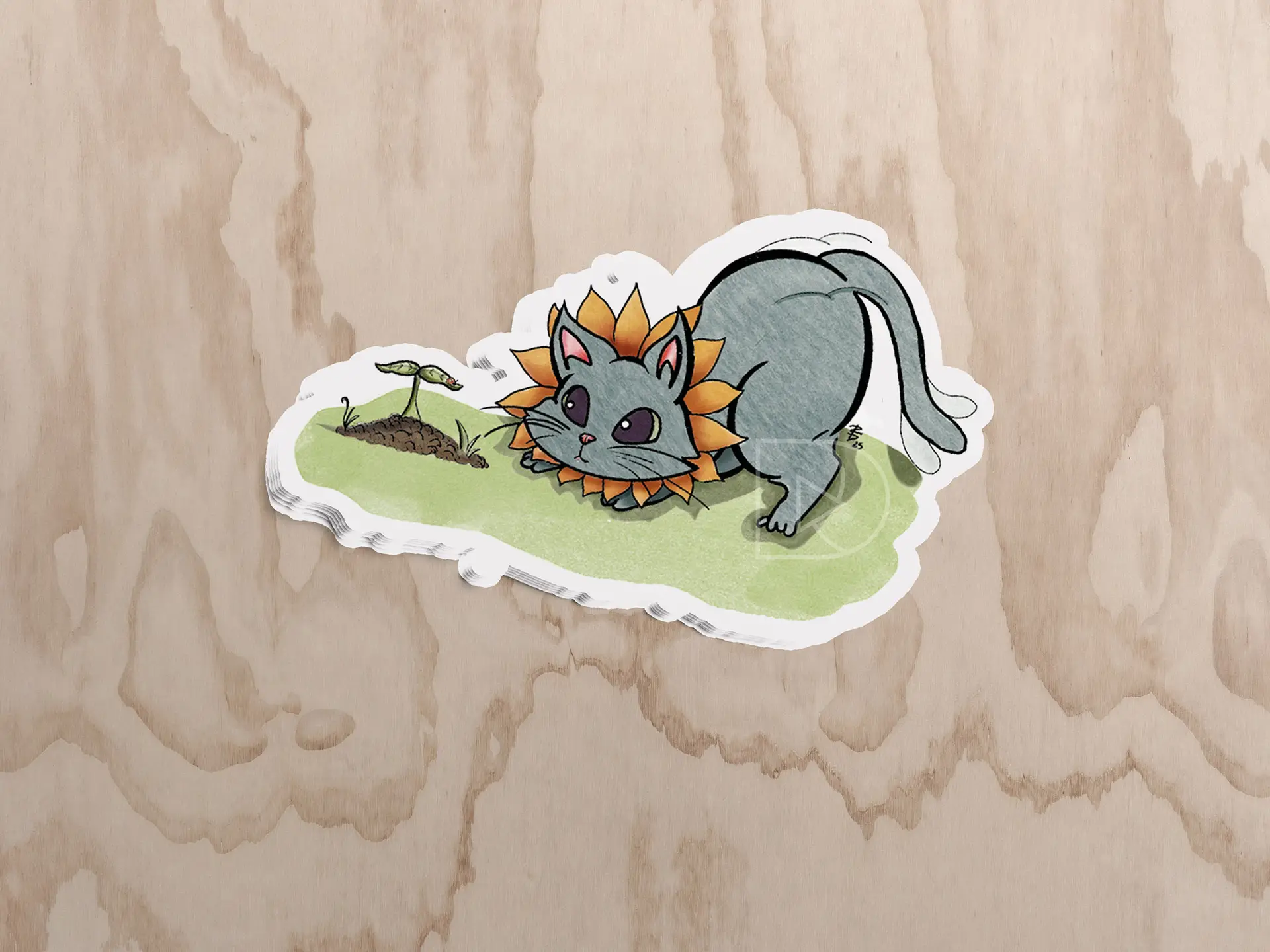
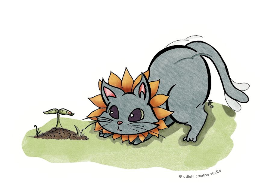
In creating my Sunflower Cat illustration, I aimed to blend the warmth and vitality of sunflowers with the playful charm of cats.This fusion symbolizes the joy and comfort that both elements bring into our lives.The design features a cat adorned with sunflower mane preparing to pounce on an unsuspecting ladybug, capturing a sense of whimsy, natural beauty, and a little bit of humor.Crafted with attention to detail, this sticker is a celebration of nature and feline grace, intended to brighten any space it adorns. This illustration is currently available for purchase on Etsy as a 3 x 2.143-inch gloss-finish sticker.
Visit my Etsy shop to browse my catalog of art for sale!
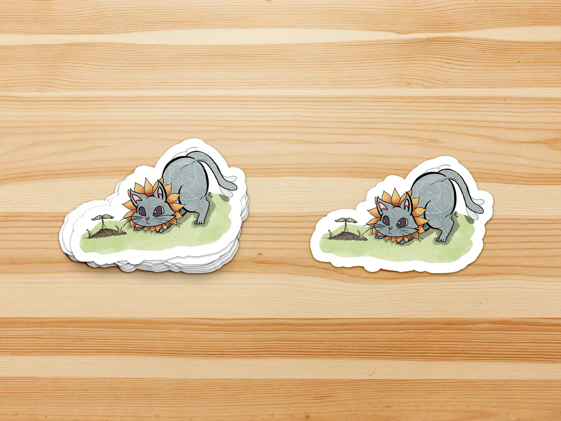
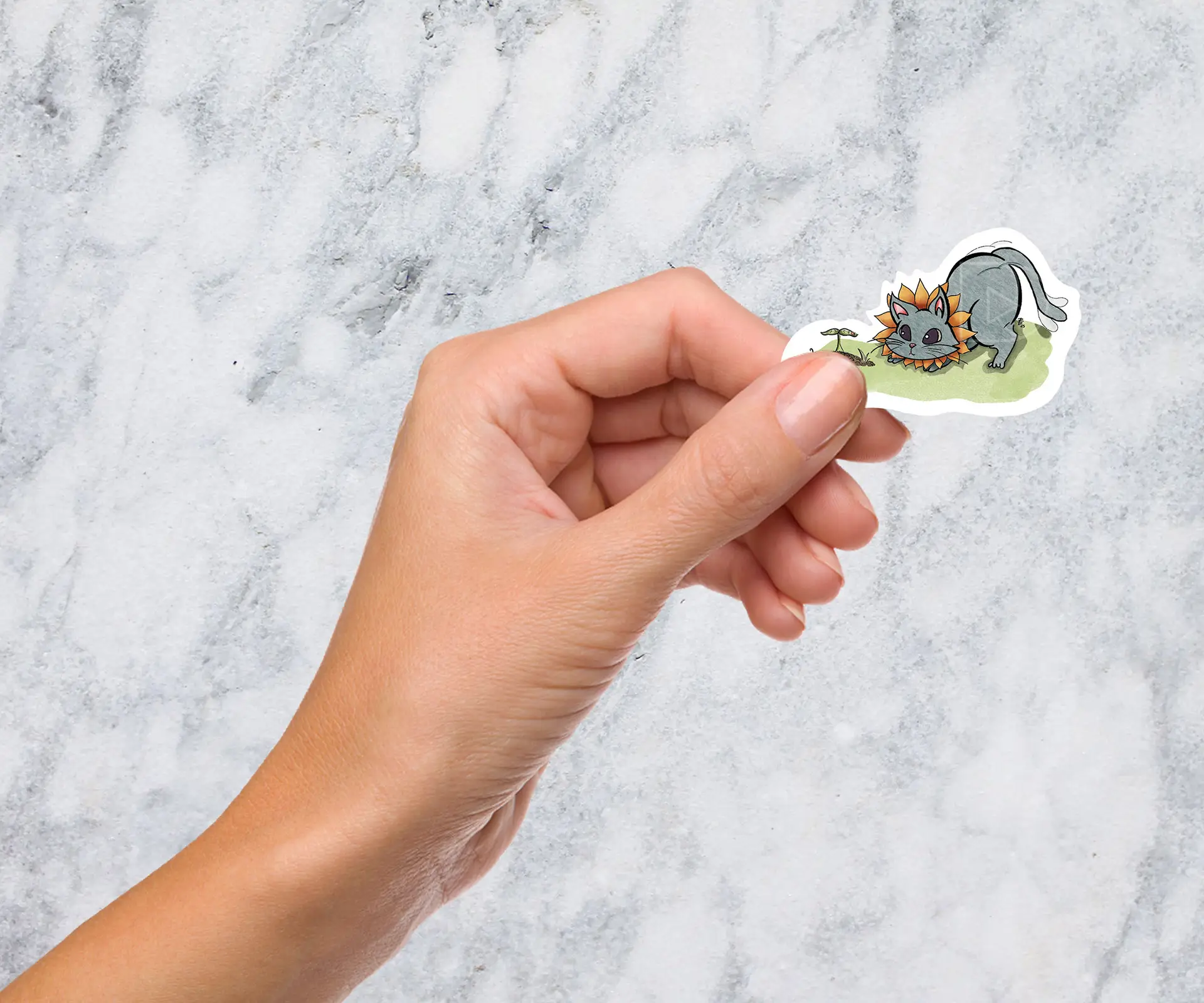
Love this illustration? Order the sticker!
Interested in purchasing this sticker? Click the button below to be redirected to this product listing on my Etsy.
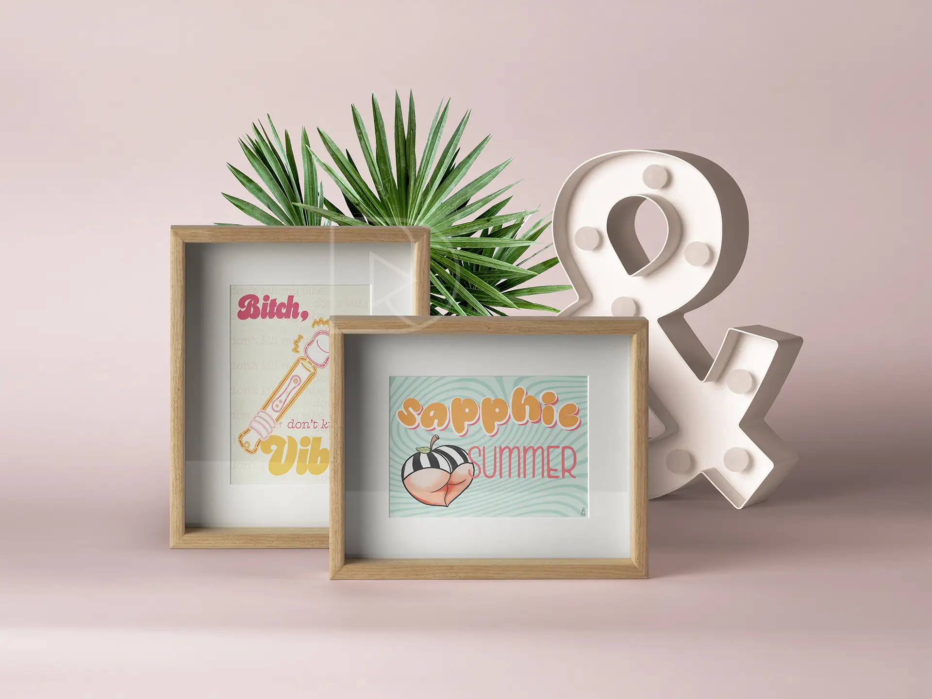
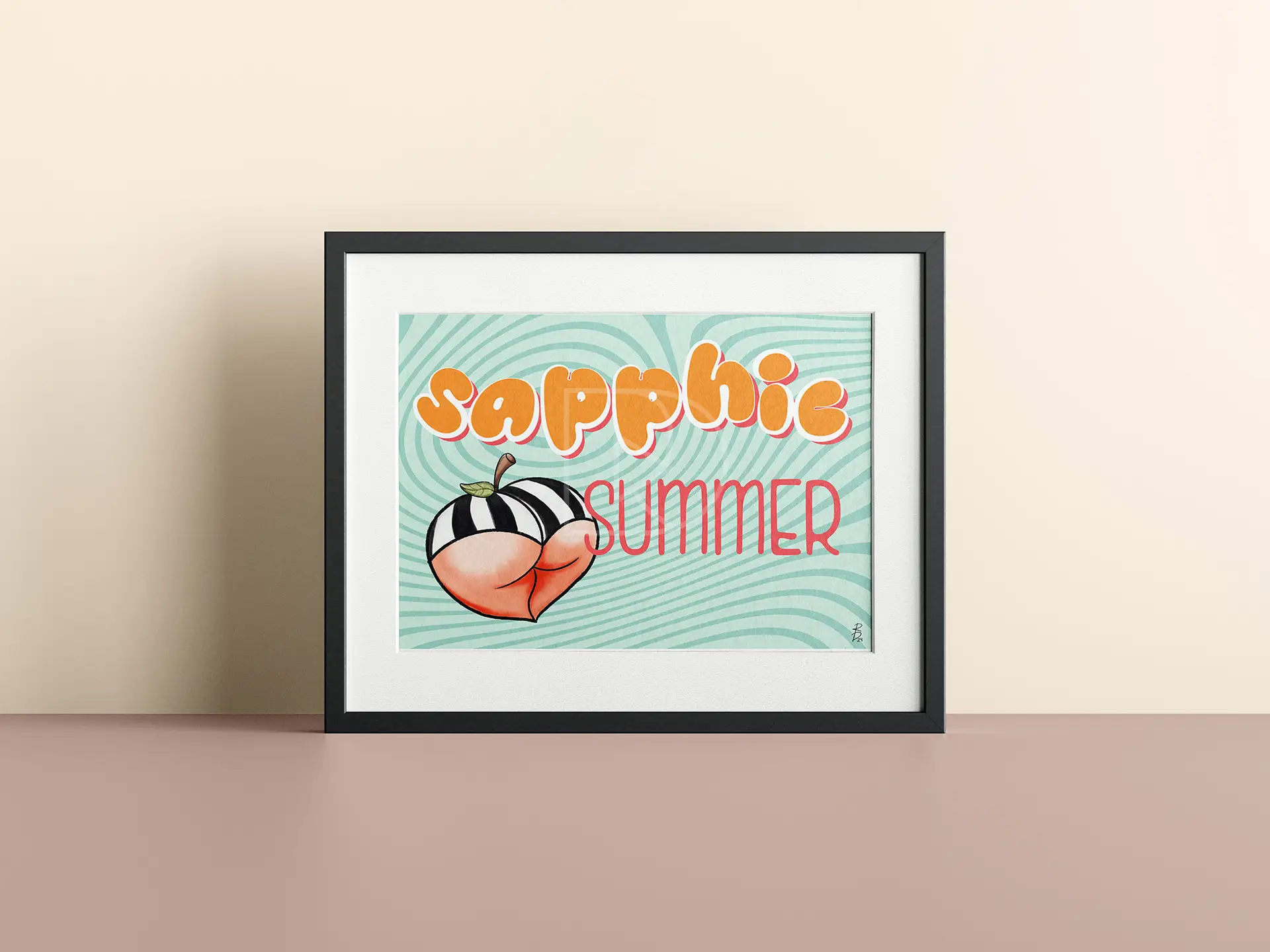
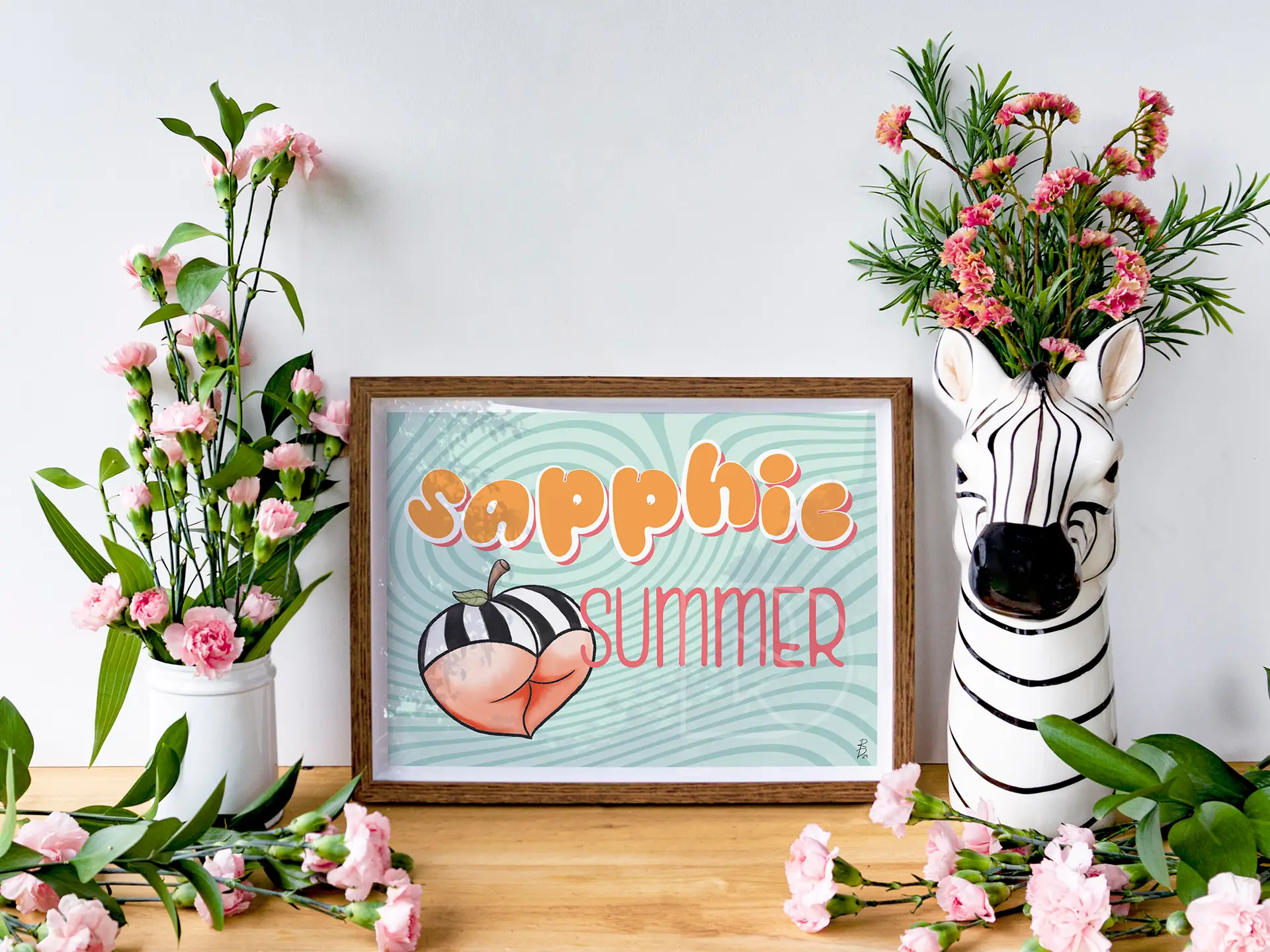
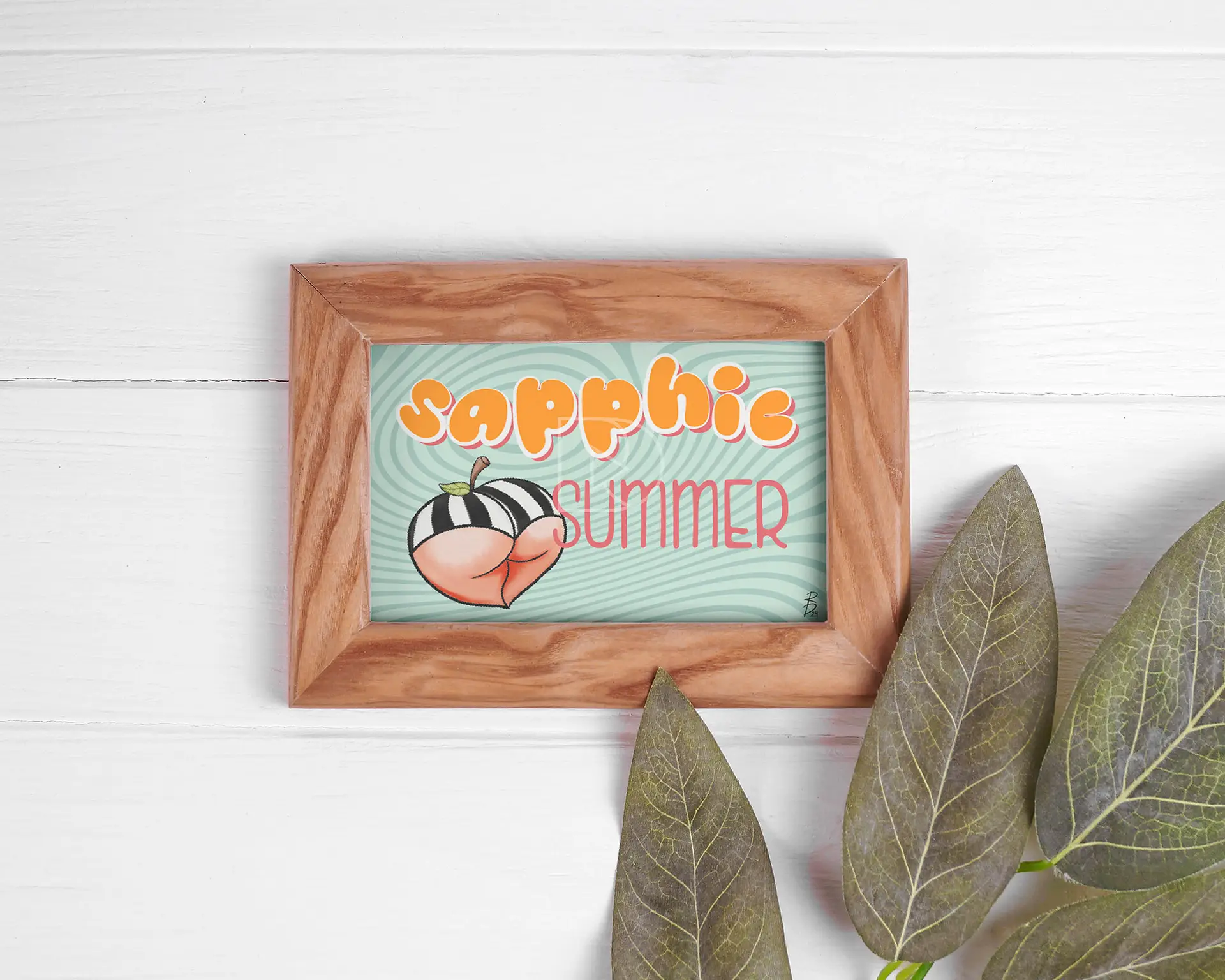
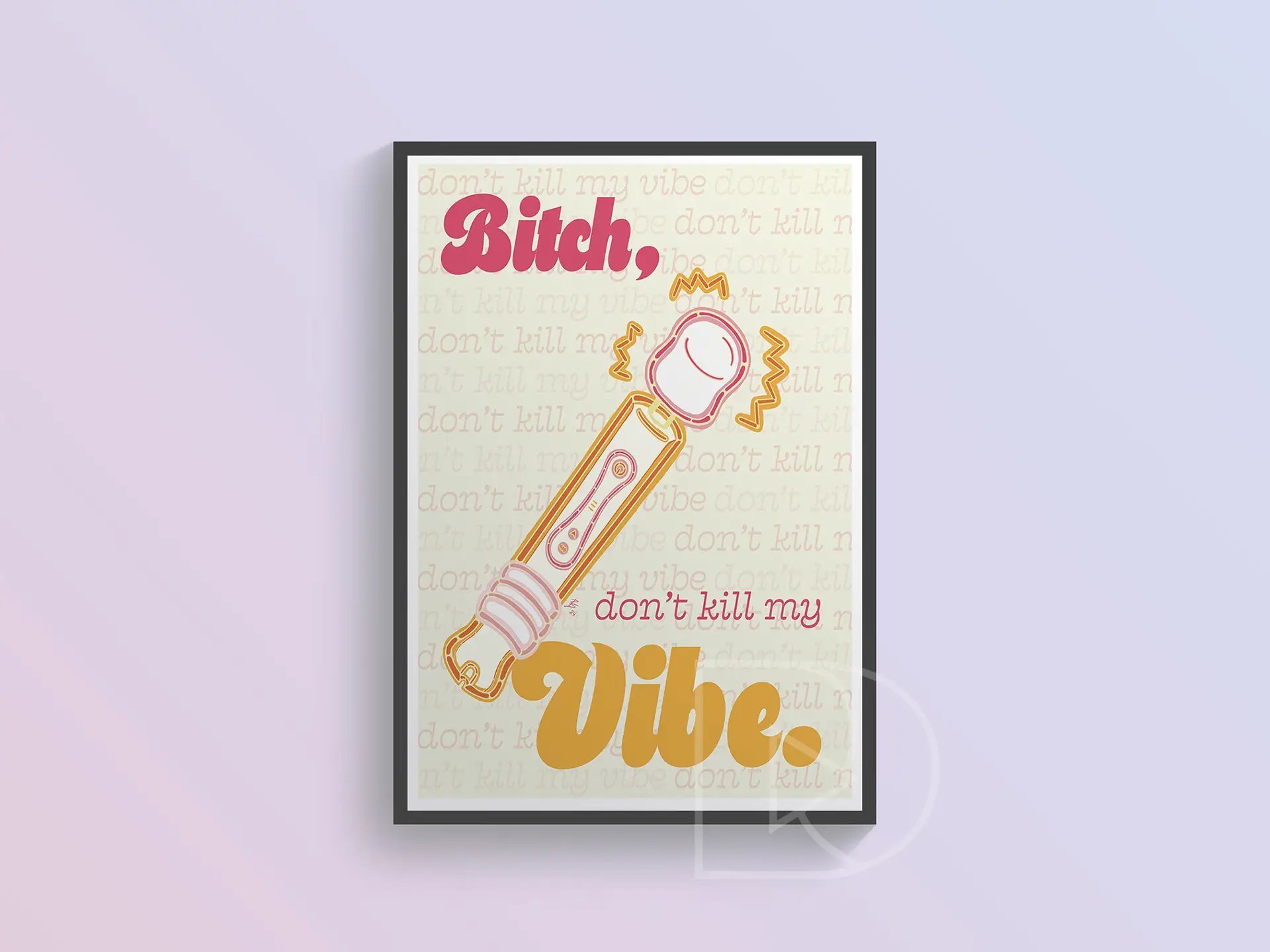
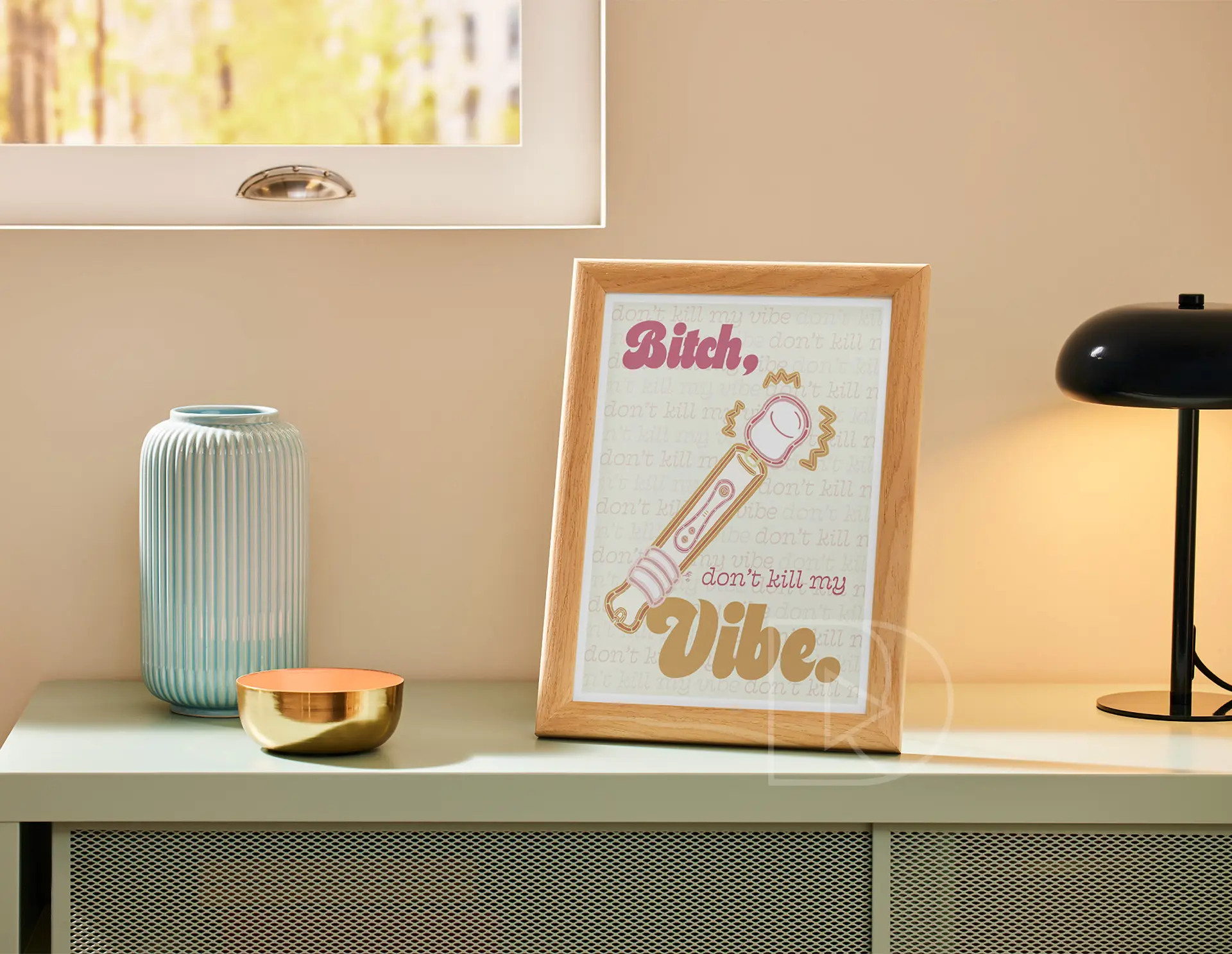
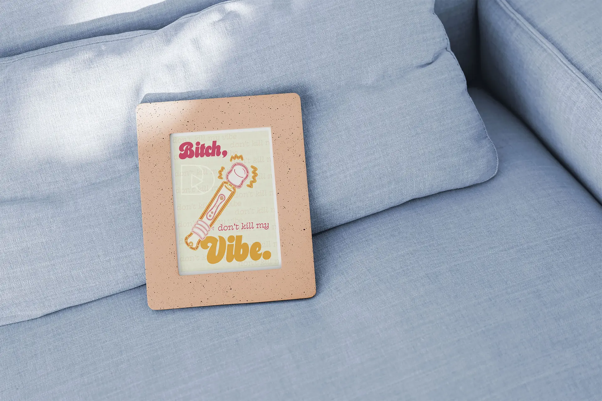
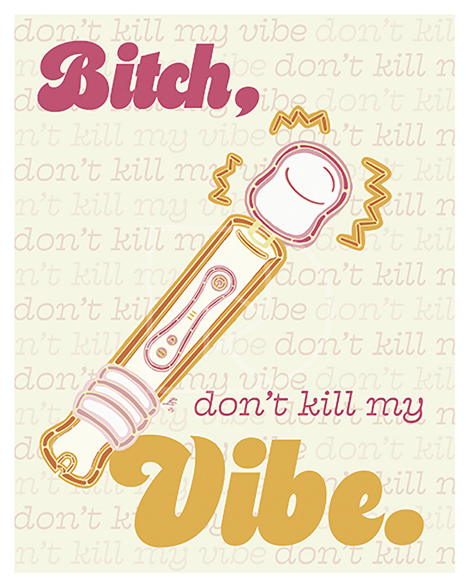
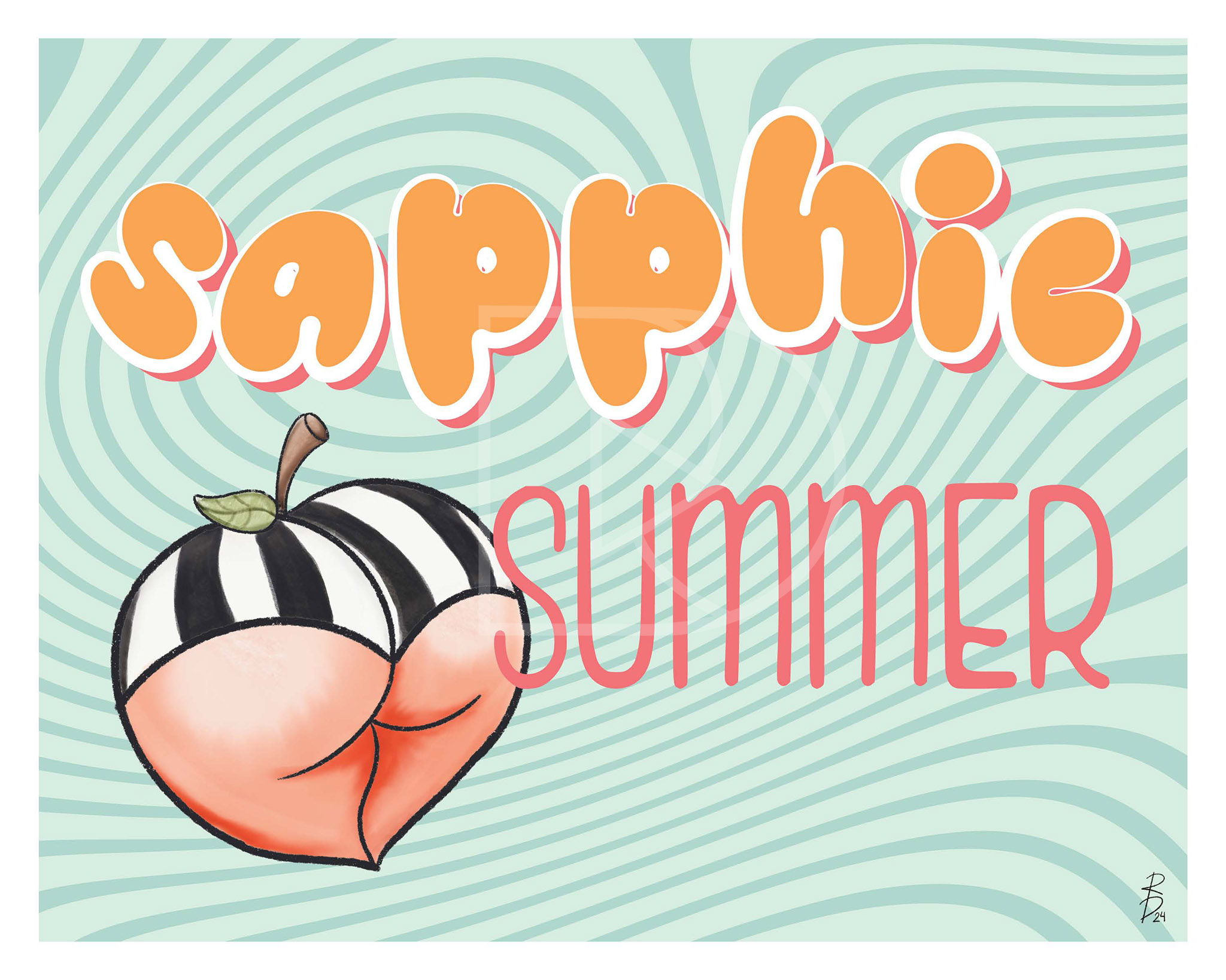
The “Self-Love Illustration Collection” currently features the mature-themed art prints, “Don’t Kill My Vibe” and “Sapphic Summer”. These illustrations celebrate themes of empowerment, self-expression, and sexual liberation. These pieces highlight the importance of embracing one’s authentic self, with vibrant visuals and bold imagery that foster conversations around sex positivity and queer love.
The collection is a playful yet powerful reminder to live freely, love fully, and honor the beauty of self-acceptance in every form. These artworks are currently available as 5 x 7-inch and 8 x 10-inch art prints on Etsy, with new artworks coming soon.
Visit my Etsy shop to browse my catalog of art for sale!
Love this collection?
Interested in purchasing these artworks? Click the buttons to be redirected to these product listings on my Etsy.
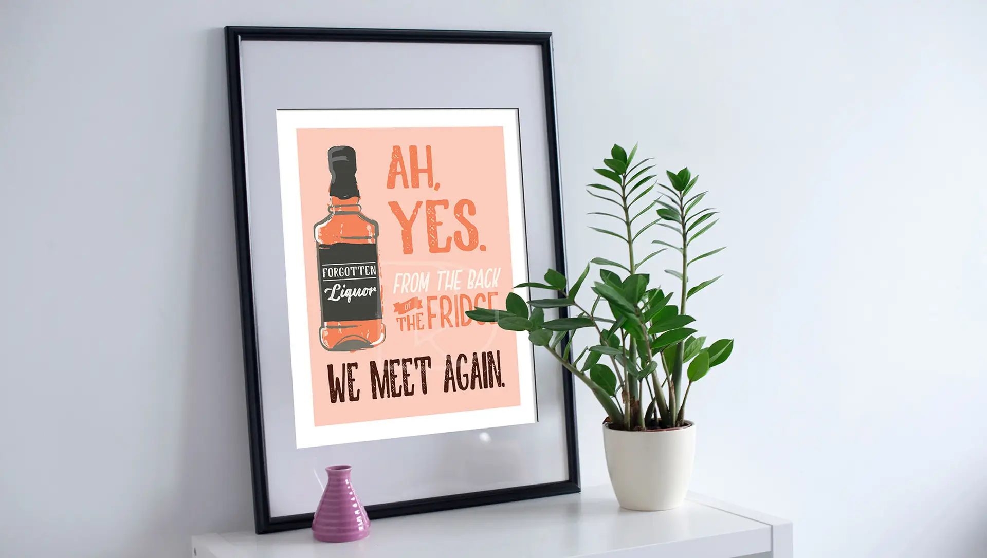
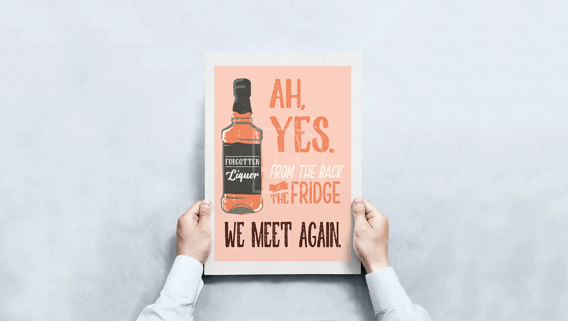
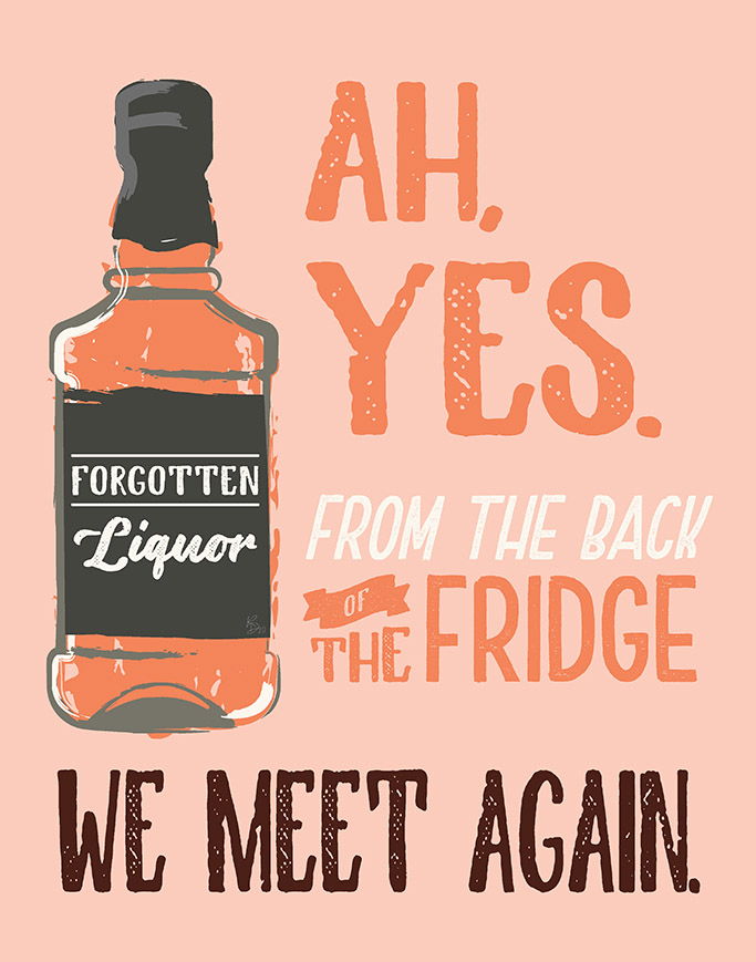
“Forgotten Liquor” is a whimsical exploration of nostalgia and humor, brought to life through a lithographic-print style illustration. The inspiration behind this piece stems from those quiet, almost forgotten corners of the world—whether it’s a dusty liquor cabinet or the hidden stories that sit just beyond everyday life. I wanted to evoke the lightheartedness of overlooked moments, using bright, bold colors to give personality to objects that might otherwise be ignored. The result is an animated composition that invites viewers to find joy in the quirky and mundane.
This print reflects my continued fascination with combining familiar elements with a sense of whimsy and storytelling. It speaks to the fleeting, often overlooked details in our surroundings and transforms them into something memorable and worthy of a smile. As with much of my work, “Forgotten Liquor” encourages a mindful pause, asking viewers to take a second look and appreciate the humor in the ordinary.
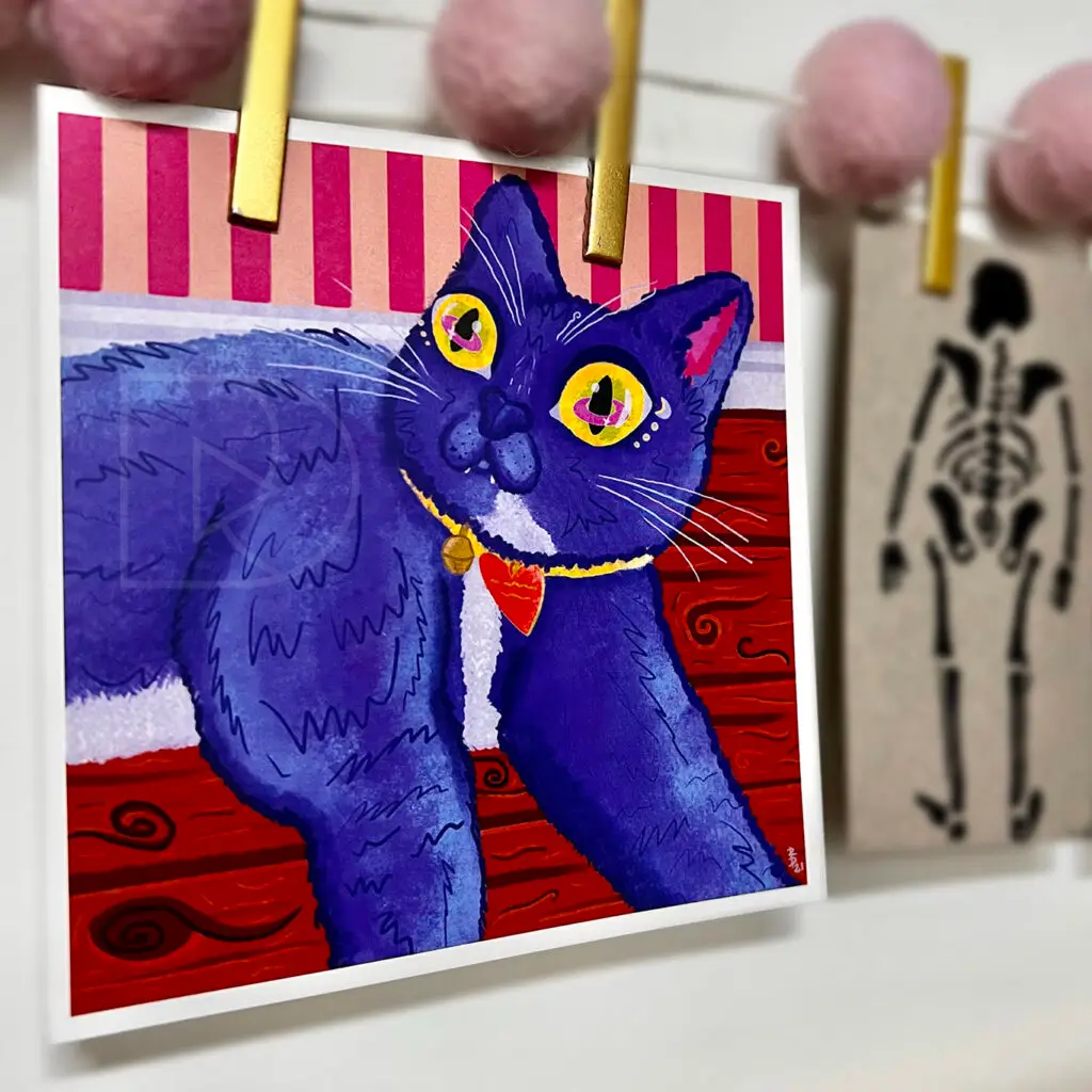
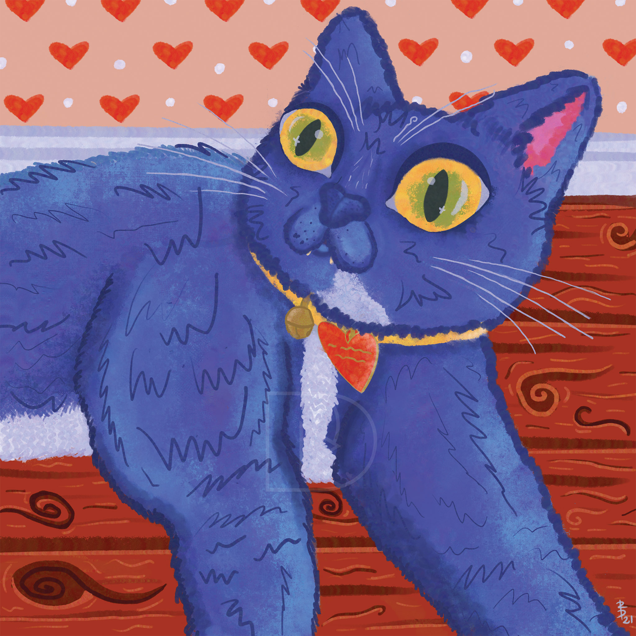
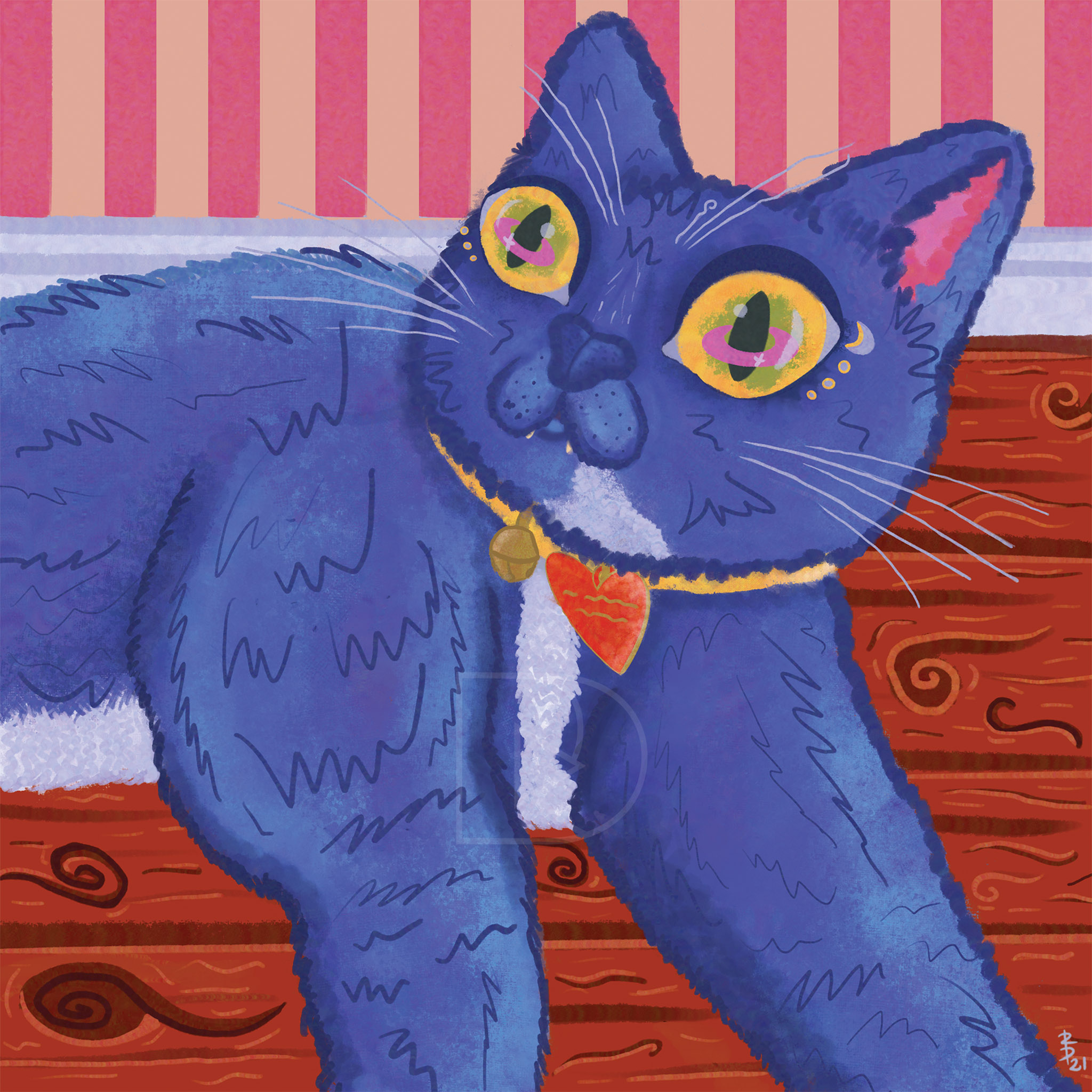
This whimsical illustration diptych features two feline companions that capture the essence of curiosity and cosmic wonder. Inspired by both the playfulness of cats and the boundless mystery of space, the Space Cat(“Major Tom”) embarks on a colorful, cosmic journey among stars and galaxies. Drawing on a vibrant palette and imaginative details, this piece celebrates the adventurous spirit of cats. The design speaks to those who dream of the unknown and revel in the limitless possibilities of the universe.
In contrast, the Earth Cat(“Ground Control”) brings a grounded, serene presence. With nature-inspired elements and an equally bold use of color, this illustration highlights a harmonious connection to Earth. Both pieces are crafted in a whimsical style, combining elements of folk art and fantasy, making them perfect for lovers of cats, outer space, and nature alike.
Together, this collection of art prints serves as a playful narrative between ‘Ground Control’and ‘Major Tom’, embodying the duality of exploration—both of the world around us and the worlds beyond. These illustrations are designed to inspire a sense of wonder, adventure, and connection with the natural and cosmic realms.
Artist’s Note: The alternate titles of these pieces serve as a little easter egg to my creative process — my creative soundtrack during the making of this collection was David Bowie’s second self titled album. One of his most popular songs from this album, ‘Space Oddity’, has a line that reads ‘Ground Control to Major Tom’.
artwork previews
Ground Control Cat Illustration
'Major Tom' Space Cat Illustration
Visit my Etsy shop to browse my catalog of art for sale!
Want This Art?
Interested in purchasing any of these artworks? Click the buttons to be redirected to these product listings on my Etsy.
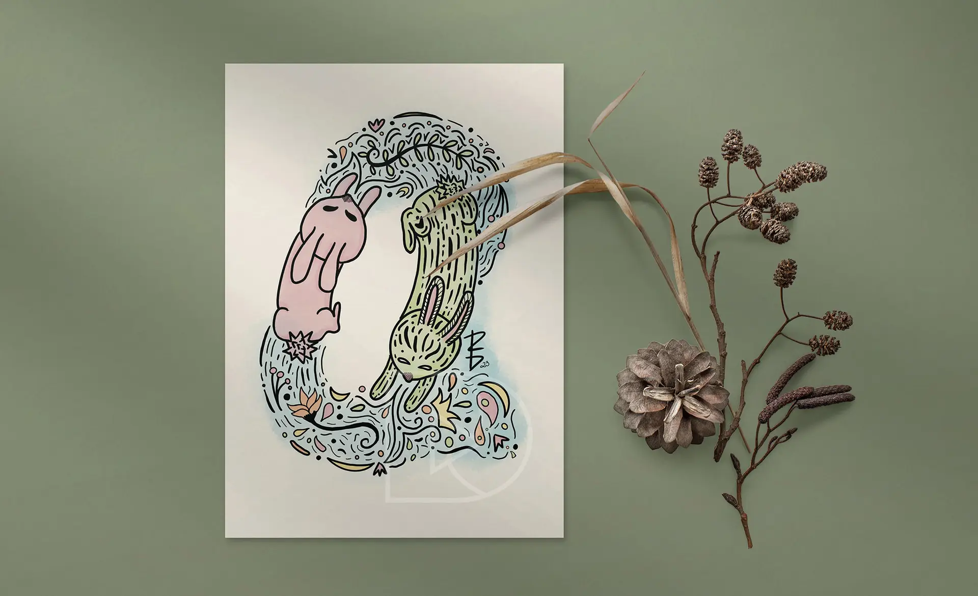
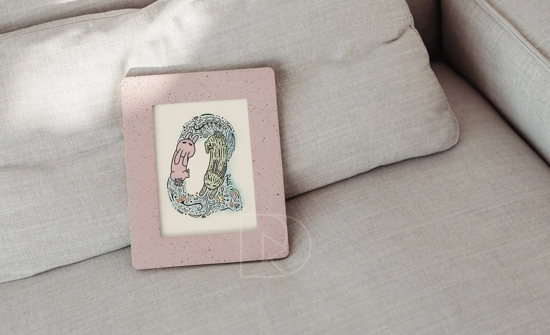
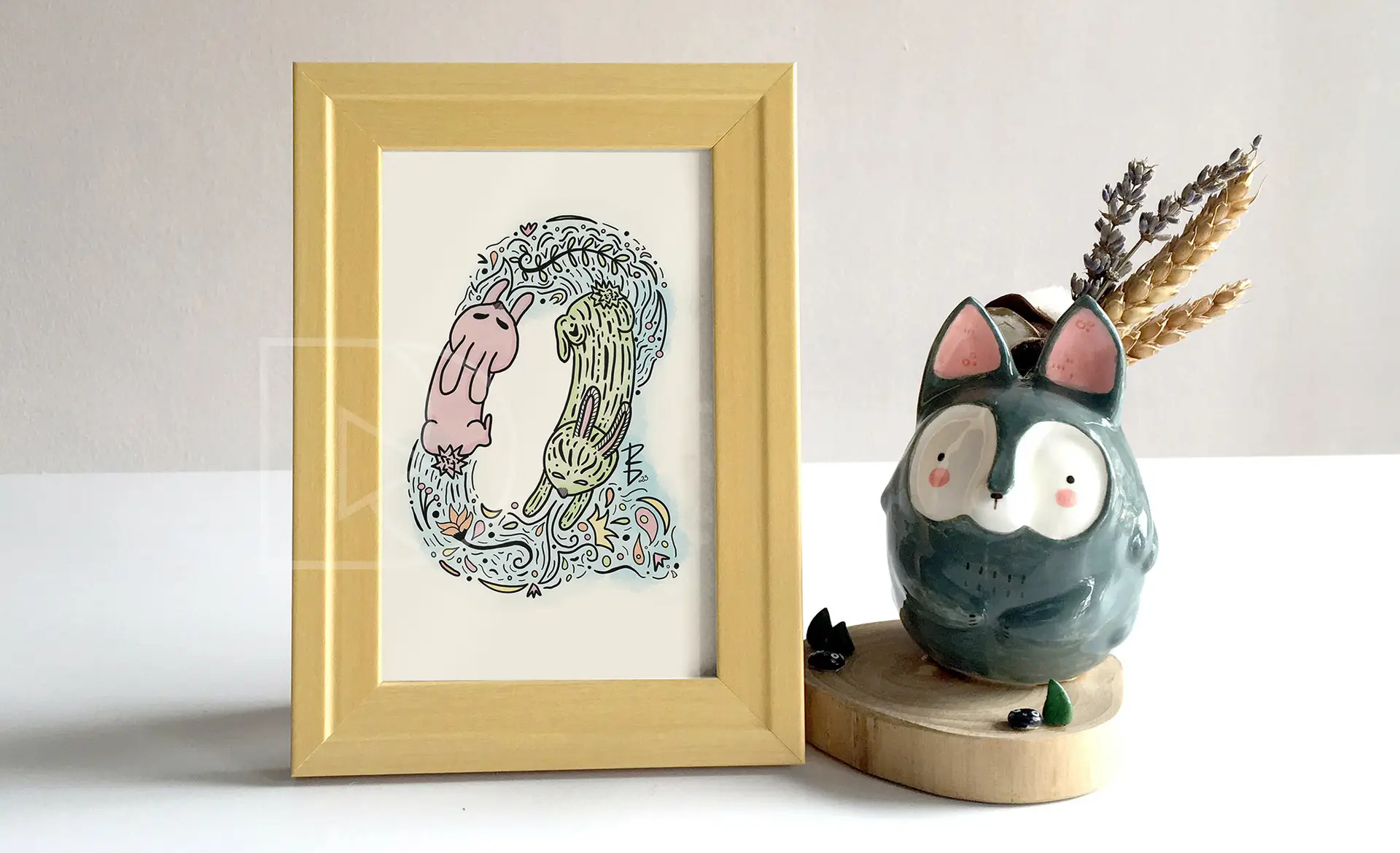
“Rabbit Races” is inspired by the intricate and charming elements of Scandinavian folk art; celebrating movement, play, and the beauty of nature’s simple joys. In this piece, I sought to evoke the lively, circular motifs and natural patterns often seen in Scandinavian design, bringing to life two whimsical rabbits engaged in a playful dance. The earthy tones, paired with delicate details like swirling leaves, flowers, and flowing water patterns, create a sense of harmony and motion that invites viewers to explore and find a sense of peace within the artwork.
This piece is meant to evoke the calm and imaginative spirit characteristic of Scandinavian folk art, making it an ideal addition to spaces that encourage creativity and warmth, such as nurseries or cozy corners of the home. I believe in art’s ability to create small moments of joy, and with “Rabbit Races,” I aim to inspire others to find delight in the simplicity and rhythm of everyday life.
digital illustration | print design | charity projects
Hands Off! Stacked Charity Sticker(s) on Purple Background
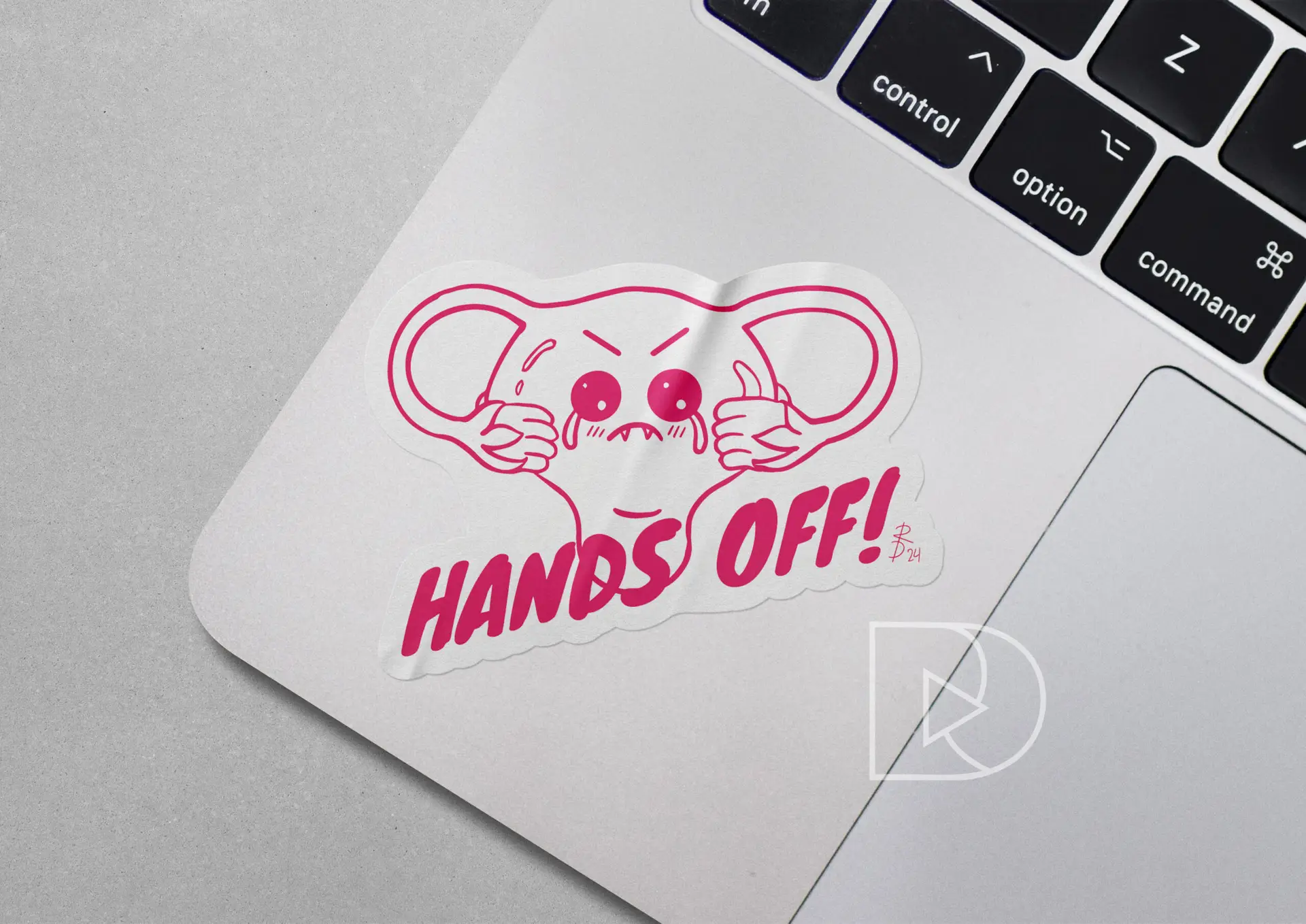
Hands Off! Charity Sticker on Laptop
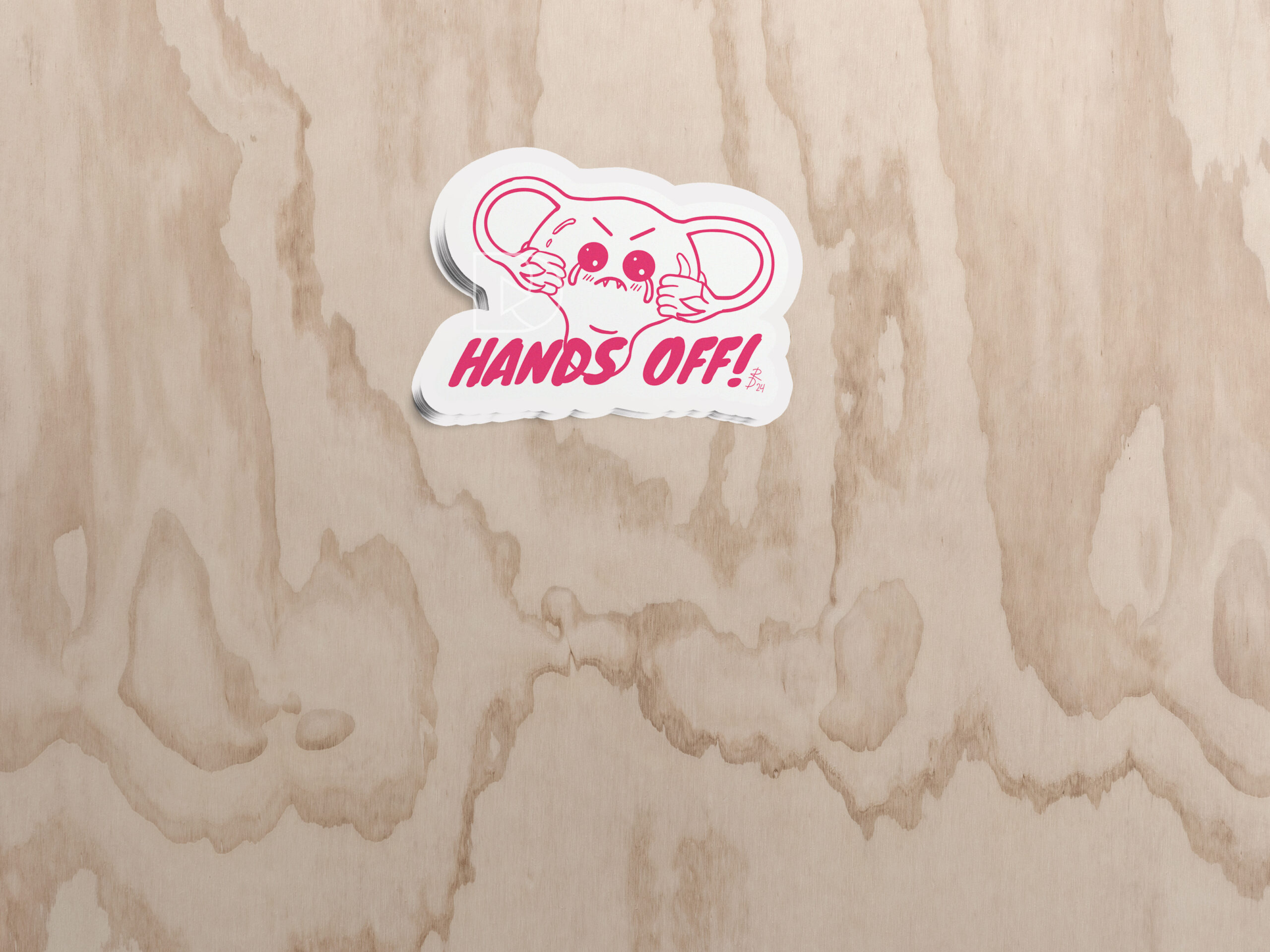
Hands Off! Charity Sticker on Wood
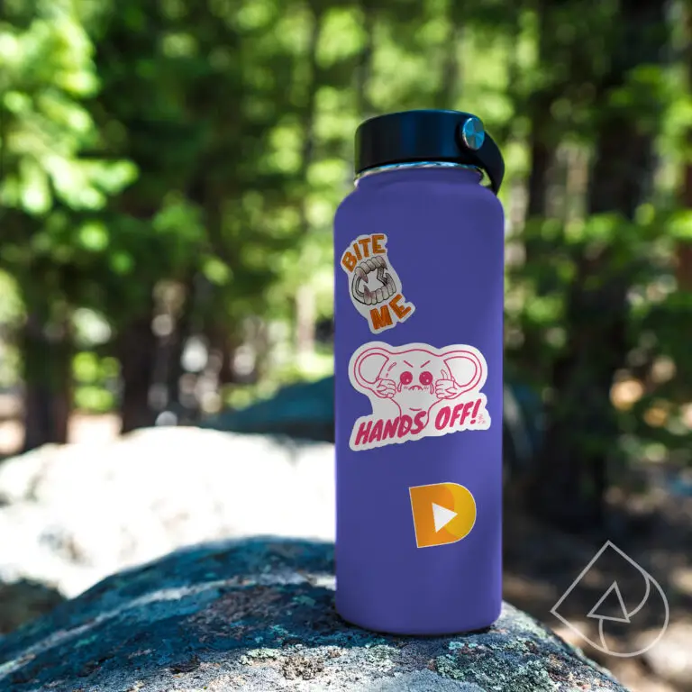
Hands Off! Charity Sticker on Water Bottle
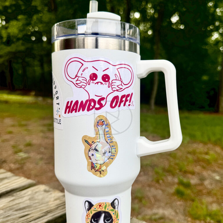
Hands Off! Charity Sticker on Tumbler
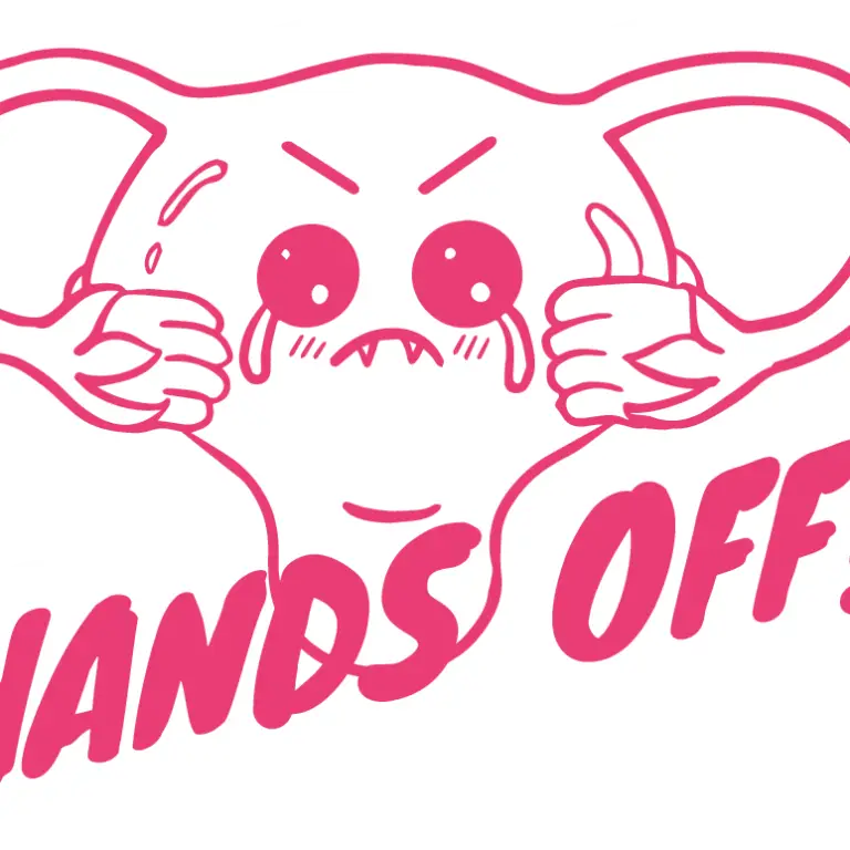
Hands Off! Charity Sticker Digital Preview
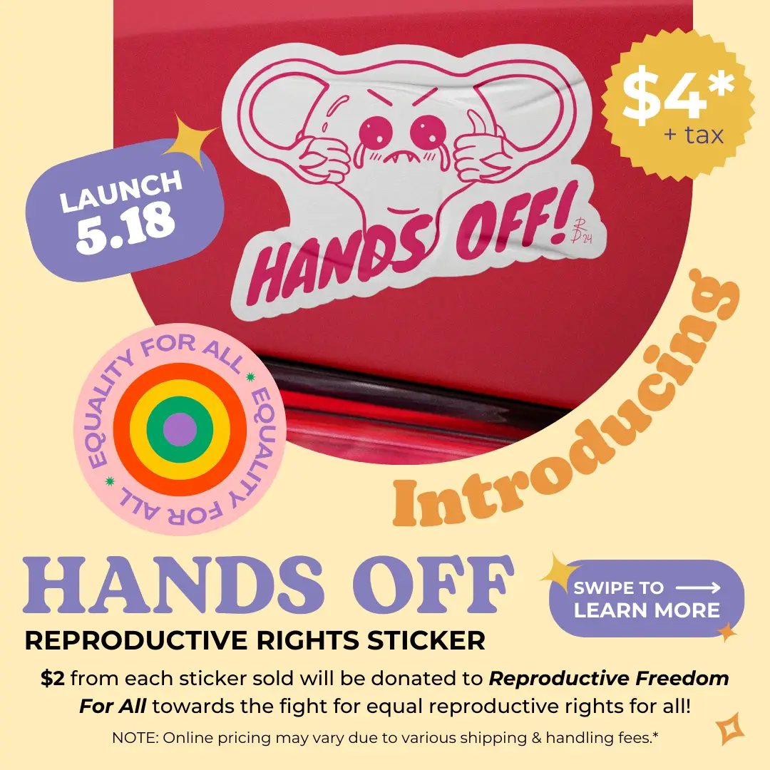
Challenge: As part of my ongoing commitment to supporting reproductive rights, I repurposed my “Hands Off!” Benefit Tee design as a sticker, a bold visual statement that promotes the message of autonomy over one’s body. This limited-edition sticker is the second component of a benefit campaign aimed at raising awareness and funds for Reproductive Freedom for All, a charity dedicated to protecting reproductive rights.
Product Care Instructions:
Clean the area prior to sticking to ensure a long-lasting bond.
Not dishwasher safe; hand wash only to preserve details and longevity.
Do not place in microwave; high heat may cause bubbling or melting.
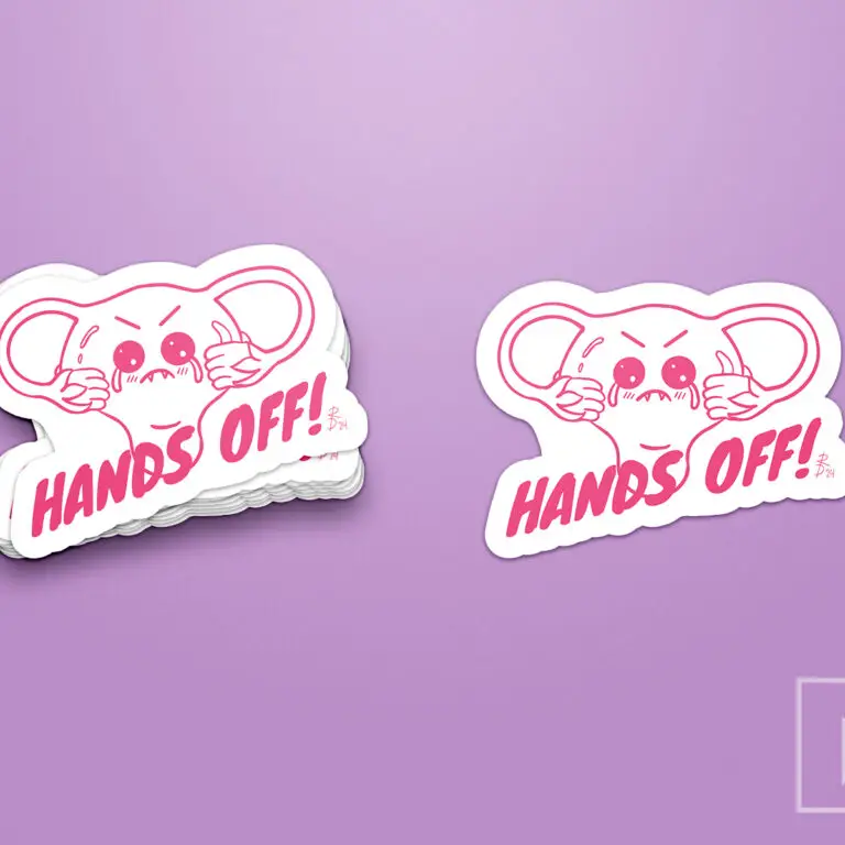
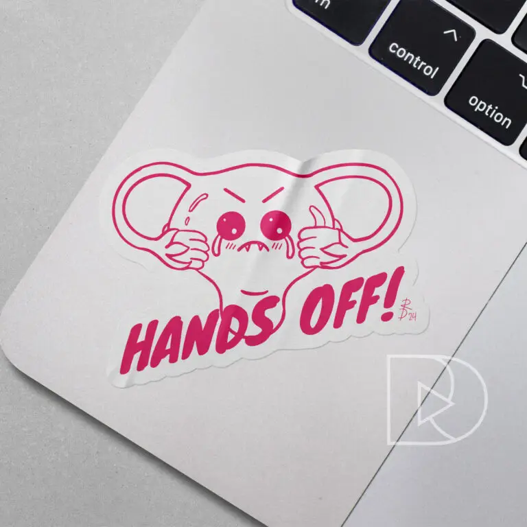
Design Solution: Building on the playful, kawaii aesthetic used in the design of the benefit tee, this sticker features a cheeky illustrated uterus with a fierce “Hands Off!” expression. Using hot-pink line work and bold typography, the design keeps its lighthearted tone while delivering a strong, unambiguous message. This sticker is perfect for laptops, water bottles, and car bumpers, making it a versatile product that helps spread an important message wherever it goes. Priced at $4 each, $2 from each sticker sold is donated directly to Reproductive Freedom for All.
Reflection: It’s incredibly rewarding to see how such a simple design can inspire and empower people. By combining kawaii-style imagery with a strong feminist message, this project continues to create awareness and raise funds for a vital cause. At just $4, the sticker provides an accessible way for supporters to contribute to Reproductive Freedom for All, and every purchase brings us closer to ensuring equal rights for all.
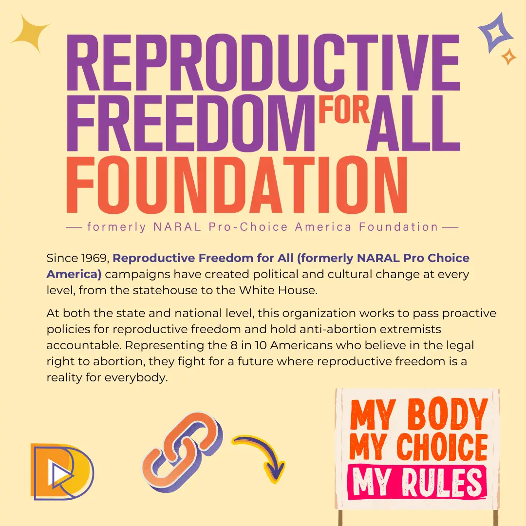
Reproductive Freedom for All
(formerly NARAL Pro Choice America)
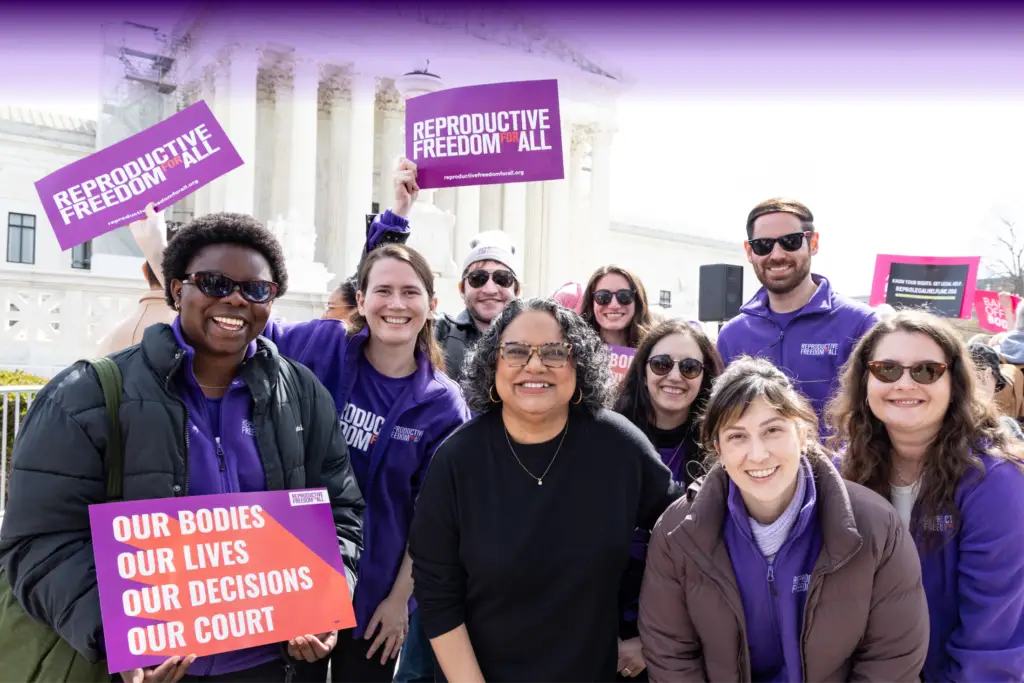
Reproductive Freedom for All (formerly NARAL Pro-Choice America) has been advocating for reproductive rights since 1969. Their mission is to create political and cultural change at every level of government, working to pass proactive policies for reproductive freedom and hold anti-abortion extremists accountable. Representing 8 in 10 Americans who support the legal right to abortion, this organization fights for a future where reproductive freedom is a reality for all. Every ‘Hands Off!’ sticker sold helps contribute to this ongoing effort.
Image courtesy of www.reproductivefreedomforall.org/
Click the button below to learn more about this organization and their fight for reproductive rights for all.
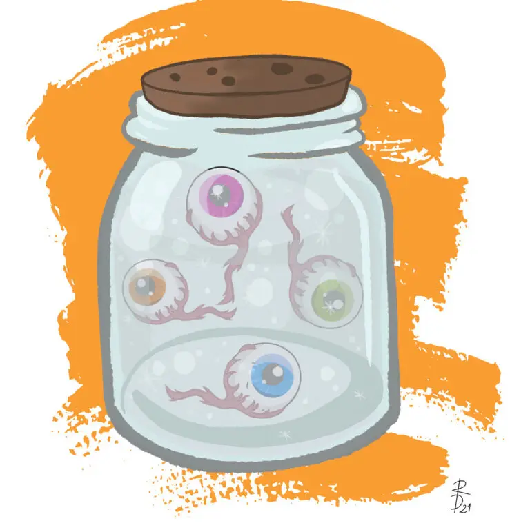
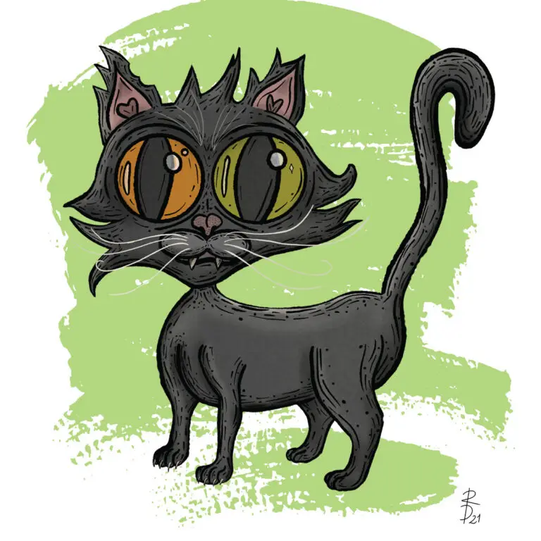
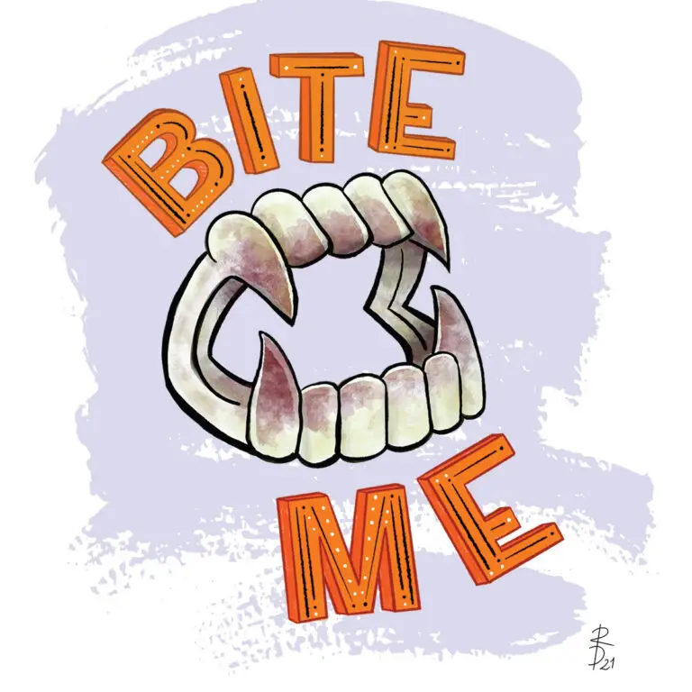
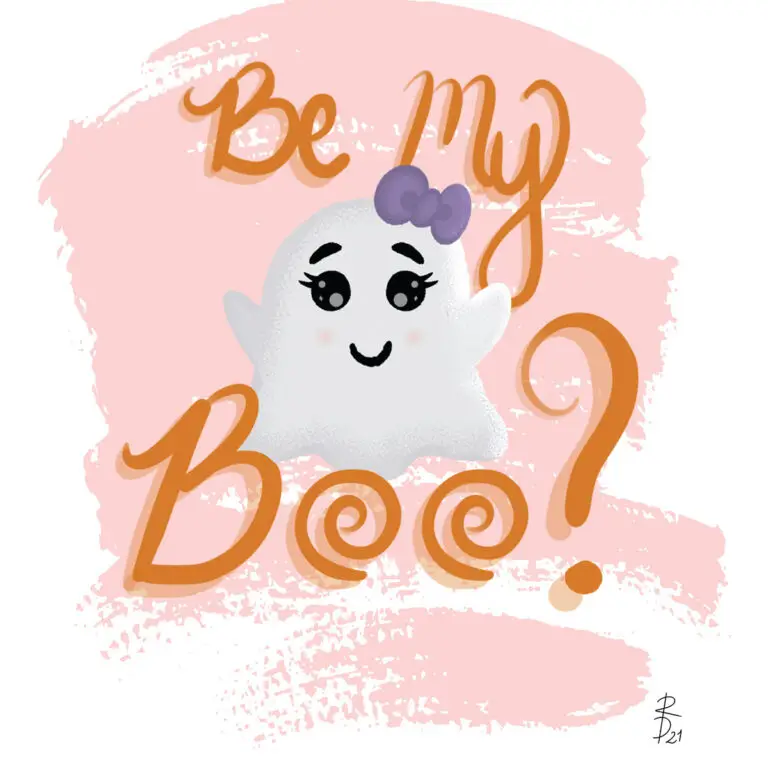
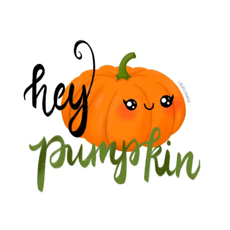
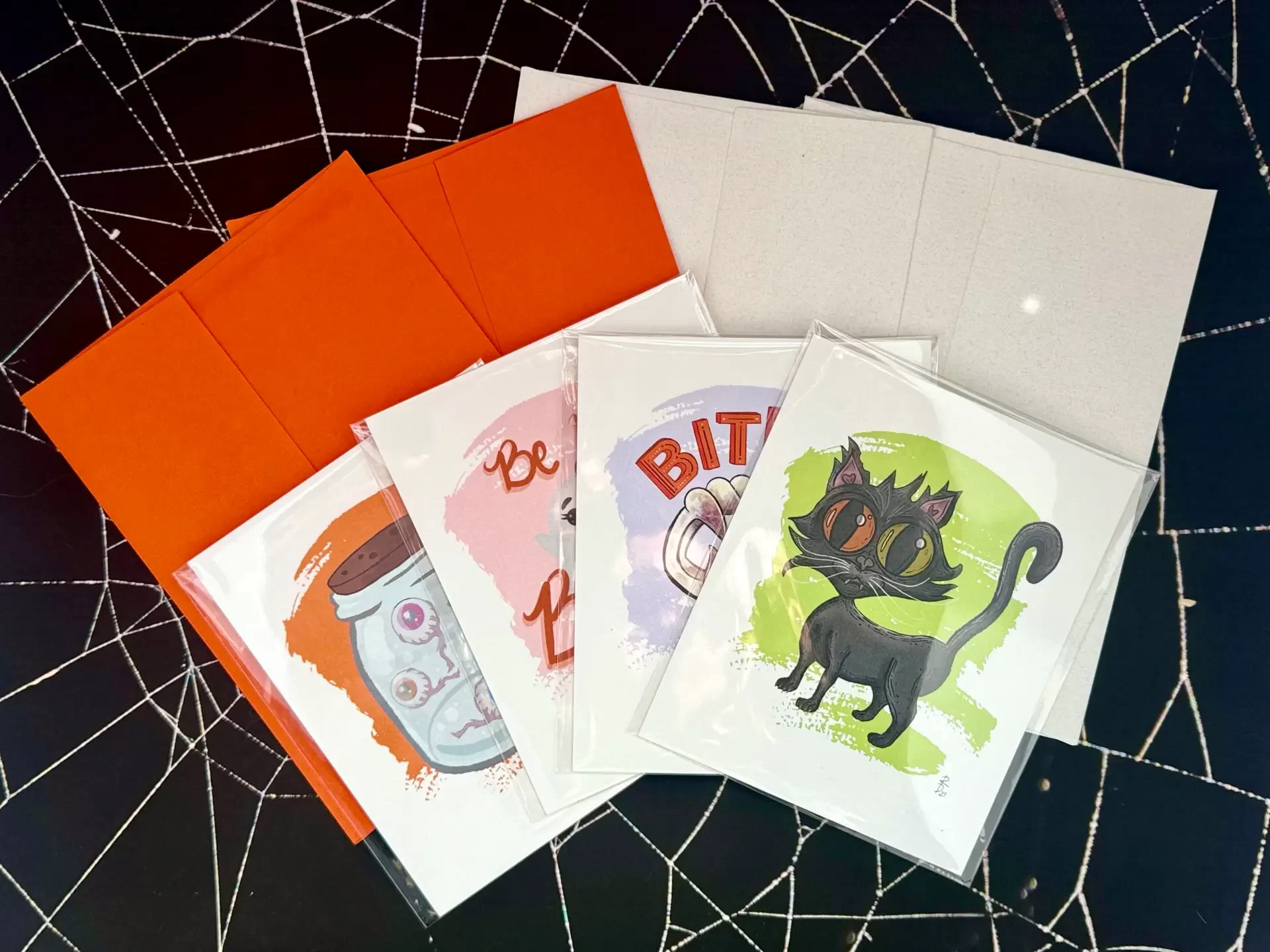
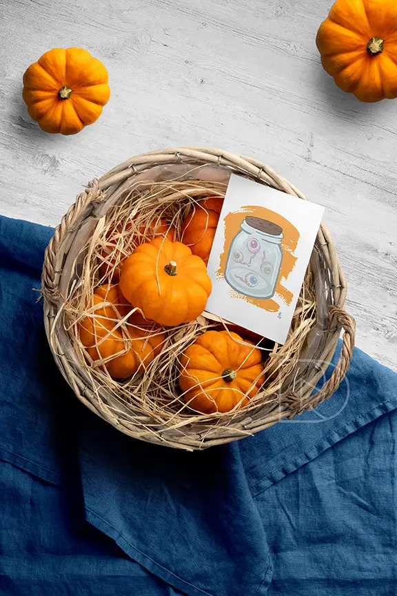
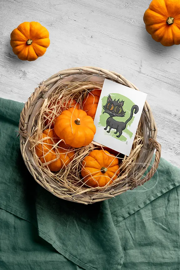
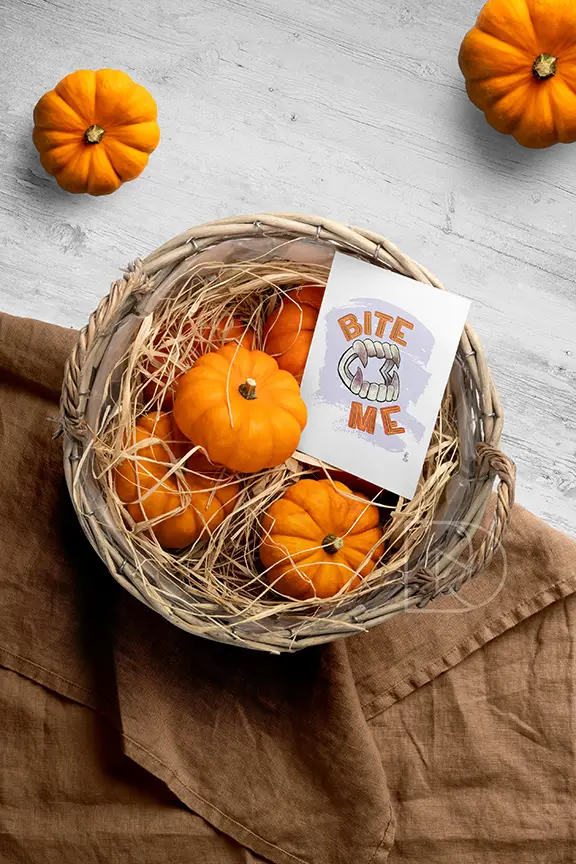
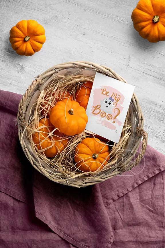
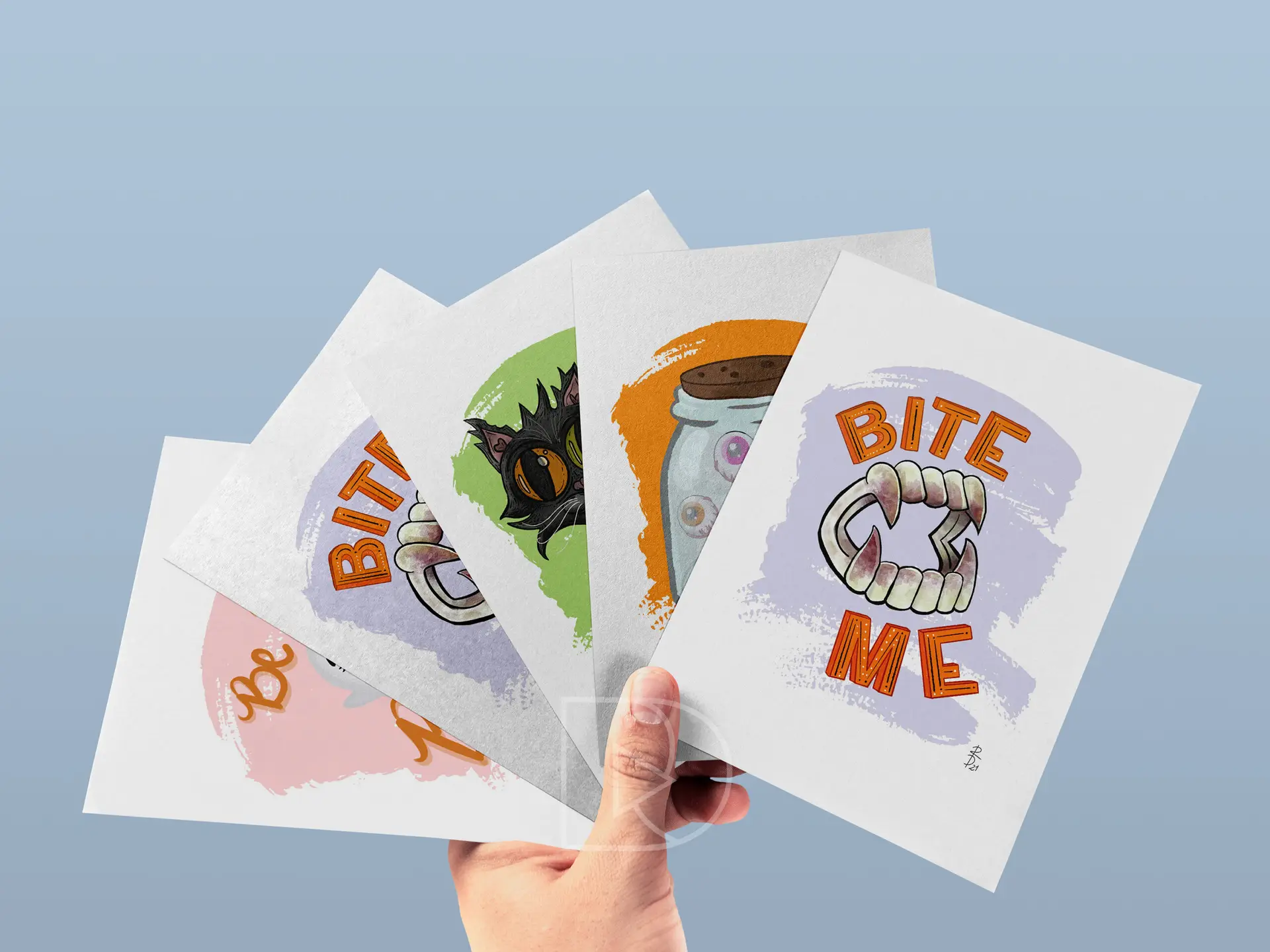
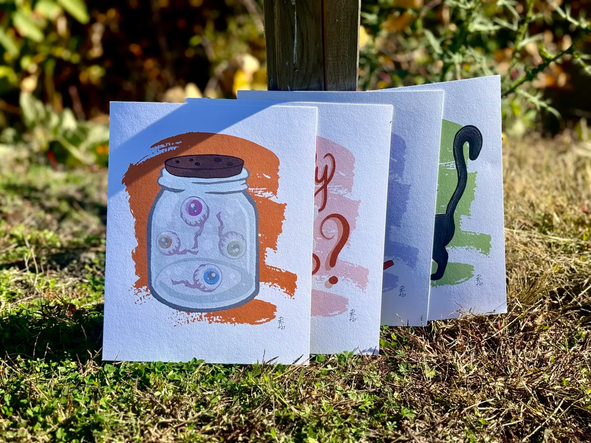
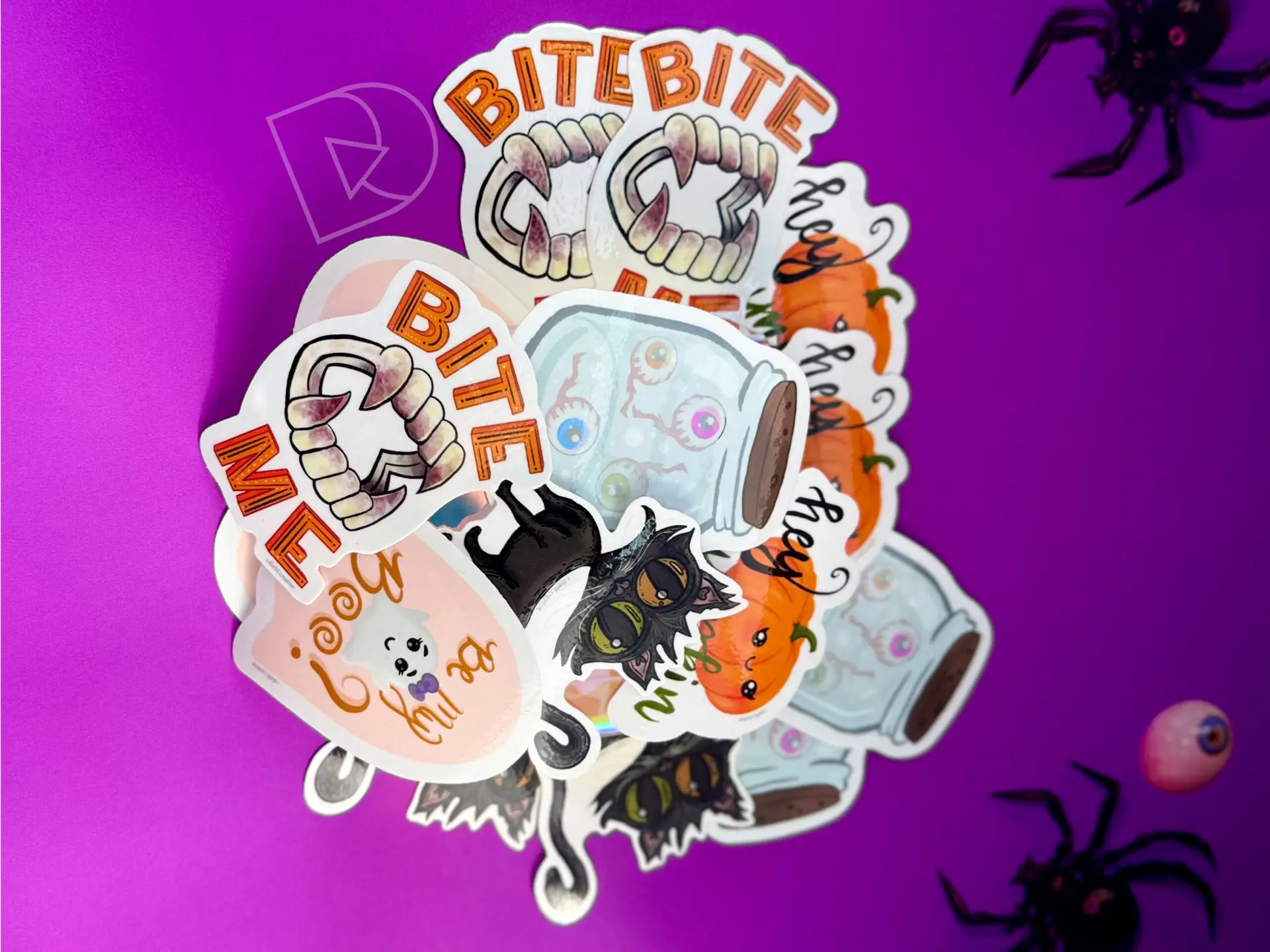
My Halloween illustration collection is a love letter to the vintage charm of classic Halloween celebrations. With bold, simplified shapes and vibrant, flat colors, my designs are inspired by retro postcards and decorations from decades past. Pumpkins, witches, and playful black cats fill the scenes with a sense of nostalgia, making them feel both familiar and timeless. Each piece is crafted to bring back memories of simpler, spooky times, while adding a fun and whimsical flair to modern-day Halloween festivities through products like stickers, cards, art prints, and apparel!
apparel design | digital illustration | content & post creation
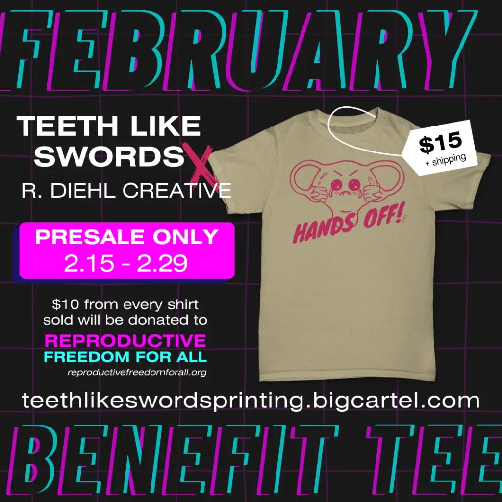
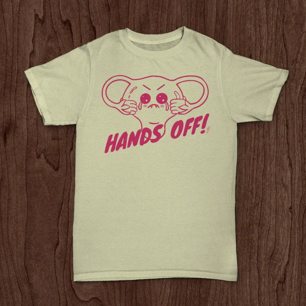
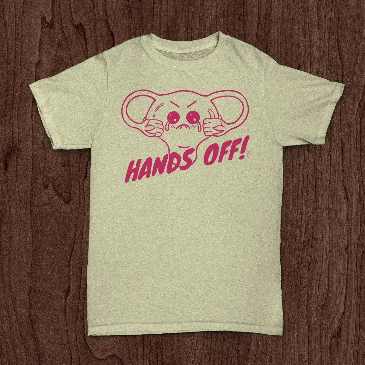
Challenge: In February 2024, I collaborated with local screenprinter, Teeth Like Swords Printing, to launch a limited edition benefit tee supporting reproductive freedom and women’s rights. This project aimed to blend cute, kawaii-inspired design with a powerful message advocating for autonomy over one’s own body. The goal was to create a visually appealing tee that resonated with women and feminine-identifying individuals while clearly communicating the message “HANDS OFF” in regards to reproductive rights. Additionally, the project aimed to raise funds for the charity Reproductive Freedom for All to support their ongoing advocacy efforts.
Design Solution: Having discovered my interest in screen-printing back in high school, the idea alone of doing a local screen-printed tee collab gave my 25-year old self goosebumps. The association of this design with a well-known organization meant it needed to be tastefully provocative, and speak a concise but compelling message. Inspired by the cute, feminine aesthetic of kawaii culture, I began by sketching various concepts that incorporated playful imagery and bold typography. After several iterations, I settled on a design featuring a whimsical illustrated uterus behind the slogan “HANDS OFF” in a dynamic, eye-catching font. The pink color palette was chosen to evoke feelings of female empowerment.
Reflection: This project was a total blast from start-to-finish. The cheeky uterus illustration was printed as a one-color design with hot-pink colored ink onto high-quality, cream-colored tees. Priced at $15 plus shipping, each purchase of this tee contributed $10 directly to Reproductive Freedom for All; providing an accessible and affordable way for supporters to contribute to the cause. Between our two marketing campaigns, we sold a total of 7 shirts! Paul posted a few times on social media over the 2-week sales period, and I ran two 5-day ad-campaigns on Facebook and Instagram to boost my own views and product sales.
Only offering pre-ordering with products like this can sometimes be tricky… the customer is operating on blind faith that the order will be fulfilled within a reasonable timeframe, and that it will be the quality you’re expecting. As both the artist and a customer (because of course I had to order one for myself…), I was practically stalking my mailman, nose pressed to the window, until mine arrived. So far, I’ve worn mine at least 5 times out in public (and complimented on it every time), washed and dried it three times, and removed coffee stains and the ink is still as vibrant as the day I got it. I will wear this tee until it falls off my body. Stay tuned for modeled pics!
Air drying the garment is best to preserve the quality of the design.
Use spot-cleaning method for stain treatment to avoid ink bleed.
Reproductive Freedom for All
(formerly NARAL Pro Choice America)
Since 1969, Reproductive Freedom for All (formerly NARAL Pro Choice America) campaigns have created political and cultural change at every level, from the statehouse to the White House.
At both the state and national level, this organization works to pass proactive policies for reproductive freedom and hold anti-abortion extremists accountable. Representing the 8 in 10 Americans who believe in the legal right to abortion, they fight for a future where reproductive freedom is a reality for everybody.
Click the button below to learn more about this organization and their fight for reproductive rights for all.
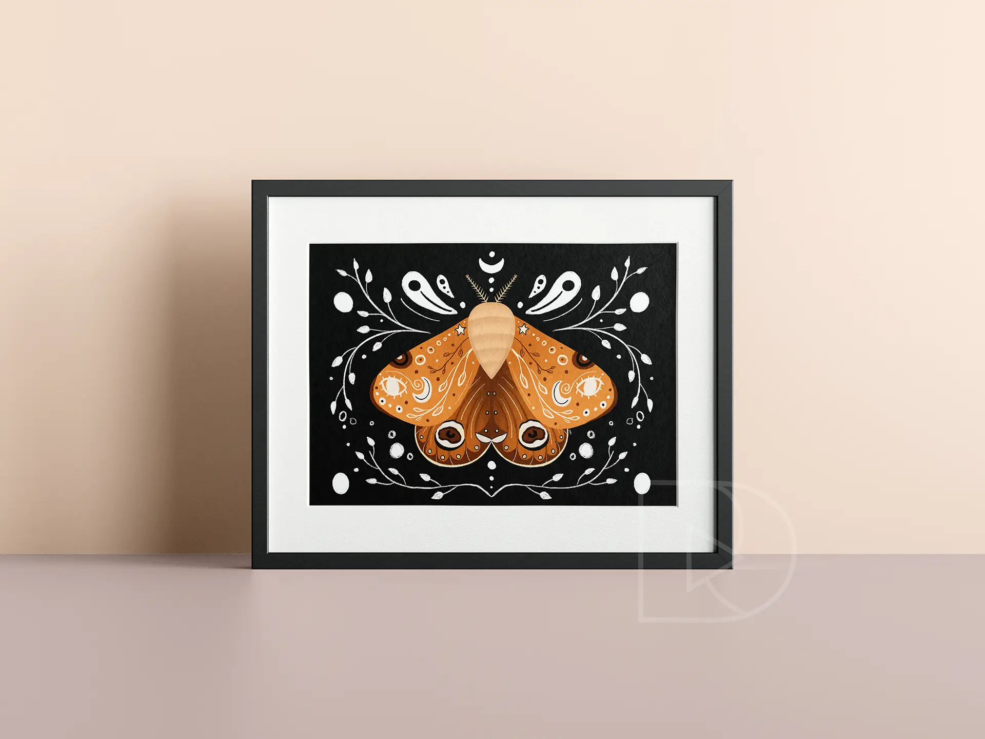
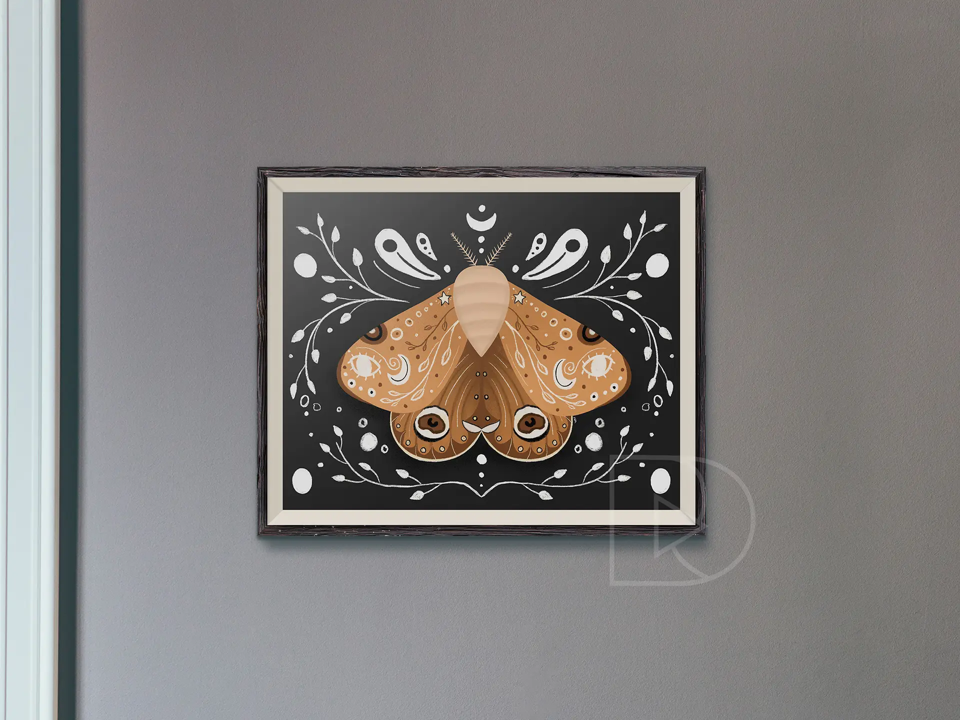
like a moth to flame...fueled by desire | digital illustration | 2021
This digital illustration of a moth draws inspiration from icons of divination and alchemy. Throughout various forms of media, we often see moths and other insects associated with positive magic. Using imagery from the black arts, this whimsical insect is representational of the bridge between horticulture and natural magic.
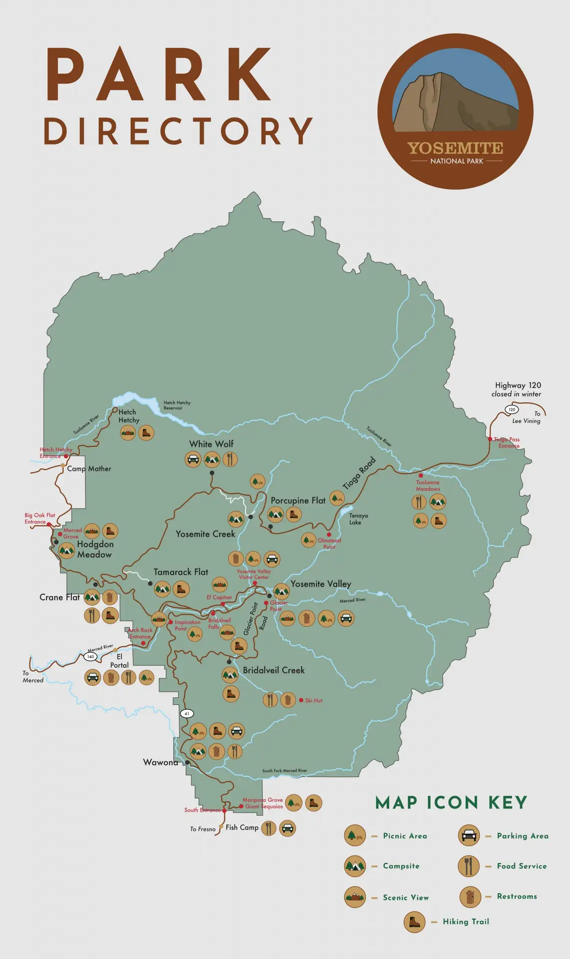
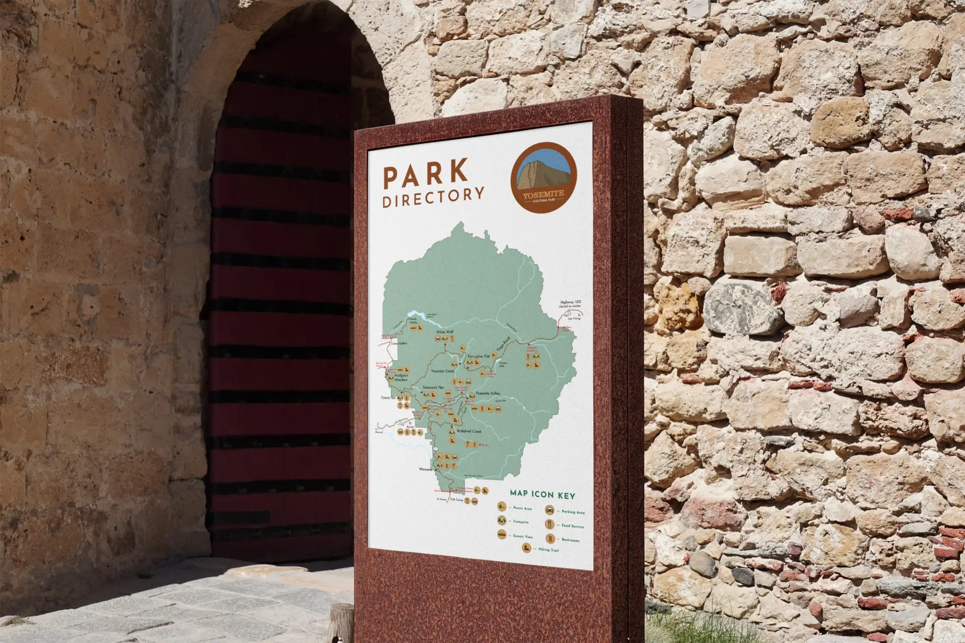
Develop a wayfinding system for an organization of your choosing, complete with icons, maps, and kiosks.
Design Solution:
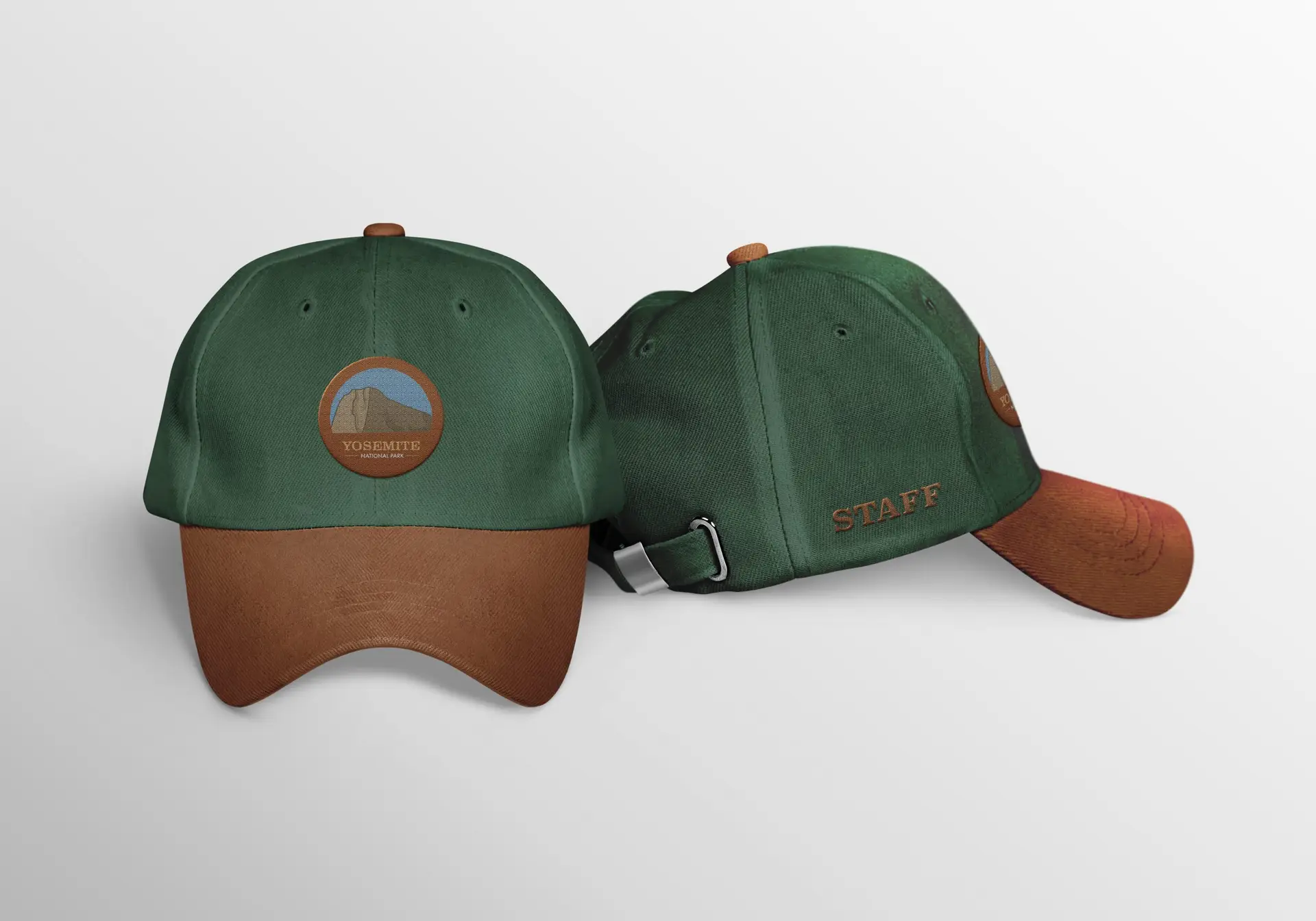
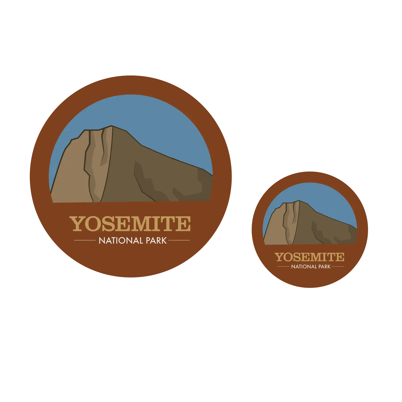
When developing this concept for a wayfinding system for Yosemite National Park, my first instinct was to keep the “nature” vibe they already had. National Parks are all about getting outside and enjoying the beauty the world has to offer, and to modernize that would be to diminish the entire feeling of the park. That being said, I decided to improve their logo to showcase their most popular attraction; El Capitan. The fonts and style I chose are reflective of the “natural” vibe I went with, adding just a tiny touch of modern by using Josefin Sans as a “secondary font” in the logo. As for the icons, I wanted to stay simple and minimal, but these are a work in progress. As they are right now, the restroom icon is far more detailed than the others; and I actually prefer them that way! I am in the process of revising these icons to fit more with the restroom icon.
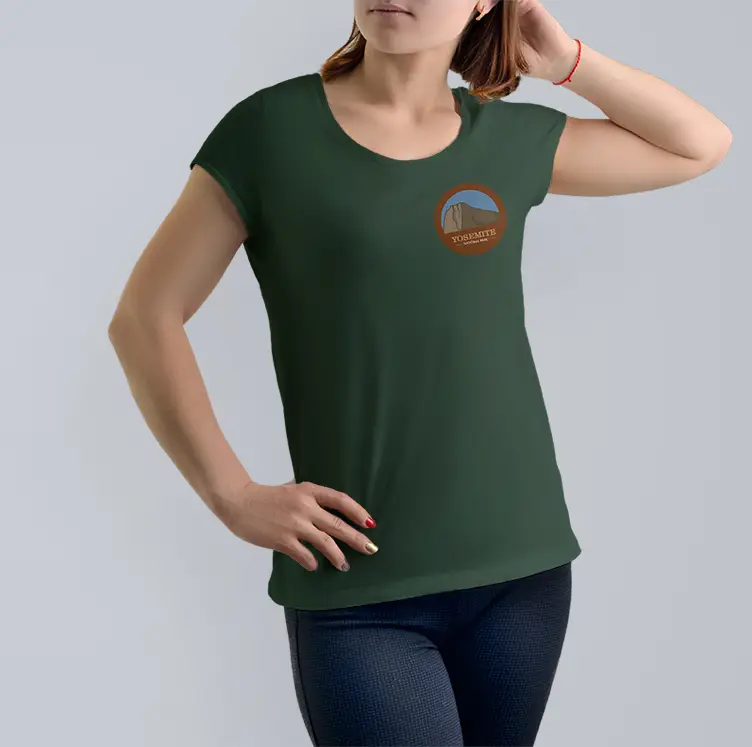
Additionally, I have created a wayfinding kiosk for visitors to use to map out their travels throughout the park. When designing this part of the project, I took a lot of inspiration from the appearance of wishing wells. The kiosk is also a work in progress, as I would like to refine the details in this more. Lastly, I developed a couple apparel items, consisting of a t-shirt and a baseball cap boasting the new logo. Ideally, this would be for park staff to wear so that visitors can pick them out easily.
Self-Reflection:
This project was definitely an interesting one, to say the least. I recall hitting a lot of roadblocks in the initial ideation of this work. I guess if I can take anything from this one, it’s that sometimes back to basics is best.
