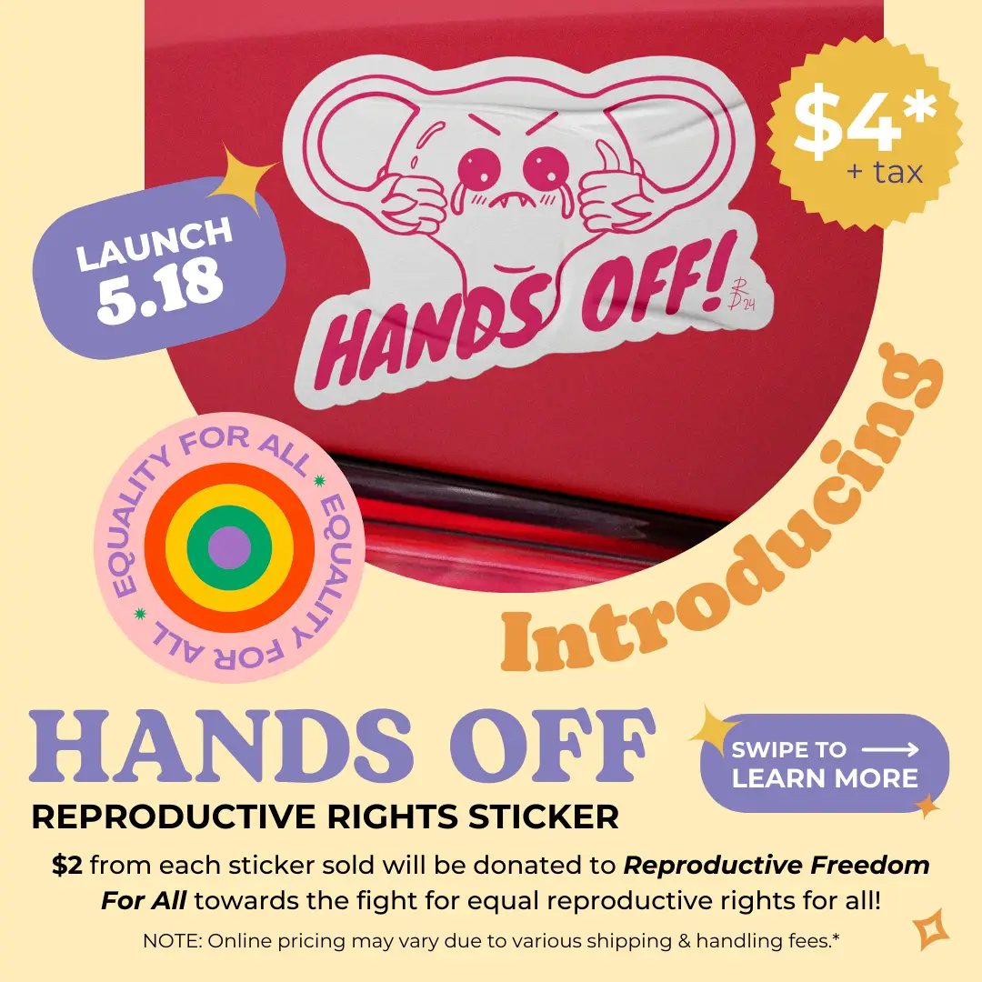
reproductive freedom charity sticker
digital illustration | print design | charity projects
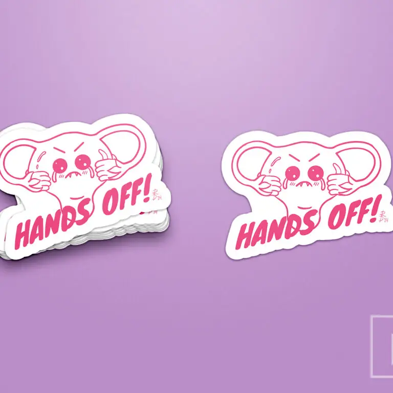
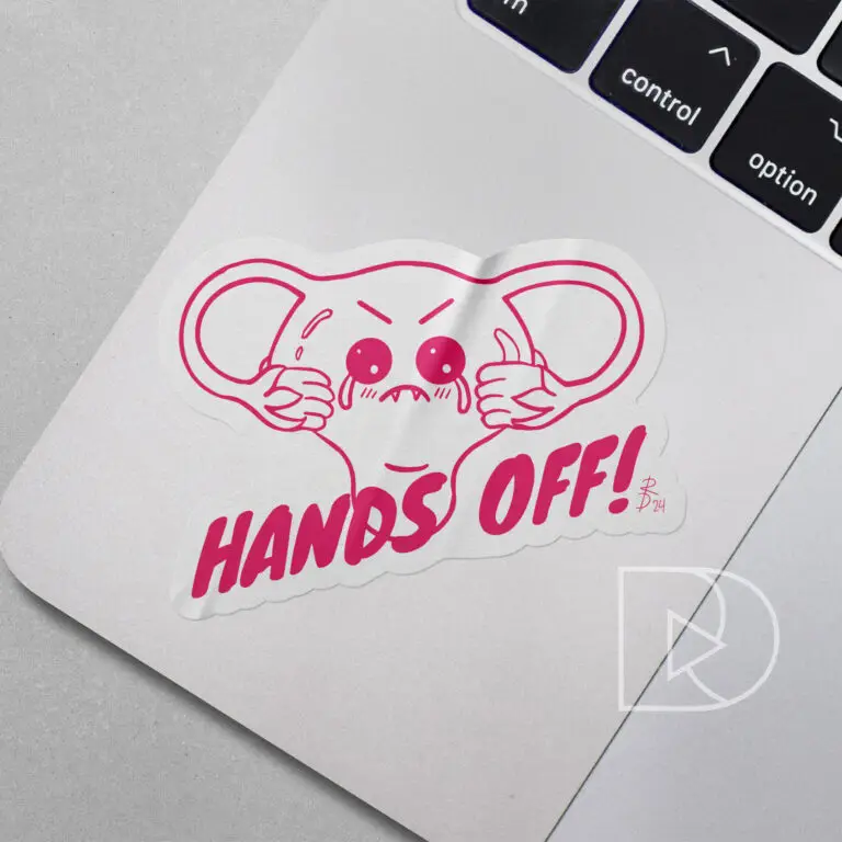
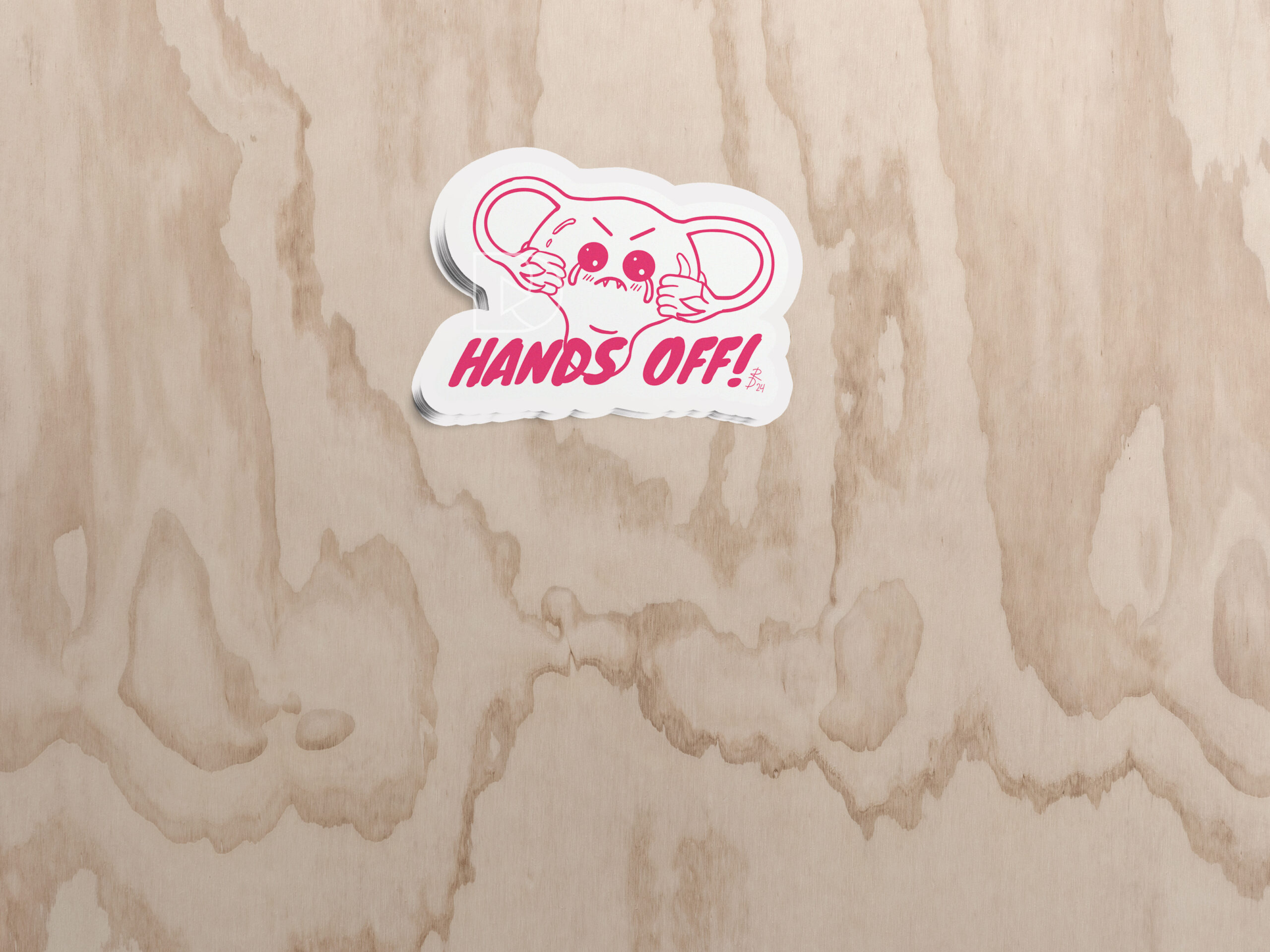
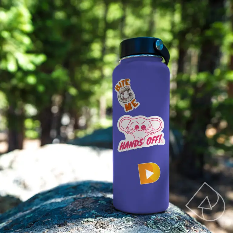
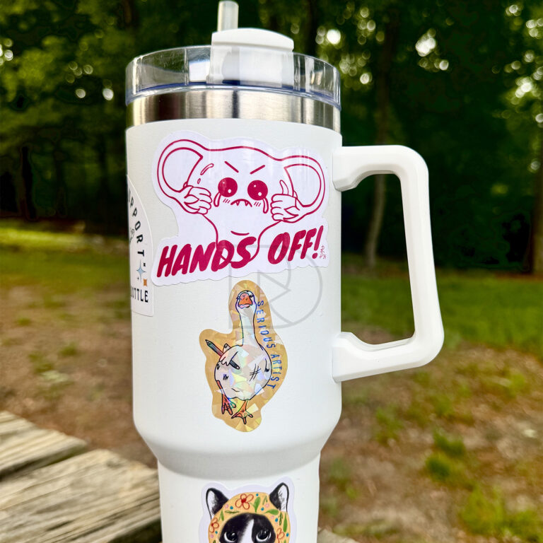
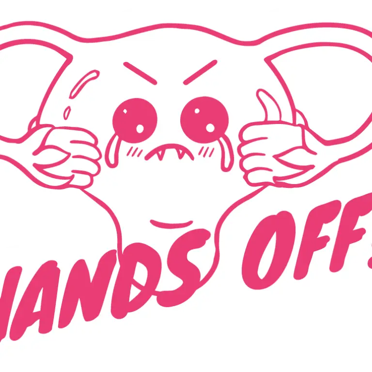
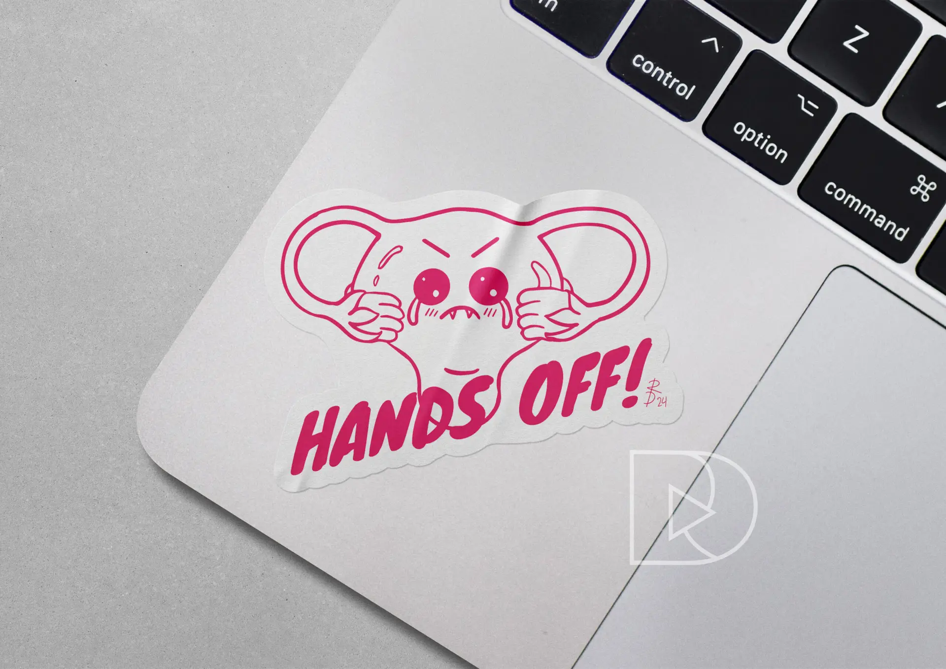
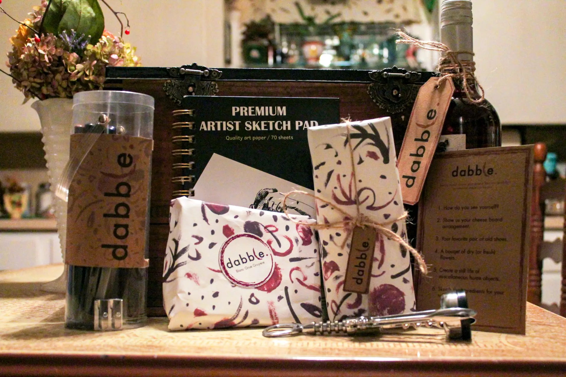
Challenge: As part of my ongoing commitment to supporting reproductive rights, I repurposed my “Hands Off!” Benefit Tee design as a sticker, a bold visual statement that promotes the message of autonomy over one’s body. This limited-edition sticker is the second component of a benefit campaign aimed at raising awareness and funds for Reproductive Freedom for All, a charity dedicated to protecting reproductive rights.
Product Care Instructions:
- Clean the area prior to sticking to ensure a long-lasting bond.
- Not dishwasher safe; hand wash only to preserve details and longevity.
- Do not place in microwave; high heat may cause bubbling or melting.
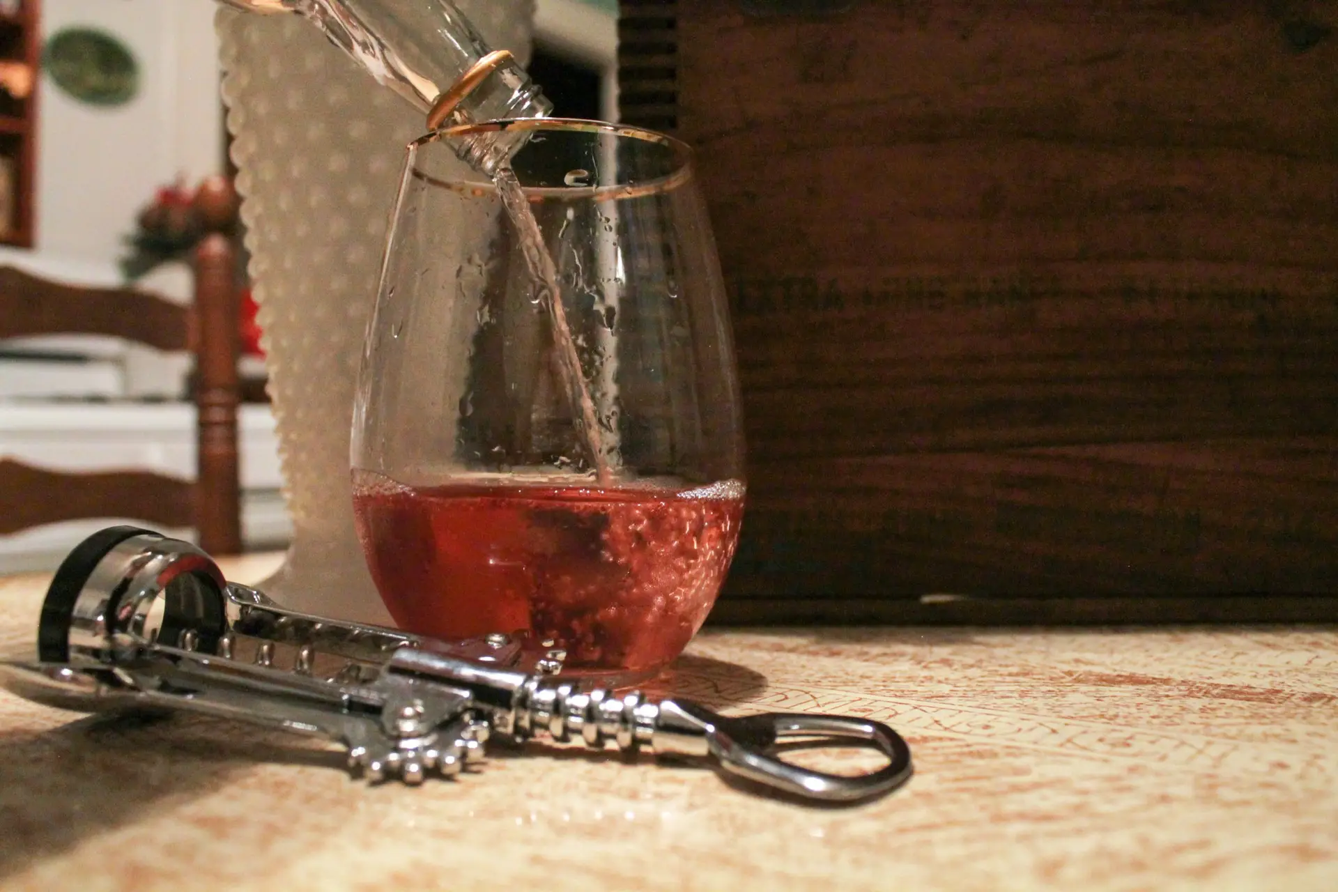
Design Solution: Building on the playful, kawaii aesthetic used in the design of the benefit tee, this sticker features a cheeky illustrated uterus with a fierce “Hands Off!” expression. Using hot-pink line work and bold typography, the design keeps its lighthearted tone while delivering a strong, unambiguous message. This sticker is perfect for laptops, water bottles, and car bumpers, making it a versatile product that helps spread an important message wherever it goes. Priced at $4 each, $2 from each sticker sold is donated directly to Reproductive Freedom for All.
Reflection: It’s incredibly rewarding to see how such a simple design can inspire and empower people. By combining kawaii-style imagery with a strong feminist message, this project continues to create awareness and raise funds for a vital cause. At just $4, the sticker provides an accessible way for supporters to contribute to Reproductive Freedom for All, and every purchase brings us closer to ensuring equal rights for all.
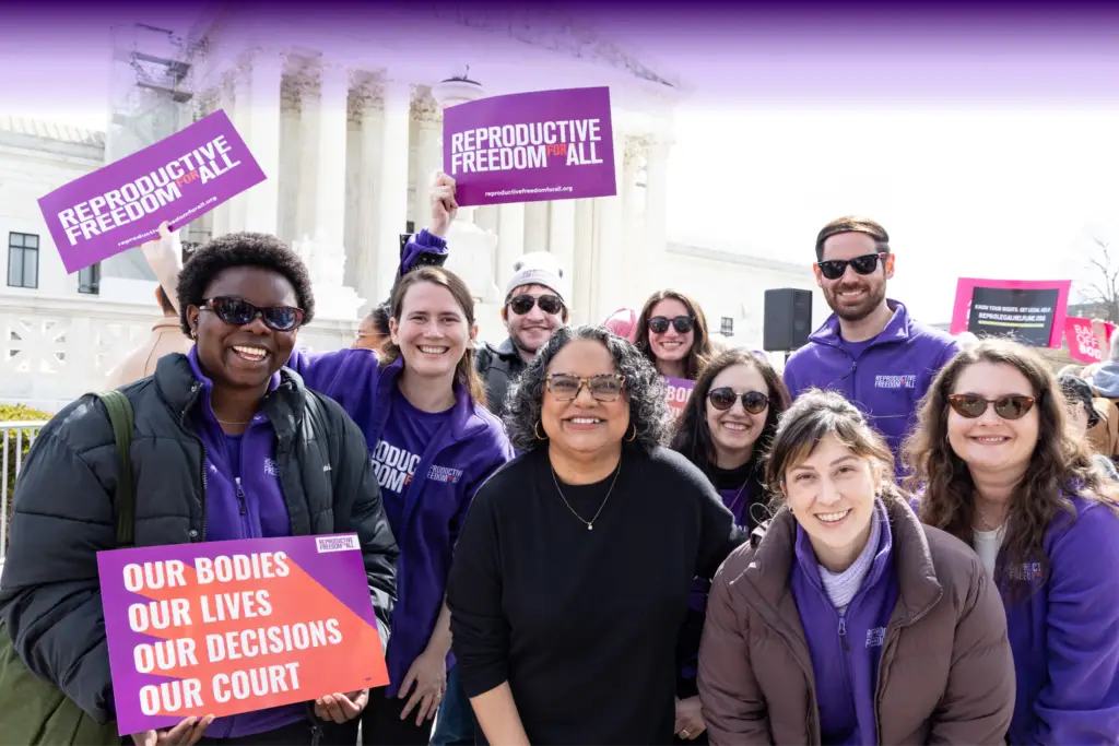
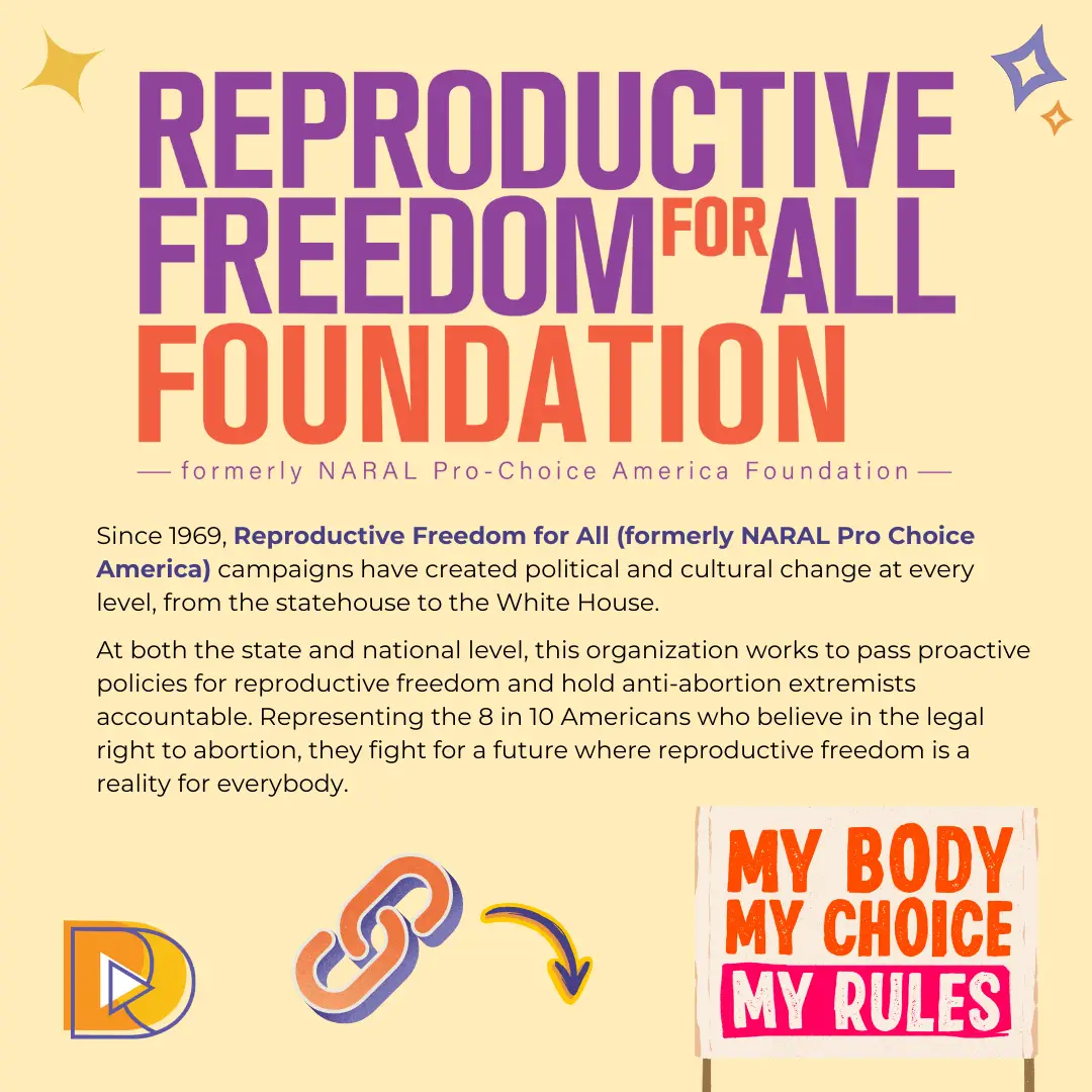
Reproductive Freedom for All
(formerly NARAL Pro Choice America)
Reproductive Freedom for All (formerly NARAL Pro-Choice America) has been advocating for reproductive rights since 1969. Their mission is to create political and cultural change at every level of government, working to pass proactive policies for reproductive freedom and hold anti-abortion extremists accountable. Representing 8 in 10 Americans who support the legal right to abortion, this organization fights for a future where reproductive freedom is a reality for all. Every ‘Hands Off!’ sticker sold helps contribute to this ongoing effort.


