catalog publication design
branding | publication | digital media
Challenge:
Develop a catalog based on a product of your choosing, complete with branding elements.
Design Solution:
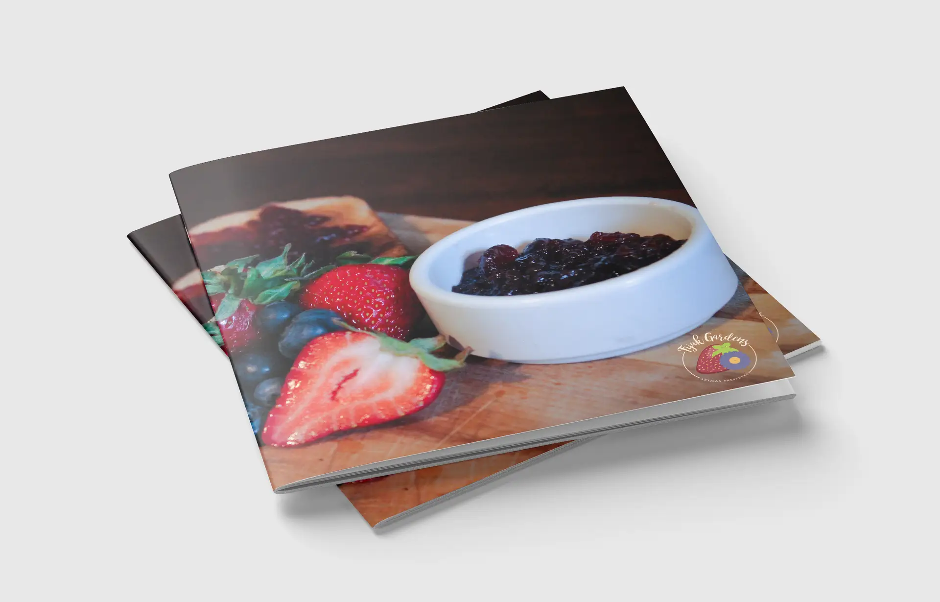
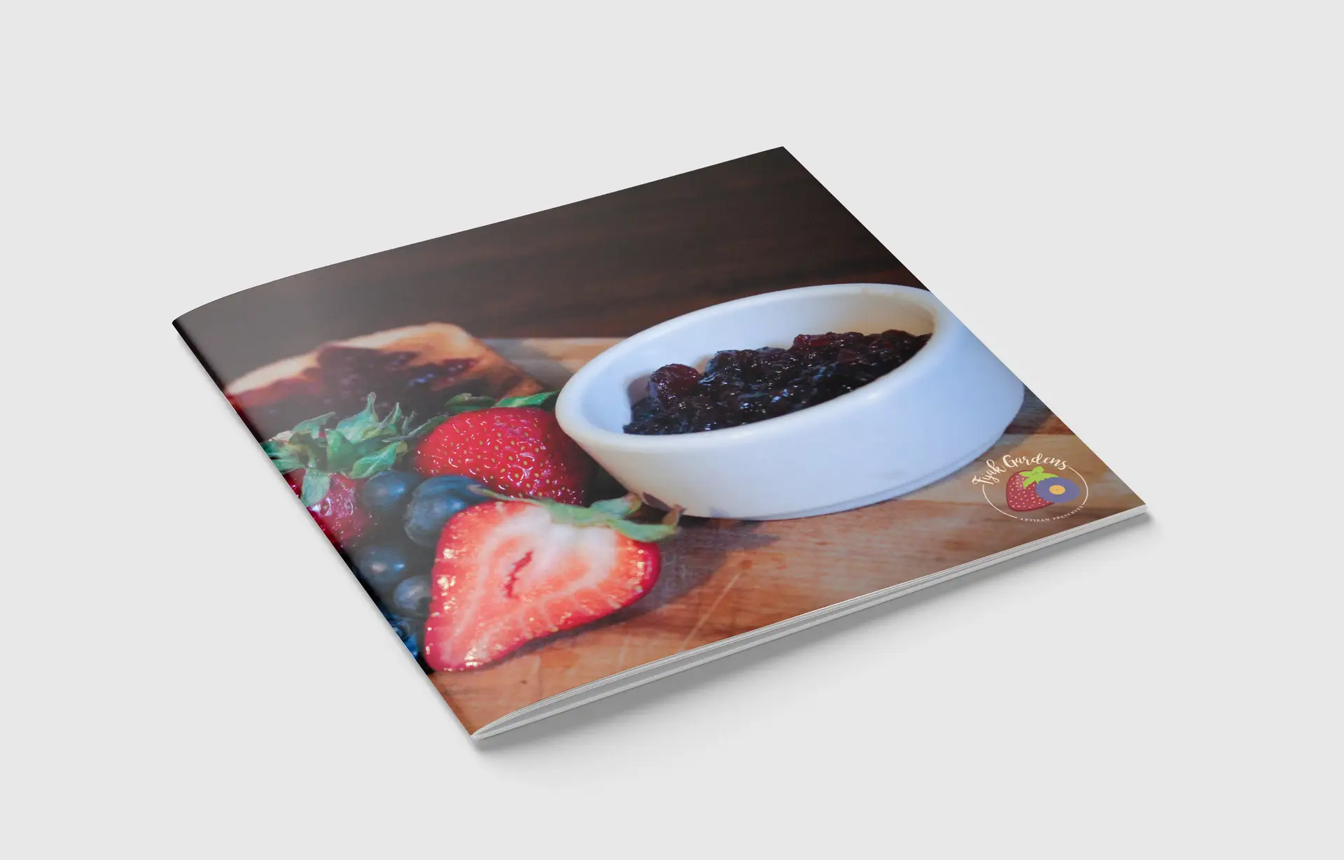
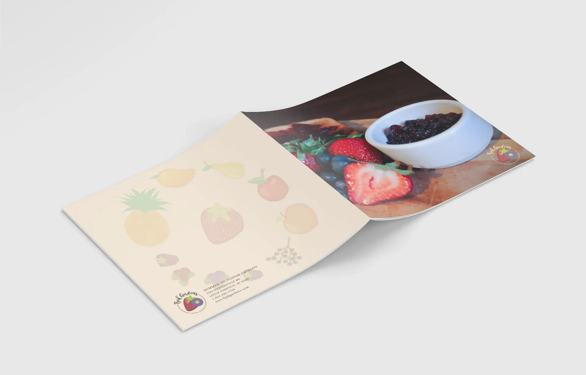
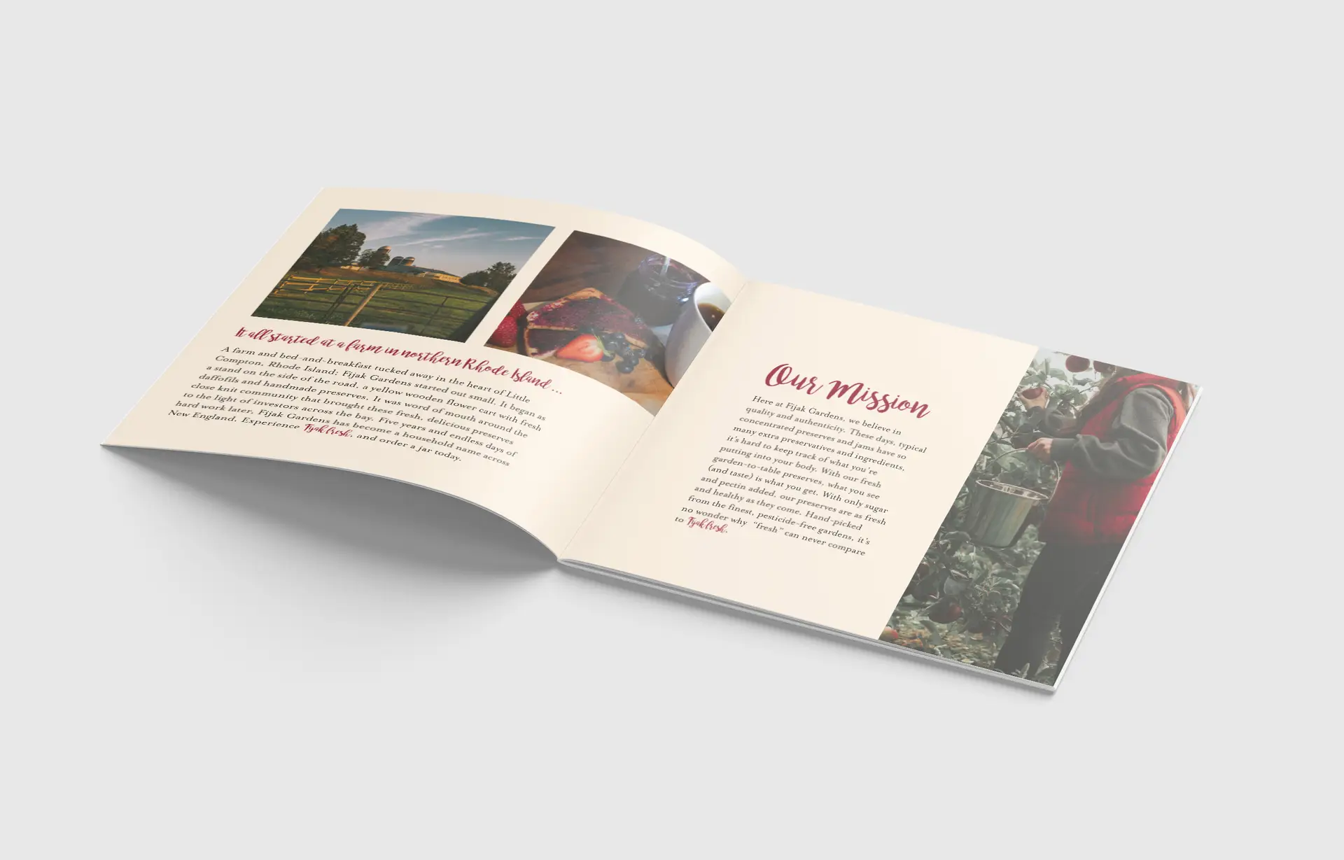
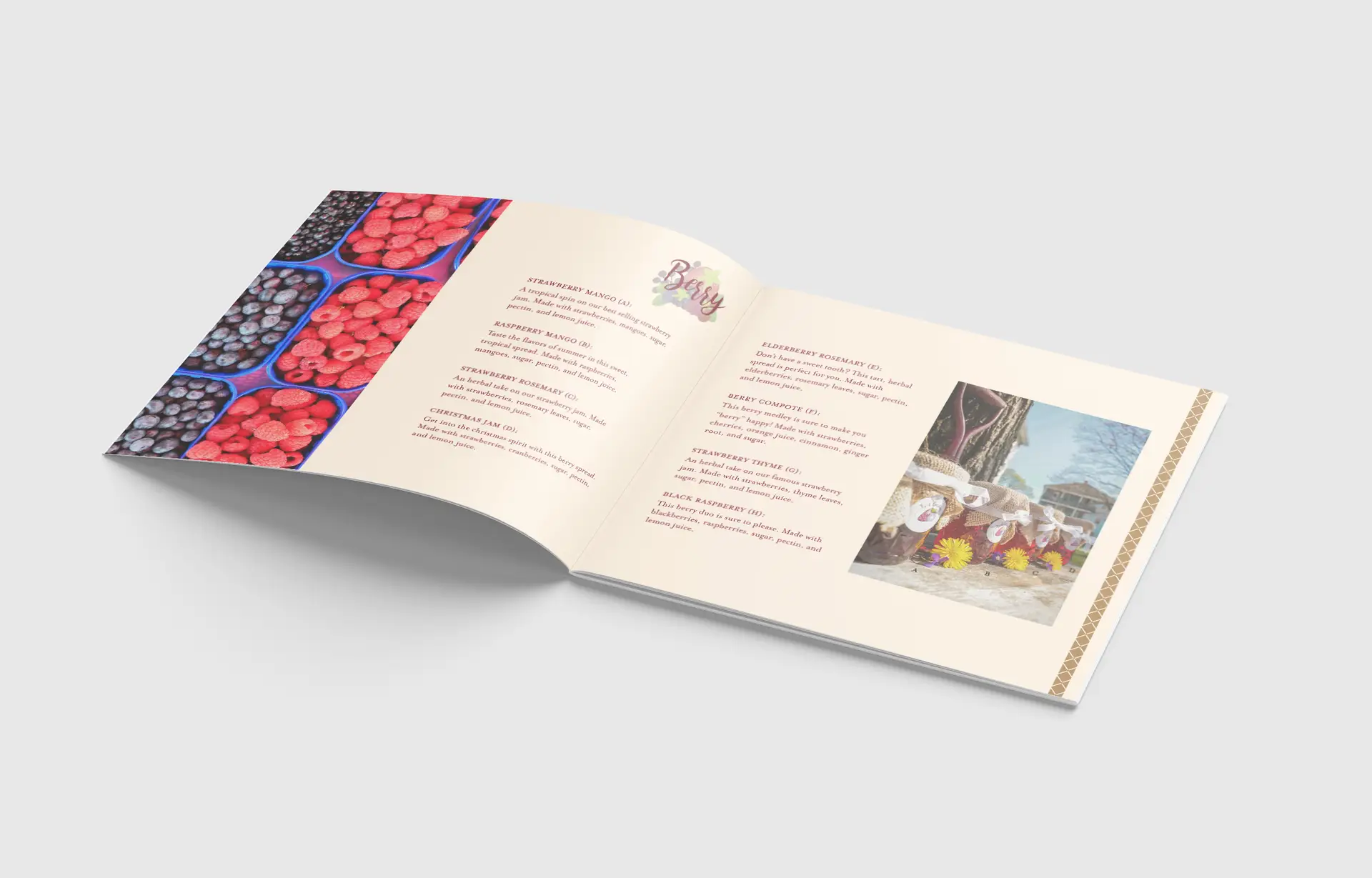
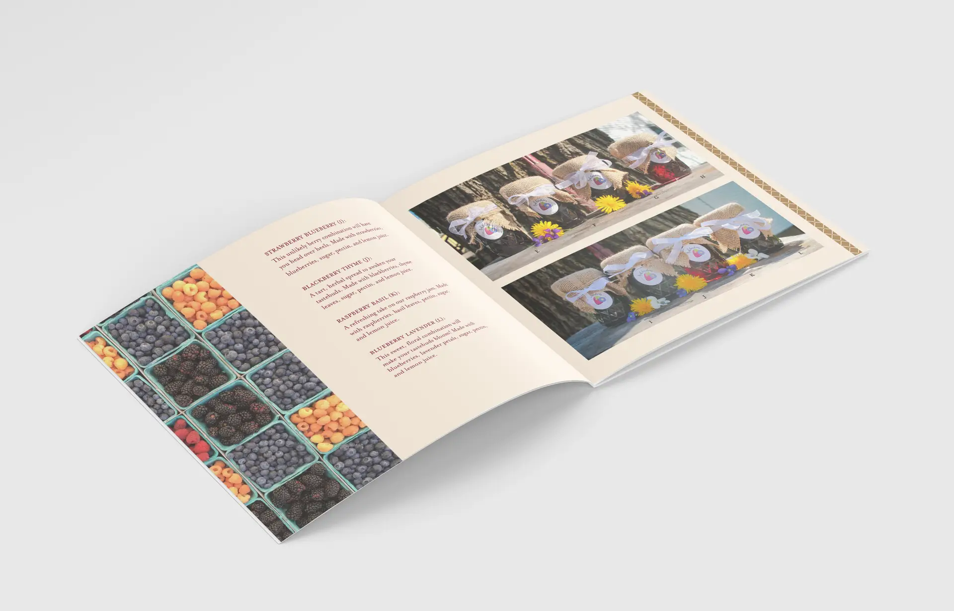
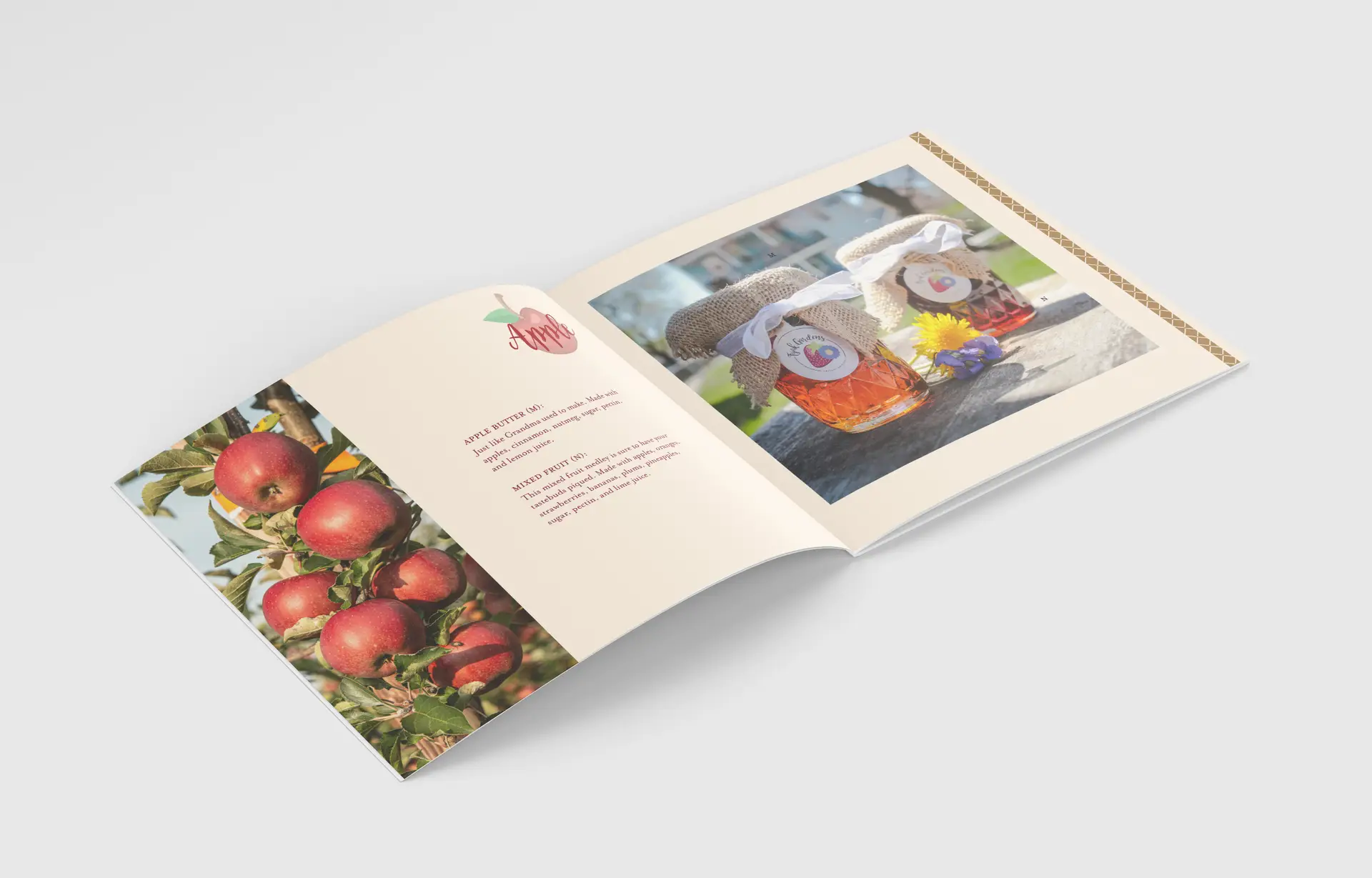
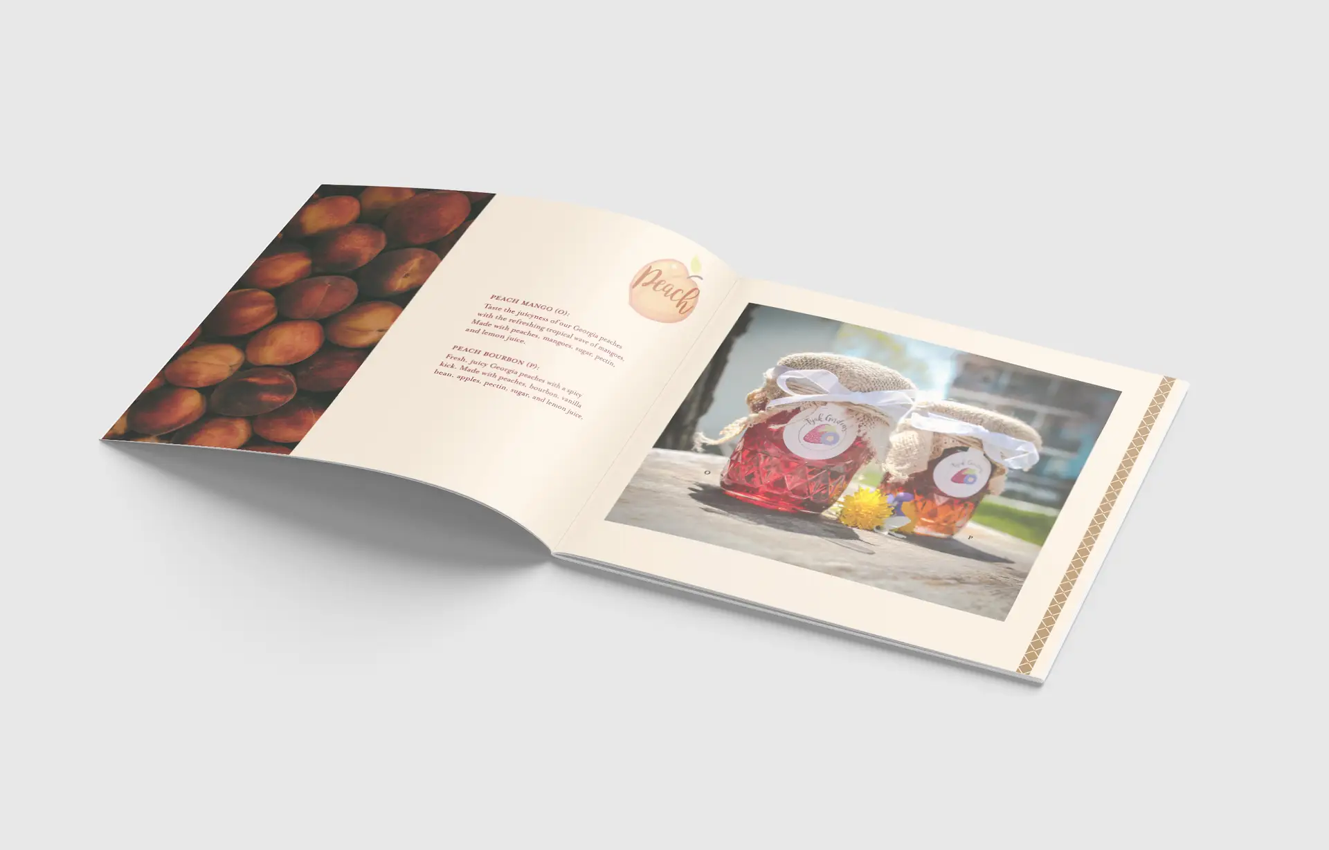
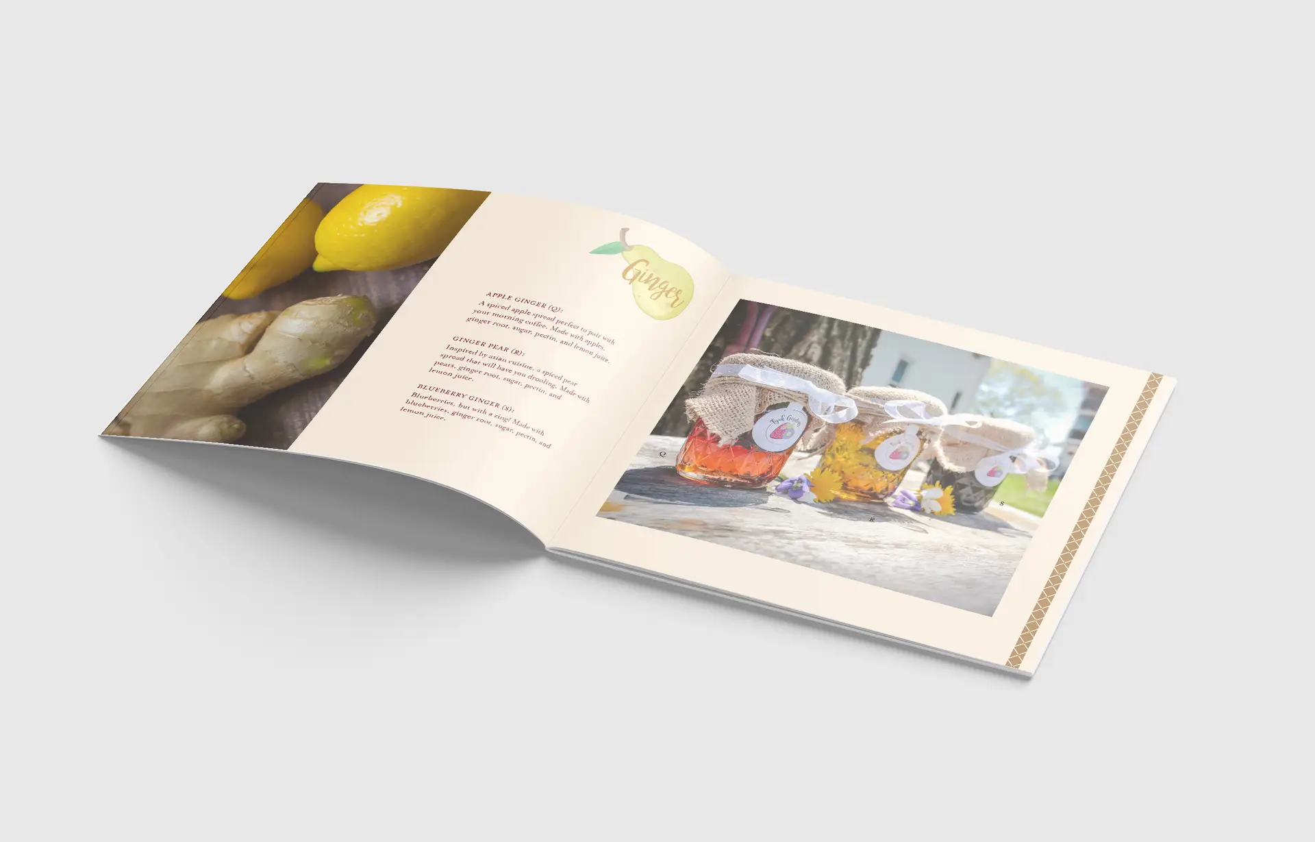
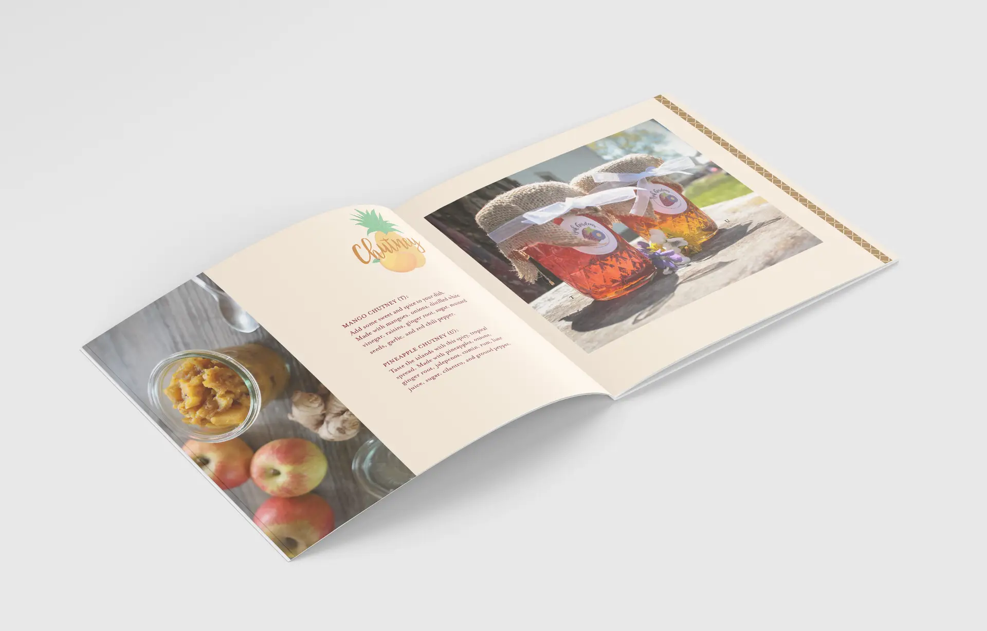
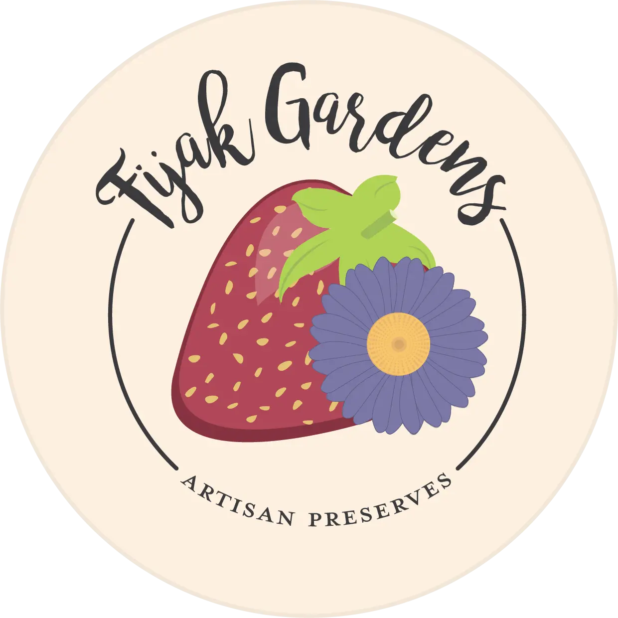
For Digital Media Studio I, I created a brand centered around fresh, artisan preserves. Growing up, I always helped my Grandma (Fijak) pick fruits from her gardens, and tried my best, as a five year old with mediocre cooking knowledge, to help her create her fruit preserves. To this day, I drool over the thought of her jams in my Christmas baskets ever year. I took inspiration from these cherished family moments to develop the company Fijak Gardens. Since my inspiration came from the concept of homemade, preserved memories, I chose to go a rather “kitcshy” tone for the brand aesthetic. Fijak Gardens is all about farm to table, fresh ingredients and cooking with care. When these aspects come to mind, the first thing that always comes to mind is a “homemade-grandma” vibe, so I honed in on this tone in my packaging methods, logo design, and even photo composition.
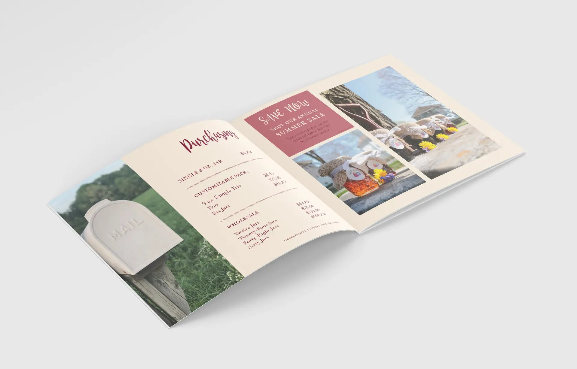
We are set out amongst the rest of our competitors, and I wanted the catalog to shout this from the rooftops, using high-end and kitschy elements to create an all-around successful farm-to-table brand.
Self-Reflection:
The passion I put into this project is definitely more than usual, but then again, not all of my projects have a personal connection behind them. Due to this, I feel like I could really pour my heart and soul into the copy, photos, packaging, and logo. I was even able to take this project above and beyond, creating real labels with my Cricut. Crafting my own labels and taking my own photos, rather than using jar mockups, really took this project to the next level.