Author: Rhea Diehl
InfinityEd membership enrollment campaign
Posted on by Rhea Diehl
InfinityEd membership enrollment campaign

digital marketing | web design | campaign development
Challenge:
Develop an advertising campaign, related graphic deliverables, and a central information hub (website) to increase membership sales and awareness of the company.
Design Solution:
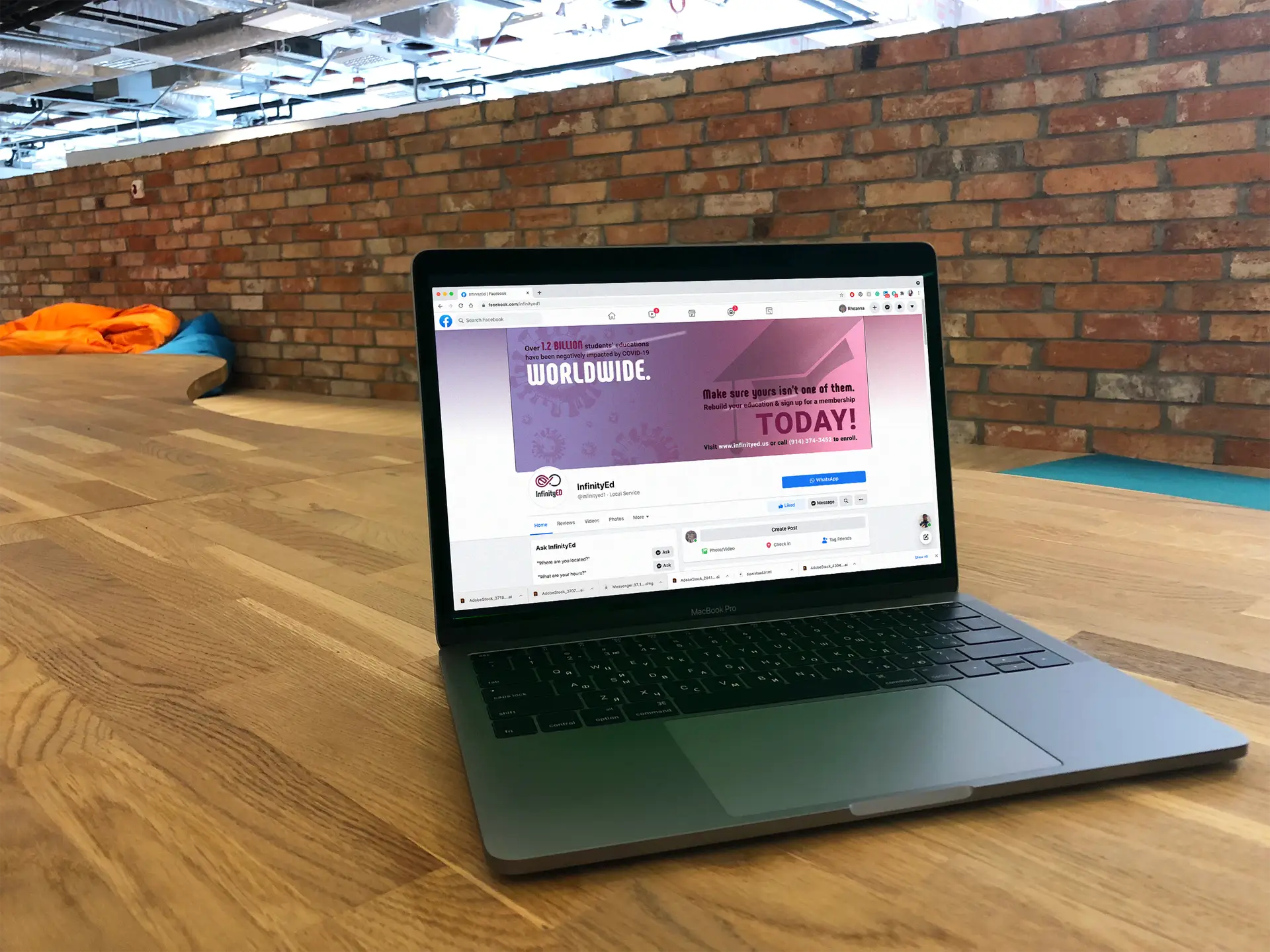
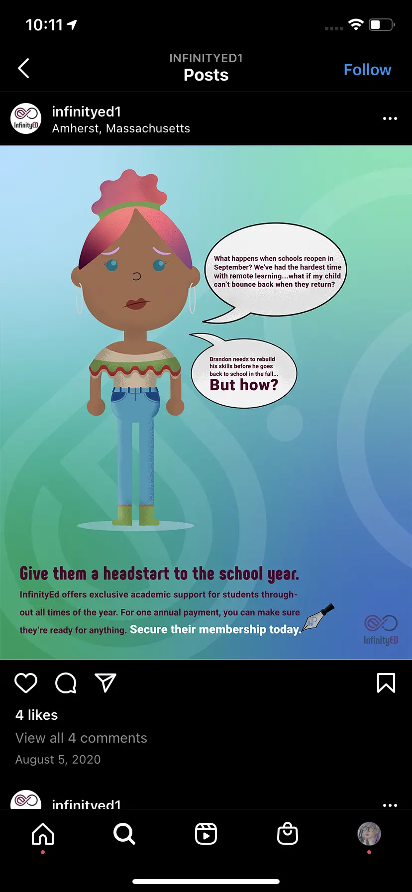
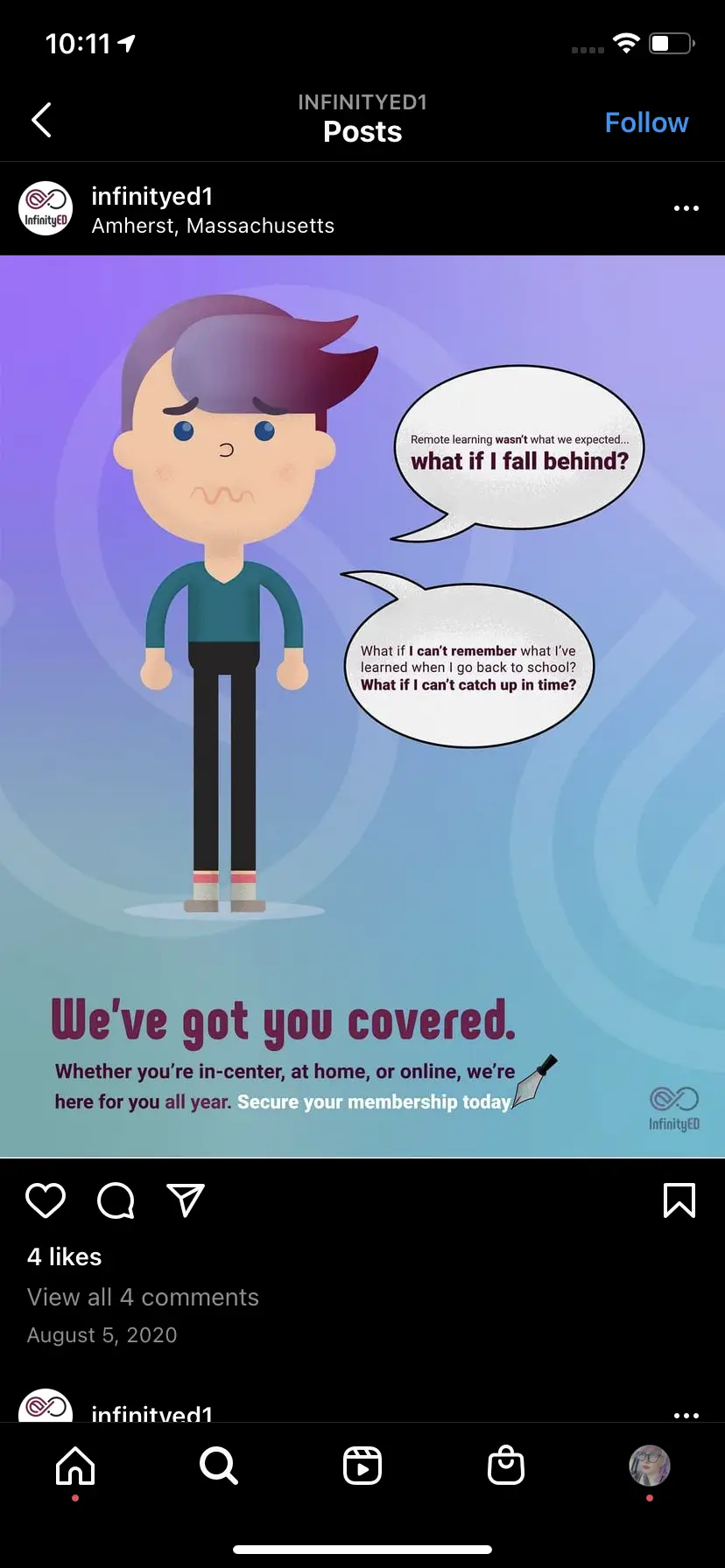
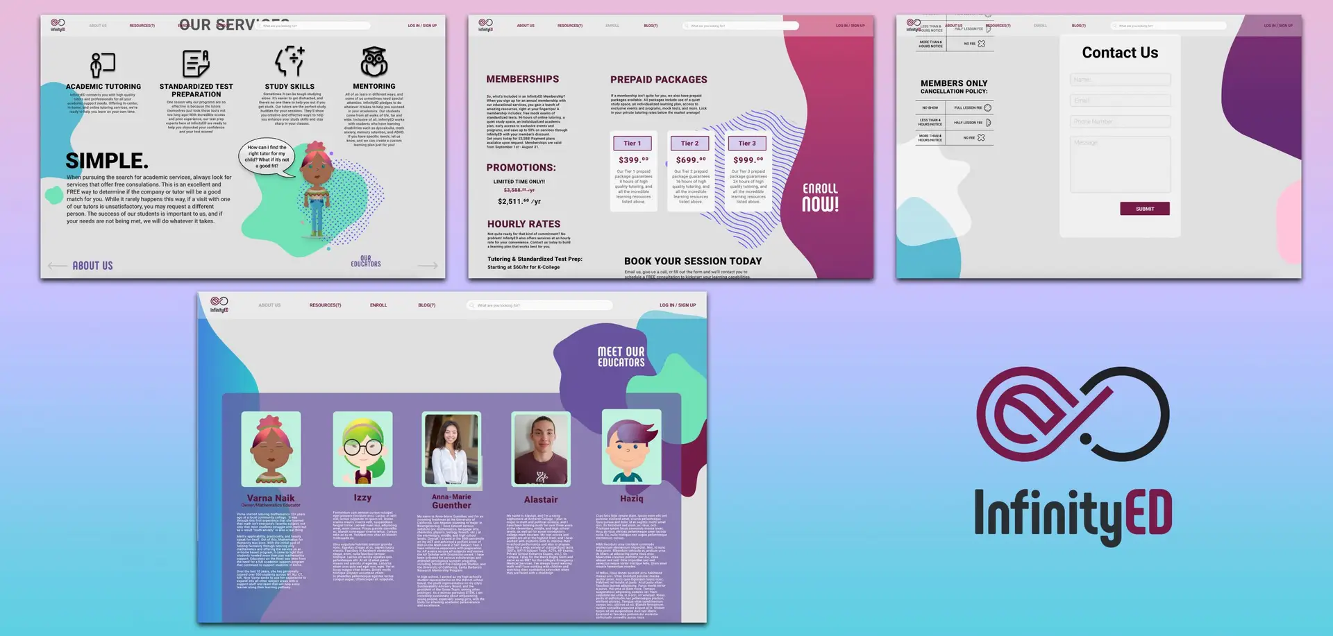
Following the first quarantine of the COVID-19 pandemic, Varna Naik reached out to me for help with picking her business back up by the bootstraps. Based in Amherst, MA, InfinityED is a small business in the education industry. Working with students from Kindergarten to Graduate School, Varna and her team create learning plans based on student-specific need. With e-learning becoming the norm at the time and membership sales decreasing, Varna needed to advertise to the public that “hey, we’re still here, and we do online tutoring too!”.
Working closely with her and her team, we developed a campaign to increase company awareness and membership sales using digital deliverables. This was achieved through the use of social media advertisements across a multitude of platforms, as well as building an on-brand, user friendly website utilizing original illustrations and graphics to appeal to the target audience of the company.
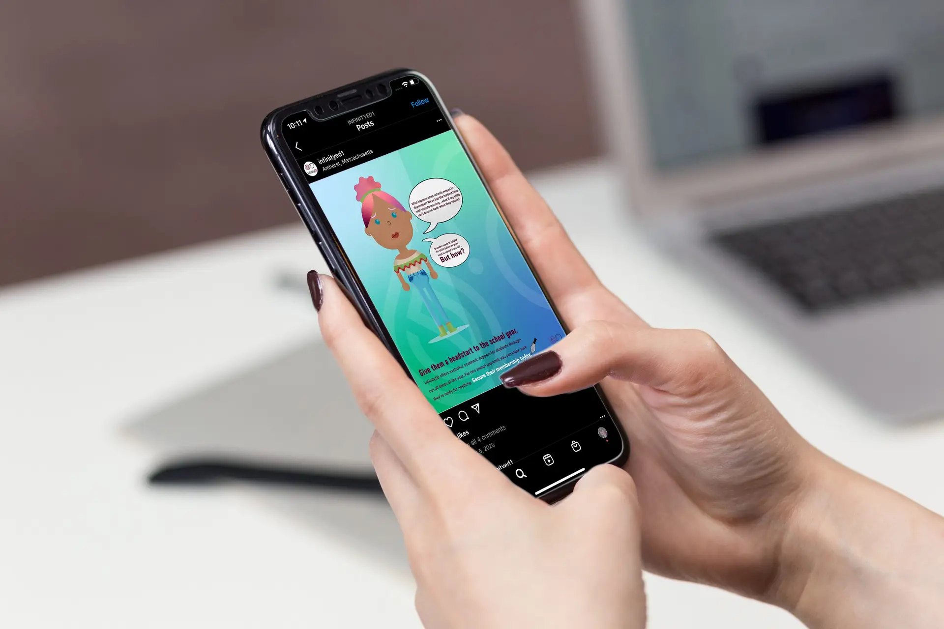
Being that the company’s target audience was both parents and students, two alternating advertisements were created for social media; one in the perspective of a parent, and one in that of a student. We wanted to take both customers’ worries into consideration and reiterate that we are here for everyone.
Interested in learning more about InfinityED and their mission?
Follow them on social media to stay up to date on the latest and greatest in non-profit education and sustainability.
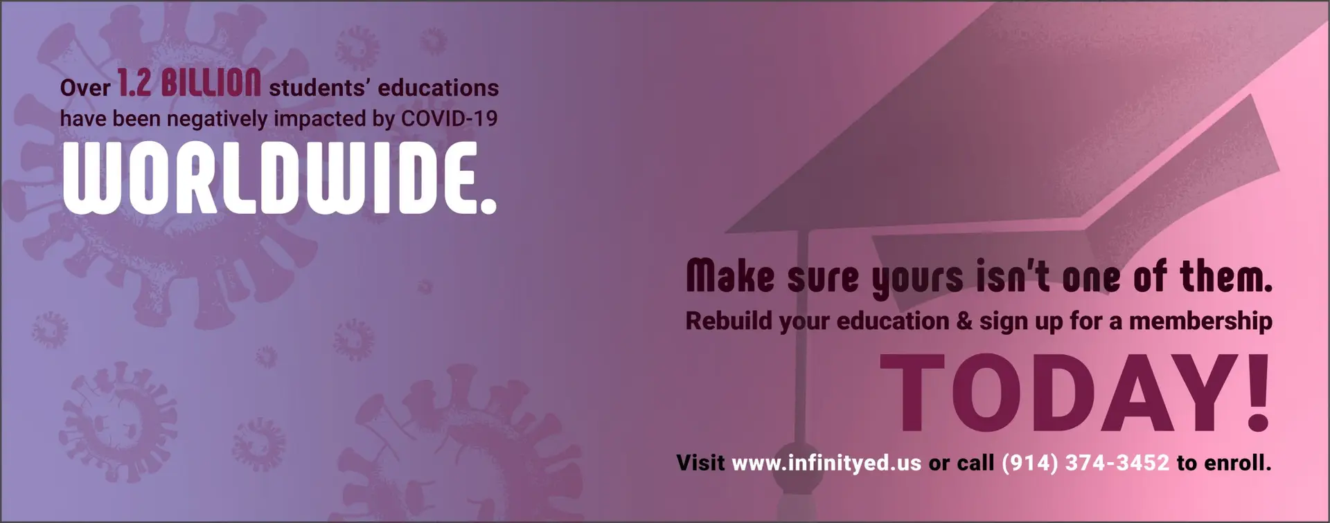
Campaign-specific header images were also developed for the company’s various social media pages. These focused on students bouncing back from e-learning struggles, and featured membership promotions.
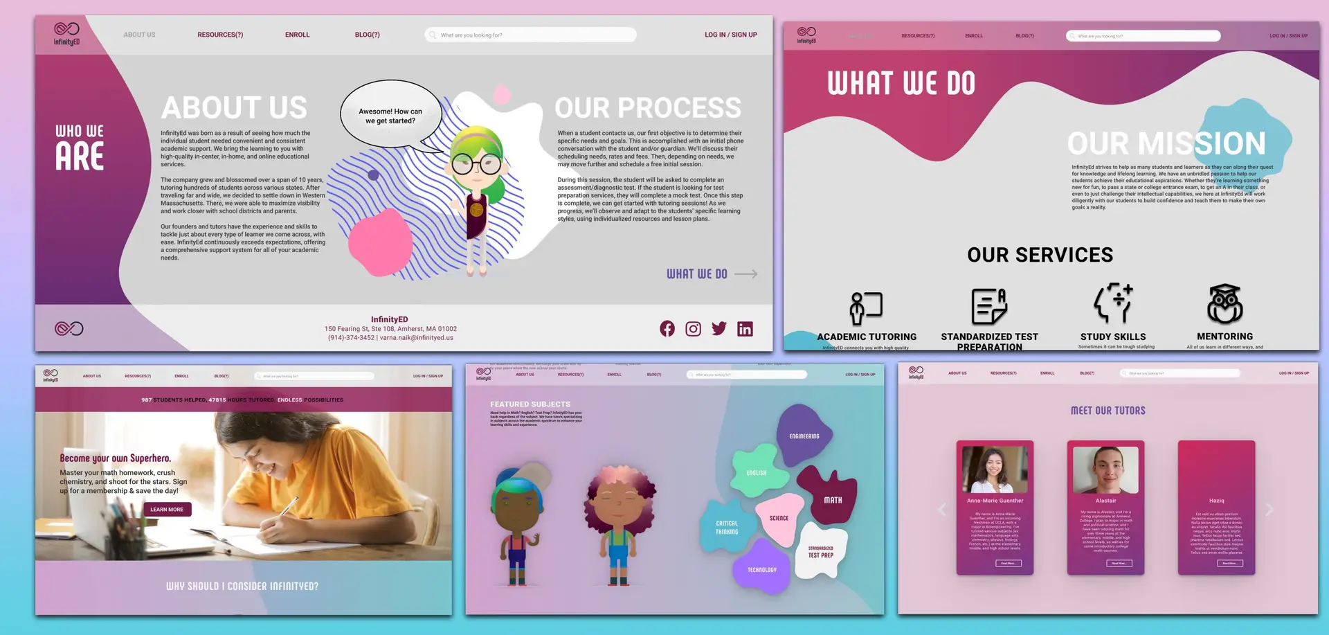
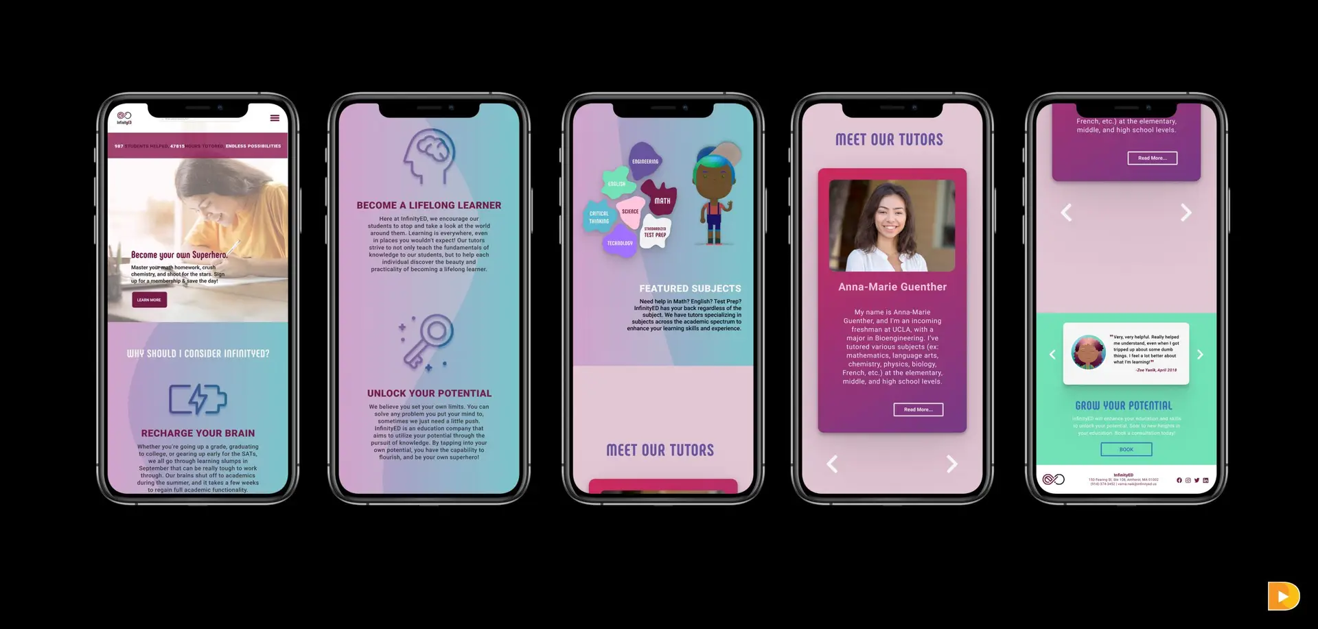
Probably the largest portion of this project though, was designing the website. Starting with the bare bones of a just a footer and navigation menu, her web developer and I teamed up to create a buzzing, fun, eye-catching website as a centralized informational hub for potential customers. Featuring numerous web pages such as an about page, membership sales, and a “meet the tutors” page, this website not only communicates information well, but in an eye-catching, on-brand, friendly way.
Self-Reflection:
This client project was definitely a test on my web design skills. While I’d done tons of website designs and prototypes for school, I had never done one for a real client prior to this. This involved a ton of research and even more of my time, but was totally worth it. To create a successful website that communicates the company’s tone and aesthetic effectively, and seeing it as a live website, out there on the real-life internet as opposed to a prototype, was, and still is a really spectacular feeling.
wayfinding brand revision
Posted on by Rhea Diehl
wayfinding brand revision
digital media | brand redesign | illustration
Challenge:
Develop a wayfinding system for an organization of your choosing, complete with icons, maps, and kiosks.
Design Solution:
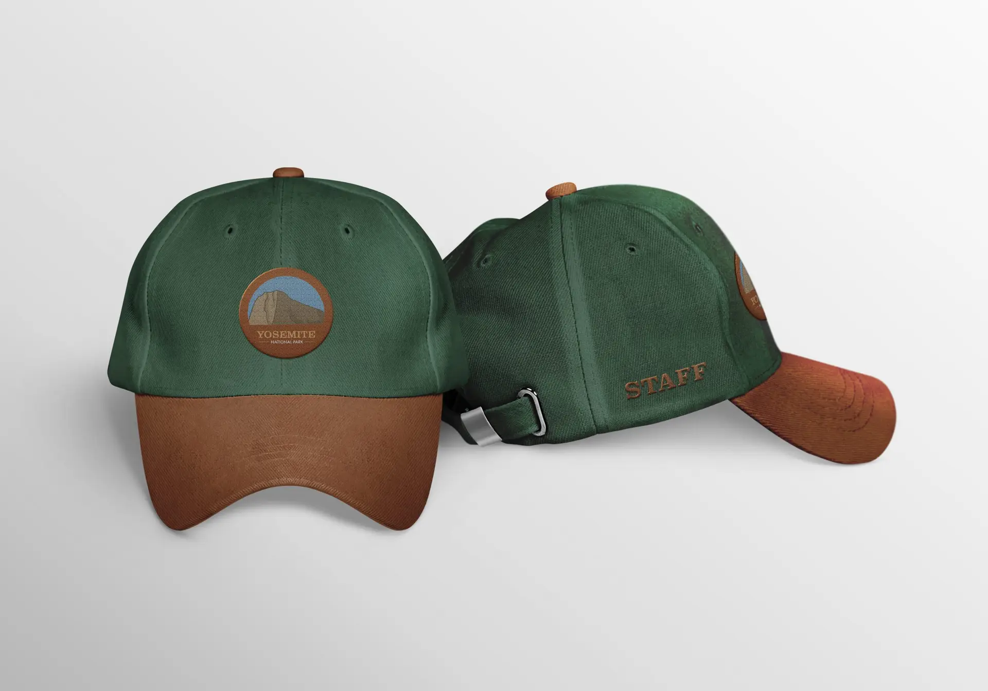
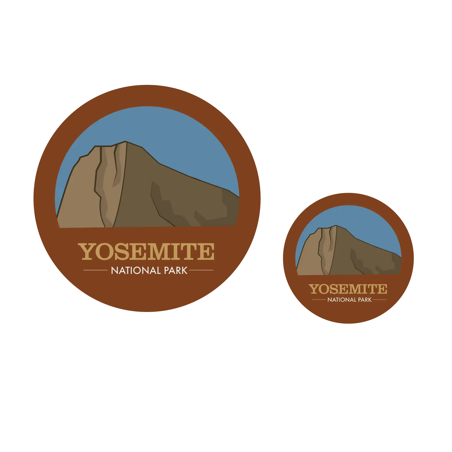
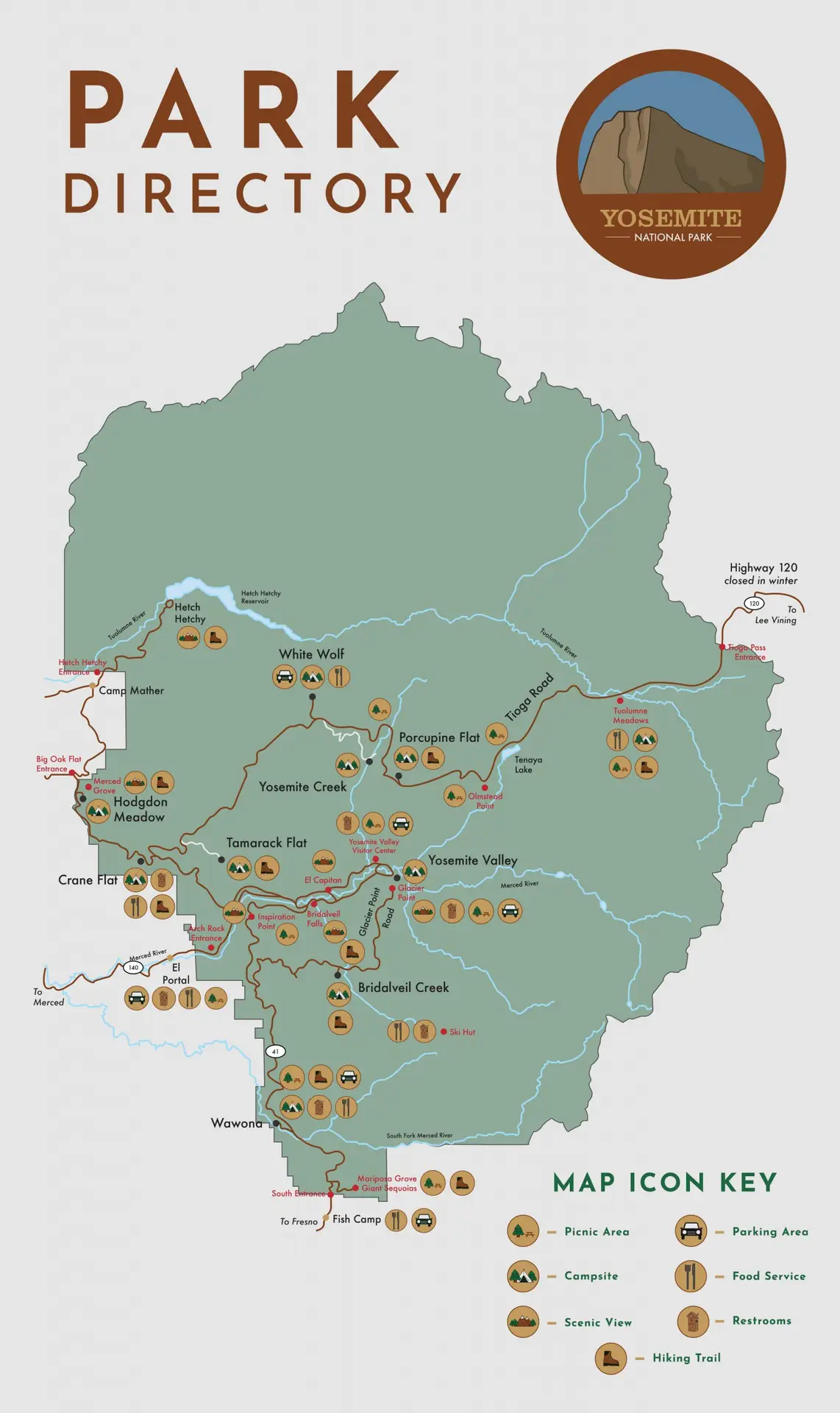
When developing this concept for a wayfinding system for Yosemite National Park, my first instinct was to keep the “nature” vibe they already had. National Parks are all about getting outside and enjoying the beauty the world has to offer, and to modernize that would be to diminish the entire feeling of the park. That being said, I decided to improve their logo to showcase their most popular attraction; El Capitan. The fonts and style I chose are reflective of the “natural” vibe I went with, adding just a tiny touch of modern by using Josefin Sans as a “secondary font” in the logo. As for the icons, I wanted to stay simple and minimal, but these are a work in progress. As they are right now, the restroom icon is far more detailed than the others; and I actually prefer them that way! I am in the process of revising these icons to fit more with the restroom icon.
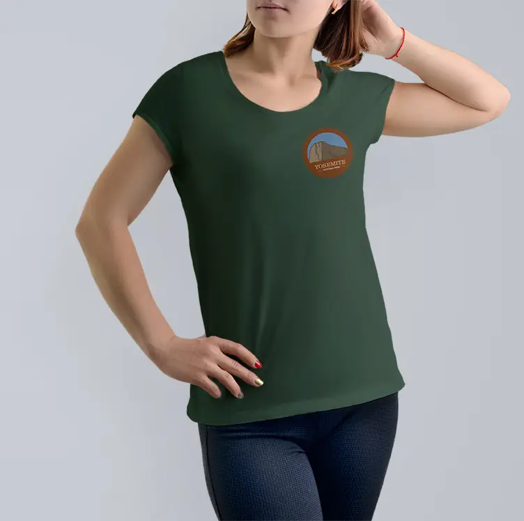
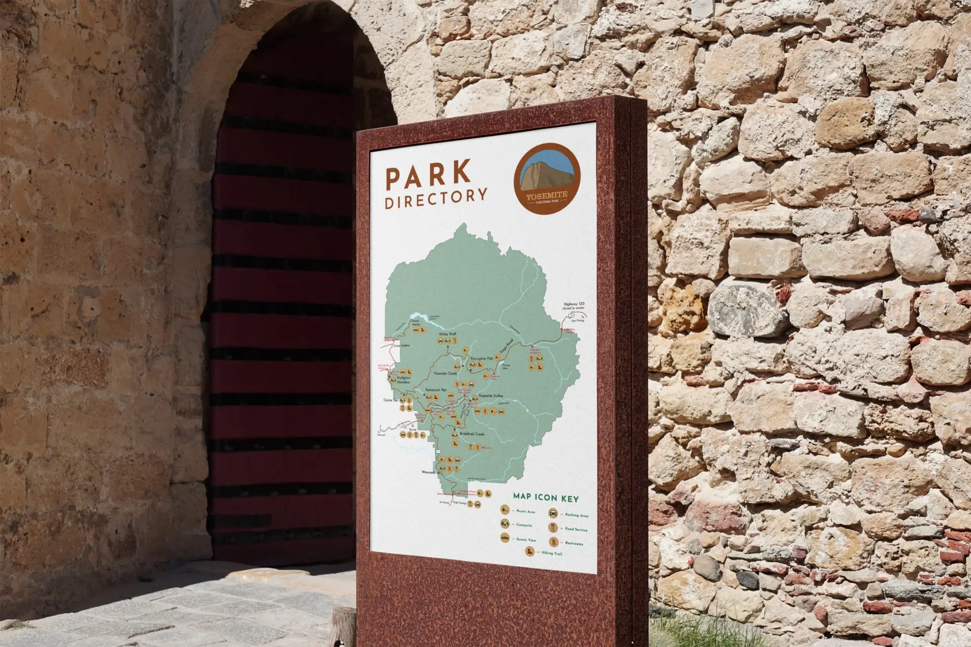
Additionally, I have created a wayfinding kiosk for visitors to use to map out their travels throughout the park. When designing this part of the project, I took a lot of inspiration from the appearance of wishing wells. The kiosk is also a work in progress, as I would like to refine the details in this more. Lastly, I developed a couple apparel items, consisting of a t-shirt and a baseball cap boasting the new logo. Ideally, this would be for park staff to wear so that visitors can pick them out easily.
Self-Reflection:
This project was definitely an interesting one, to say the least. I recall hitting a lot of roadblocks in the initial ideation of this work. I guess if I can take anything from this one, it’s that sometimes back to basics is best.
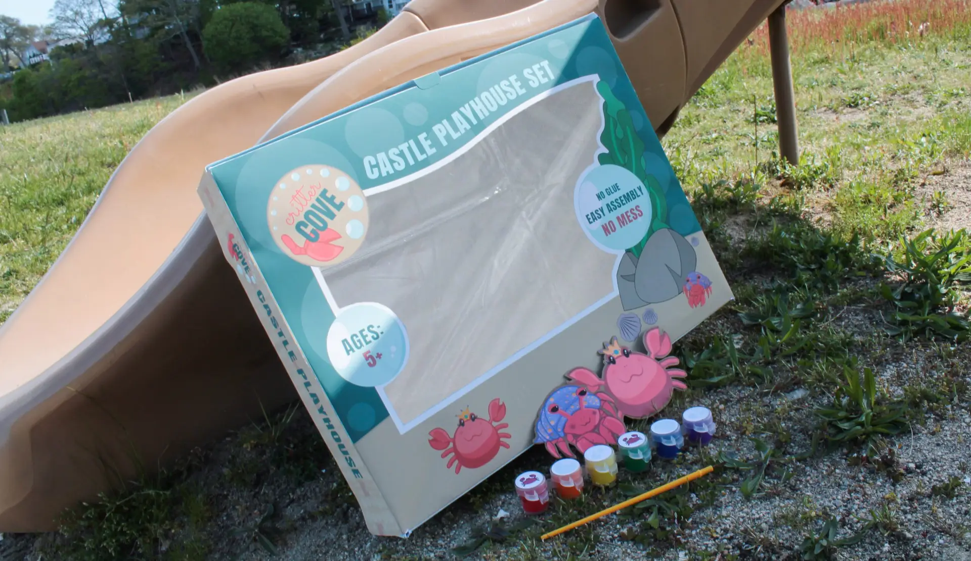
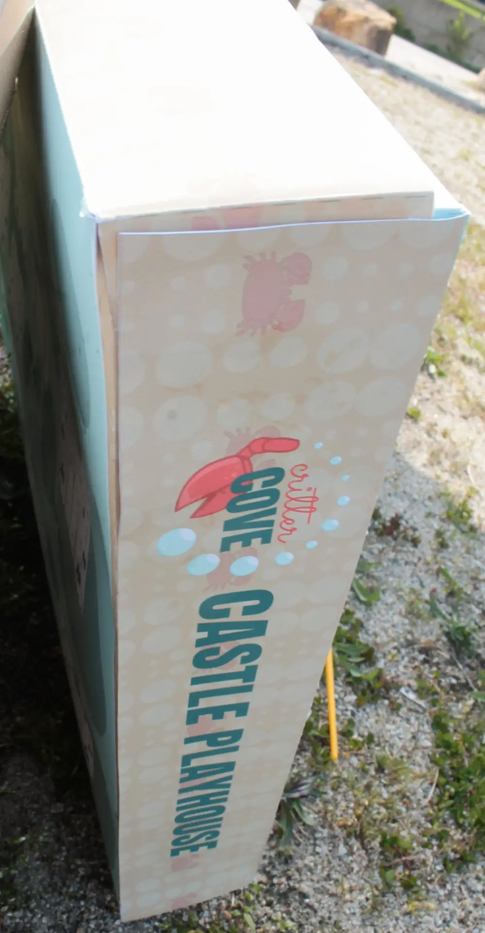
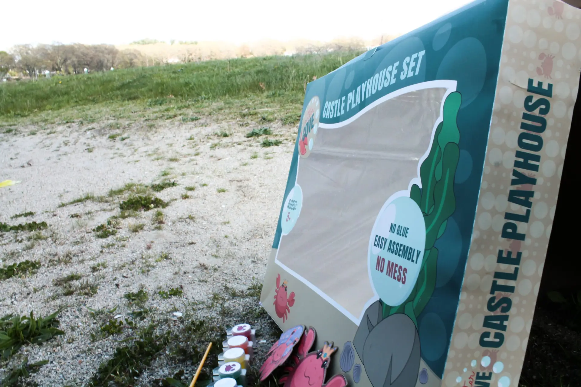
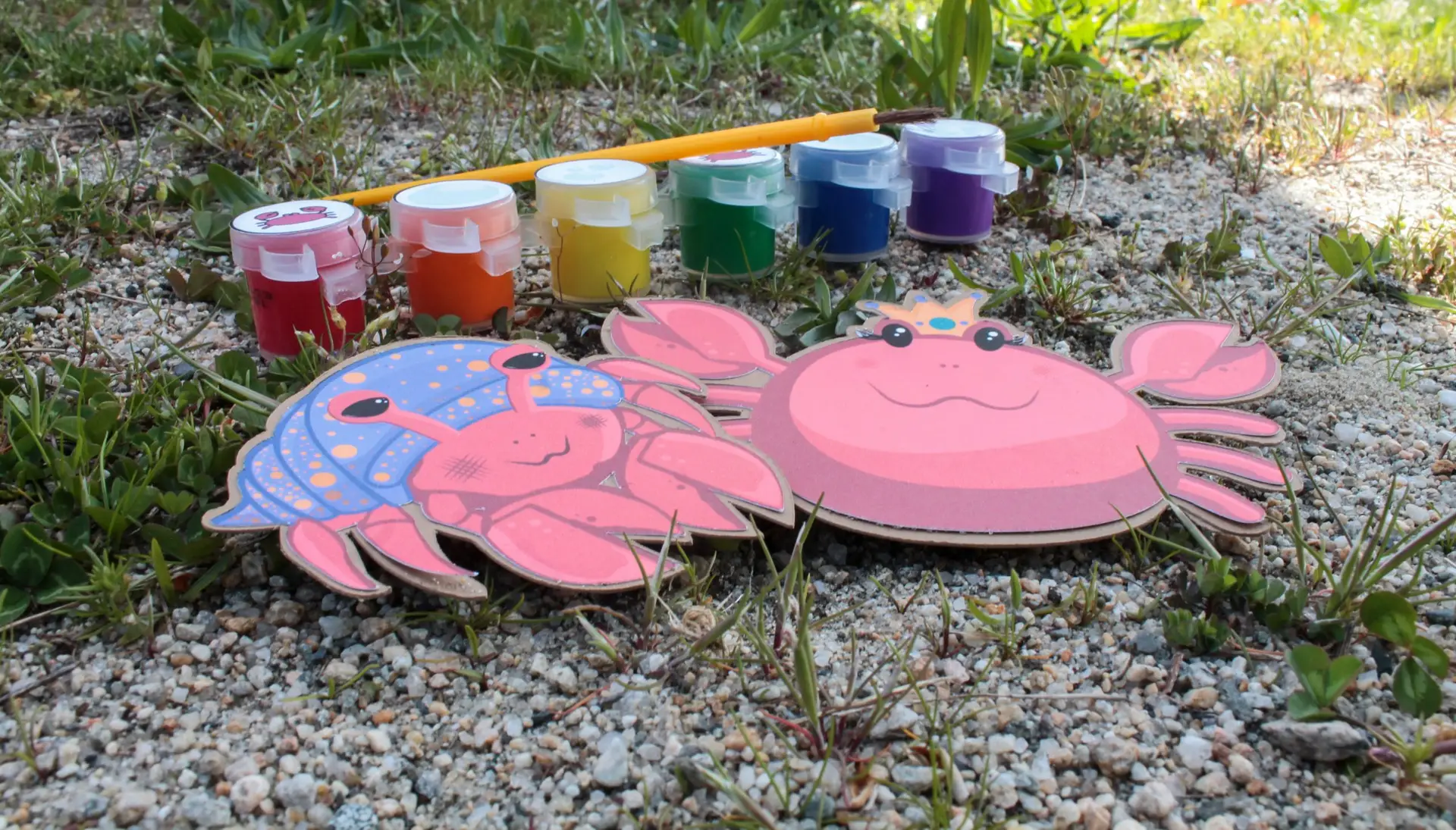
kids playhouse gender neutral package design
Posted on by Rhea Diehl
kids playhouse gender neutral package design
package design | illustration | crafting
Challenge:
Design a gender neutral brand and product for an assigned kids playhouse.
Design Solution:
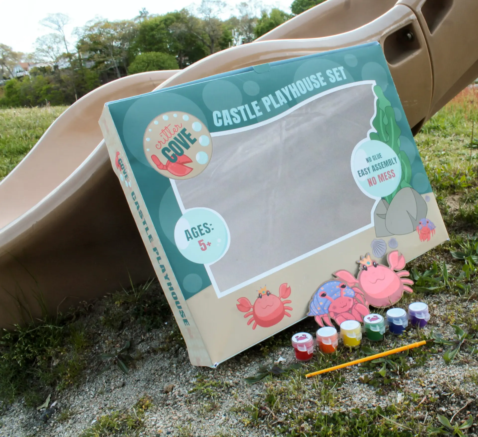
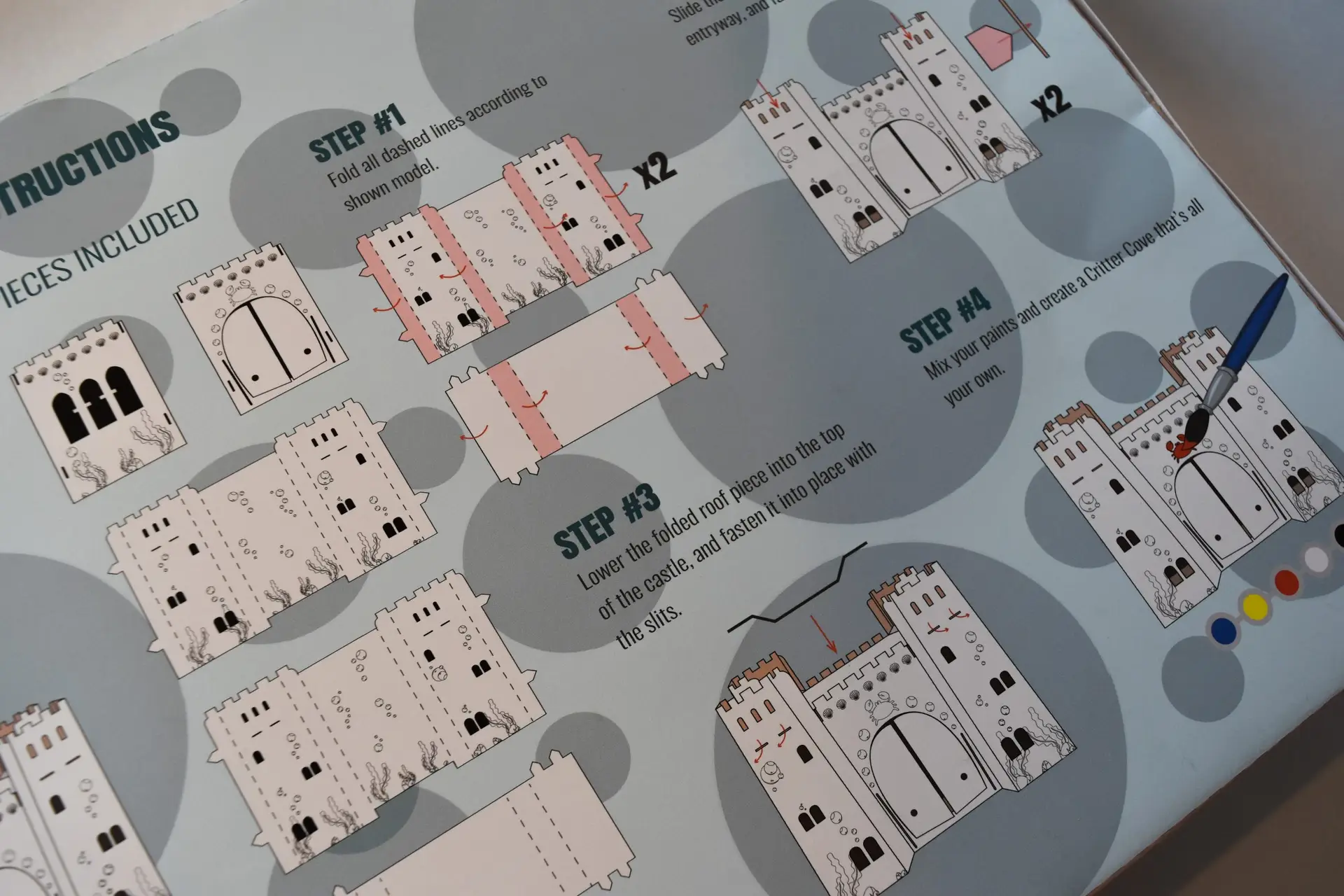
During my time in college, I was asked to develop a brand identity and package design for an existing architectural playhouse assigned. I chose to pursue a sandcastle concept that would appeal to children of both genders. Regardless of gender, everyone can agree that kids love sandcastles. I used this common interest as inspiration for this project, and developed a concept of a crab themed sandcastle. From the package design, to the pieces of the kids playhouse itself, the theme is communicated efficiently and cohesively throughout the brand. The playhouse set also features an on-theme paint set with a brush to customize the castle, washable, of course. Whether your kid colors inside the lines or out, the included paint is washable to make cleanup a breeze.
Self-Reflection:
This project combined my branding and crafting skills, and challenged me to build a brand and product that is cohesive throughout. It also challenged me to focus on a broader audience, being a gender neutral product for children. Knowing and being able to appeal to your audience is an important skill in the design world.
Interested in finding out more about gender neutrality in packaging and product design?
GVC’s “So What’s The Deal?” vlog series
Posted on by Rhea Diehl

GVC’s “So What’s The Deal?” vlog series
motion graphics | illustration | branding
Challenge:
Utilizing various skills, develop a video blog series and branding elements revolving around diversity and inclusion in the workplace and mainstream media.
Design Solution:
During the time I spent at my internship, I was given the responsibility of developing volume one of our VLOG series at Global View Communications. The goal was to put something out there that gets people talking about D & I, and gets them to form opinions and speak out. This included basic practices such as motion graphics animation, character design, and audio development. This particular volume revolves around inclusion within the LGBTQIA community, launched in alignment with Pride Month in June. Starting with the logo, we visualized a typographic concept to appeal to our corporate partners and followers on social media. My team and I found inspiration from various sources, such as the news segment “Do You Buy That?” by FiveThirtyEight, infographics, experiences, and more.
With creative assets of original design, the vlogs even include custom characters that you’ll see throughout the series. These characters are designed with their own personalities in mind.
Following my internship, I was asked to come back as a contract junior designer by the CEO, Greg Almeida. After creating several more vlogs for the series under GVC, our projections for social media engagement were met, and the design solution was deemed successful.
Self-Reflection:
This vlog project was definitely a learning curve at first. The first video in the series took a solid couple of months to complete, as I was doing all the animations from scratch the first time around. This impractical turnaround time prompted me search for a better way to streamline the animations, and introduced me to the wonderful world of AE Plugins! I was able to use plugins to animate my illustrations, and took the production time from 2 months to 2 weeks. And then one week. And then three days. I personally believe that this discovery was crucial to my time management skills as a designer, and without this project prompting me to search out an alternative, I might have never learned about the other ways I could improve as a designer by becoming faster.
Interested in learning more about Global View Communications and their mission?
Follow them on social media to stay up to date on the latest and greatest in human resources, talent acquisition, company culture, and staying inclusive in the workplace.
subscription box package design
Posted on by Rhea Diehl
subscription box package design
branding | crafting | web design
Challenge:
Formulate a unique concept and design a monthly subscription box and website.
Design Solution:
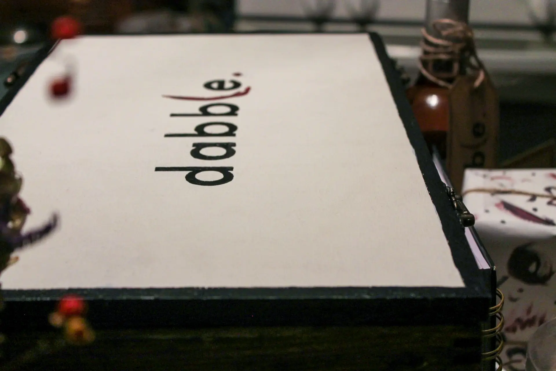
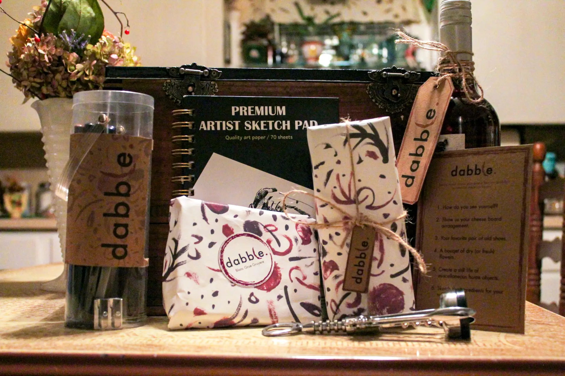
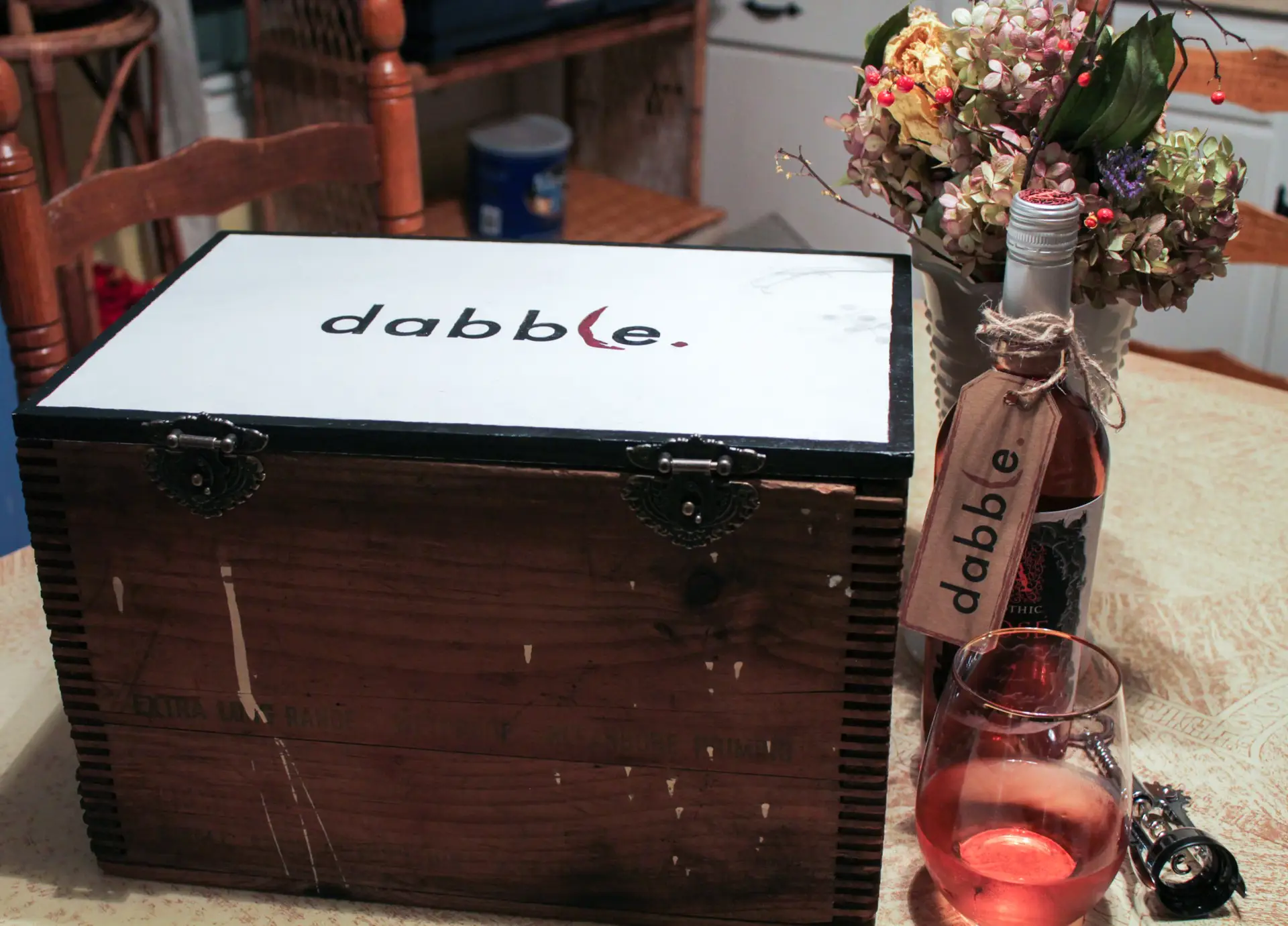
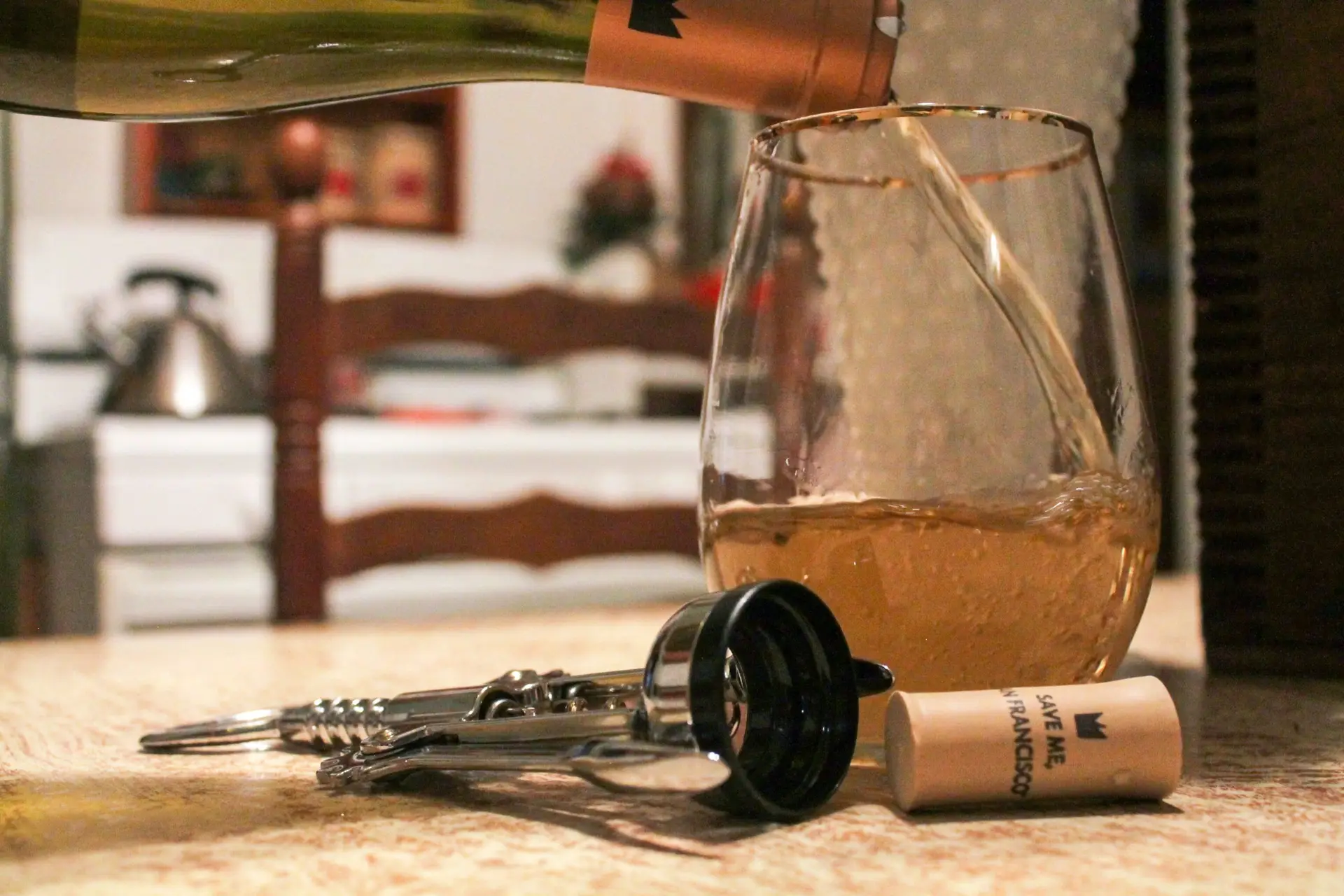
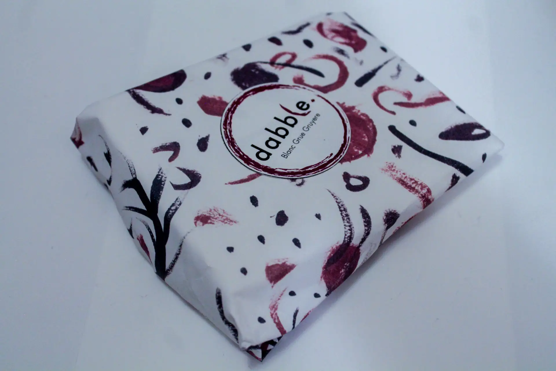
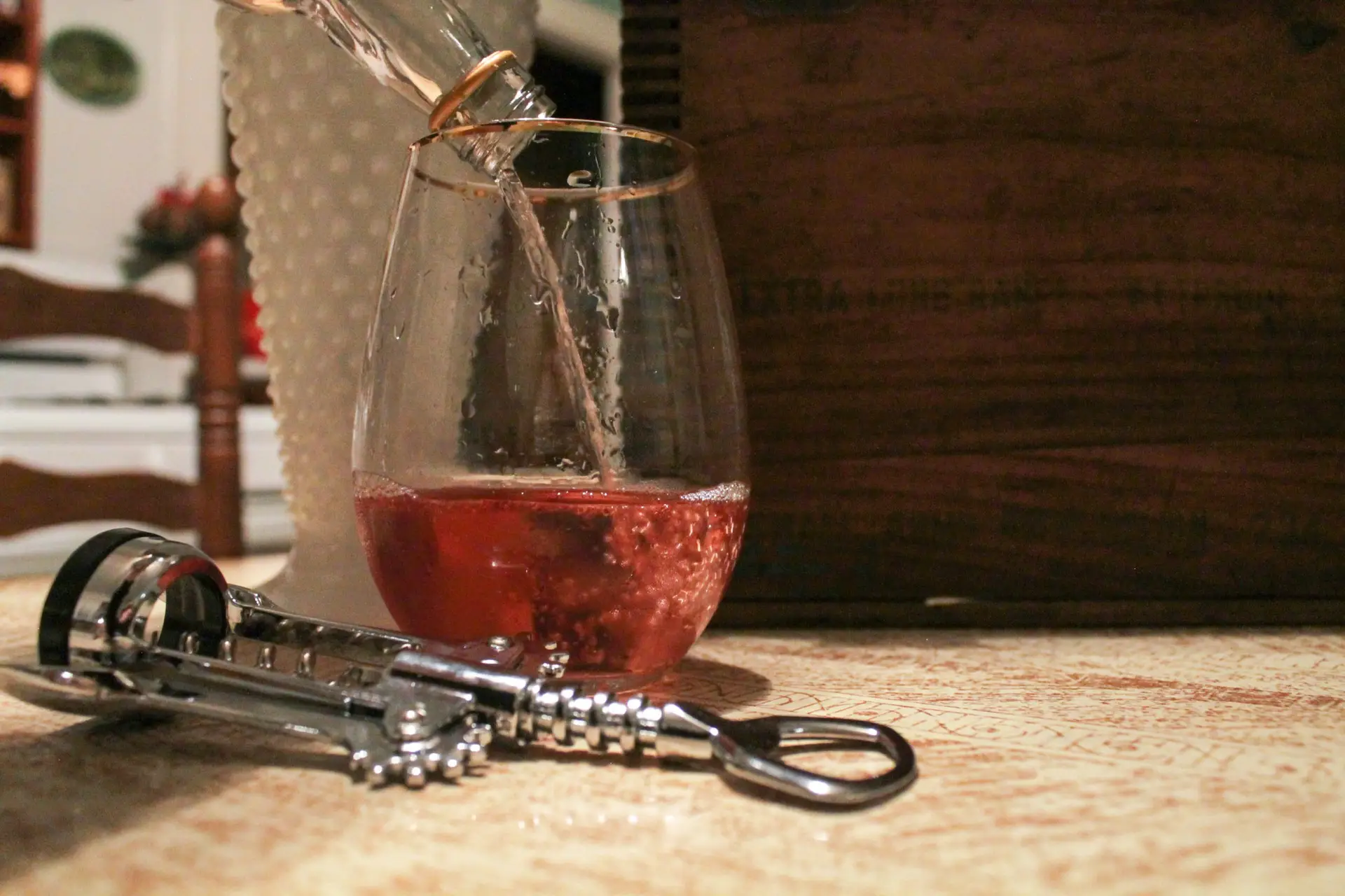
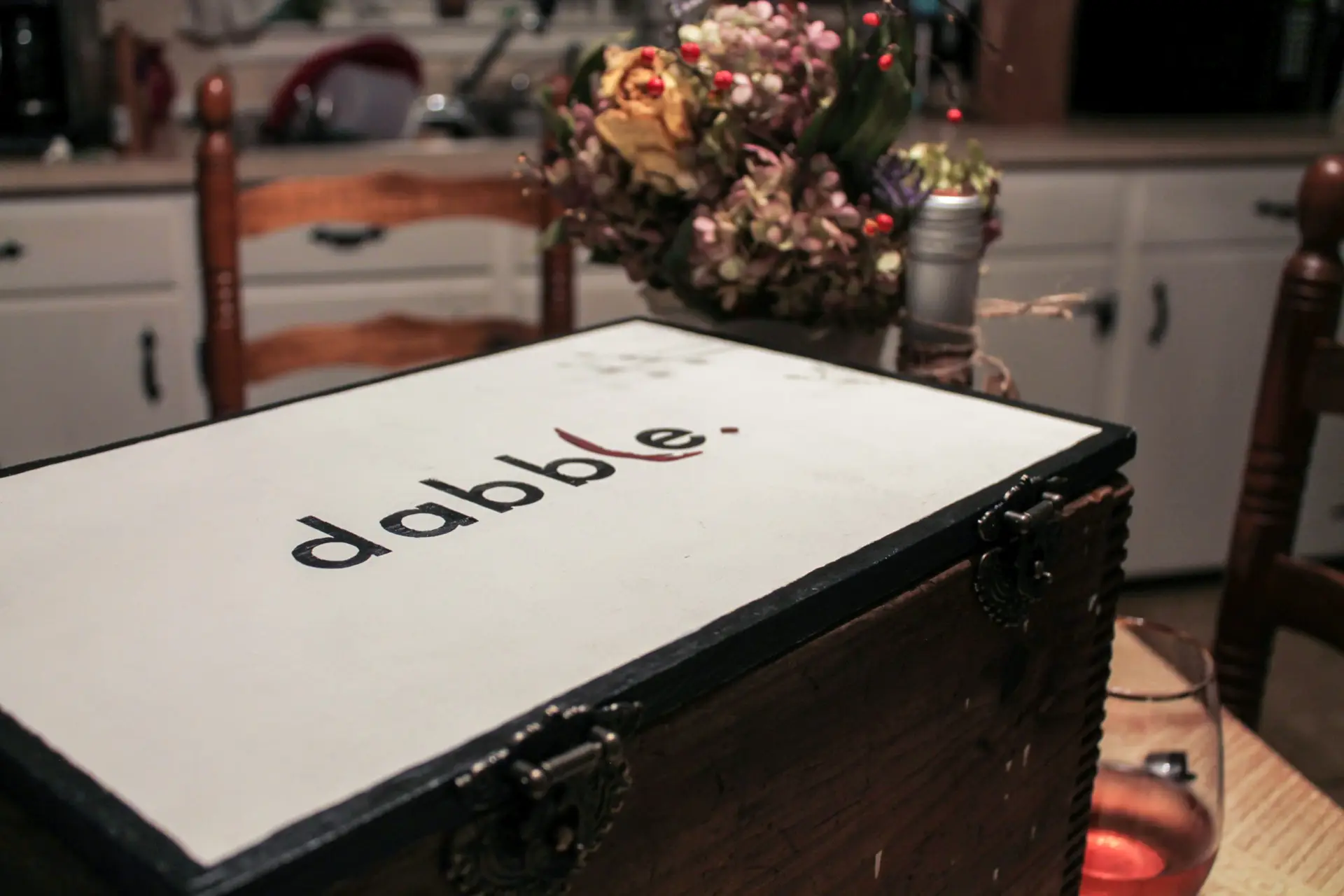
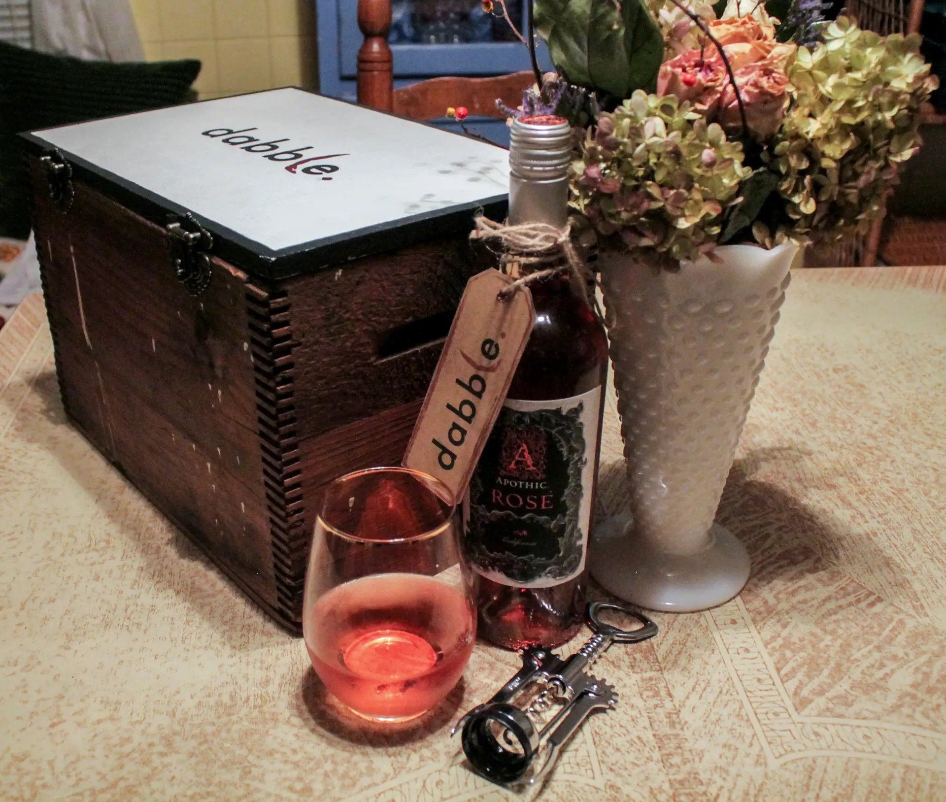
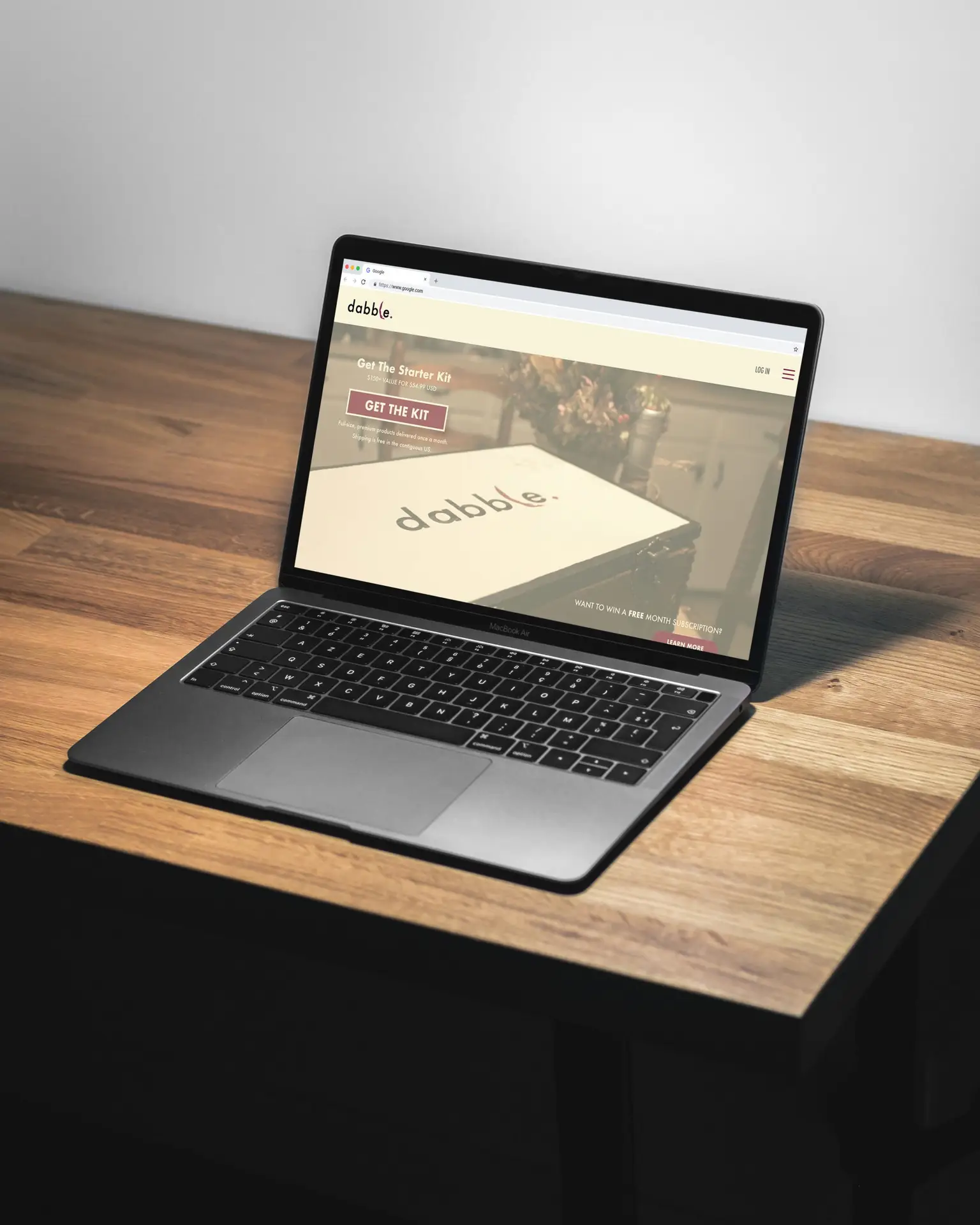
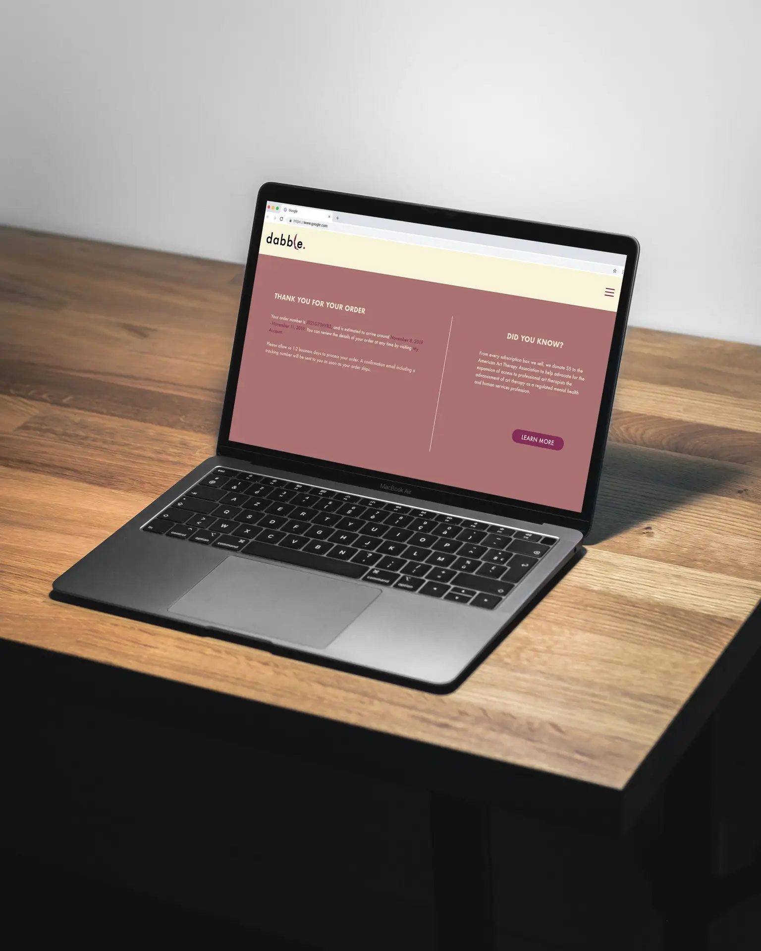
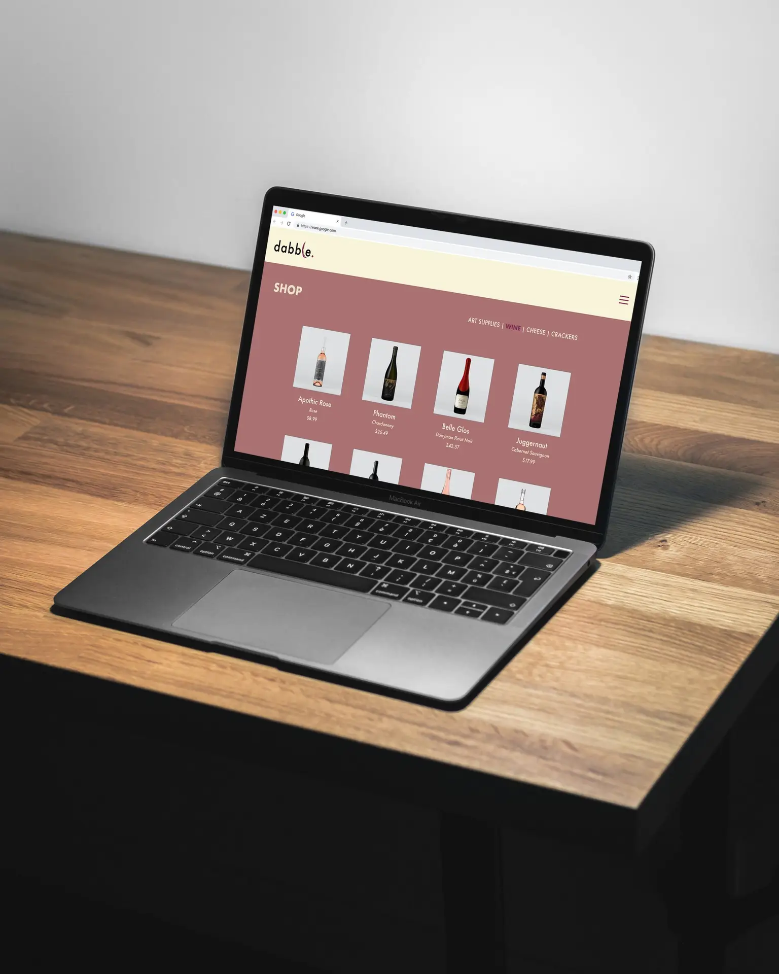
For Digital Media Studio II, we developed a brand, corresponding website prototype, and subscription box on a topic of our choosing. Artistic expression was my main focus of this assignment, and this prompted my concept of an art and wine subscription box named Dabble; a brand that promotes dabbling in various arts. I’m sure that I am not the only one who prefers to drink and do my art at home, as opposed to in public. I used this common interest as inspiration for this project, and developed a wine and art box; similar to that of a “wine and paint” event. It was my intention to communicate artistic expression throughout all aspects of the brand (using brush strokes, homemade patterns, and more).
The monthly subscription box features a bottle of wine, an art project with supplies, and a cracker and cheese pairing, as well as offering several ways to get creative, even down to the lid of the complimentary supply box.
Self-Reflection:
This project encompassed an array of my skills, such as branding, crafting physical prototypes, photography, and web layout design. I took this project as a new challenge, and used the opportunity to come up with a unique concept that was executed beautifully. From the box, to the contents, to the website; this brand and product screams “creative” in a way that is elegant and artistic. I would consider this project one of my strongest yet.
Click the button to view the working desktop prototype for Dabble Creative.
catalog publication design
Posted on by Rhea Diehl
catalog publication design
branding | publication | digital media
Challenge:
Develop a catalog based on a product of your choosing, complete with branding elements.
Design Solution:
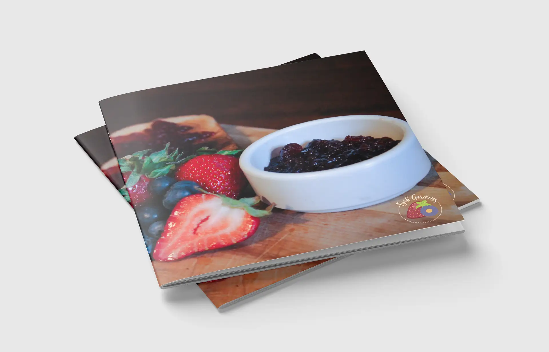
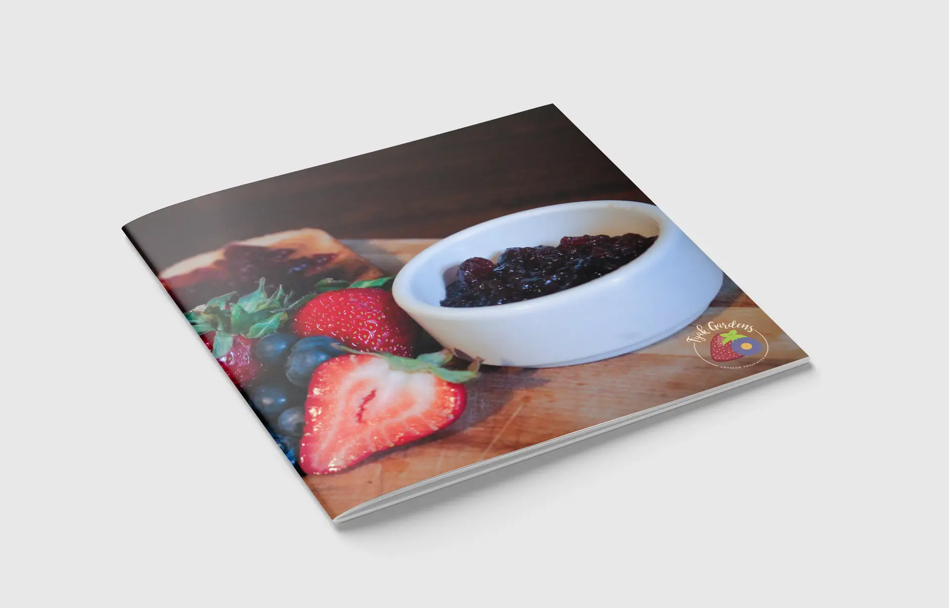
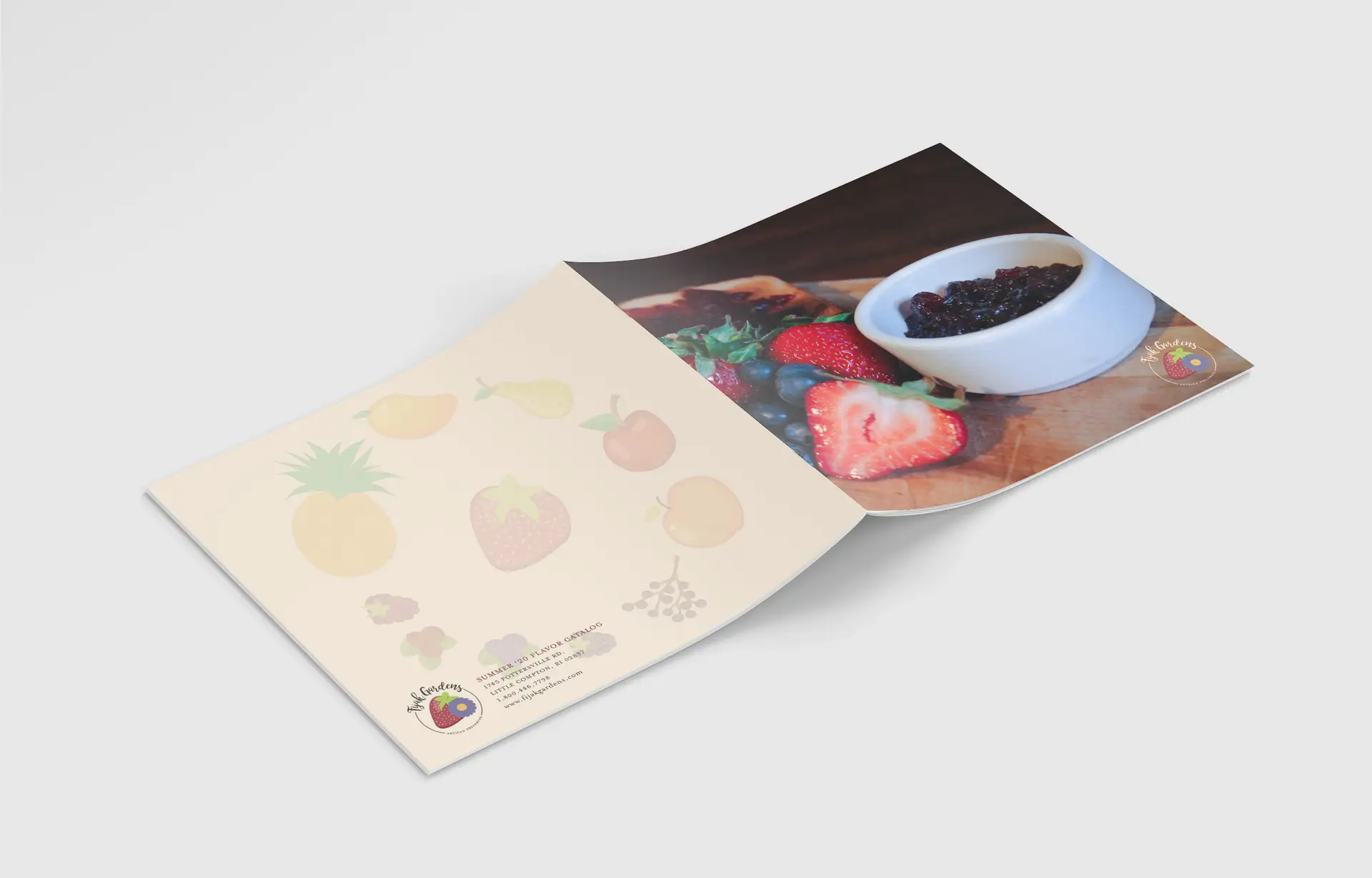
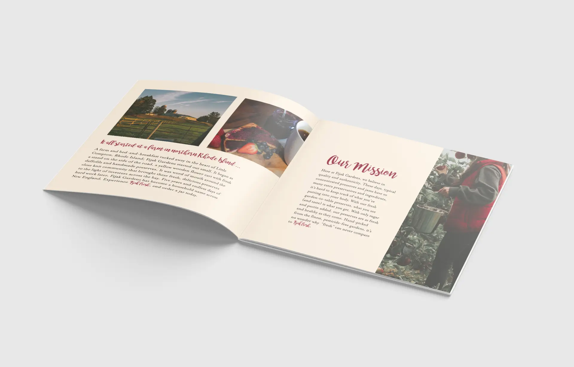
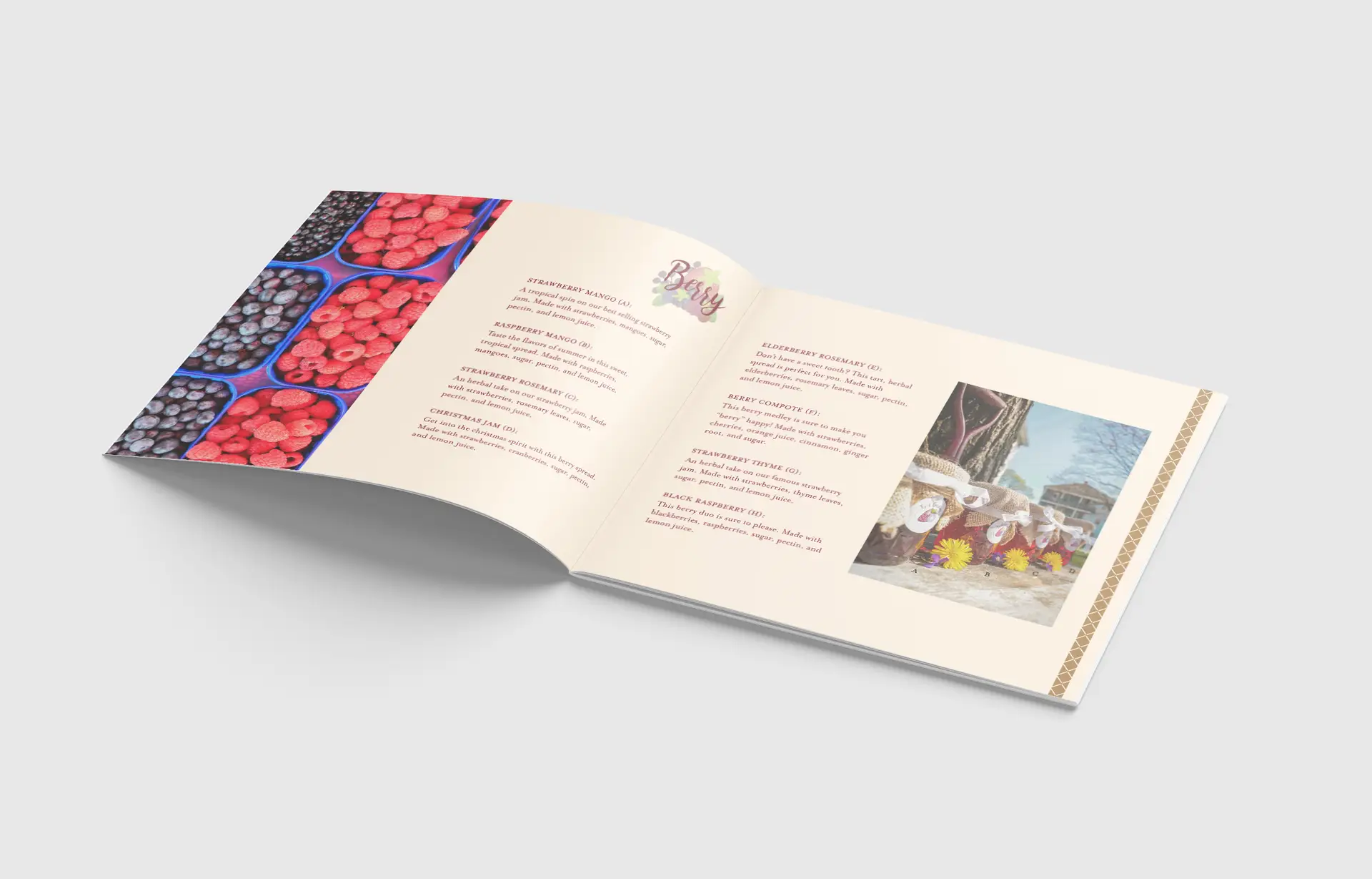
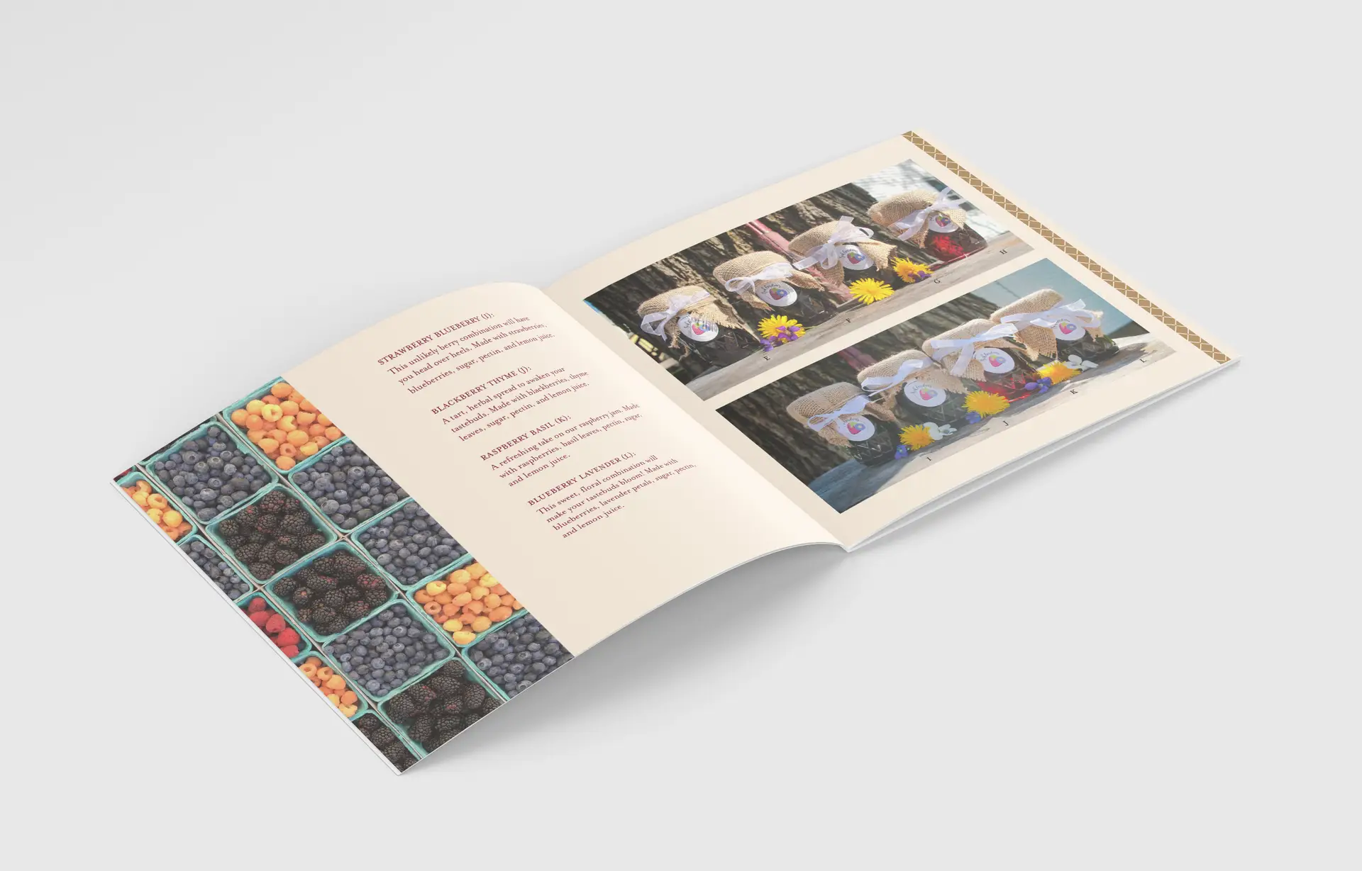
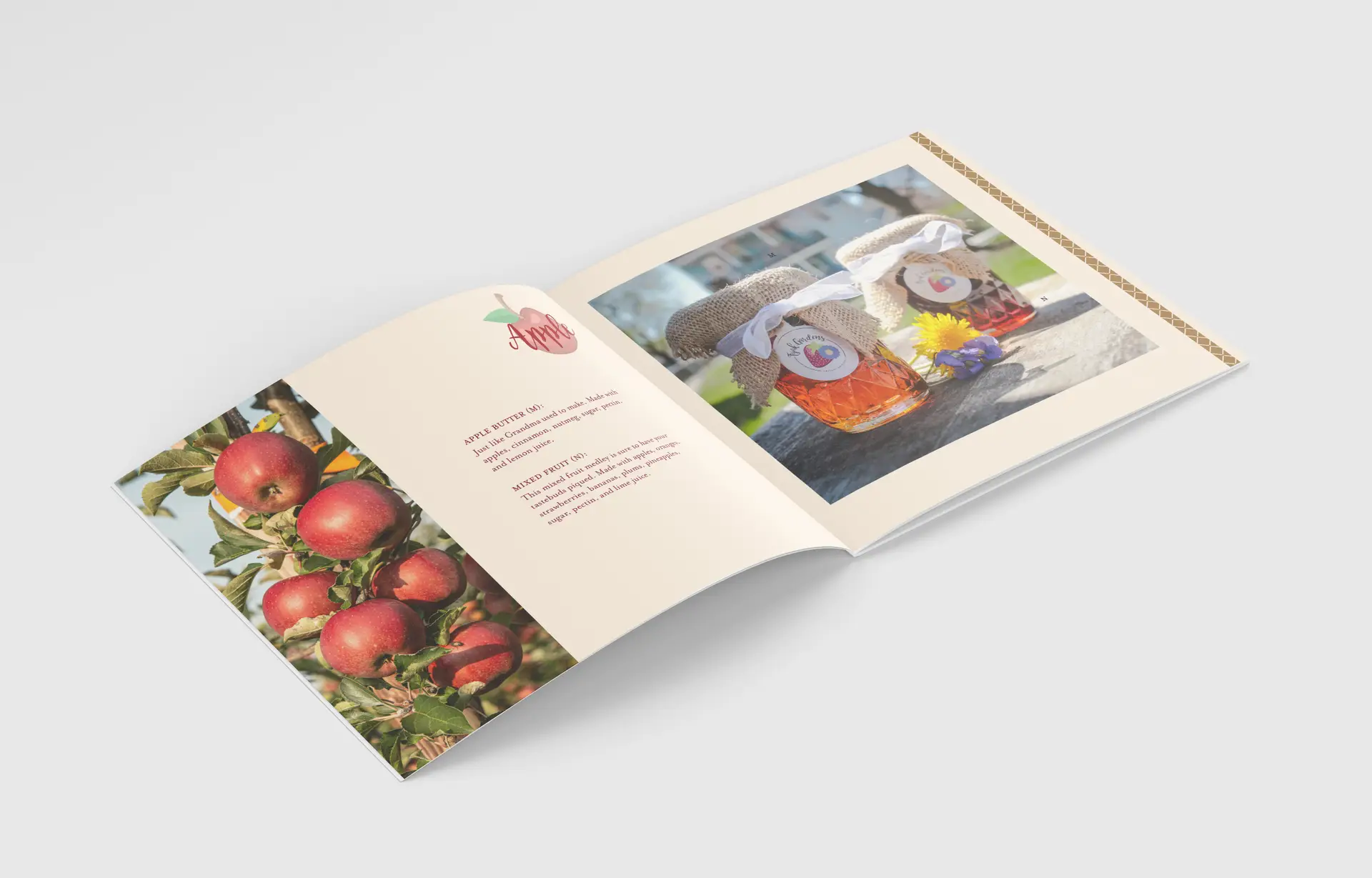
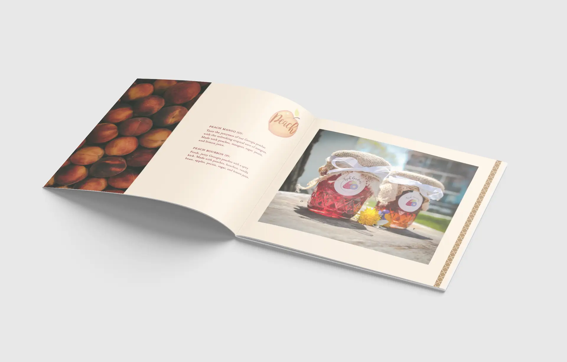
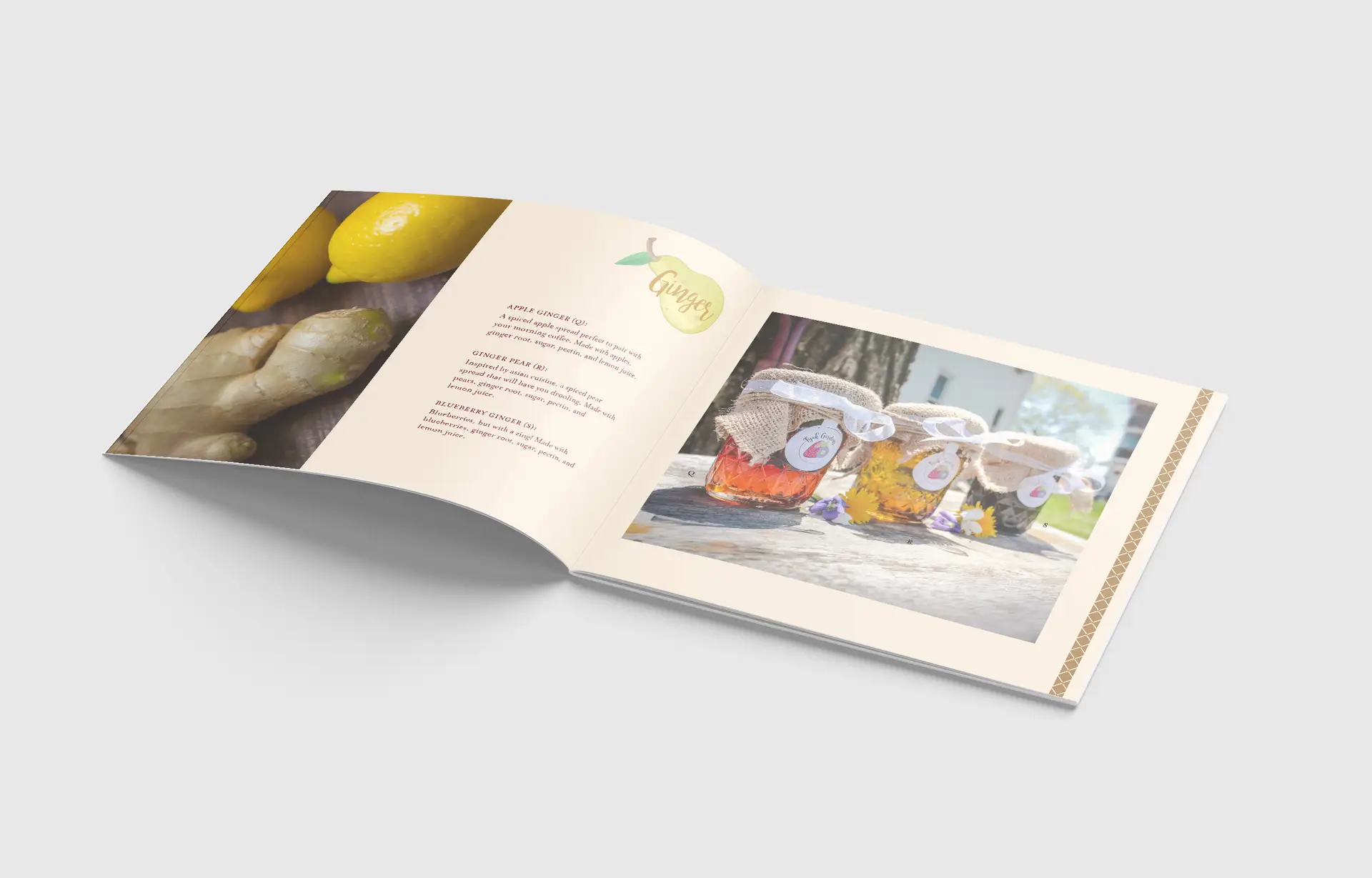
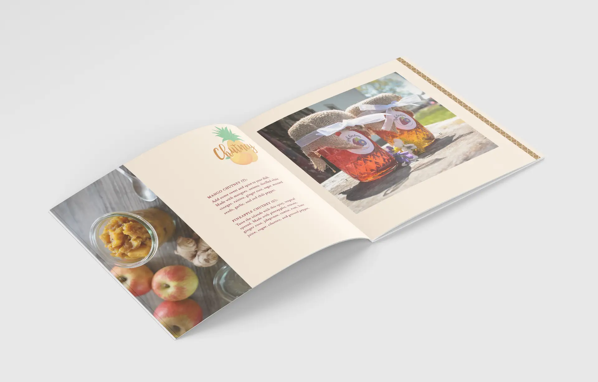
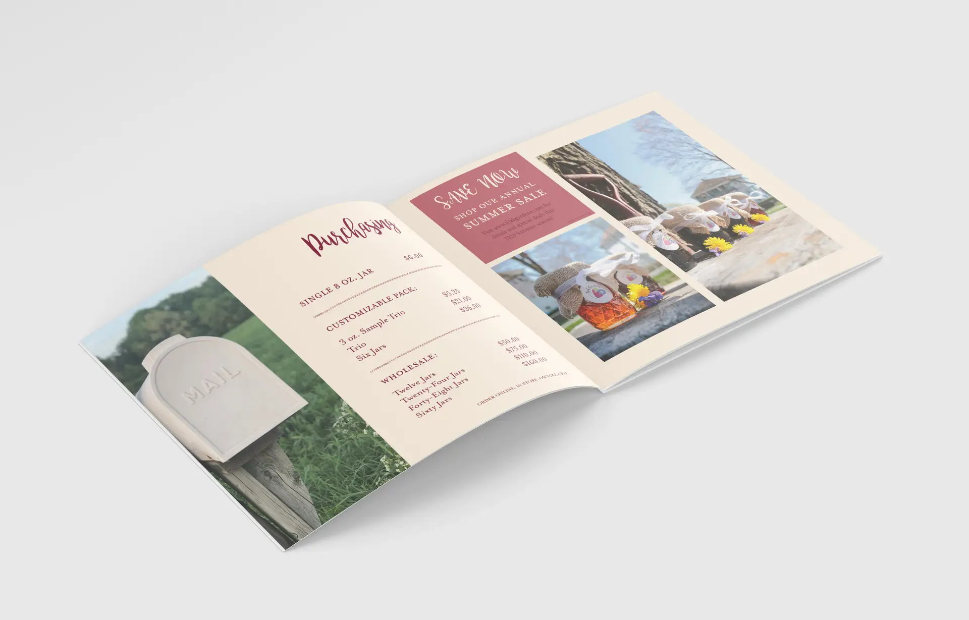
For Digital Media Studio I, I created a brand centered around fresh, artisan preserves. Growing up, I always helped my Grandma (Fijak) pick fruits from her gardens, and tried my best, as a five year old with mediocre cooking knowledge, to help her create her fruit preserves. To this day, I drool over the thought of her jams in my Christmas baskets ever year. I took inspiration from these cherished family moments to develop the company Fijak Gardens. Since my inspiration came from the concept of homemade, preserved memories, I chose to go a rather “kitcshy” tone for the brand aesthetic. Fijak Gardens is all about farm to table, fresh ingredients and cooking with care. When these aspects come to mind, the first thing that always comes to mind is a “homemade-grandma” vibe, so I honed in on this tone in my packaging methods, logo design, and even photo composition.
We are set out amongst the rest of our competitors, and I wanted the catalog to shout this from the rooftops, using high-end and kitschy elements to create an all-around successful farm-to-table brand.
Self-Reflection:
The passion I put into this project is definitely more than usual, but then again, not all of my projects have a personal connection behind them. Due to this, I feel like I could really pour my heart and soul into the copy, photos, packaging, and logo. I was even able to take this project above and beyond, creating real labels with my Cricut. Crafting my own labels and taking my own photos, rather than using jar mockups, really took this project to the next level.
sneaker brand apparel design
Posted on by Rhea Diehl
sneaker brand apparel design
digital media | brand development | illustration
Challenge:
Develop a creative, innovative shoe brand or collaborative ection complete with brand assets and unique illustrations.
Design Solution:
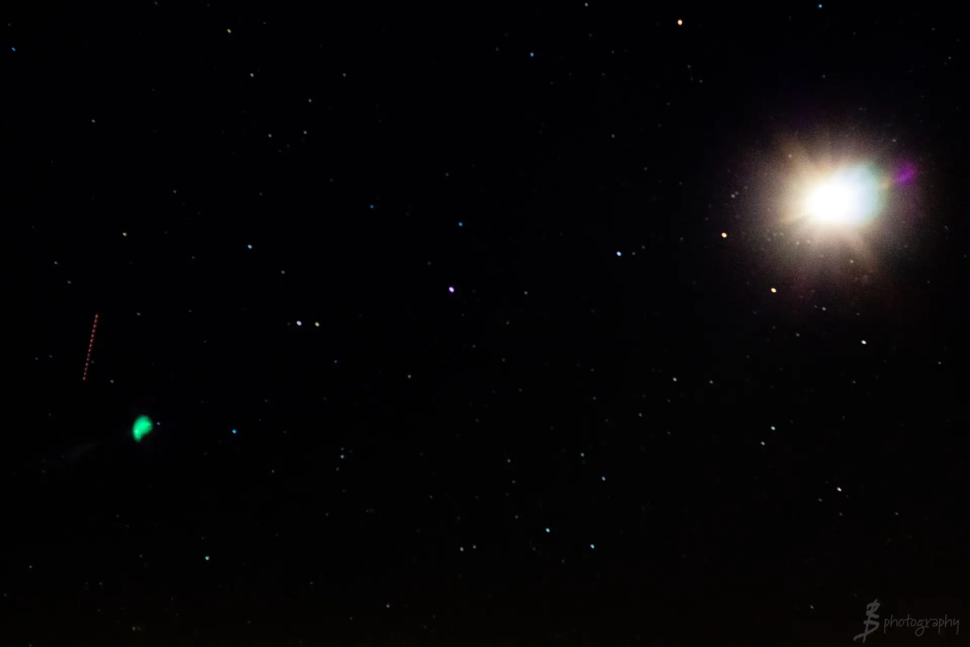
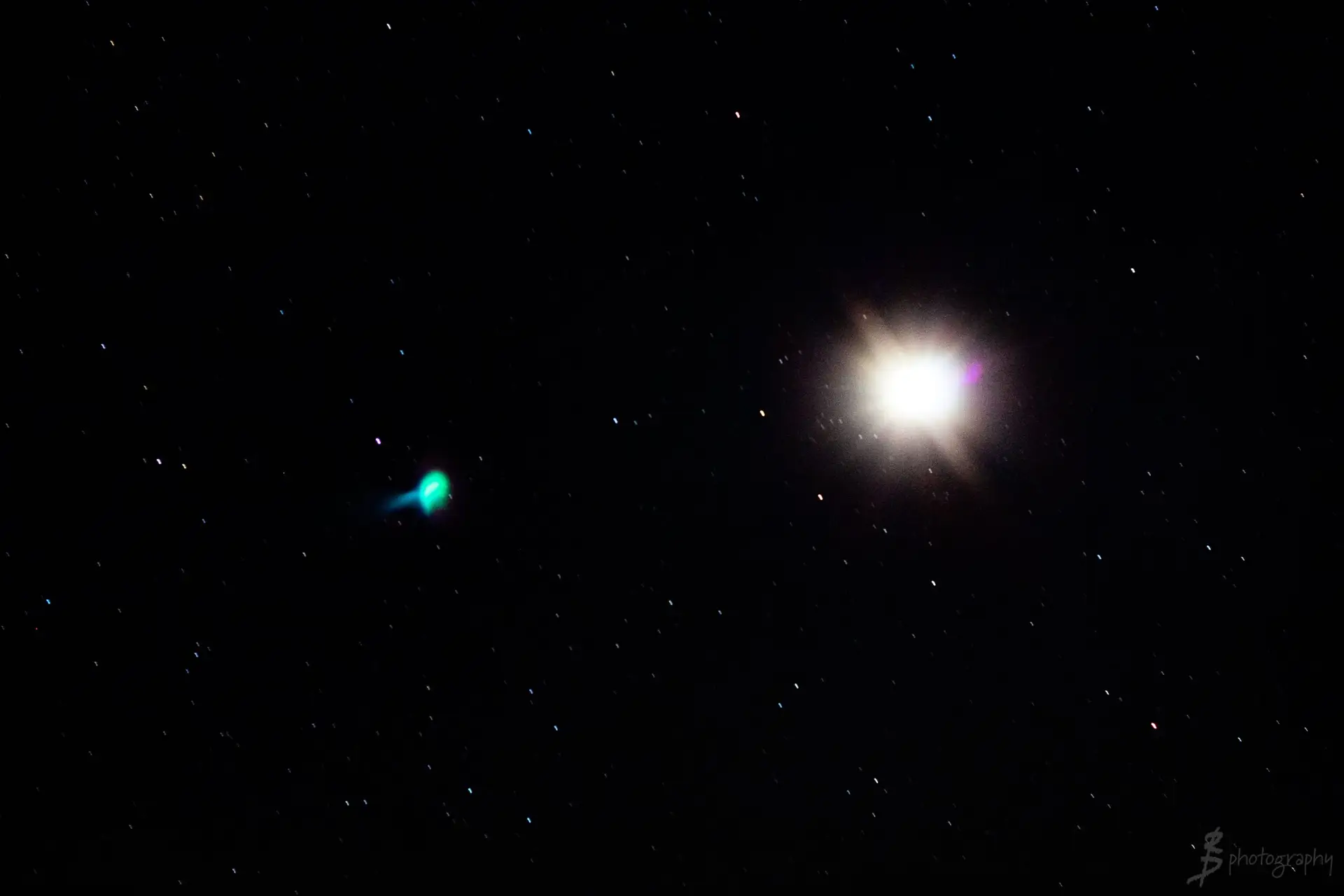
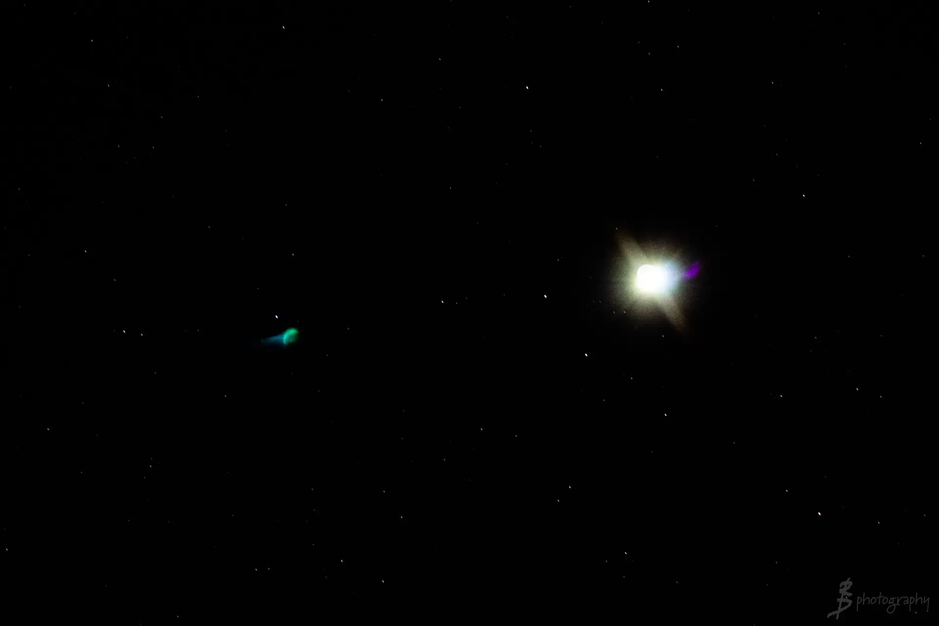
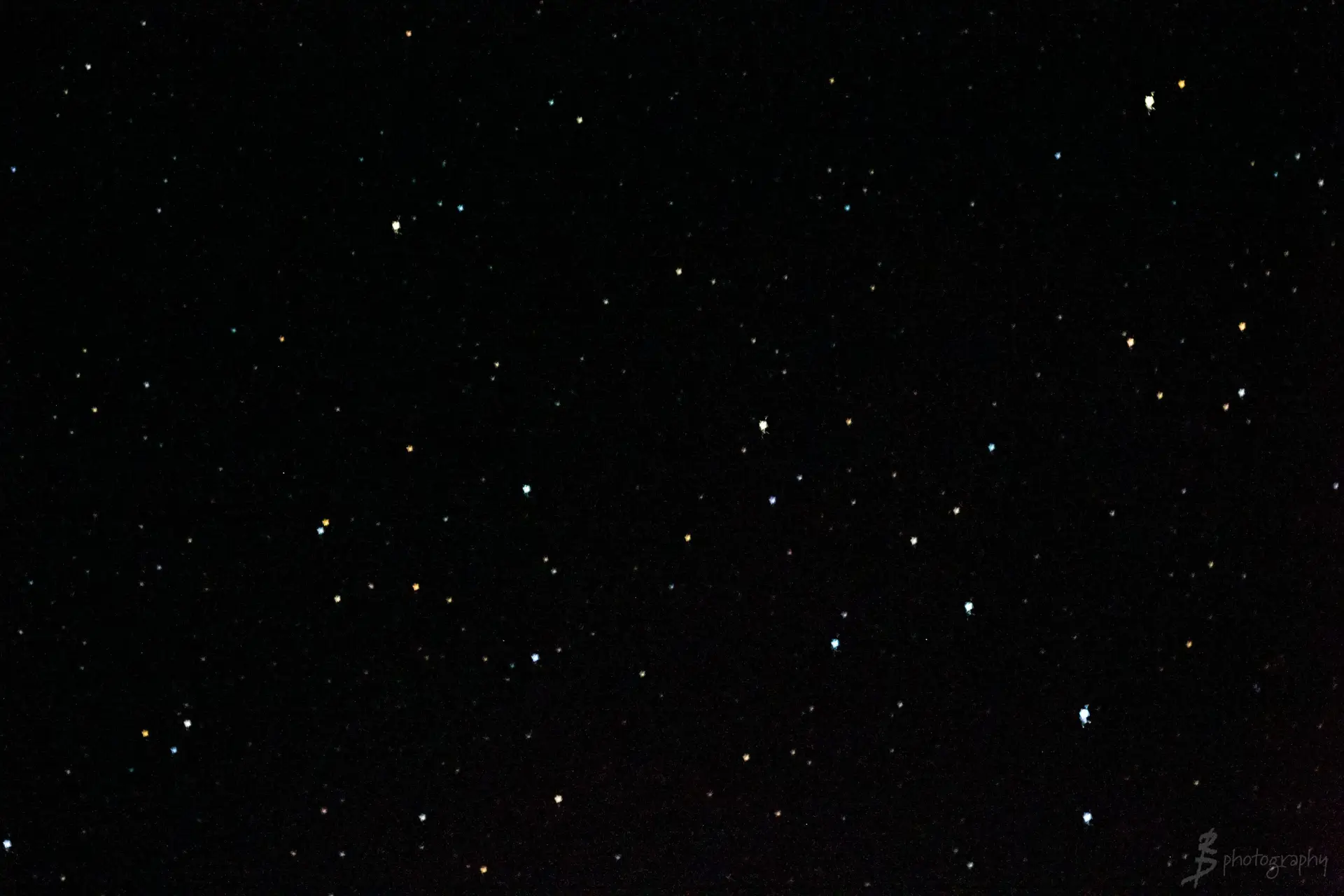
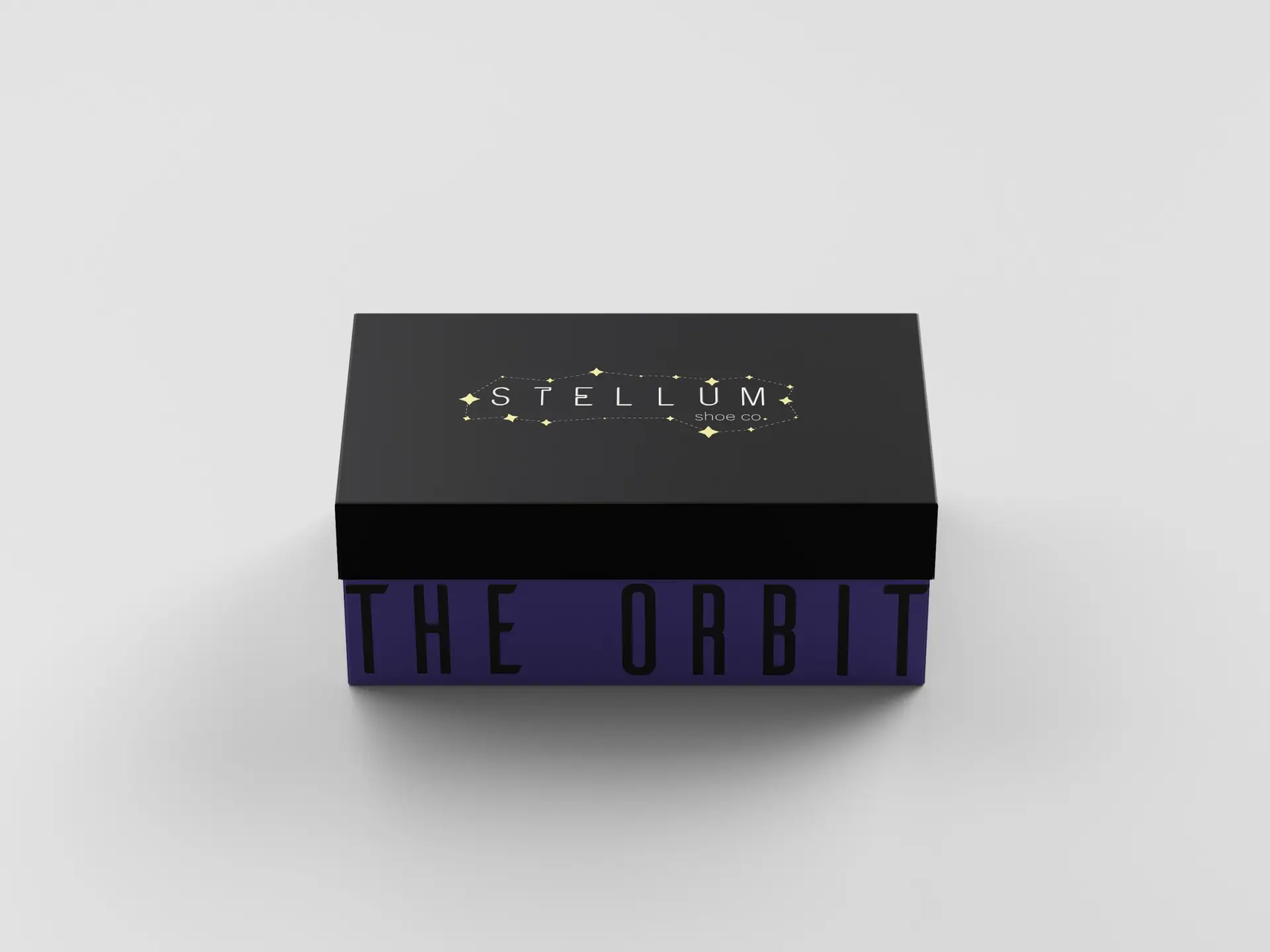
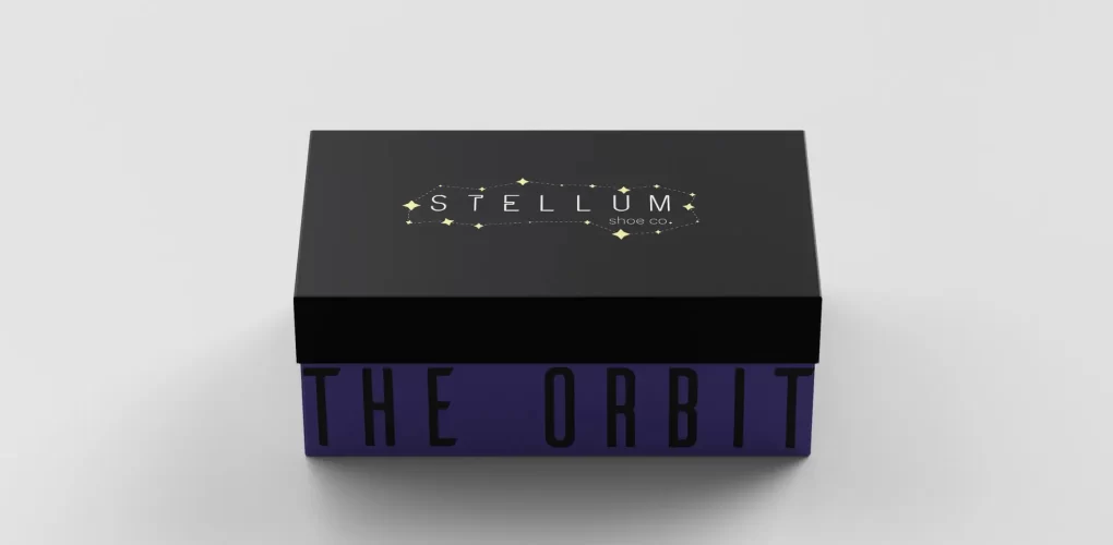
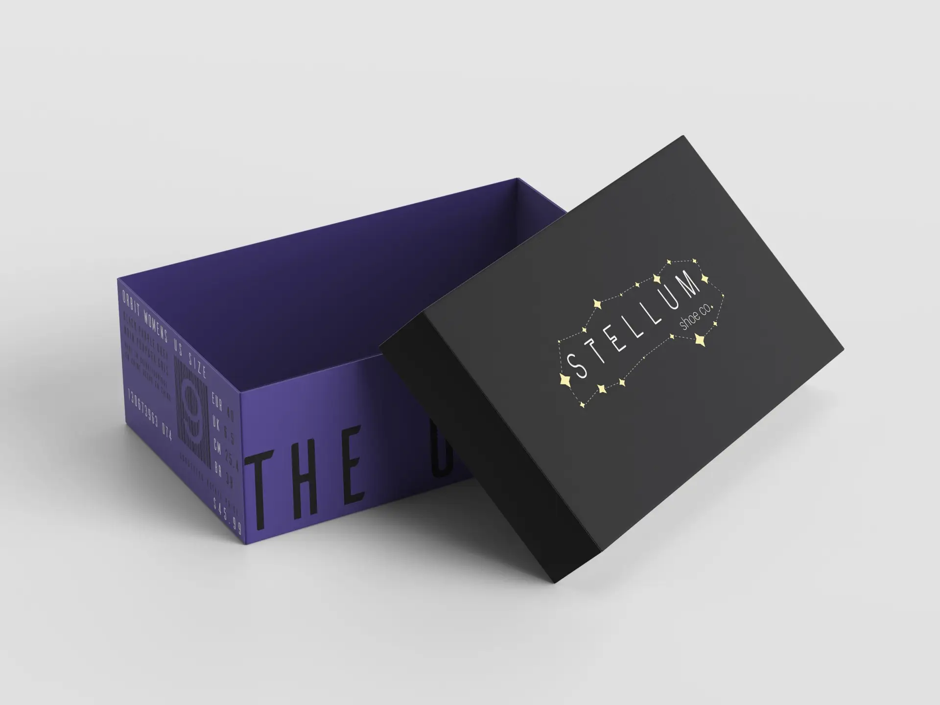
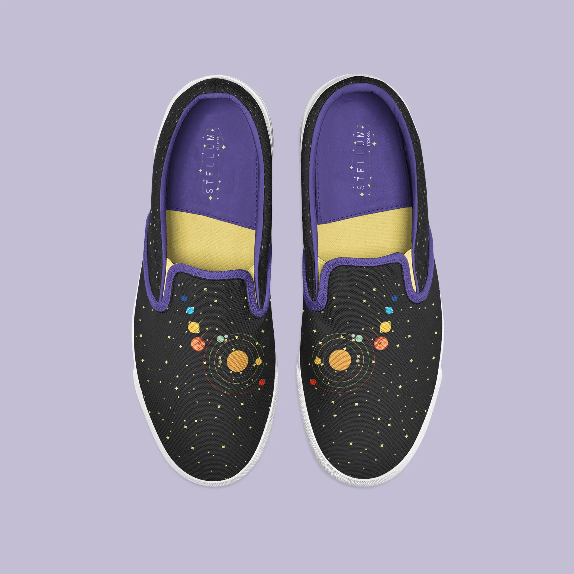
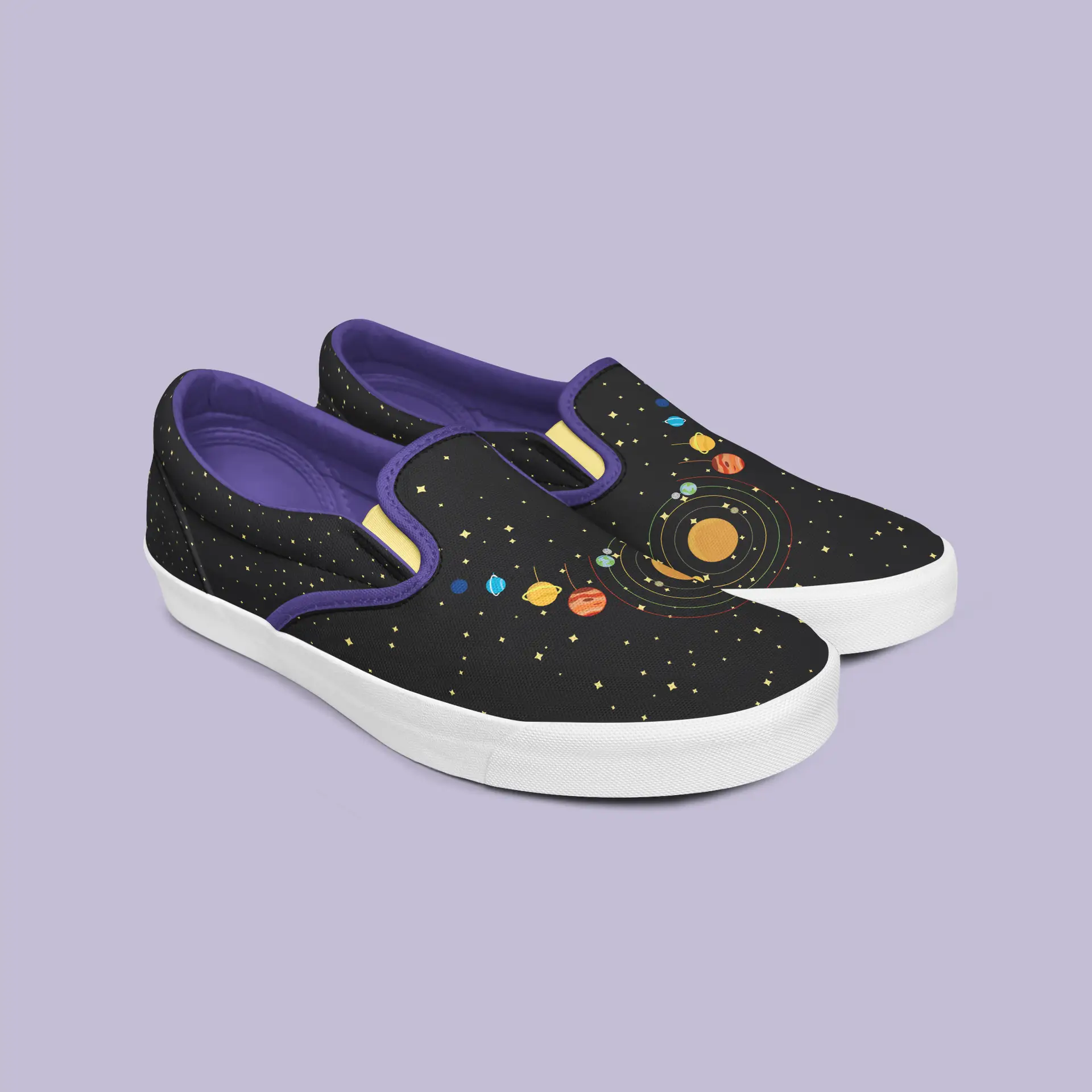
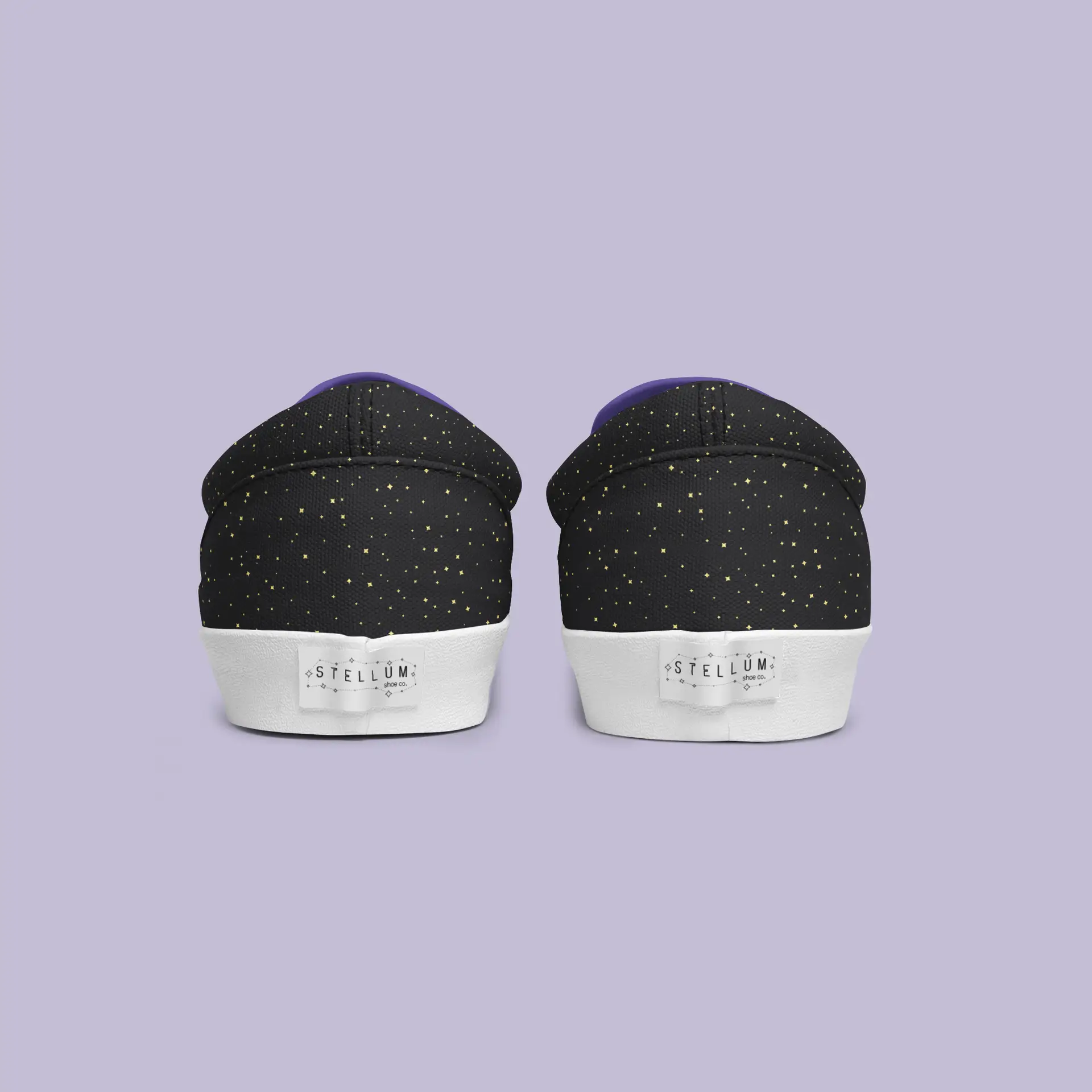
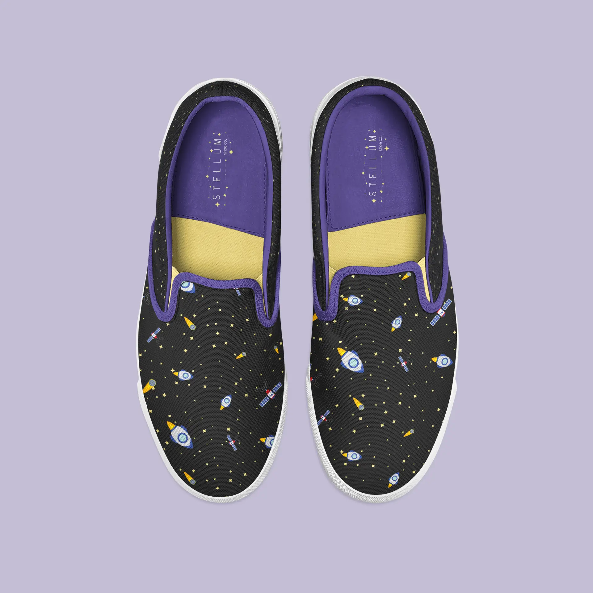
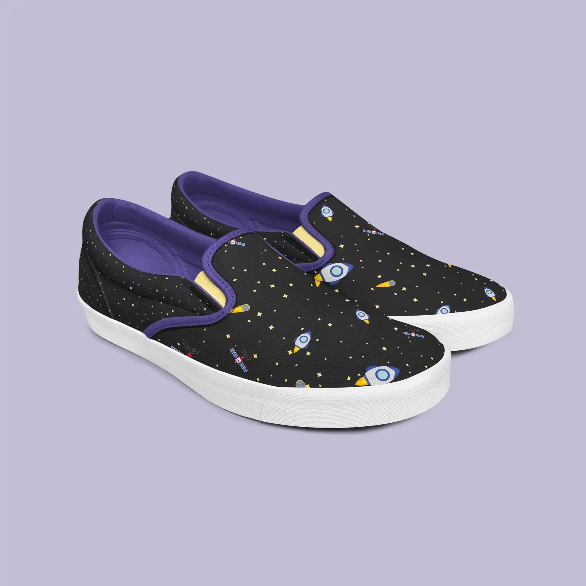
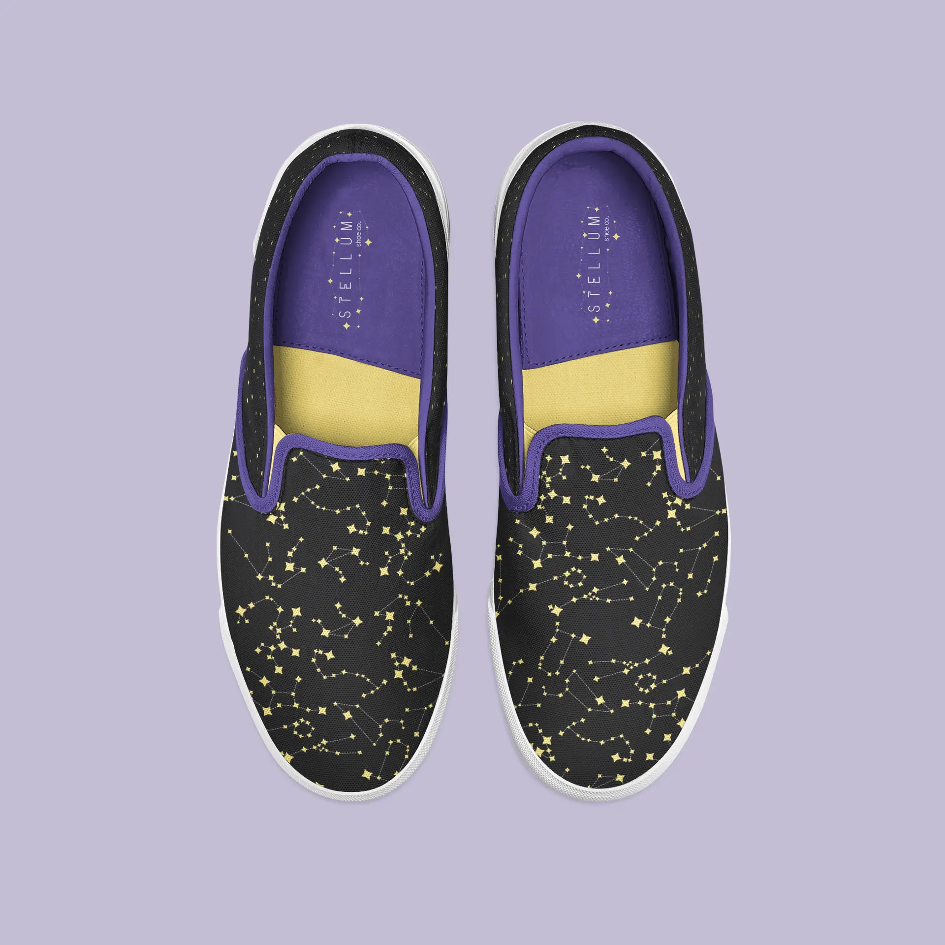
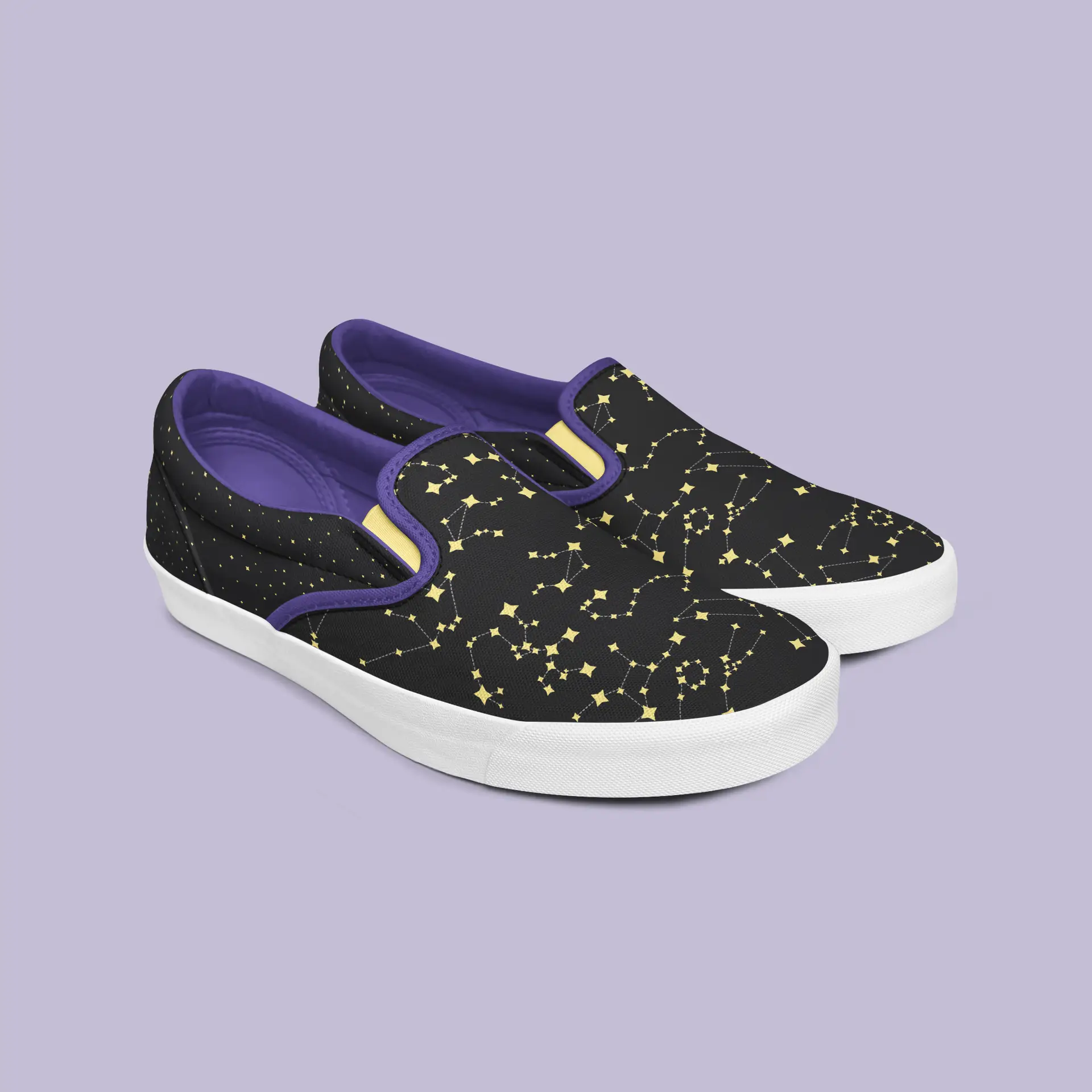
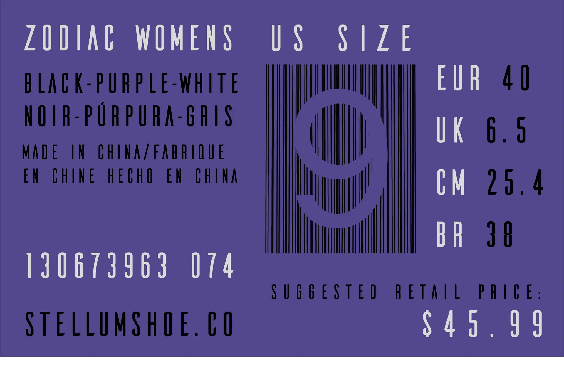
When developing this concept for my Digital Media Studio class, it was at a time where I was really starting to take off in my vector art. Acknowledging that my skills were improving tremendously, I wanted to create a brand centered around vector art and icons. For a few projects, I had been toying with the concept of space, but it had usually been scrapped for a different concept. This time, I decided to take the theme of space and run with it. Finally trying my hand at a space themed design, I wanted to create a brand that could appeal to all ages, but still give off a high-end vibe, inspired by Vans and their famous skate shoes.
I accomplished this by using a thin, clean, unique typeface as the center of the logo, and kept it relatively minimal. The color palette was pulled straight from a photo of the solar system to ensure that the tones used were reflective of our galaxy itself.
Self-Reflection:
I had a ton of fun with this project! I feel like this really showcased where my illustration skills have come from, say, three years ago to now. Not only did it show off my vector icons, but I learned a lot about apparel design in itself, and how to really bring my work to life through the clothes we wear from head to toe.
sticker collection print design
Posted on by Rhea Diehl
sticker collection
digital media | typography | illustration
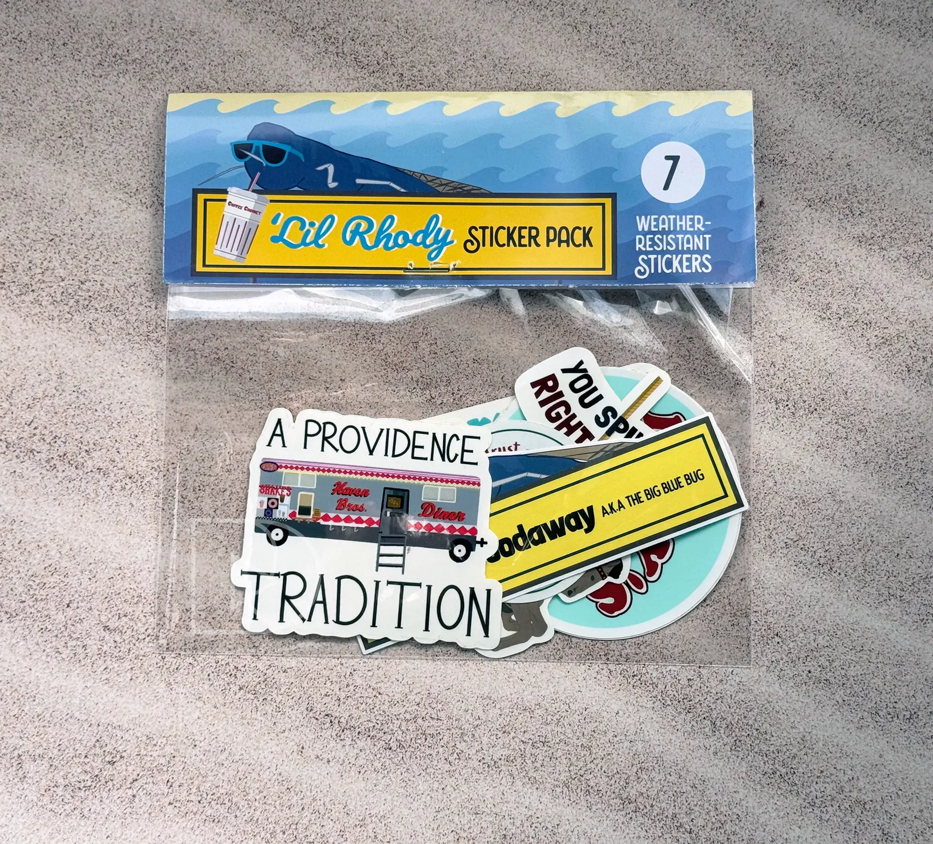
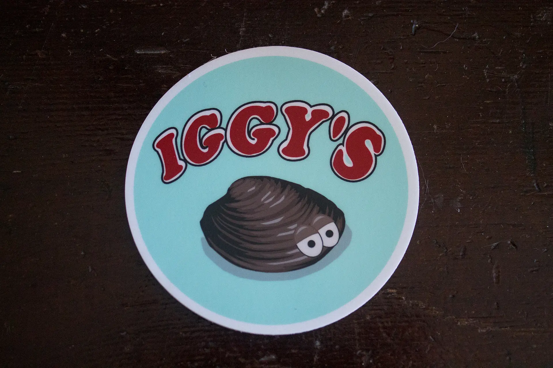
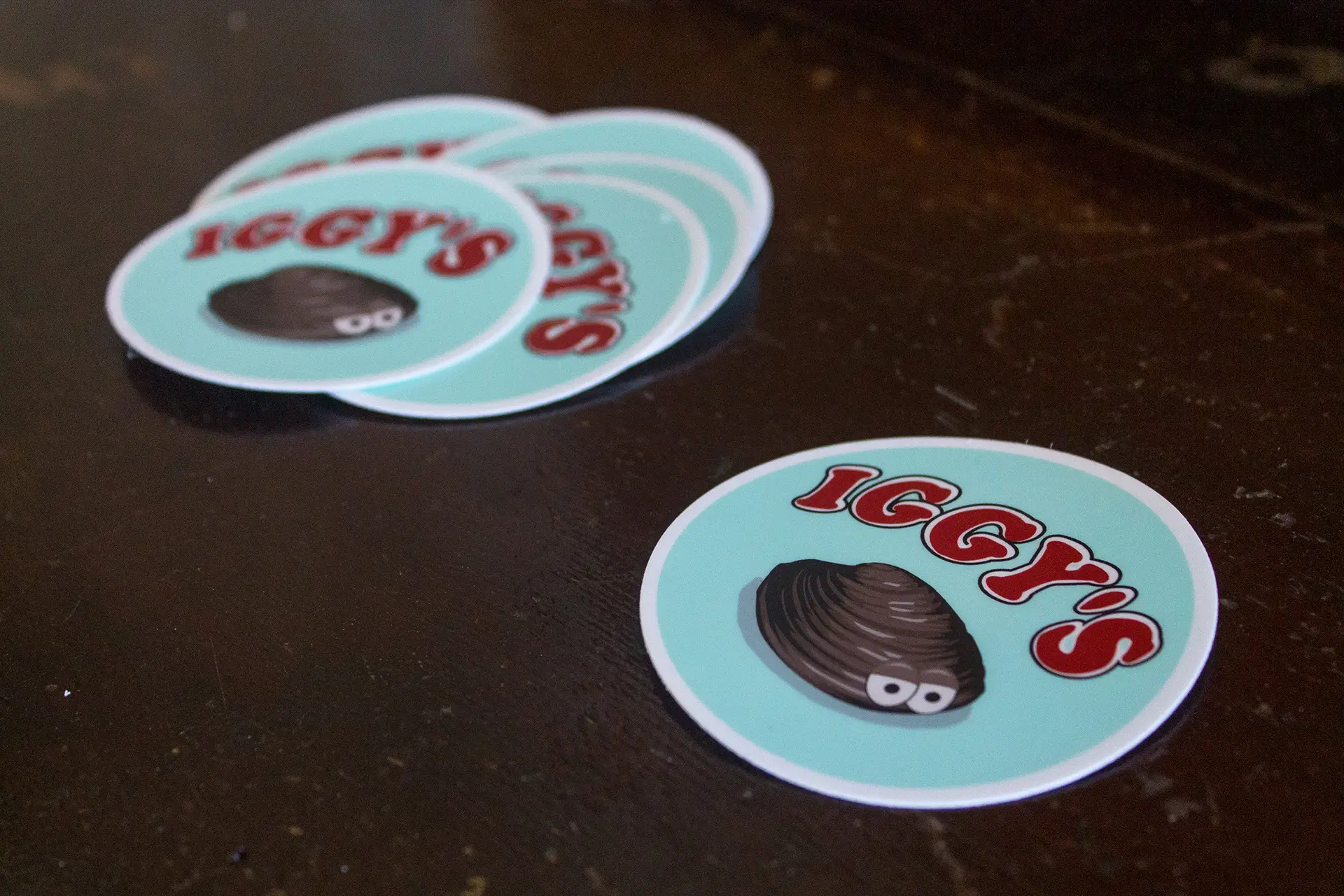
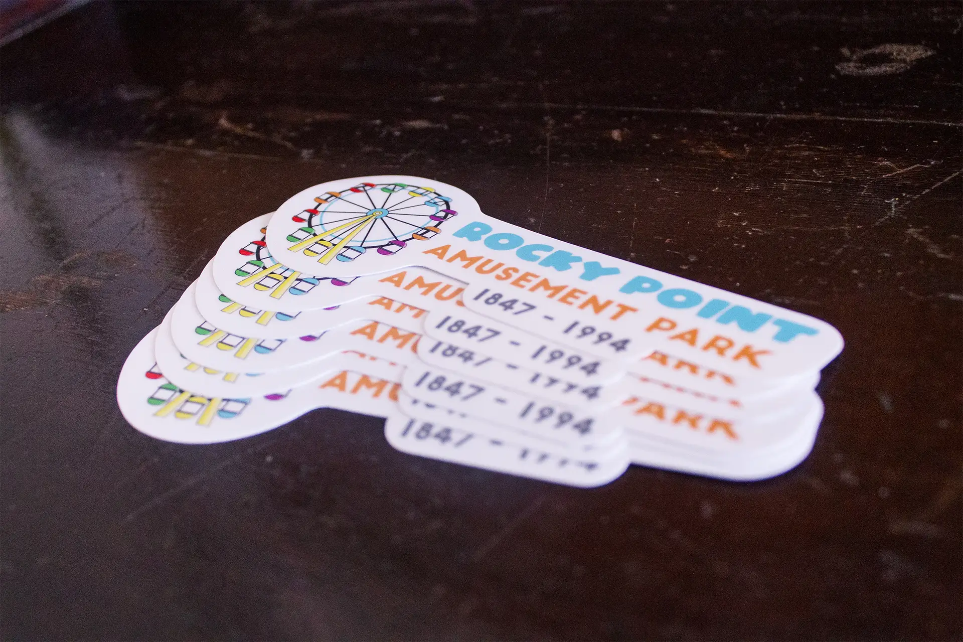
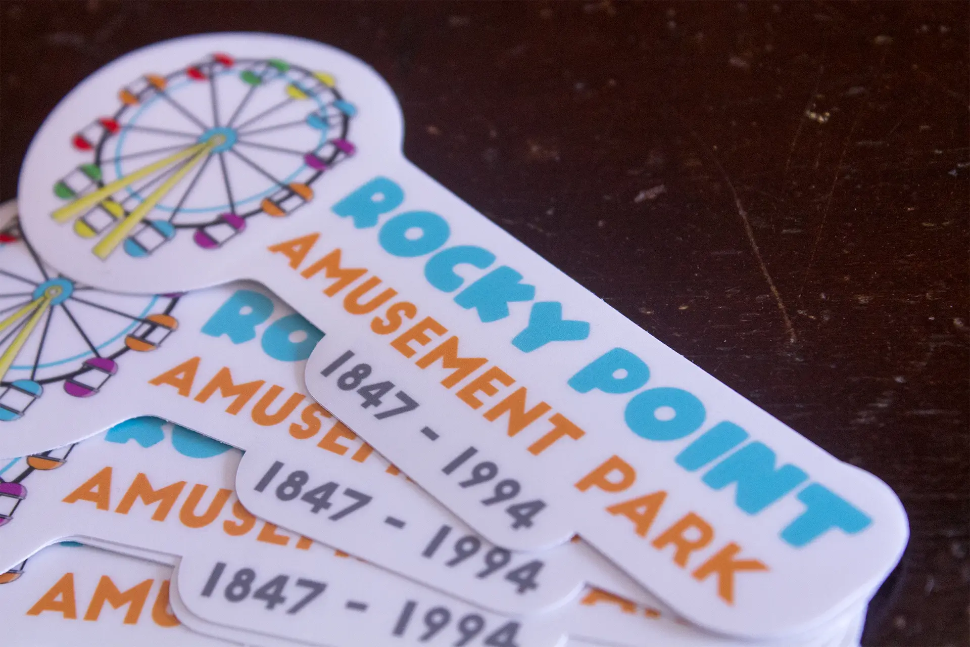
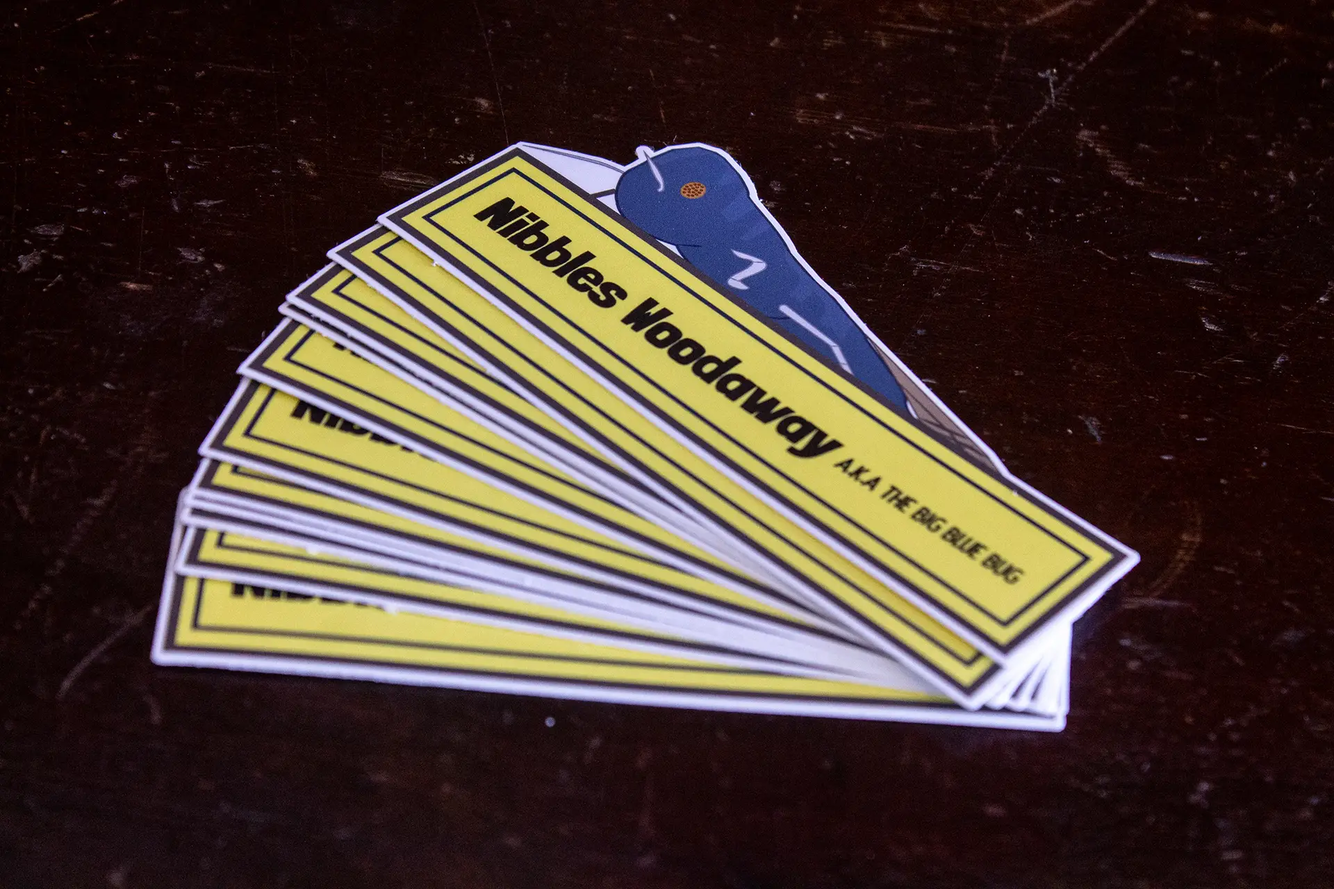
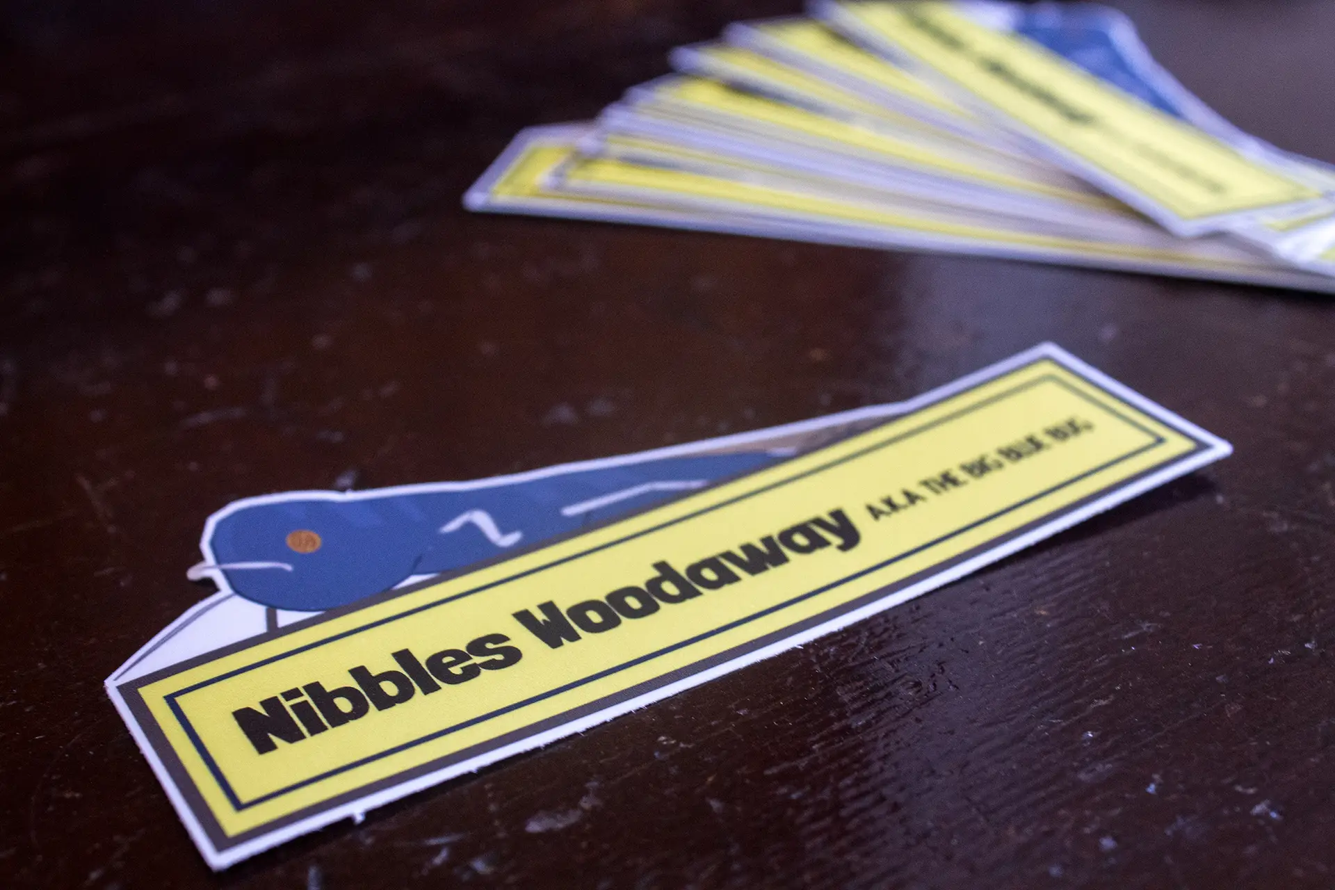
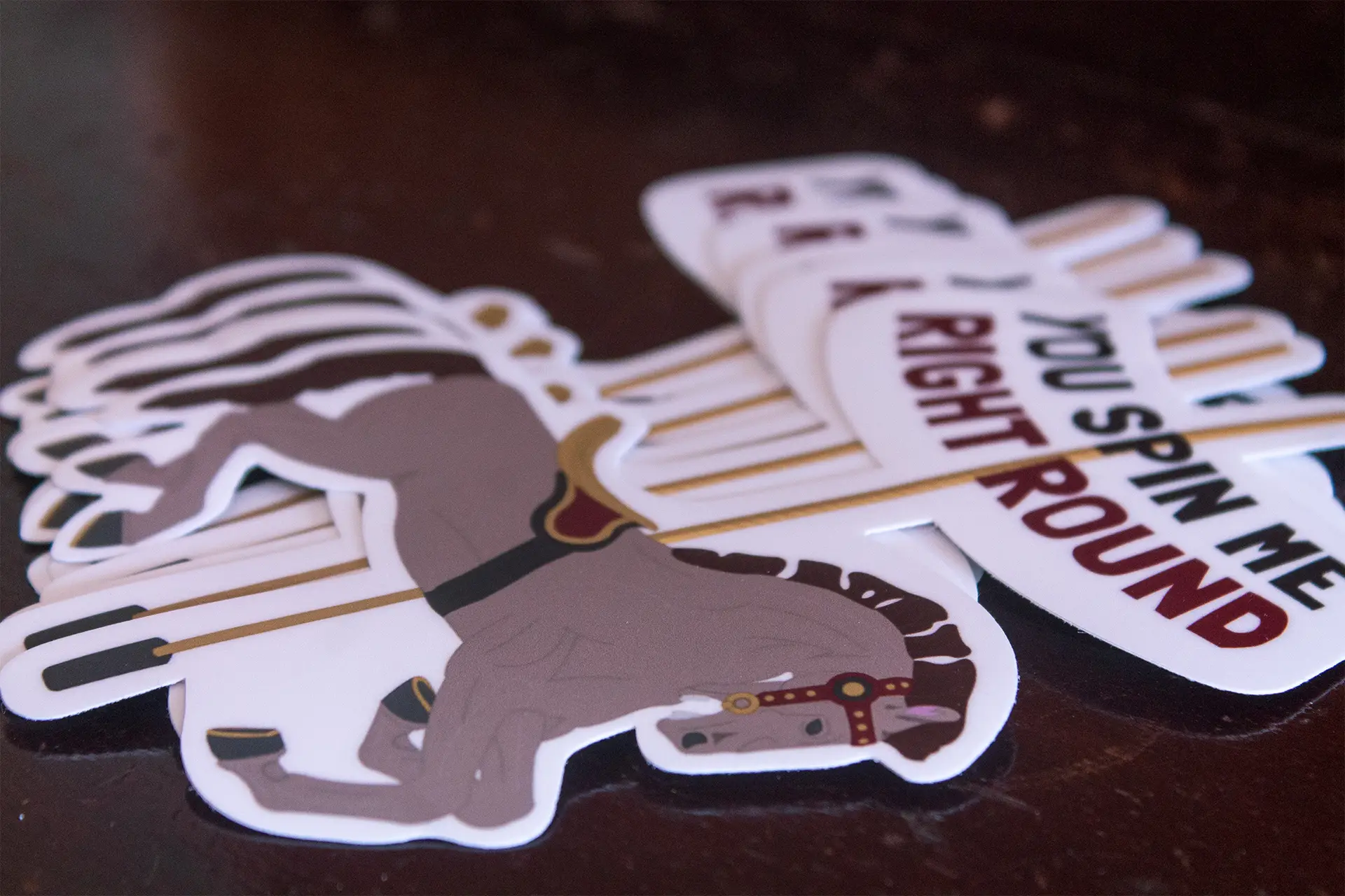
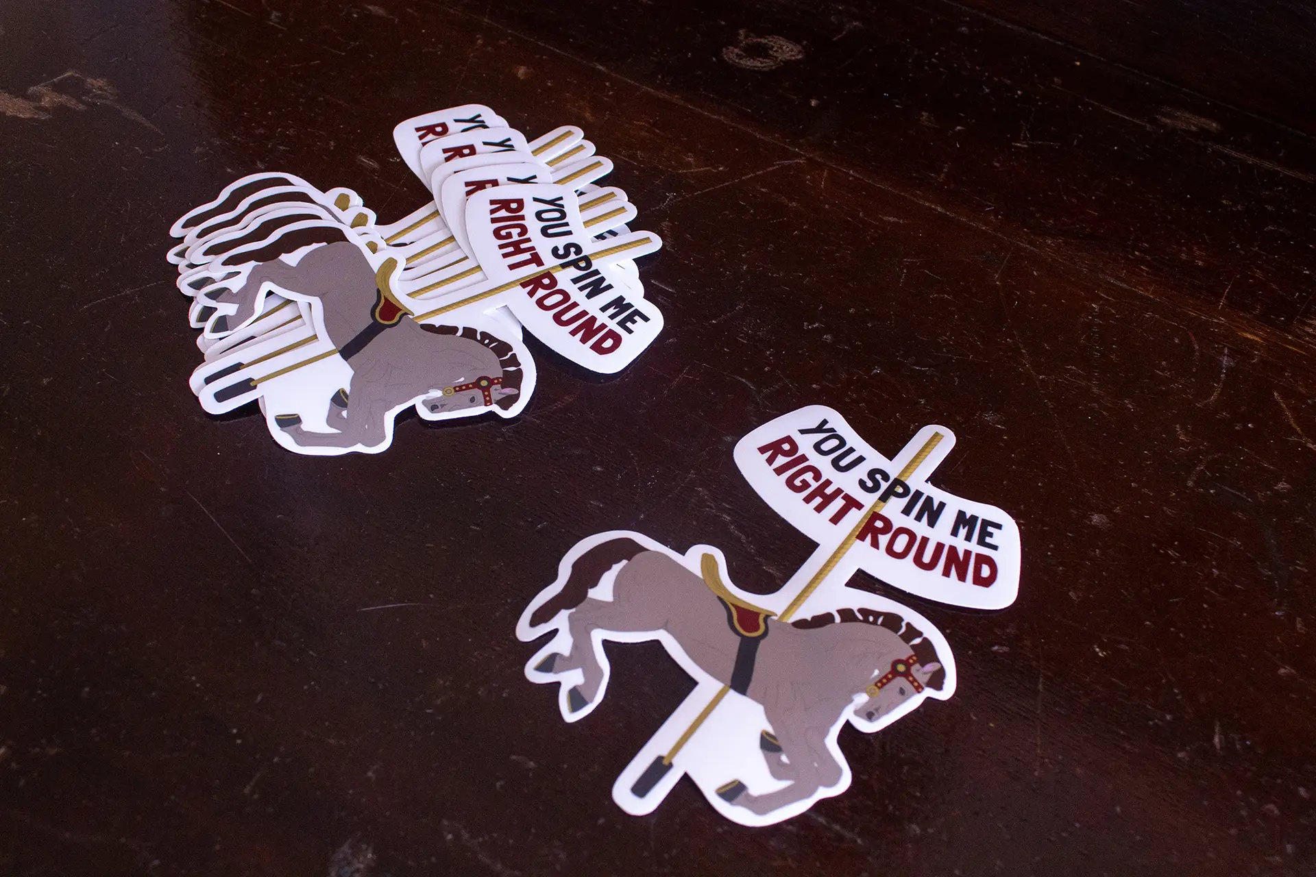
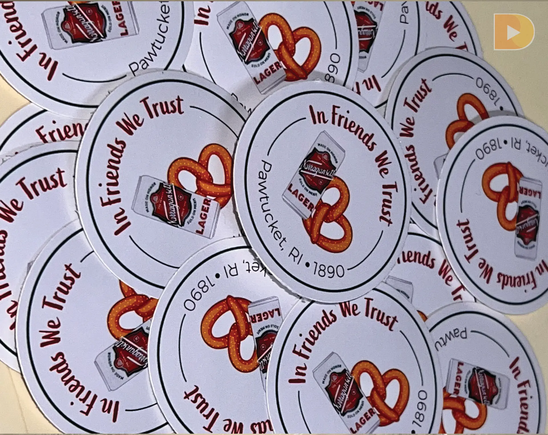
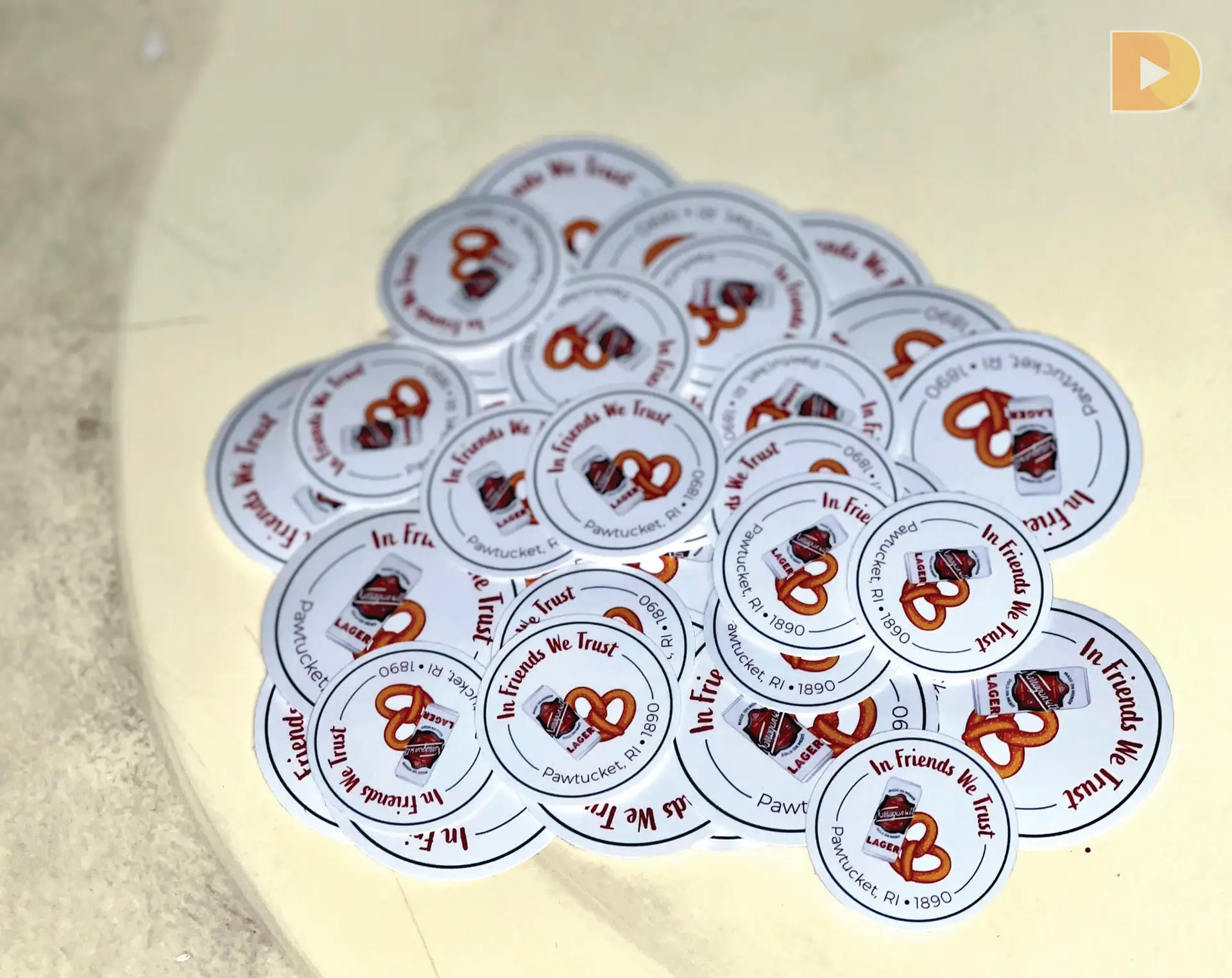
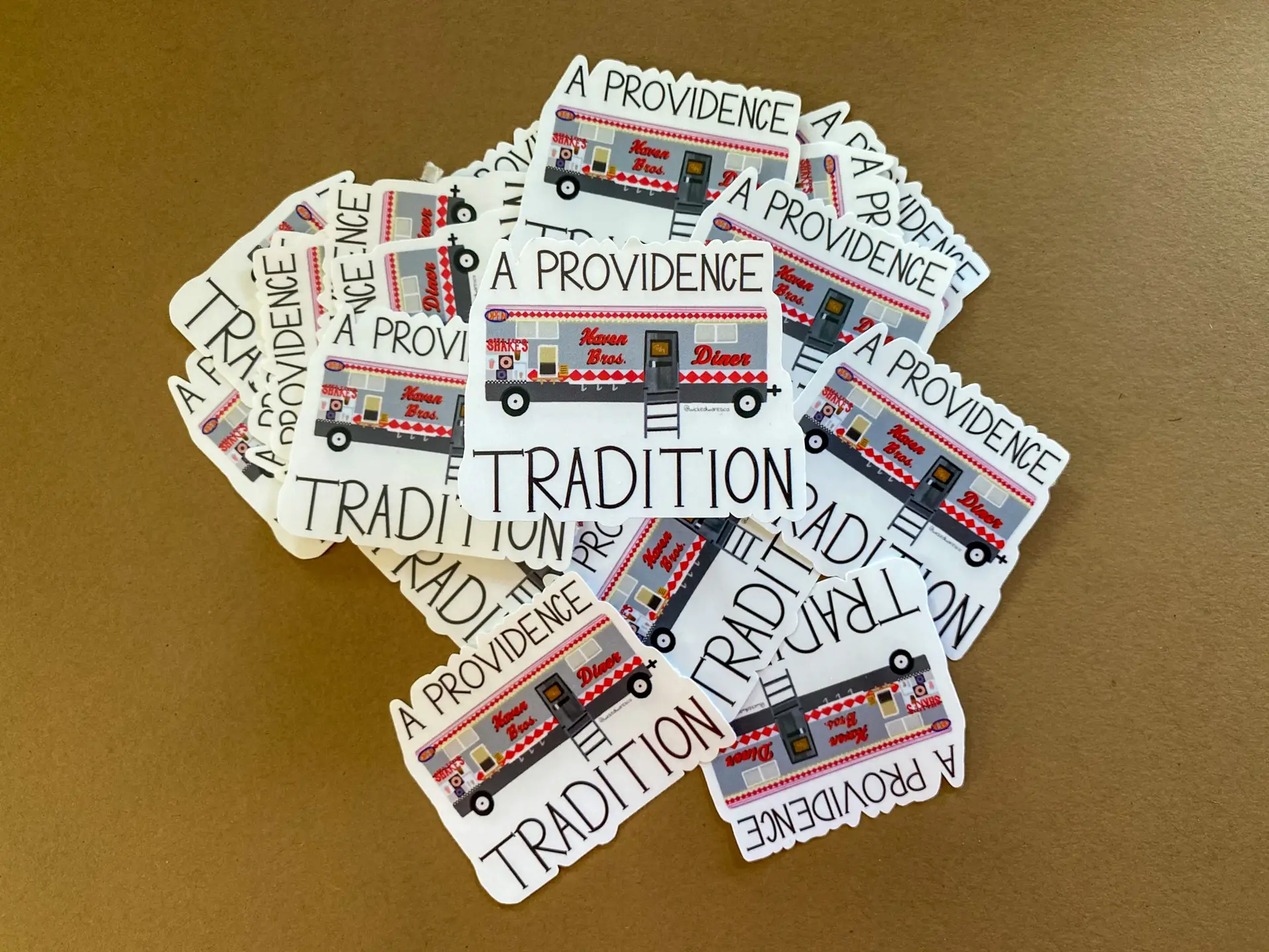
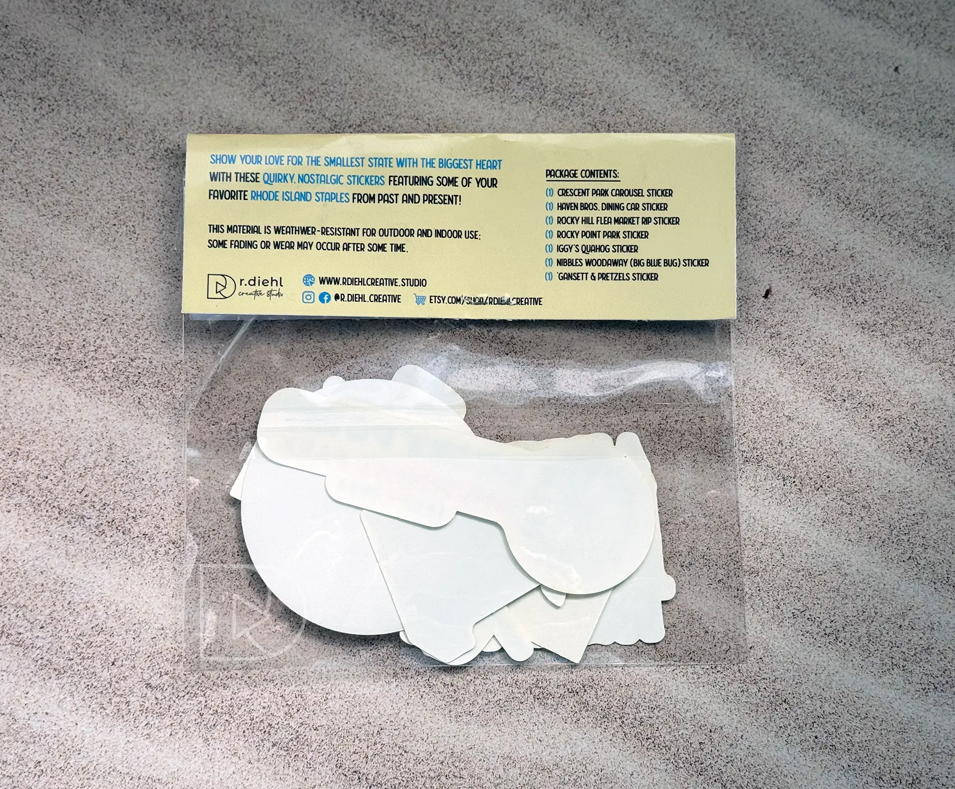
Challenge: Utilizing illustrations designed for a previous project write-up, create a limited sticker collection of iconic Rhode Island heritage.
Design Solution: This sticker collection was actually a complete reconceptualization of a previous project write-up of a window cling series. Focusing on icons of my home state, I developed a series of stickers based off of places that help make Rhode Island what it is, and in turn, help make me who I am. The icons focused on in this project were: Del’s Frozen Lemonade, Narragansett Lager, the Big Blue Bug beside I-95, Iggy’s Doughboys and Clam Shack, Rocky Point Amusement Park, and the Flying Horse Carousel in Watch Hill (the oldest operating carousel in the US). Since I was revisiting this project specifically for the graphics, I wanted to build a design around them and make them the main focal point.
While the window series itself was not up to par, the illustrations were fantastic! I wanted to find a better medium to showcase them on. Putting on my thinking cap and doing some research, I came up with some catchy sayings to really bring these graphics to the next level.
Self-Reflection: As a designer, it never really occurs to me to reconceptualize and re-use project elements. I always initially think to create something brand new, but turning this sub-par window project into an awesome sticker collection was super fun, and not all that time consuming at all! The success of this project will influence me to try to revisit and rethink other projects in the future to really push myself and see what else I can come up with.
*Disclaimer: I do not own the rights to some of the existing logos used in these designs.
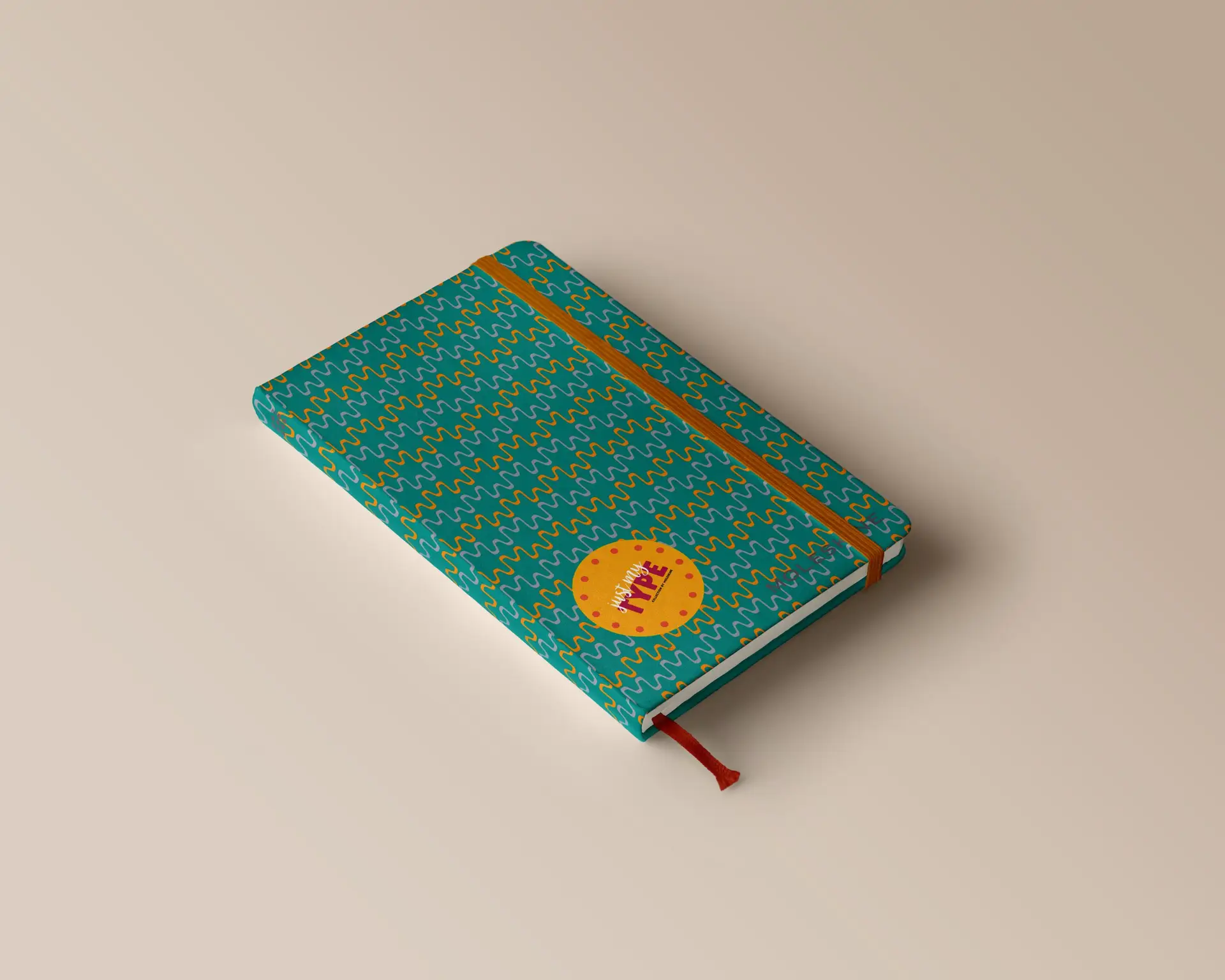
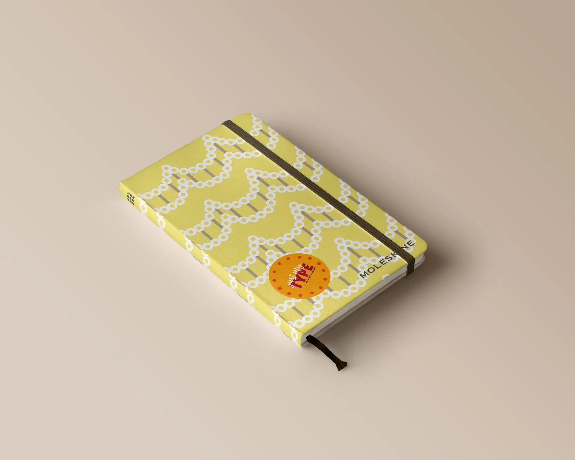
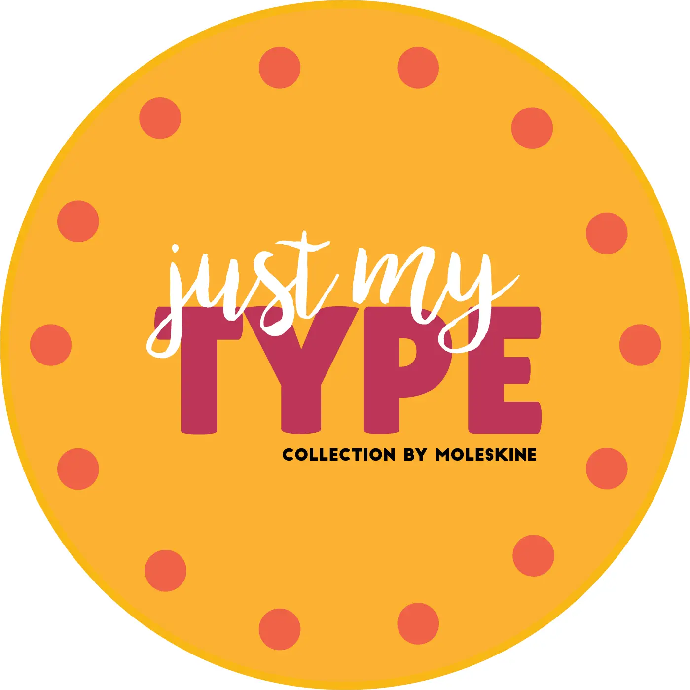
moleskine x just my type product design
Posted on by Rhea Diehl
moleskine x just my type product design
branding | typography | digital media
Challenge:
Conceptualize and build a brand around previously designed typographic patterns.
Design Solution:
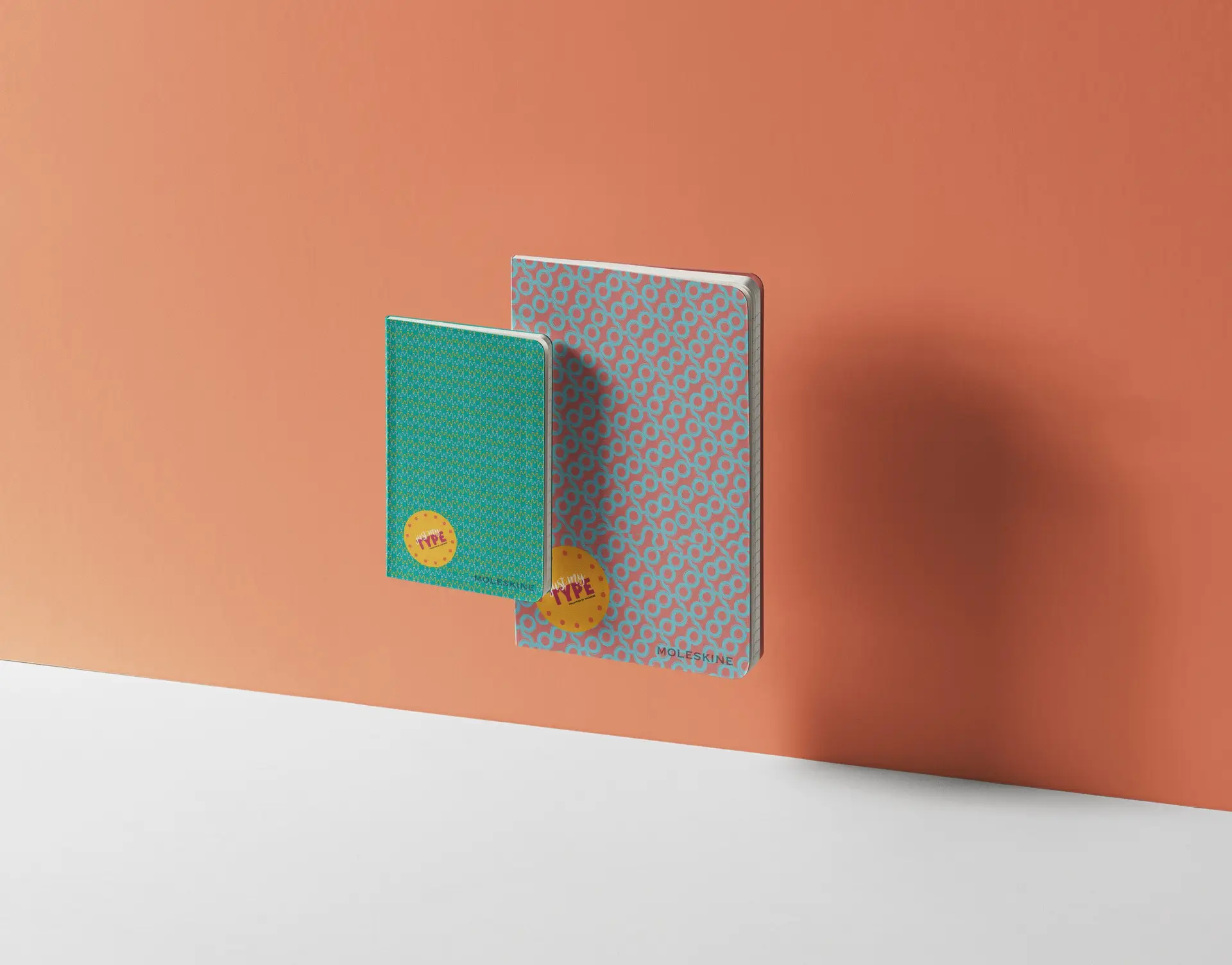
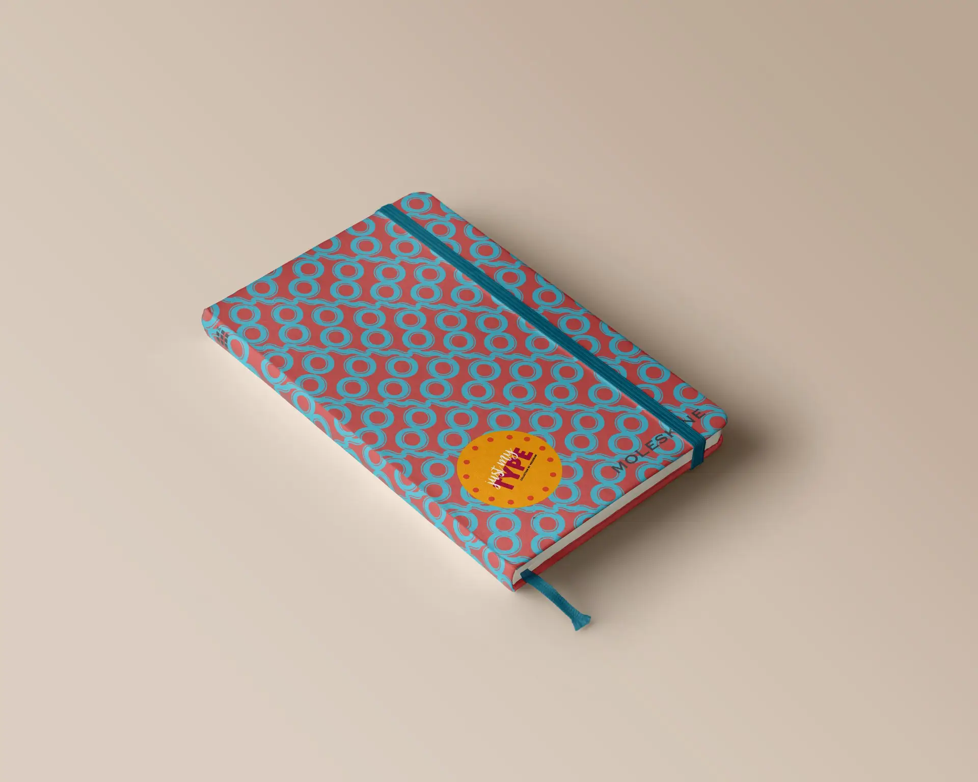
This project was actually taken from a typography exercise that I did in freshman year. We originally had to develop patterns using only type, and while one of them wasn’t too great, I’ve always loved the look of the ‘Q’ pattern. It was my professor this year that inspired me to create a notebook collection centered around typography, utilizing this ‘Q’ pattern among others.
A lot of this project was dependent on my first pattern. I couldn’t use the same font again, nor the same color palette or letter. I had to get creative, so I took to Dribble and Behance to muster up some inspiration. After playing around in Illustrator for a while, I came up with these patterns, which in a way can relate to the different side of my personalities, the side that is loud and bright, the side that is more feminine, and the side that has a great appreciation for the retro era.
Since these patterns are so busy, I chose to go rather simple with the logo, which helps to create a unified balance between elements.
Self-Reflection:
I don’t think I ever would have thought to turn this simple, interesting type exercise into a full fledged notebook collection. A lot of the time, I think more about thinking and moving forward than back, and don’t really take the time to reconceptualize former work. I’d say the main thing I took away from this project is that just when you think you’ve stretched your ideas as far as you can, there is always a way to make it better. Just think outside the box a little.
*Disclaimer: I do not own the rights to the existing logos used in these designs. These were made on an educational basis.