Author: Rhea Diehl
university acceptance package
Posted on by Rhea Diehl
university acceptance package
print design | typography | crafting
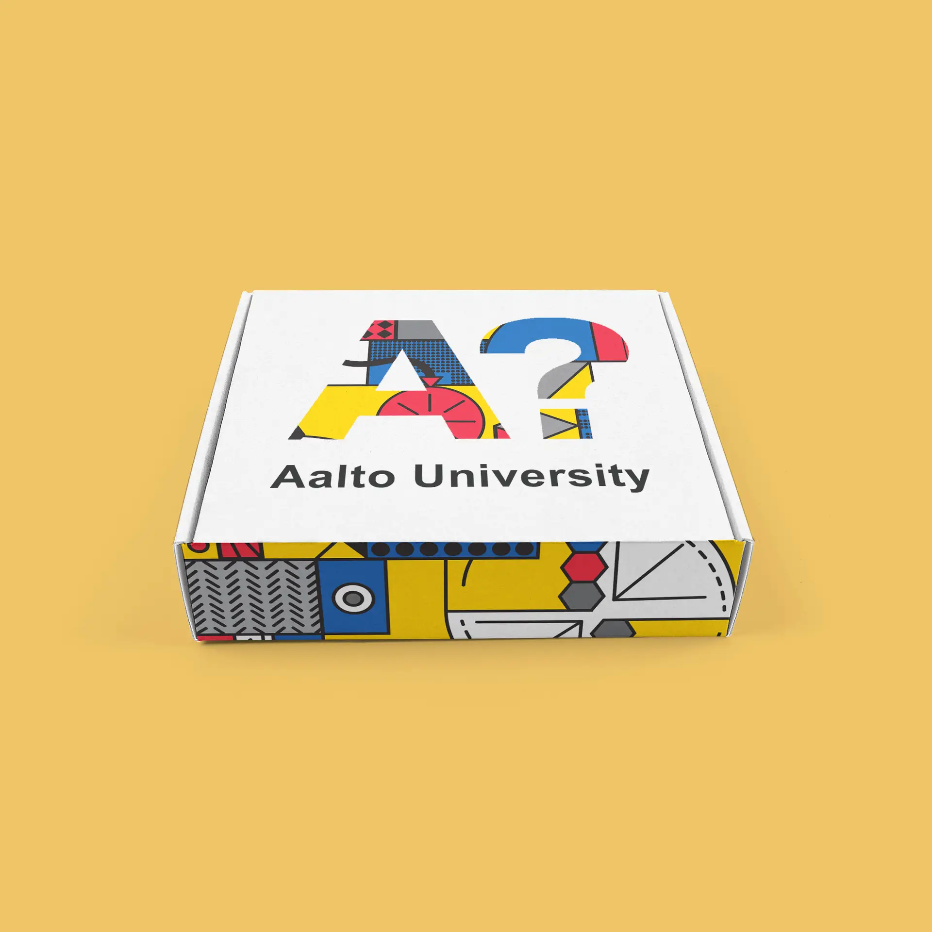
Challenge:
Design an acceptance package for a university of your choosing, utilizing the five senses to create an incredible unboxing experience.
Design Solution:
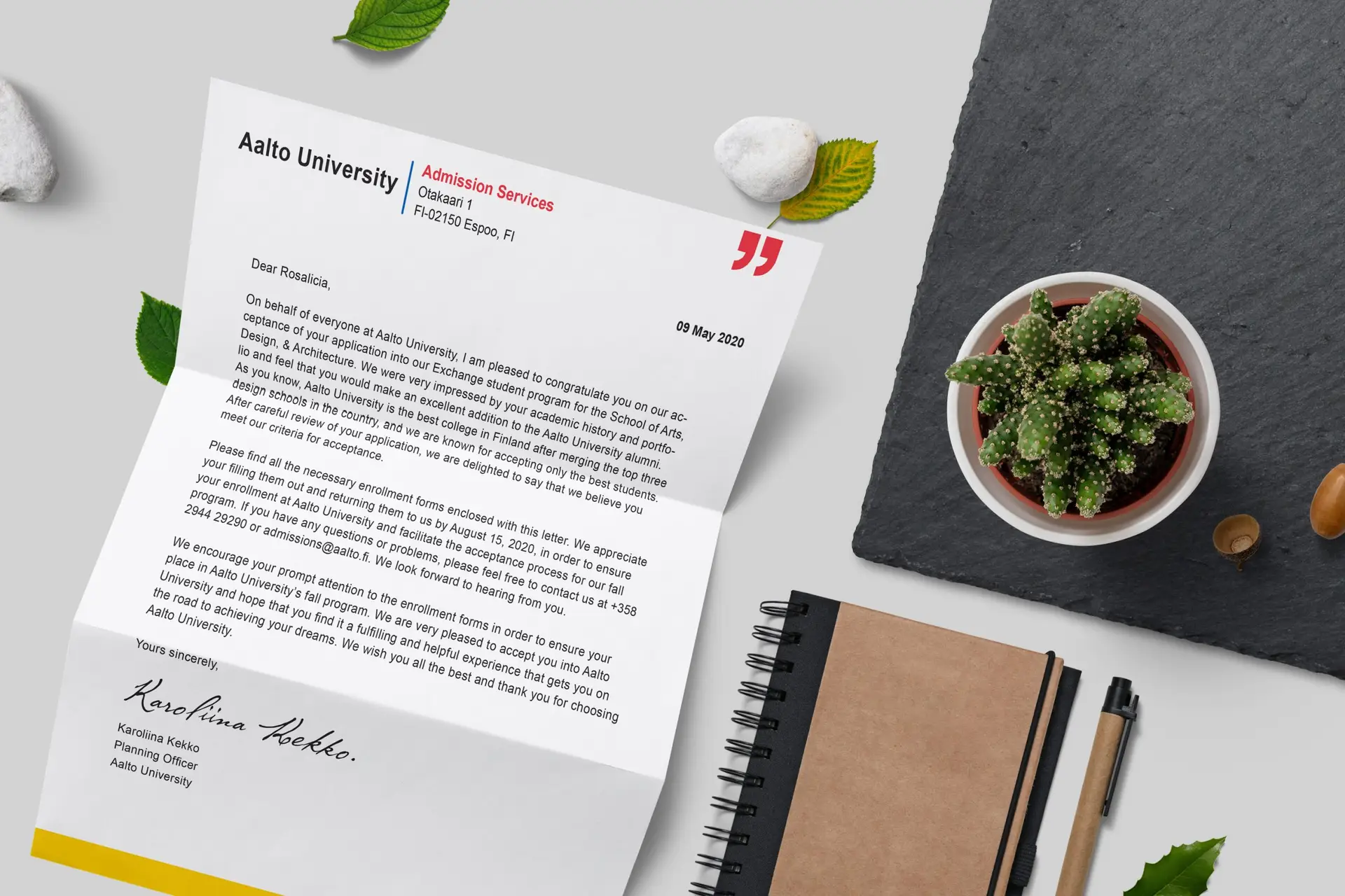
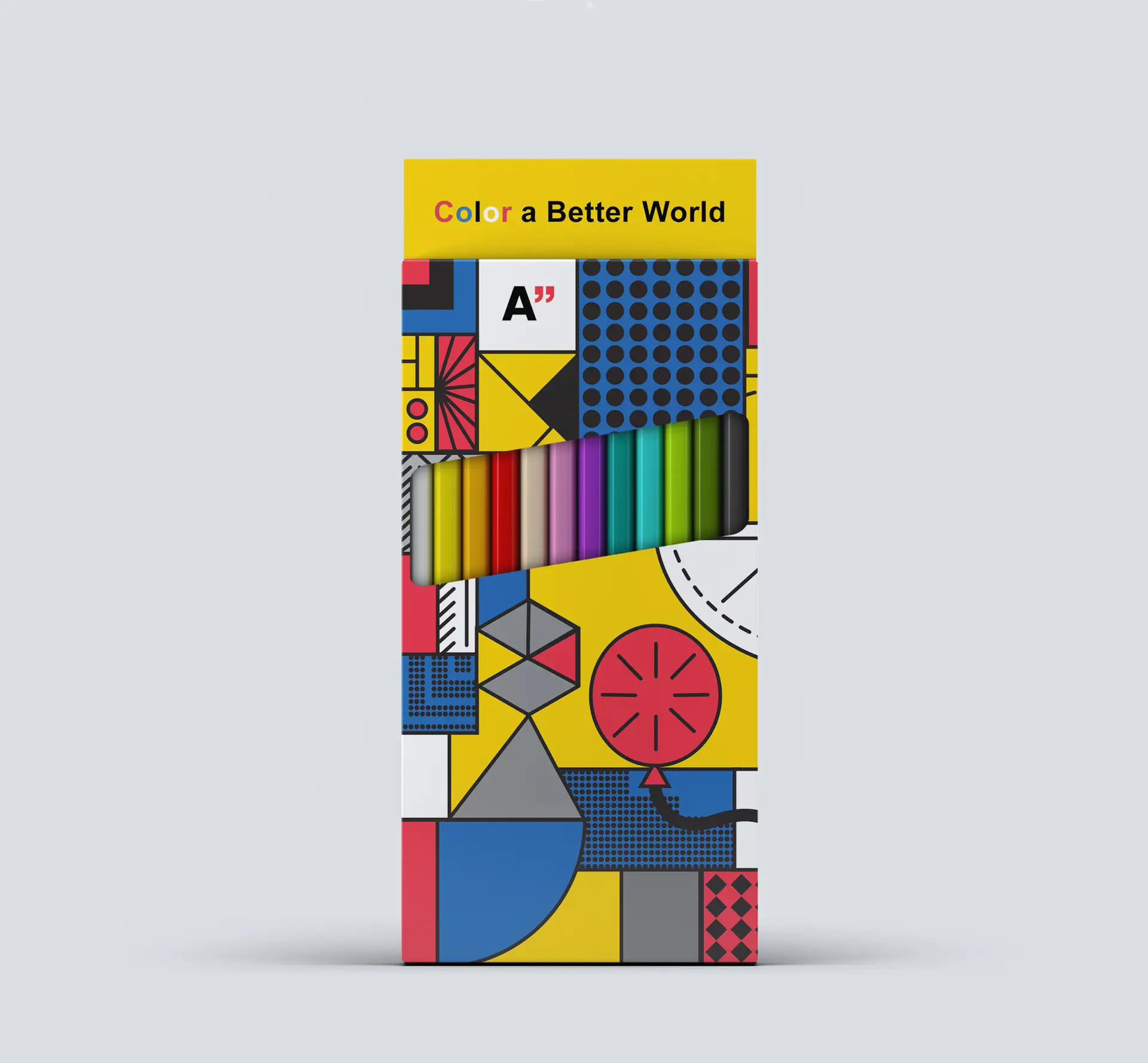
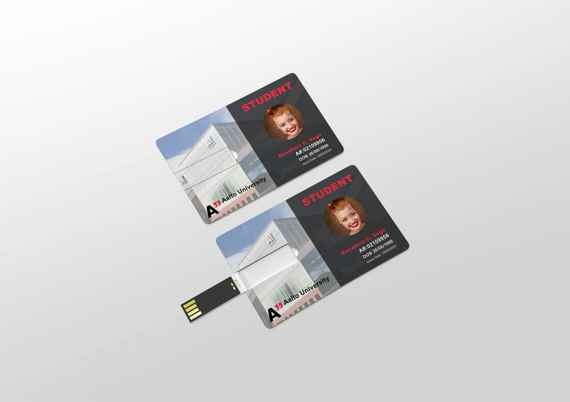
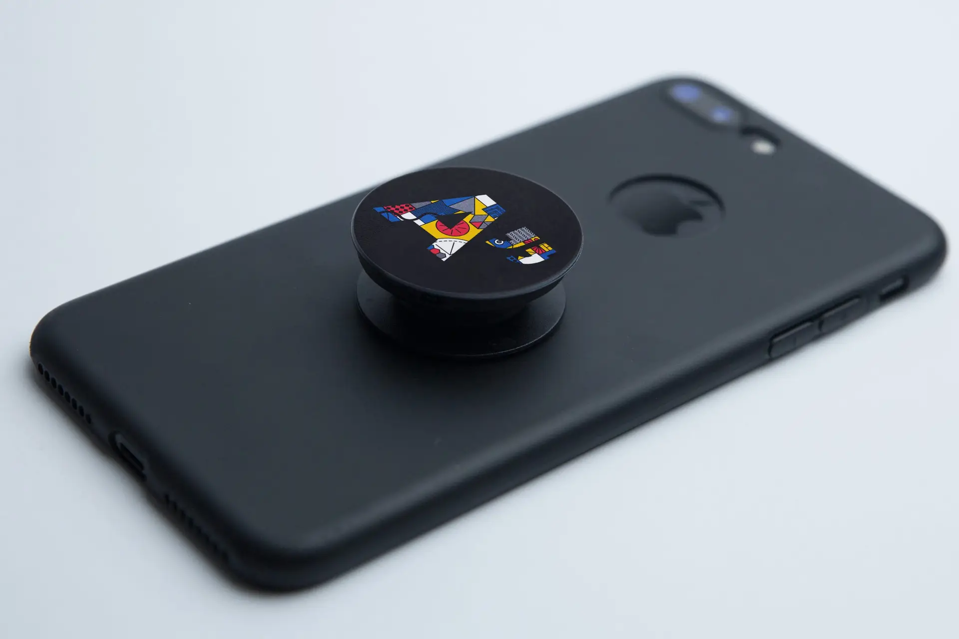
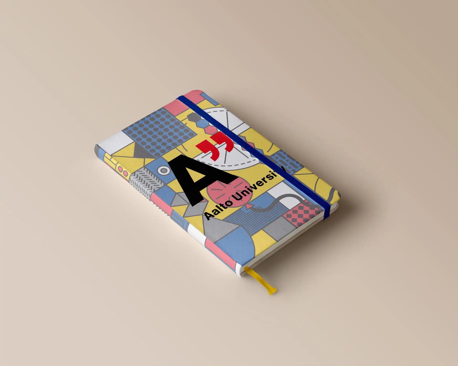
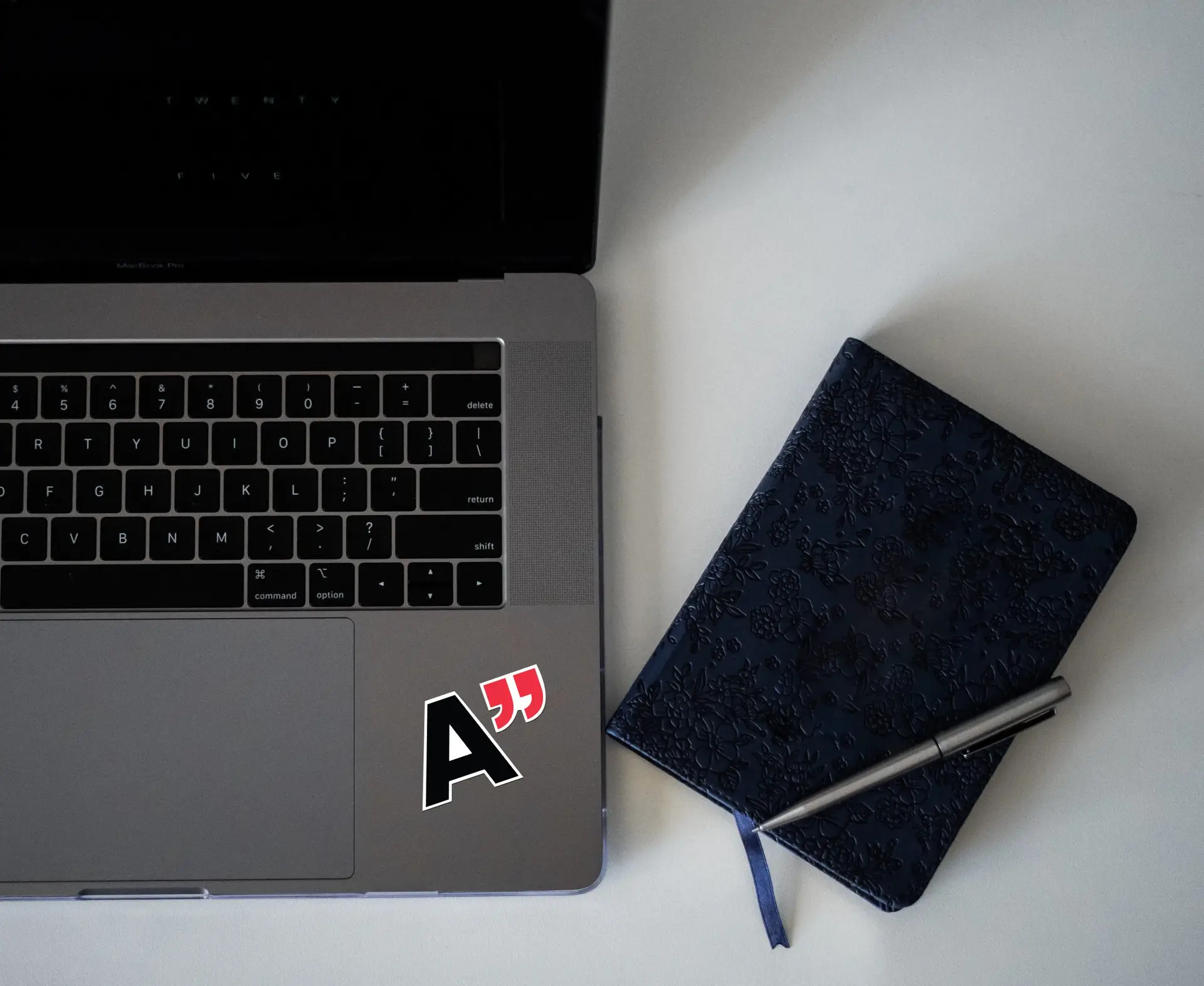
This project utilized the skills I have learned in spatial design, print design, typography, and prototyping; alongside teaching me printer specifications. Aalto University, an engineering and design institute in Finland, was chosen as the muse of this project due to the modern-style, typography heavy elements that the university employs throughout their branding. The deliverables chosen for the package included the box itself, an interactive acceptance letter, a pack of colored pencils, a sketchbook, a laptop sticker, a Popsocket, and the applicant’s student ID that doubles as a portable flash drive.
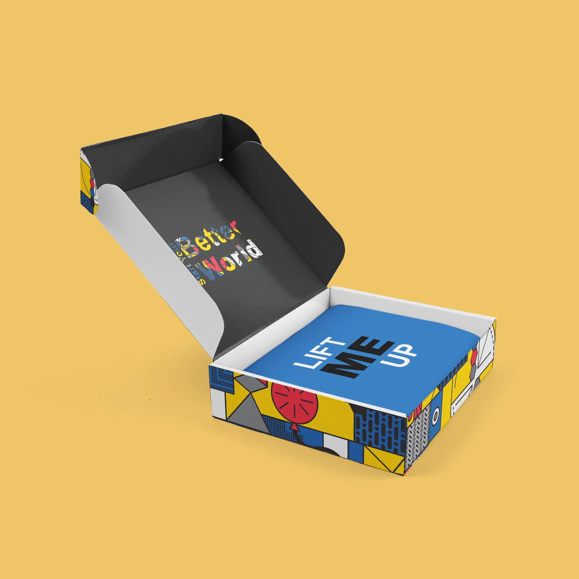
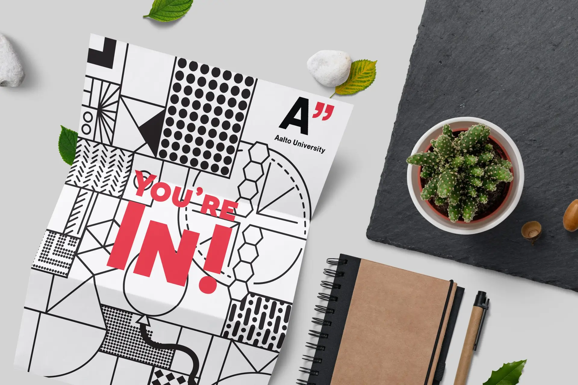
I wanted to make this college acceptance package interactive but useful for the applicant to enhance the “package-opening experience”. Bearing this in mind, I made the decision to create an on-brand and fun geometric pattern to utilize throughout the package. This includes on the backside of the acceptance letter, which presents the pattern in black and white so that the applicant can use the included colored pencils to “color their future”. The Student ID/flash drive not only gets the student excited about their acceptance, seeing it “in real life”, but it’s also incredibly practical as a way to store their school documents.
Self-Reflection:
This project taught me how to follow established brand guidelines and still come out with impressive, cohesive deliverables. It also taught me how to think outside the box to create a truly immersive unboxing experience, and the importance of printer specifications in a project.
design for good brand development
Posted on by Rhea Diehl
design for good brand development
branding | publication | layout design
Challenge:
Design a branding campaign for a fictional charity, complete with a branding strategy, logo, and peripherals.
Design Solution:
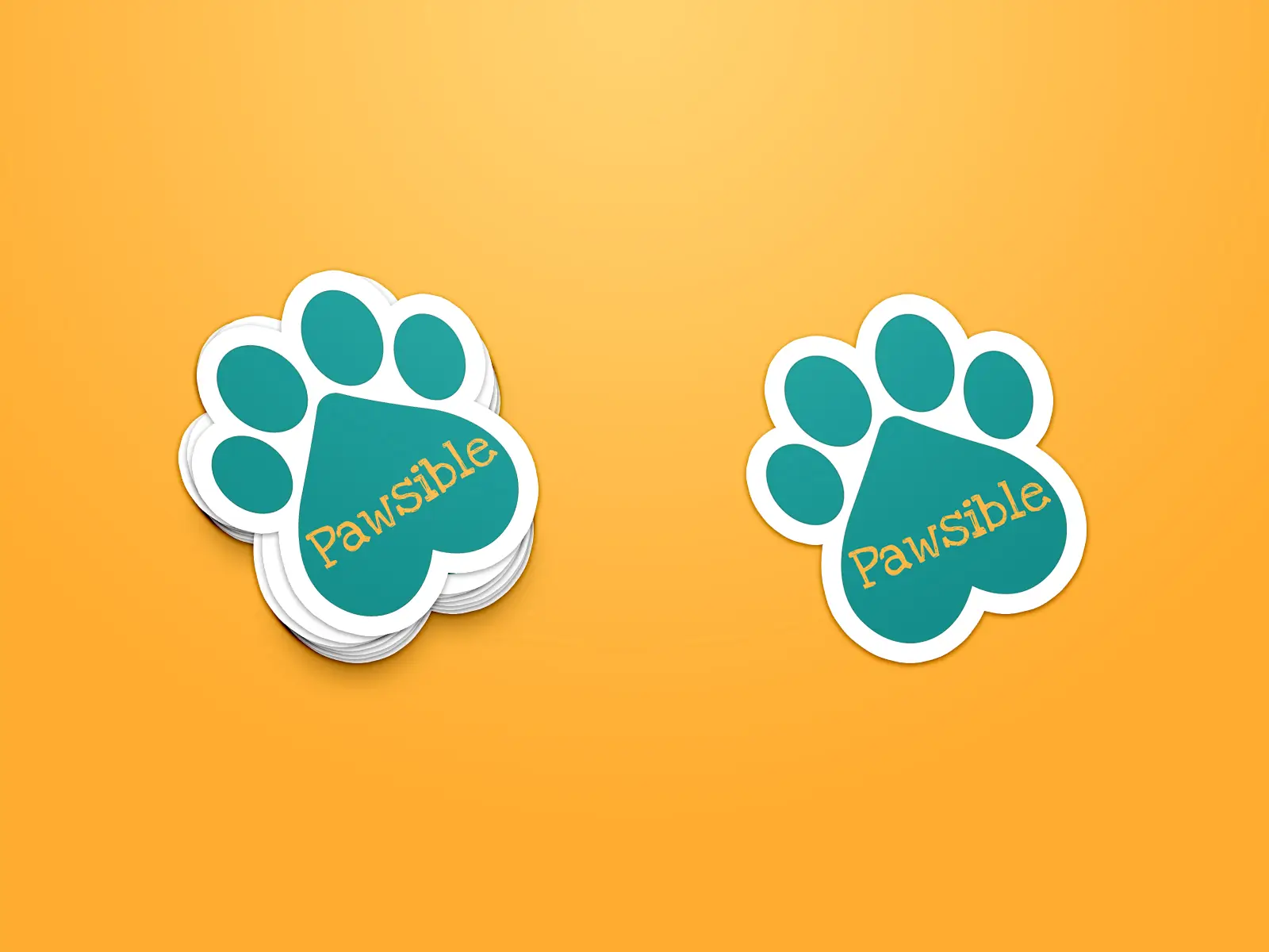
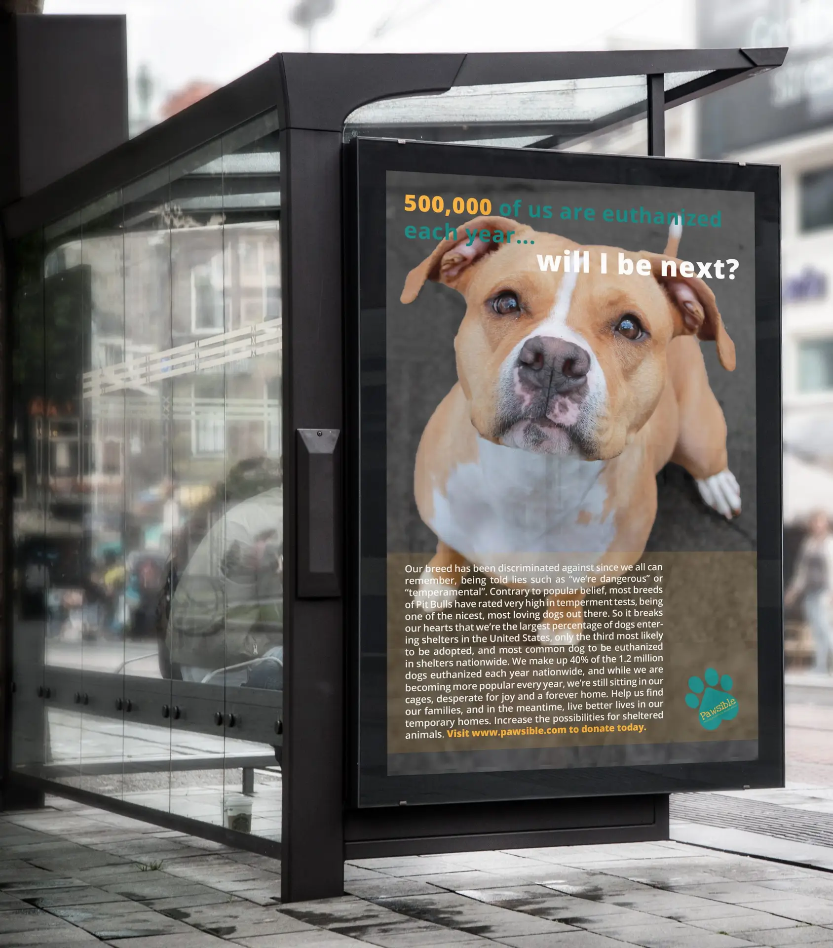
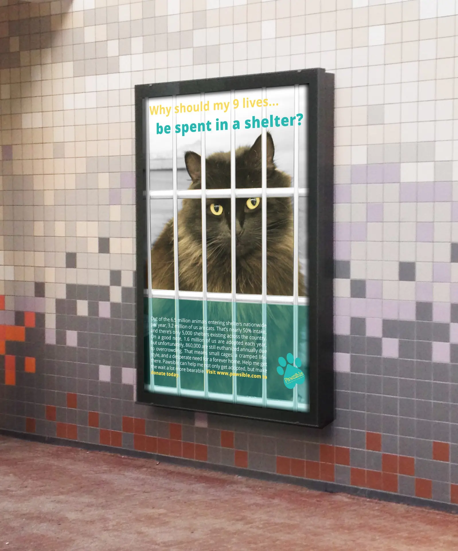
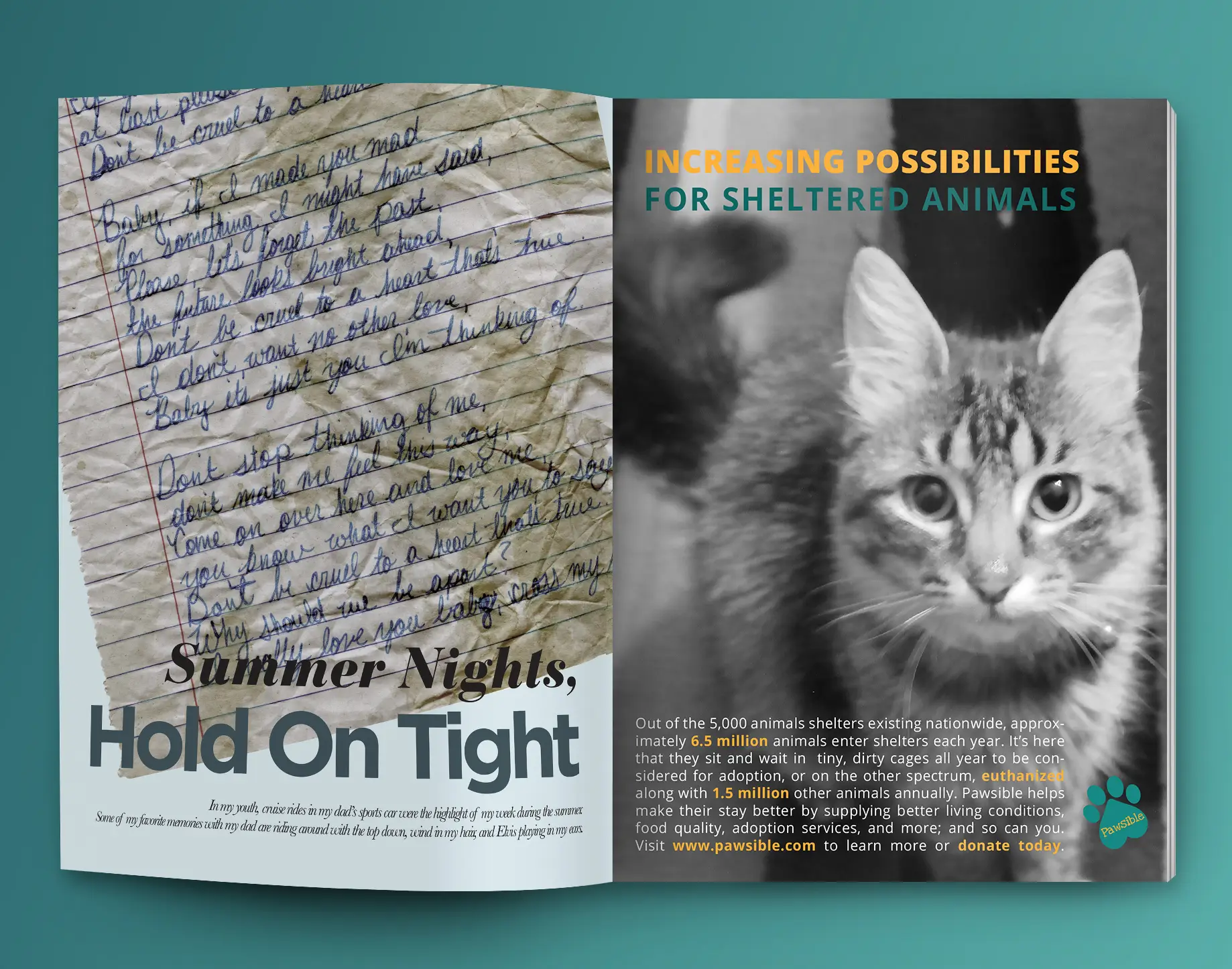
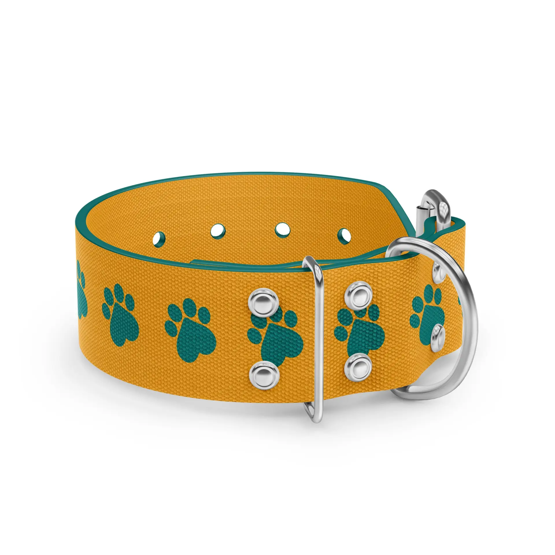
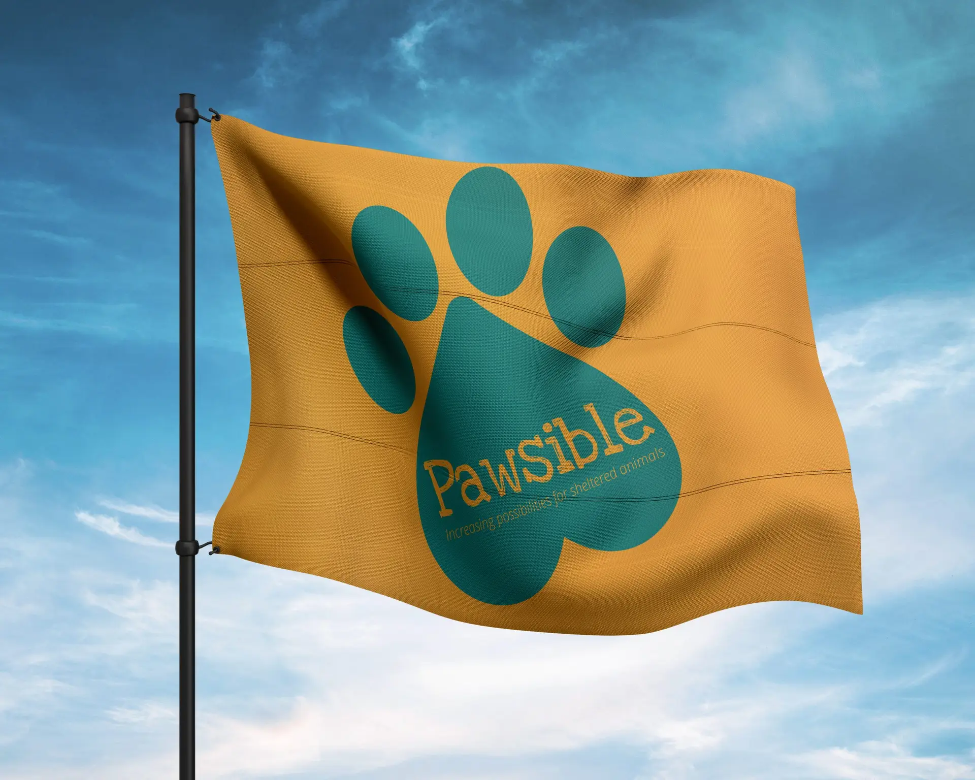
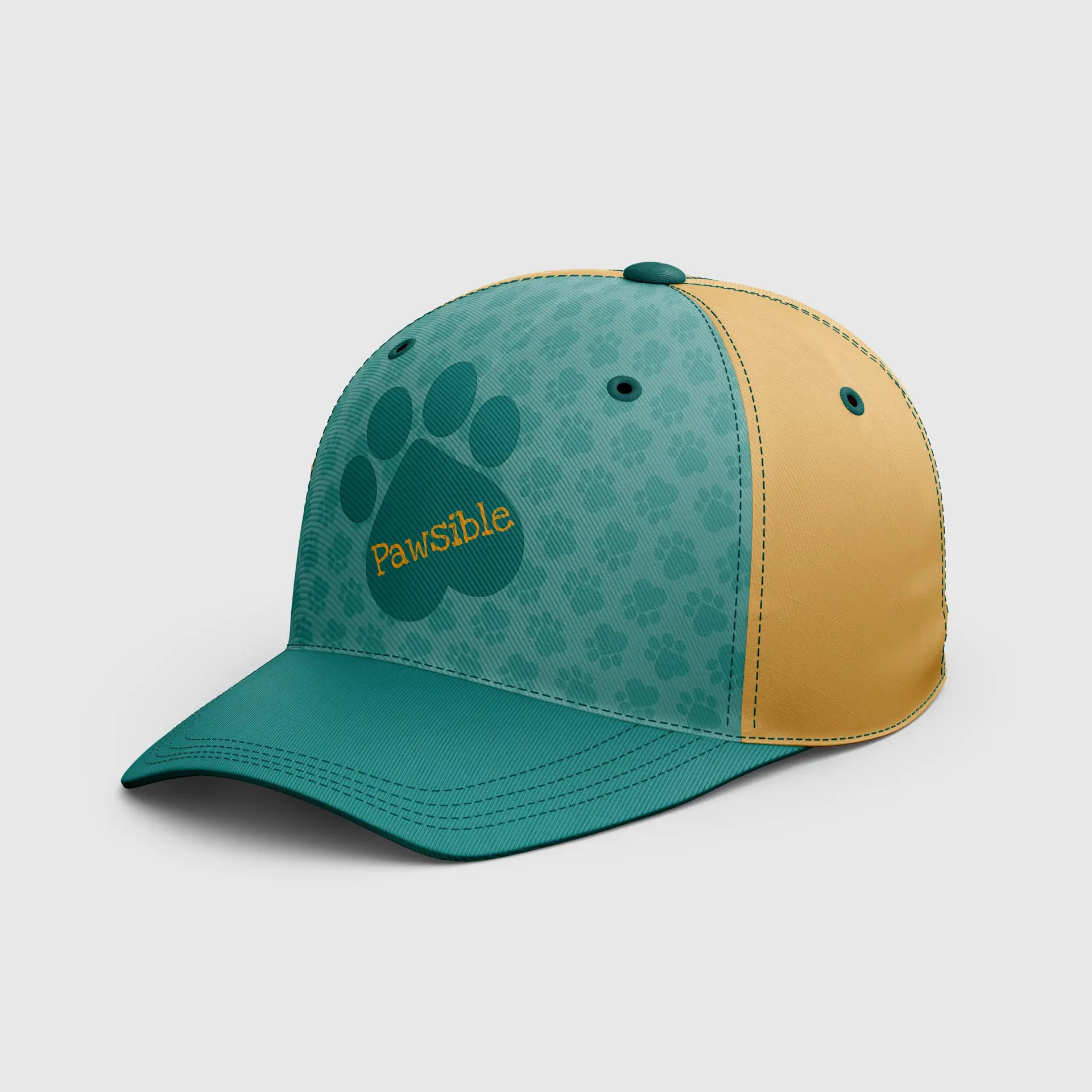
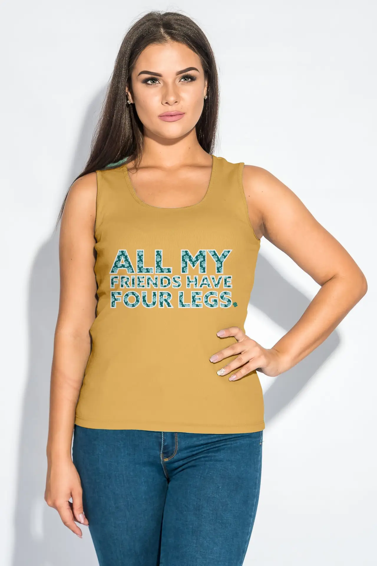
As both a designer, and a compassionate individual, this campaign was right up my alley. Pawsible is a fictional organization that focuses on bettering the lives of shelter animals. I chose to create a brand that displays cohesion and creativity for a passionate subject. I developed a brand strategy to communicate a lighthearted approach to a serious issue.
The logo design intended to get the point across without being too busy. The color palette and font choices were chosen with hidden meanings in mind; how colors and fonts make us feel, and what they stand for. Print peripherals were based off of emotional movement; using headlines that hit home to convey our serious point of view. On the other hand, my apparel conveys the playful element of the brand.
Self-Reflection:
The end result of this project was integrating two themes to create a brand that is eye-catching and cohesive while spreading a message.