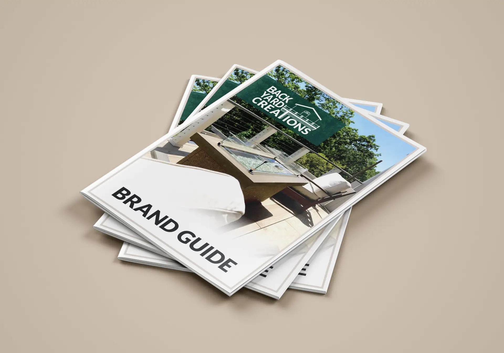
BYC brand guide

BYC brand guide

brand redevelopment | copywriting | publication design

Challenge:

Using an extended logo design, create a set of brand guidelines for the company of the client in the form of an electronic book to illustrate the brand’s story, customers, and aesthetic.

Design Solution:

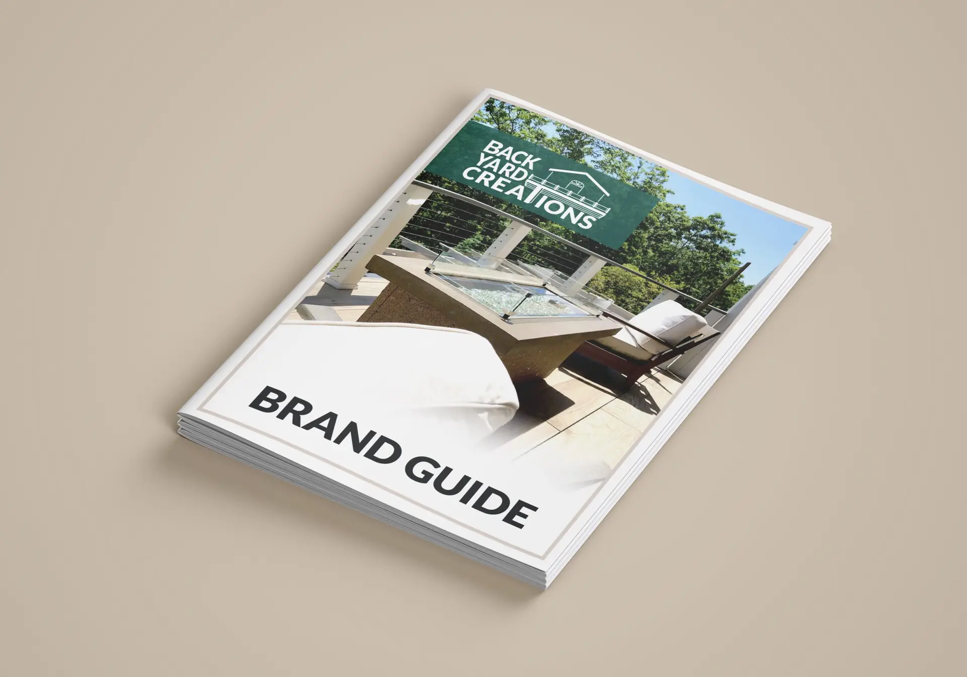
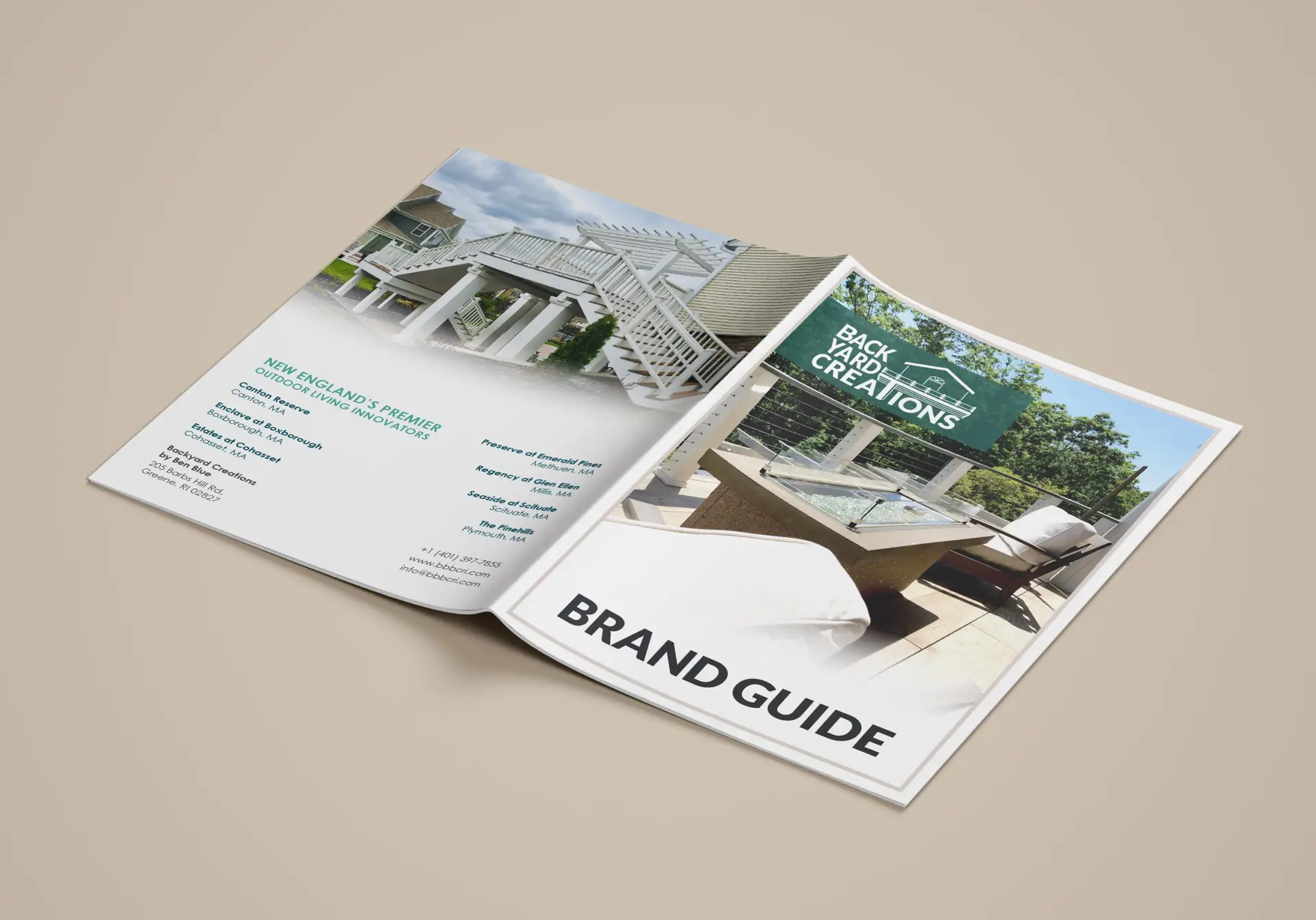
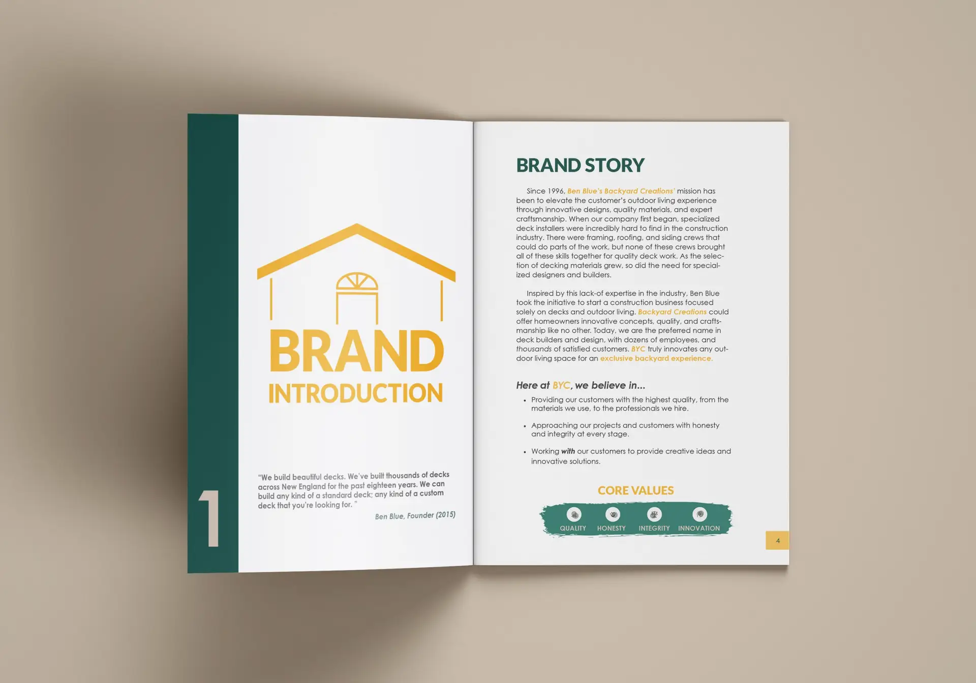
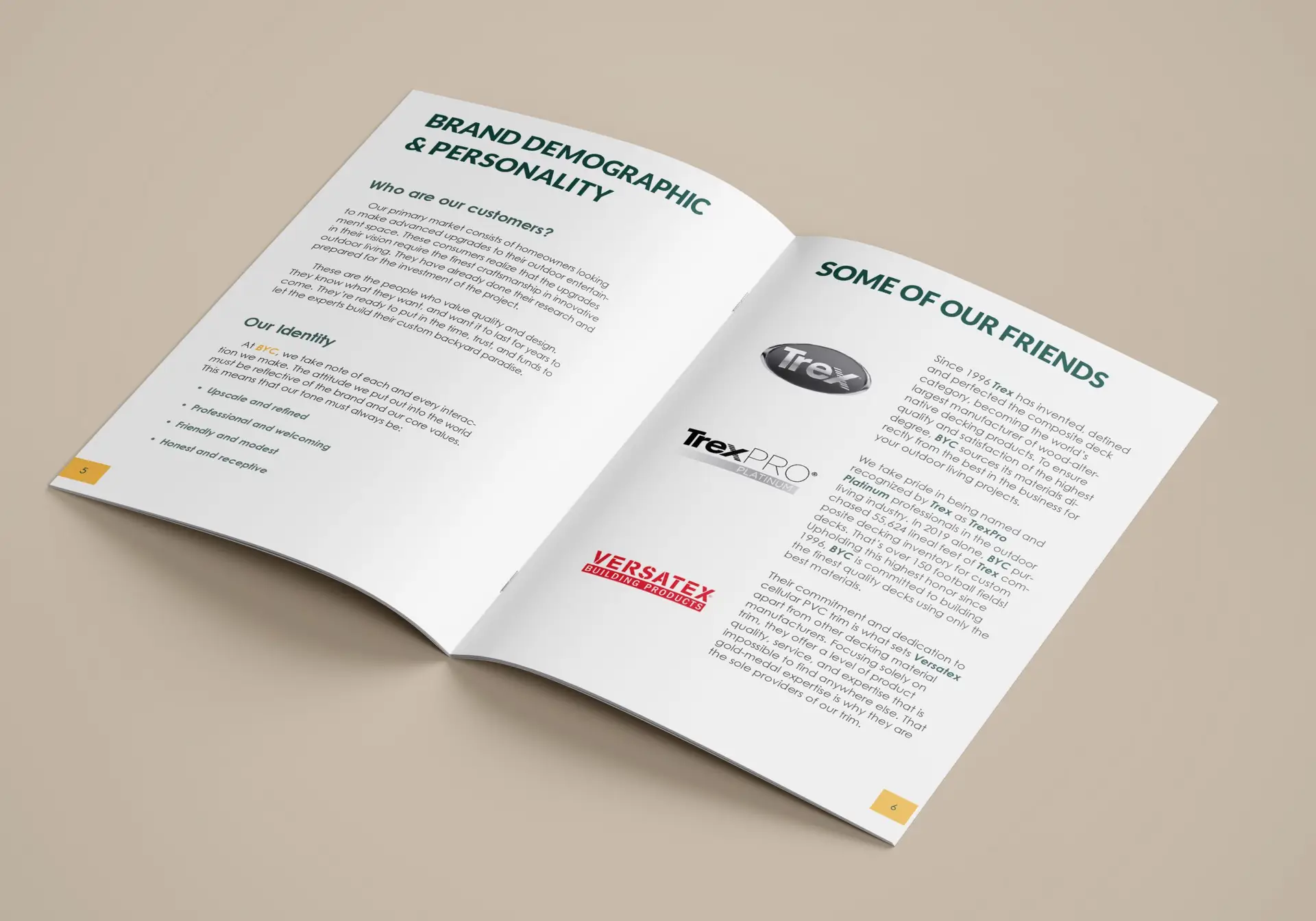
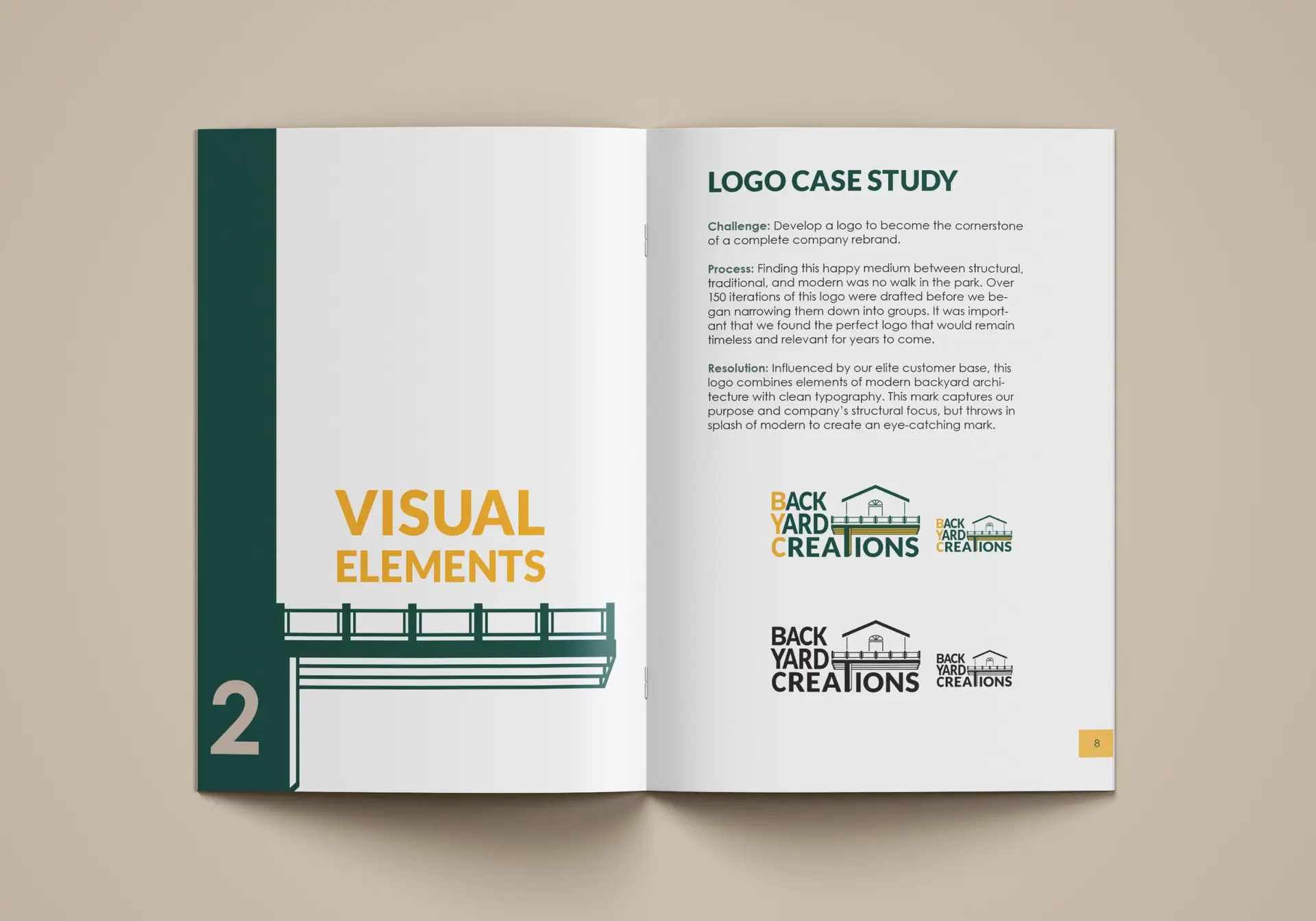
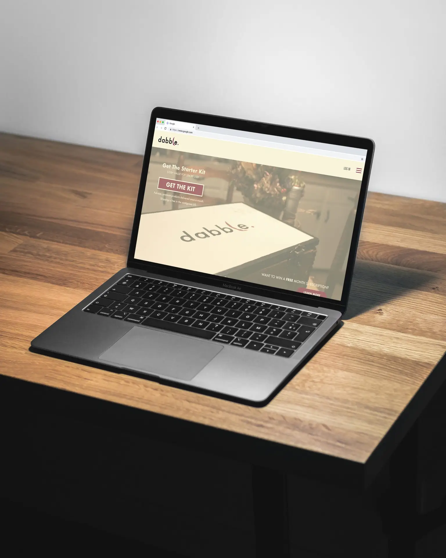
In April of 2021, Backyard Creations (an outdoor living design and build company) reached out to seek my help in a complete brand redesign. Unsatisfied with their current logo and brand, BYC wanted to elevate their aesthetic to relate more with their business relationships and knowledgeable clientele. After participating in several design consultations with the team and their own designer, a logo was designed that brought a sophisticated, modern touch to the otherwise industrialized style of this trade.  A company bases its entire brand off of its logo, and now that it was complete, I would be taking over the project. My big task was to create the brand guidelines that would ensure a seamless aesthetic company-wide.

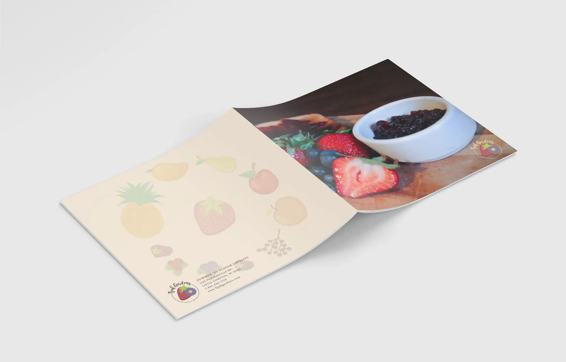
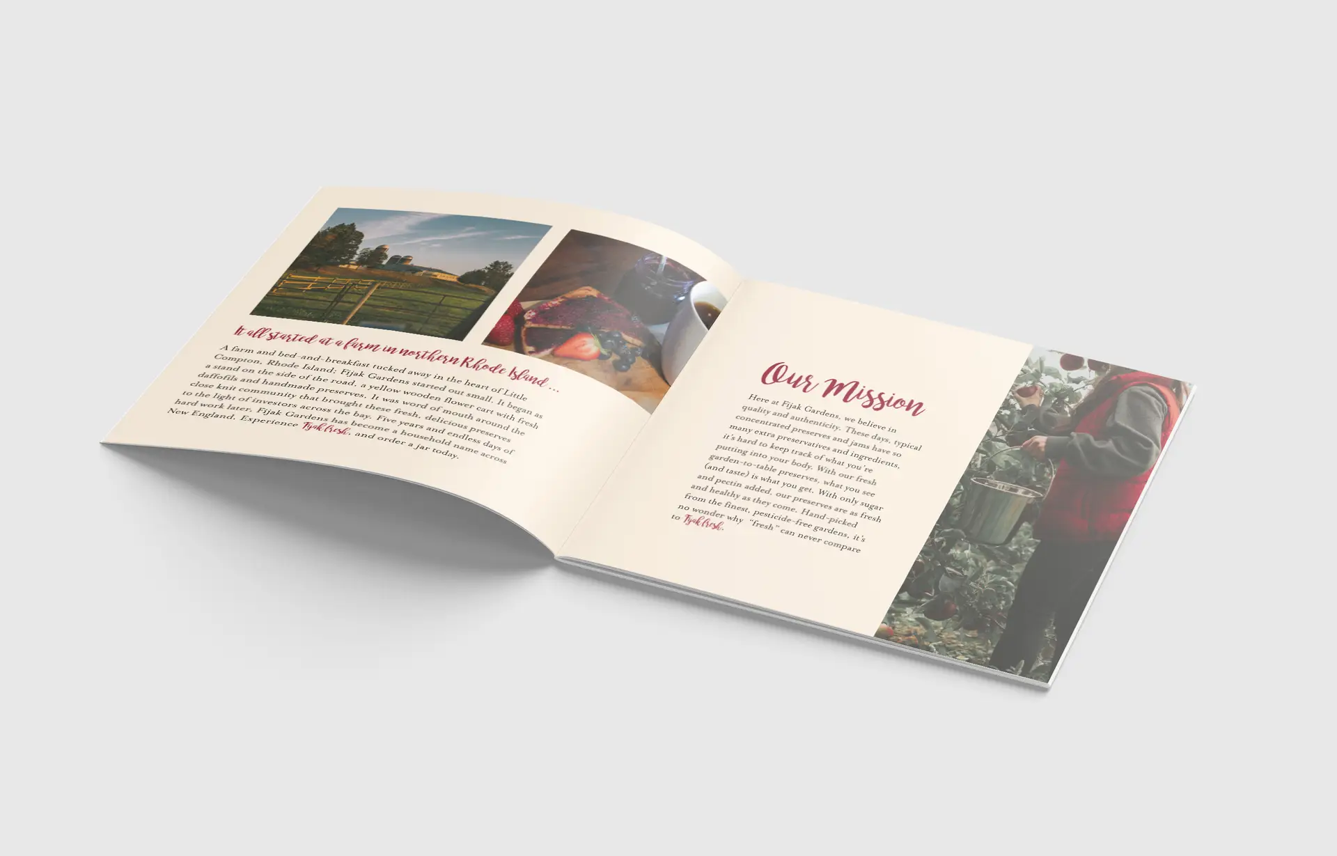
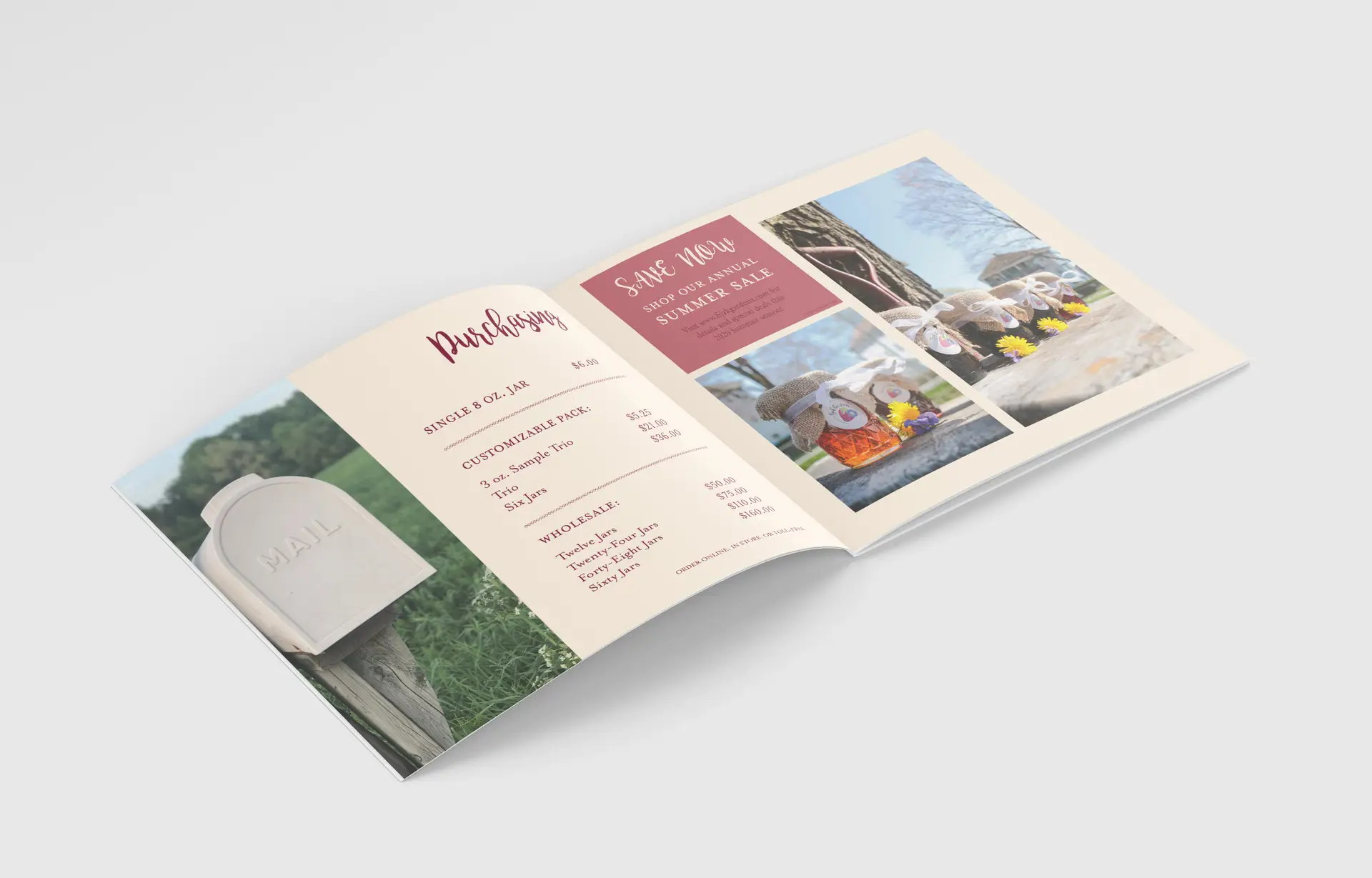
Building this brand guide was essentially starting from scratch. They wanted to do away with their old style completely, save for a couple of colors and fonts. Starting with the guidelines themselves, I did some heavy research into brand guide documents and storytelling for this project. Not only would I be writing about this company’s brand, but I’d be writing about who they are, and telling the story of their success.

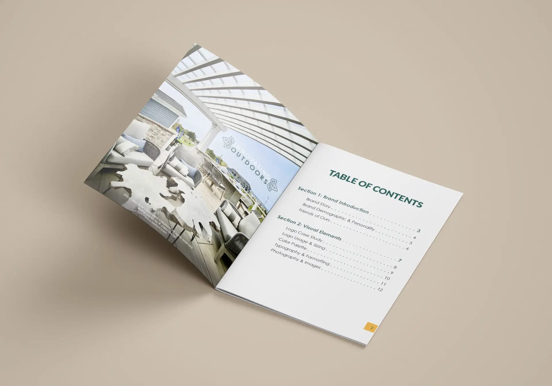
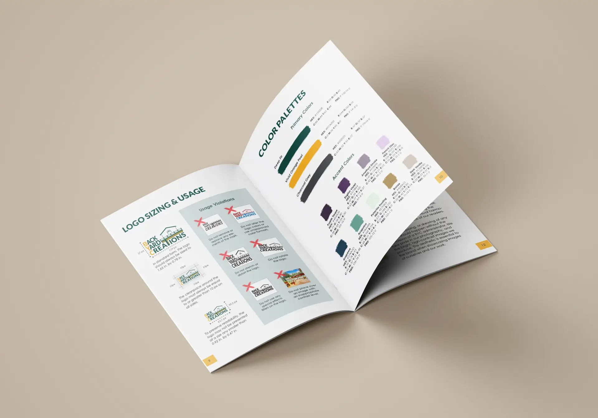
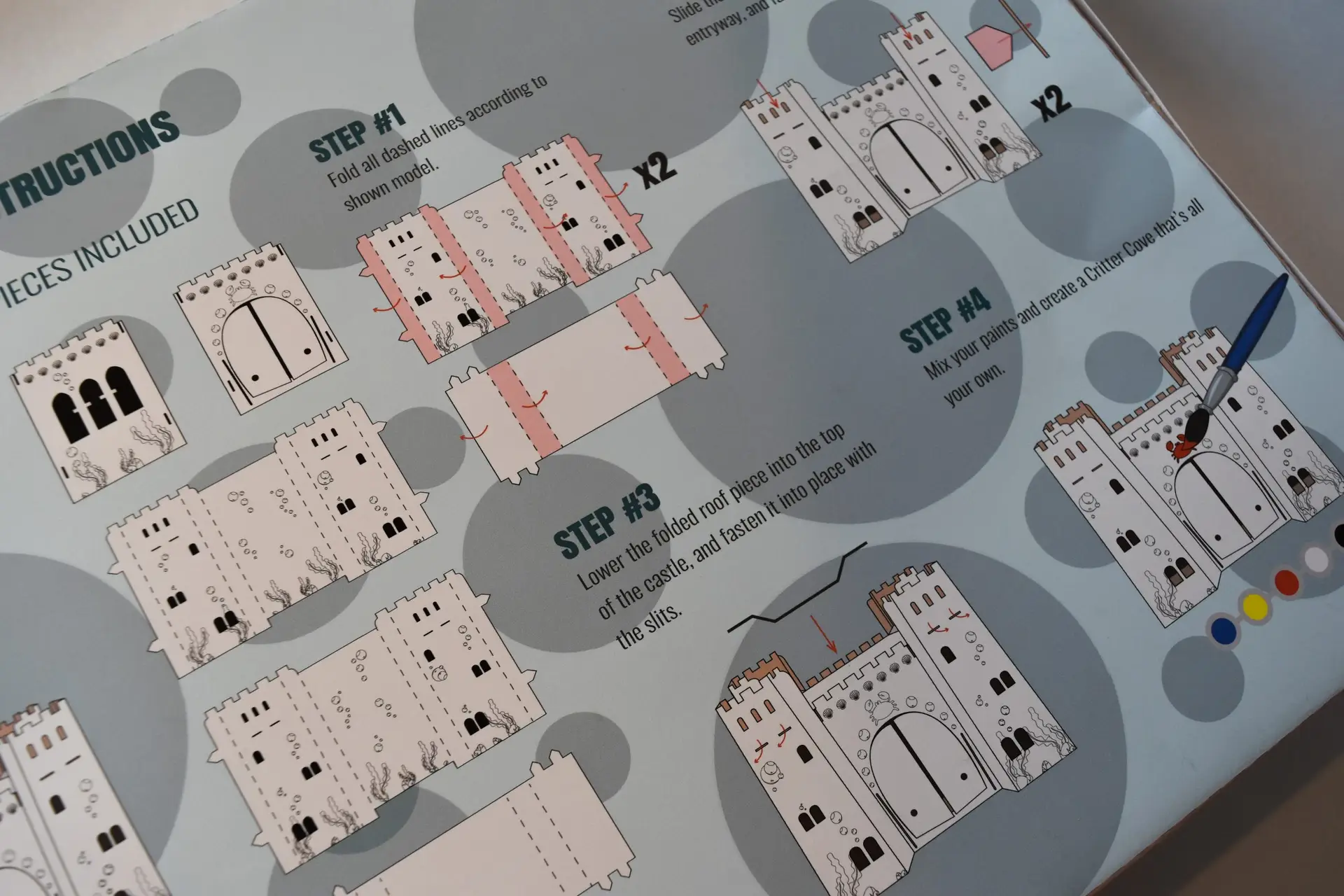
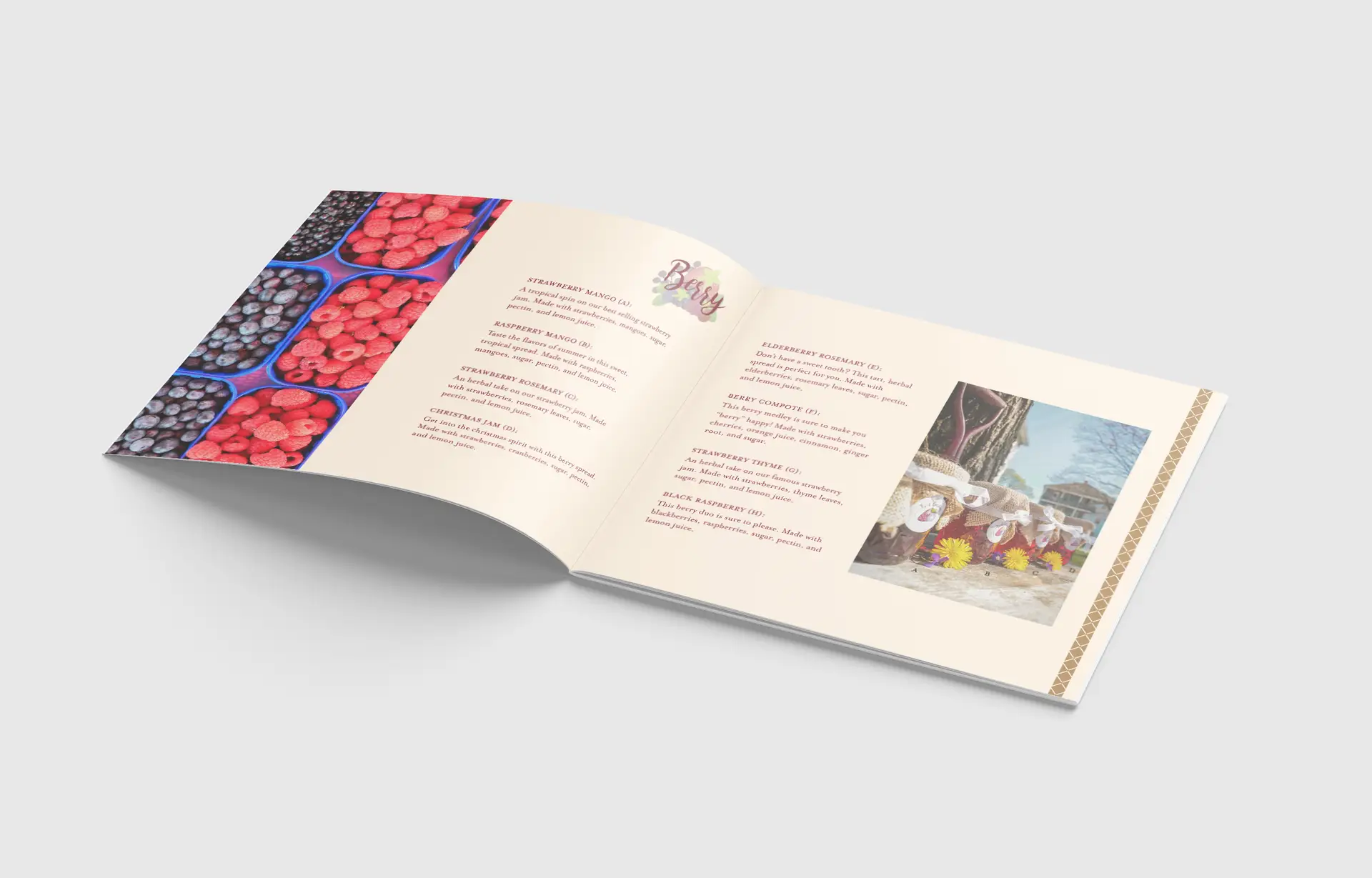
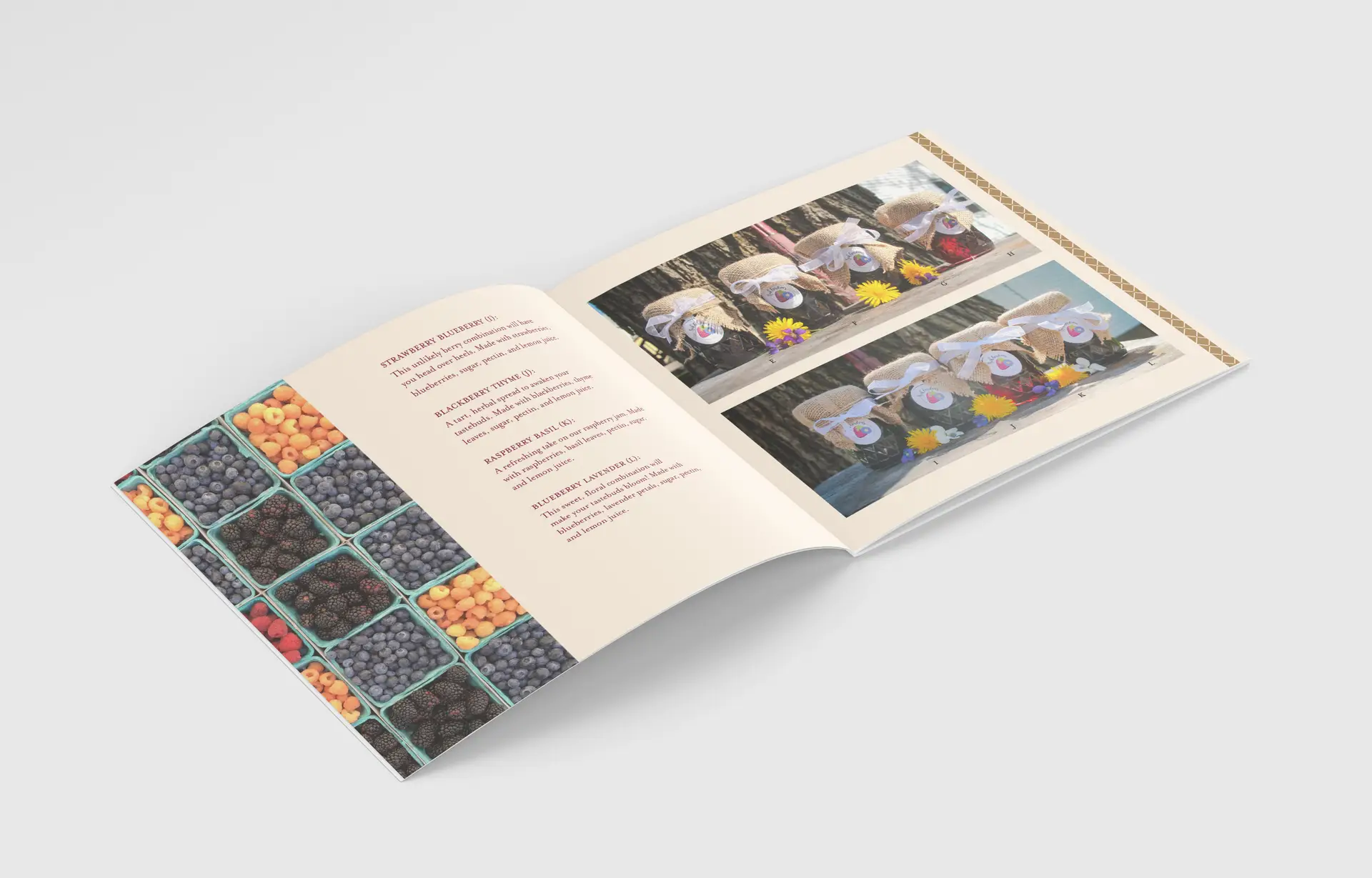
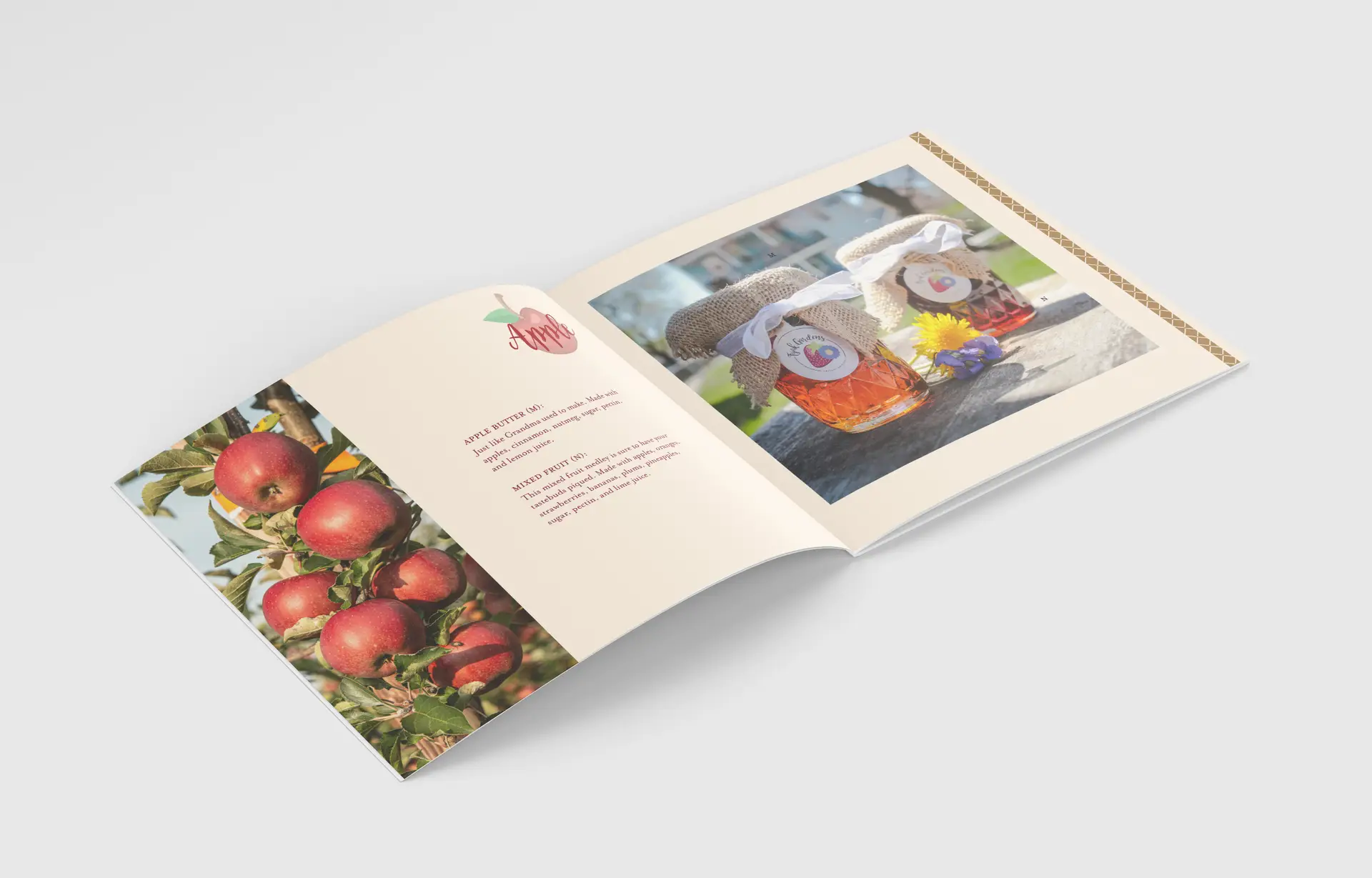
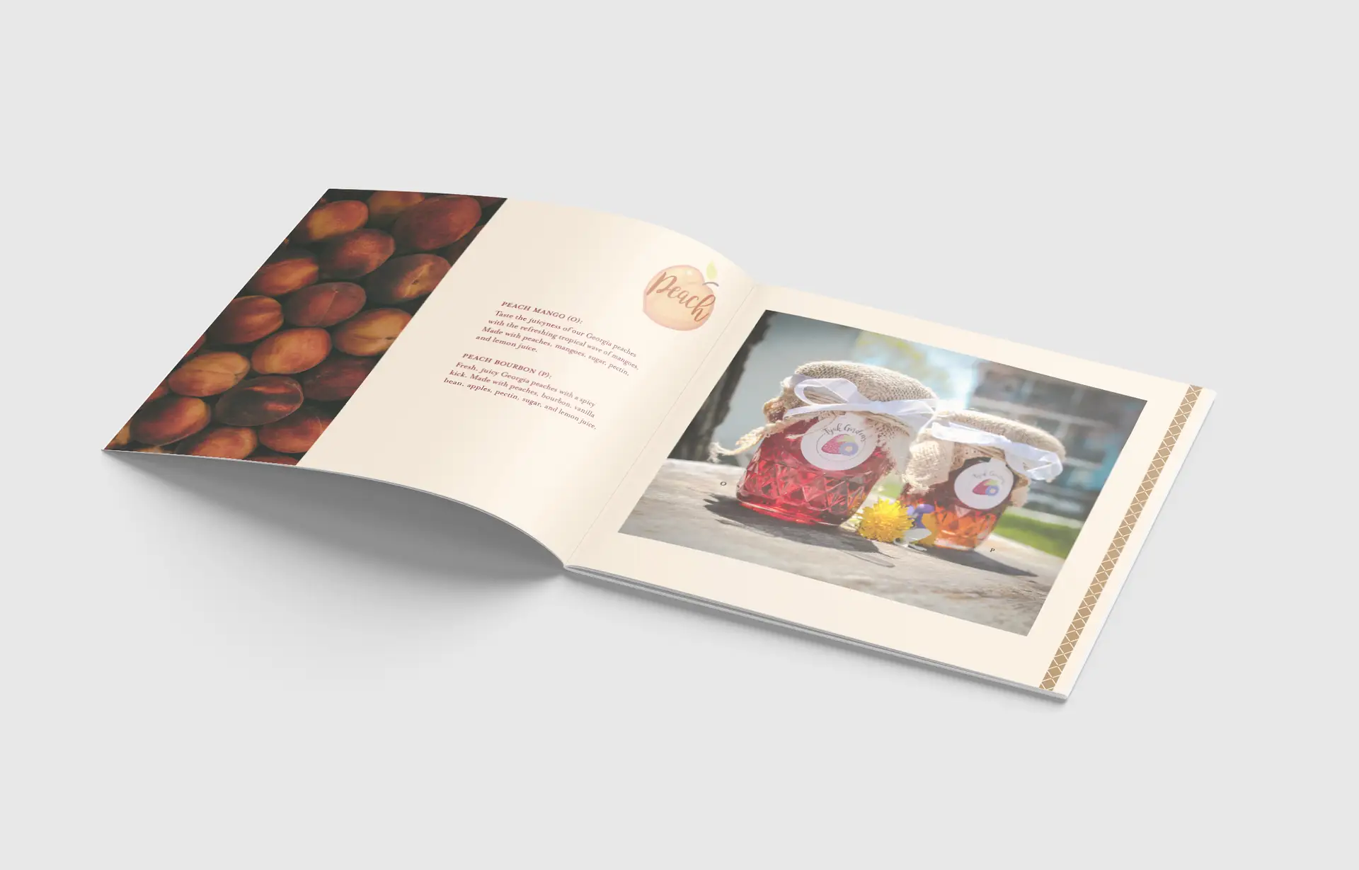
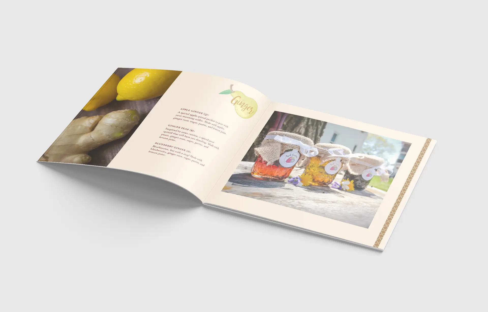
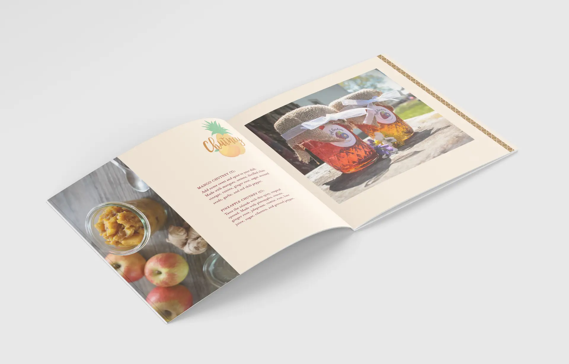
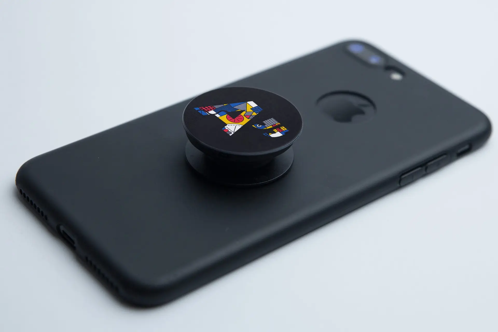
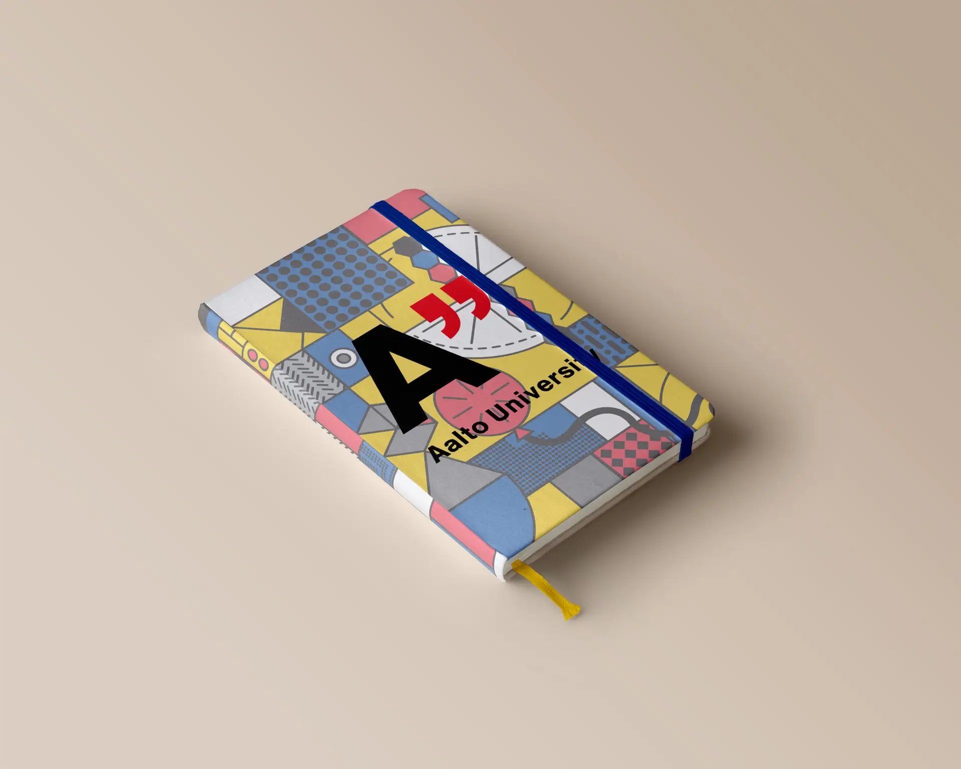
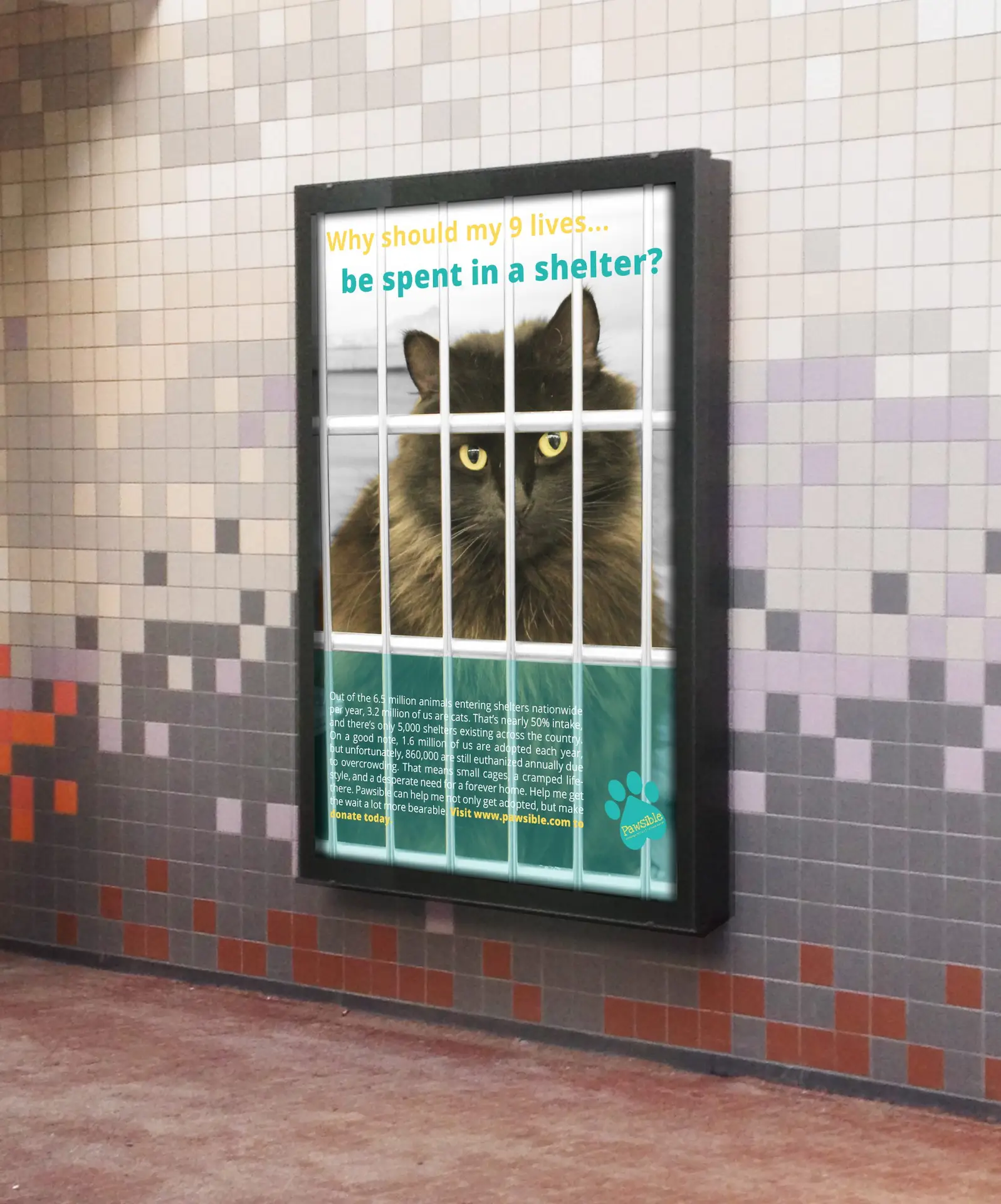
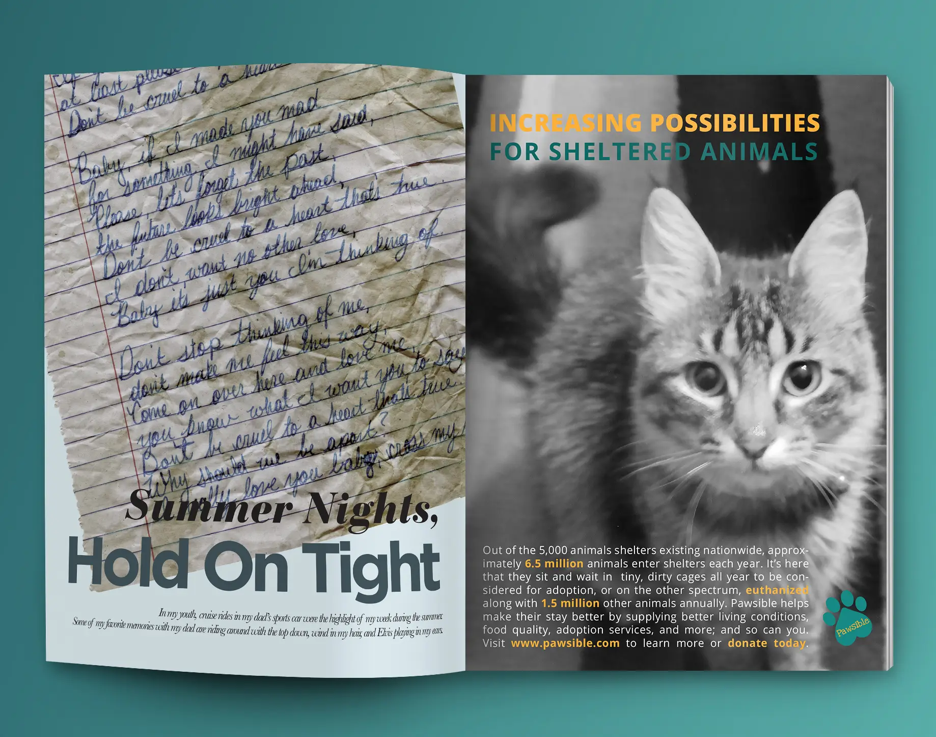
Hours and days of research and brainstorming led to the design decisions you see on these pages today. From the big, important components that you see in all brand guides (target audience, logos, typography, blah blah blah) to the small details, like making the color palette out of paint swatches.

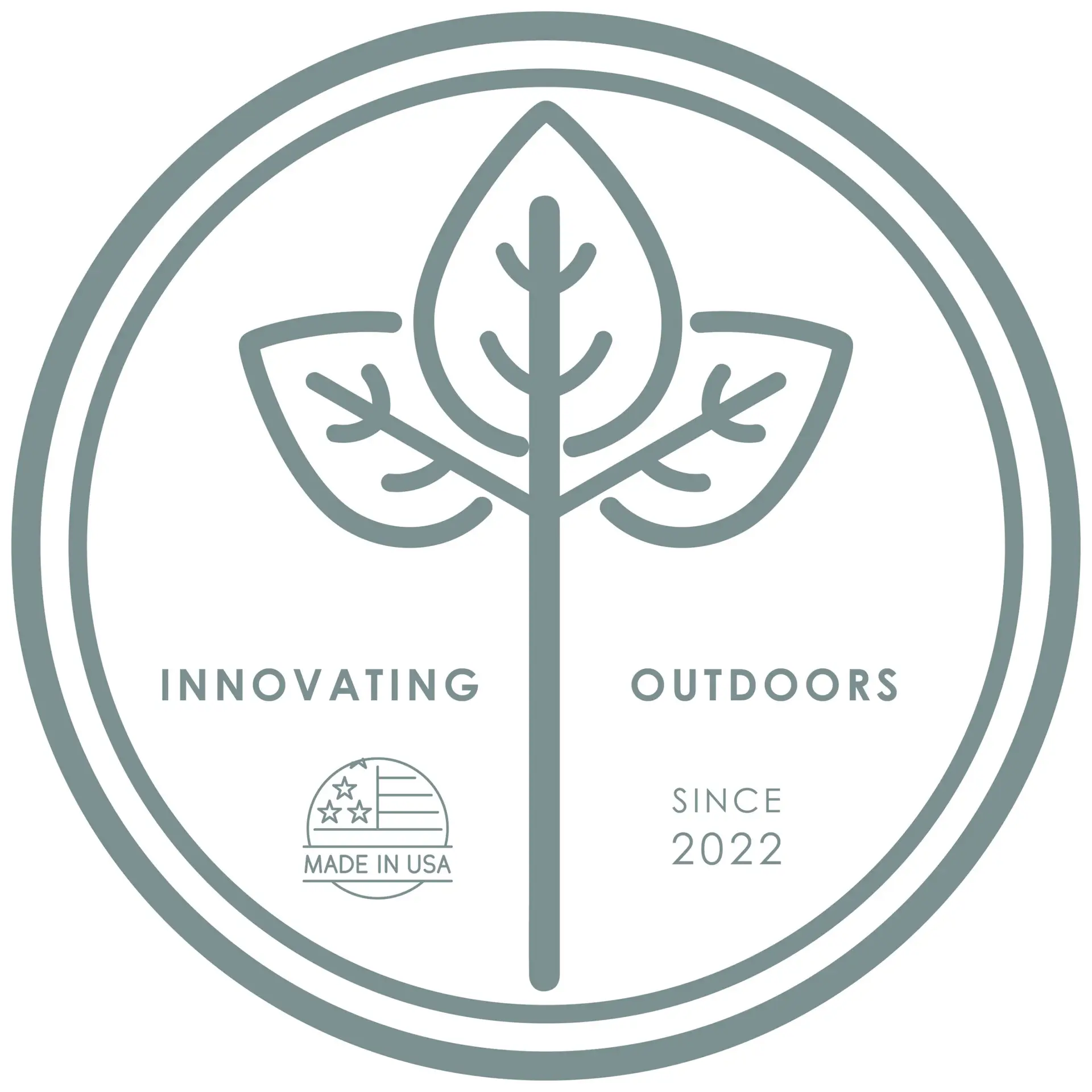
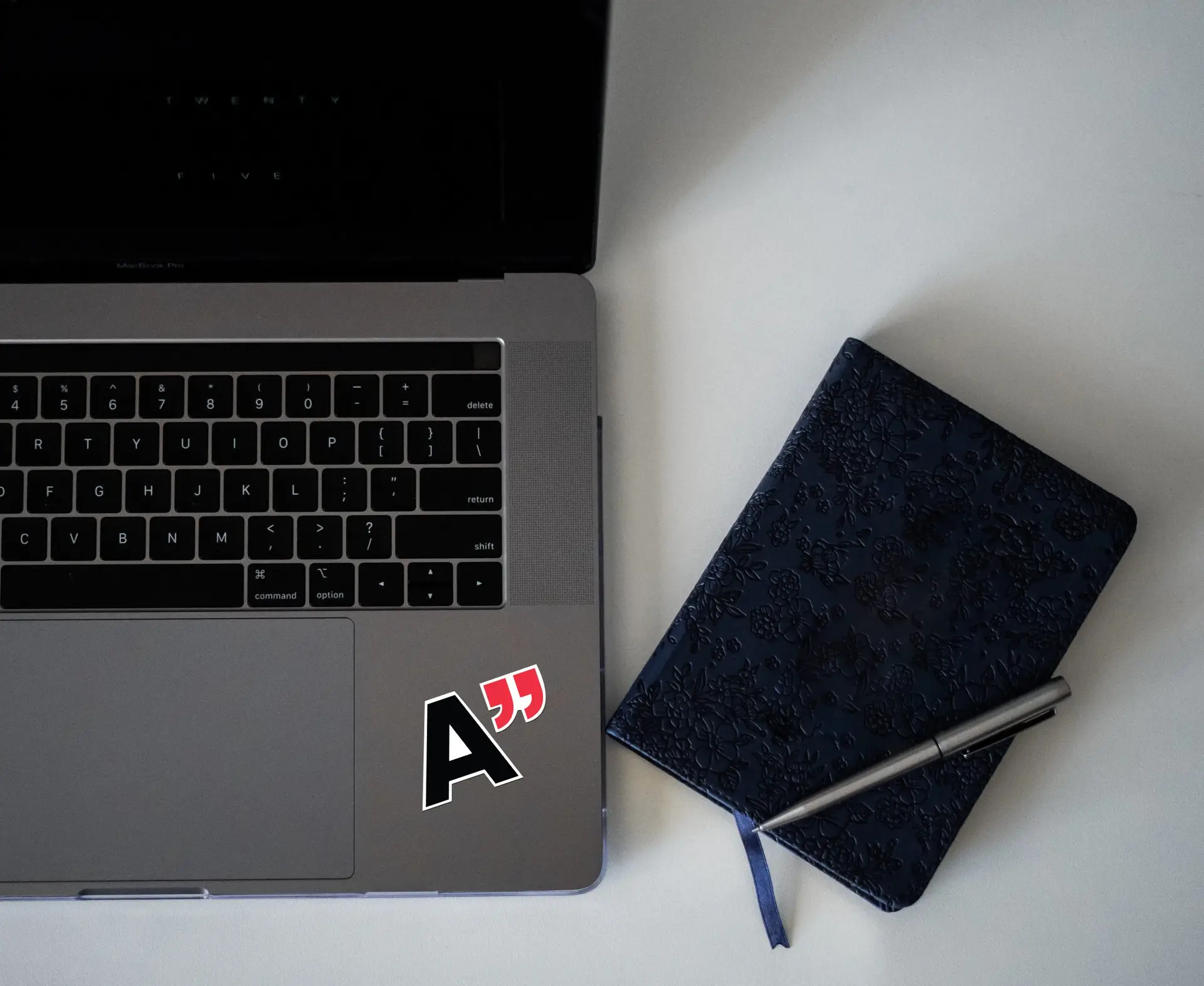
The BYC team and I also had this great idea of creating an emblem for their products. We conceptualized a wood-burning iron of sorts that gives their product a permanent “seal of approval”. They really liked the look of the vector leaves used in the brand guide design; so much that they chose that graphic as the main component of the seal. Something simple yet sleek.

Self-Reflection:

I really loved how this project came out. I think a lot of strong design decisions were made here, and that they really elevate BYC over their competitors. Their new brand aesthetic communicates that they mean business, and they’re the experts, on the up-and-up in outdoor living. Follow-ups will be made at a later date to see how the rebrand is working out.

View the Digital Publication

Click the button below to be redirected to Issuu.com, where I’ve created a digital brand book to read through in more detail.

Interested in learning more about BYC and their products?

Visit their company website to read all about their experience, quality products, and the expert services that they offer.

kids playhouse gender neutral package design

kids playhouse gender neutral package design

package design | illustration | crafting

Challenge:

Design a gender neutral brand and product for an assigned kids playhouse.

Design Solution:

During my time in college, I was asked to develop a brand identity and package design for an existing architectural playhouse assigned. I chose to pursue a sandcastle concept that would appeal to children of both genders. Regardless of gender, everyone can agree that kids love sandcastles. I used this common interest as inspiration for this project, and developed a concept of a crab themed sandcastle. From the package design, to the pieces of the kids playhouse itself, the theme is communicated efficiently and cohesively throughout the brand. The playhouse set also features an on-theme paint set with a brush to customize the castle, washable, of course. Whether your kid colors inside the lines or out, the included paint is washable to make cleanup a breeze.

Self-Reflection:

This project combined my branding and crafting skills, and challenged me to build a brand and product that is cohesive throughout. It also challenged me to focus on a broader audience, being a gender neutral product for children. Knowing and being able to appeal to your audience is an important skill in the design world.

Interested in finding out more about gender neutrality in packaging and product design?

GVC’s “So What’s The Deal?” vlog series

GVC’s “So What’s The Deal?” vlog series

motion graphics | illustration | branding

Challenge:

Utilizing various skills, develop a video blog series and branding elements revolving around diversity and inclusion in the workplace and mainstream media.

Design Solution:

During the time I spent at my internship, I was given the responsibility of developing volume one of our VLOG series at Global View Communications. The goal was to put something out there that gets people talking about D & I, and gets them to form opinions and speak out. This included basic practices such as motion graphics animation, character design, and audio development. This particular volume revolves around inclusion within the LGBTQIA community, launched in alignment with Pride Month in June. Starting with the logo, we visualized a typographic concept to appeal to our corporate partners and followers on social media. My team and I found inspiration from various sources, such as the news segment “Do You Buy That?” by FiveThirtyEight, infographics, experiences, and more. 

With creative assets of original design, the vlogs even include custom characters that you’ll see throughout the series. These characters are designed with their own personalities in mind.

Following my internship, I was asked to come back as a contract junior designer by the CEO, Greg Almeida. After creating several more vlogs for the series under GVC, our projections for social media engagement were met, and the design solution was deemed successful.

Self-Reflection:

This vlog project was definitely a learning curve at first. The first video in the series took a solid couple of months to complete, as I was doing all the animations from scratch the first time around. This impractical turnaround time prompted me search for a better way to streamline the animations, and introduced me to the wonderful world of AE Plugins! I was able to use plugins to animate my illustrations, and took the production time from 2 months to 2 weeks. And then one week. And then three days. I personally believe that this discovery was crucial to my time management skills as a designer, and without this project prompting me to search out an alternative, I might have never learned about the other ways I could improve as a designer by becoming faster. 

Interested in learning more about Global View Communications and their mission?

Follow them on social media to stay up to date on the latest and greatest in human resources, talent acquisition, company culture, and staying inclusive in the workplace.

subscription box package design

subscription box package design

branding | crafting | web design

Challenge:

Formulate a unique concept and design a monthly subscription box and website.

Design Solution:

For Digital Media Studio II, we developed a brand, corresponding website prototype, and subscription box on a topic of our choosing. Artistic expression was my main focus of this assignment, and this prompted my concept of an art and wine subscription box named Dabble; a brand that promotes dabbling in various arts. I’m sure that I am not the only one who prefers to drink and do my art at home, as opposed to in public. I used this common interest as inspiration for this project, and developed a wine and art box; similar to that of a “wine and paint” event. It was my intention to communicate artistic expression throughout all aspects of the brand (using brush strokes, homemade patterns, and more).

The monthly subscription box features a bottle of wine, an art project with supplies, and a cracker and cheese pairing, as well as offering several ways to get creative, even down to the lid of the complimentary supply box.

Self-Reflection:

This project encompassed an array of my skills, such as branding,  crafting physical prototypes, photography, and web layout design. I took this project as a new challenge, and used the opportunity to come up with a unique concept that was executed beautifully. From the box, to the contents, to the website; this brand and product screams “creative” in a way that is elegant and artistic. I would consider this project one of my strongest yet.

Click the button to view the working desktop prototype for Dabble Creative.

catalog publication design

catalog publication design

branding | publication | digital media

Challenge:

Develop a catalog based on a product of your choosing, complete with branding elements.

Design Solution:

For Digital Media Studio I, I created a brand centered around fresh, artisan preserves. Growing up, I always helped my Grandma (Fijak) pick fruits from her gardens, and tried my best, as a five year old with mediocre cooking knowledge, to help her create her fruit preserves. To this day, I drool over the thought of her jams in my Christmas baskets ever year. I took inspiration from these cherished family moments to develop the company Fijak Gardens. Since my inspiration came from the concept of homemade, preserved memories, I chose to go a rather “kitcshy” tone for the brand aesthetic. Fijak Gardens is all about farm to table, fresh ingredients and cooking with care. When these aspects come to mind, the first thing that always comes to mind is a “homemade-grandma” vibe, so I honed in on this tone in my packaging methods, logo design, and even photo composition. 

We are set out amongst the rest of our competitors, and I wanted the catalog to shout this from the rooftops, using high-end and kitschy elements to create an all-around successful farm-to-table brand.

Self-Reflection:

The passion I put into this project is definitely more than usual, but then again, not all of my projects have a personal connection behind them. Due to this, I feel like I could really pour my heart and soul into the copy, photos, packaging, and logo. I was even able to take this project above and beyond, creating real labels with my Cricut. Crafting my own labels and taking my own photos, rather than using jar mockups, really took this project to the next level.

sneaker brand apparel design

sneaker brand apparel design

digital media | brand development | illustration

Challenge:

Develop a creative, innovative shoe brand or collaborative ection complete with brand assets and unique illustrations.

Design Solution:

When developing this concept for my Digital Media Studio class, it was at a time where I was really starting to take off in my vector art. Acknowledging that my skills were improving tremendously, I wanted to create a brand centered around vector art and icons. For a few projects, I had been toying with the concept of space, but it had usually been scrapped for a different concept. This time, I decided to take the theme of space and run with it. Finally trying my hand at a space themed design, I wanted to create a brand that could appeal to all ages, but still give off a high-end vibe, inspired by Vans and their famous skate shoes.

I accomplished this by using a thin, clean, unique typeface as the center of the logo, and kept it relatively minimal. The color palette was pulled straight from a photo of the solar system to ensure that the tones used were reflective of our galaxy itself.

Self-Reflection:

I had a ton of fun with this project! I feel like this really showcased where my illustration skills have come from, say, three years ago to now. Not only did it show off my vector icons, but I learned a lot about apparel design in itself, and how to really bring my work to life through the clothes we wear from head to toe.

university acceptance package

university acceptance package

print design | typography | crafting

Challenge:

Design an acceptance package for a university of your choosing, utilizing the five senses to create an incredible unboxing experience.

Design Solution:

This project utilized the skills I have learned in spatial design, print design, typography, and prototyping; alongside teaching me printer specifications. Aalto University, an engineering and design institute in Finland, was chosen as the muse of this project due to the modern-style, typography heavy elements that the university employs throughout their branding. The deliverables chosen for the package included the box itself, an interactive acceptance letter, a pack of colored pencils, a sketchbook, a laptop sticker, a Popsocket, and the applicant’s student ID that doubles as a portable flash drive.

I wanted to make this college acceptance package interactive but useful for the applicant to enhance the “package-opening experience”. Bearing this in mind, I made the decision to create an on-brand and fun geometric pattern to utilize throughout the package. This includes on the backside of the acceptance letter, which presents the pattern in black and white so that the applicant can use the included colored pencils to “color their future”. The Student ID/flash drive not only gets the student excited about their acceptance, seeing it “in real life”, but it’s also incredibly practical as a way to store their school documents.

Self-Reflection:

This project taught me how to follow established brand guidelines and still come out with impressive, cohesive deliverables. It also taught me how to think outside the box to create a truly immersive unboxing experience, and the importance of printer specifications in a project.

design for good brand development

design for good brand development

branding | publication | layout design

Challenge:

Design a branding campaign for a fictional charity, complete with a branding strategy, logo, and peripherals.

Design Solution:

As both a designer, and a compassionate individual, this campaign was right up my alley. Pawsible is a fictional organization that focuses on bettering the lives of shelter animals. I chose to create a brand that displays cohesion and creativity for a passionate subject. I developed a brand strategy to communicate a lighthearted approach to a serious issue.

The logo design intended to get the point across without being too busy. The color palette and font choices were chosen with hidden meanings in mind; how colors and fonts make us feel, and what they stand for. Print peripherals were based off of emotional movement; using headlines that hit home to convey our serious point of view. On the other hand, my apparel conveys the playful element of the brand.

Self-Reflection:

The end result of this project was integrating two themes to create a brand that is eye-catching and cohesive while spreading a message.