GVC’s “So What’s The Deal?” vlog series

GVC’s “So What’s The Deal?” vlog series

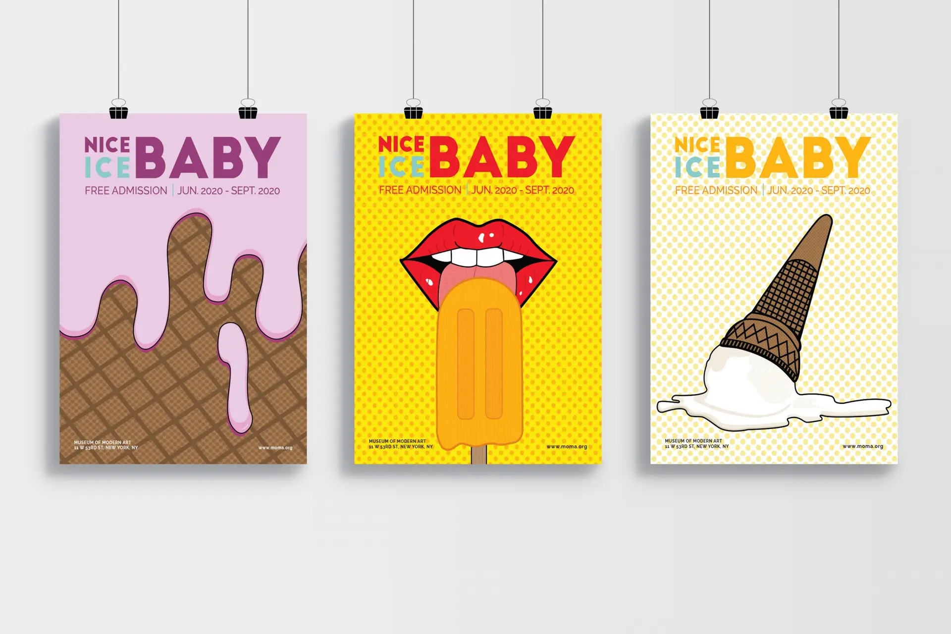
motion graphics | illustration | branding

Challenge:

Utilizing various skills, develop a video blog series and branding elements revolving around diversity and inclusion in the workplace and mainstream media.

Design Solution:

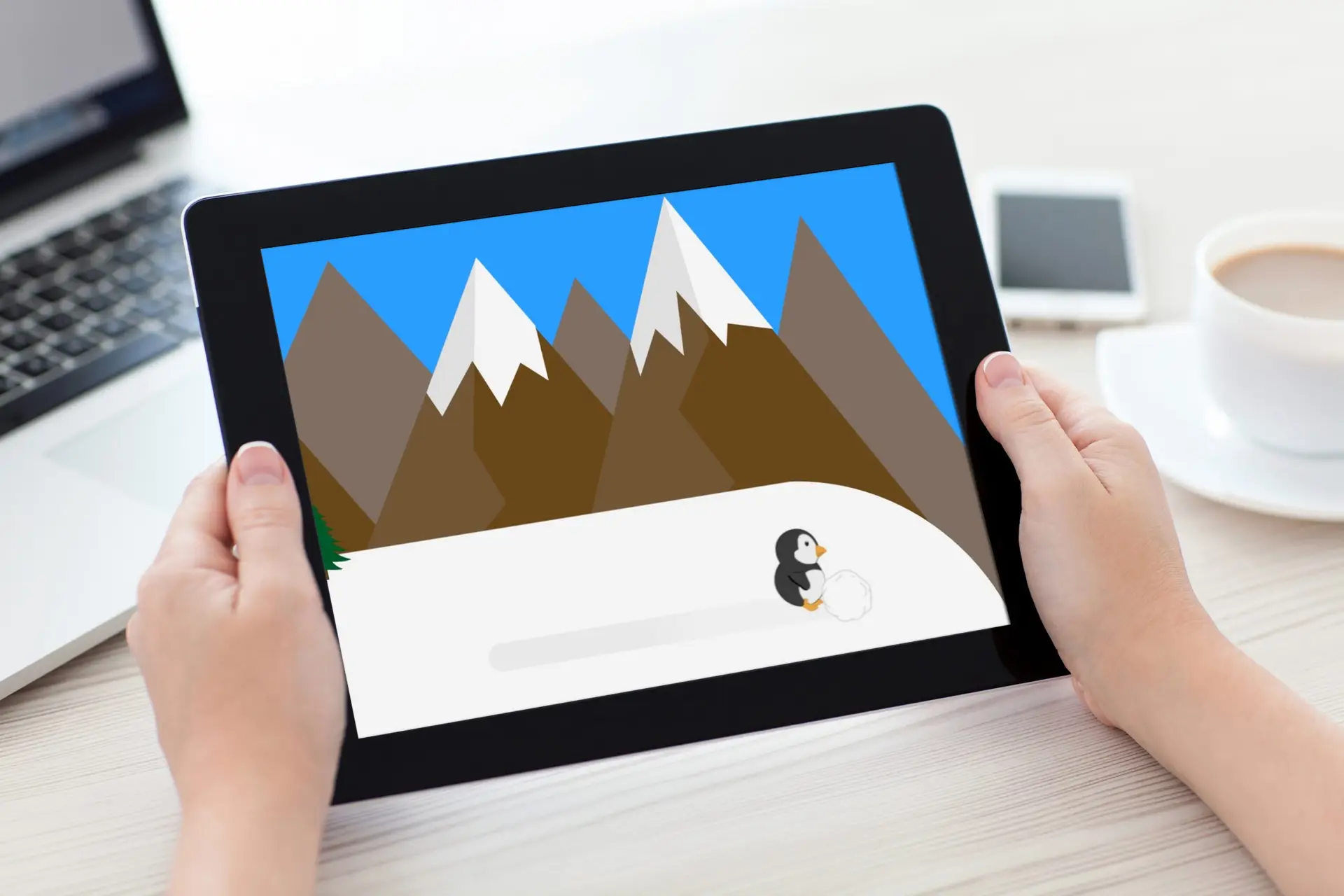
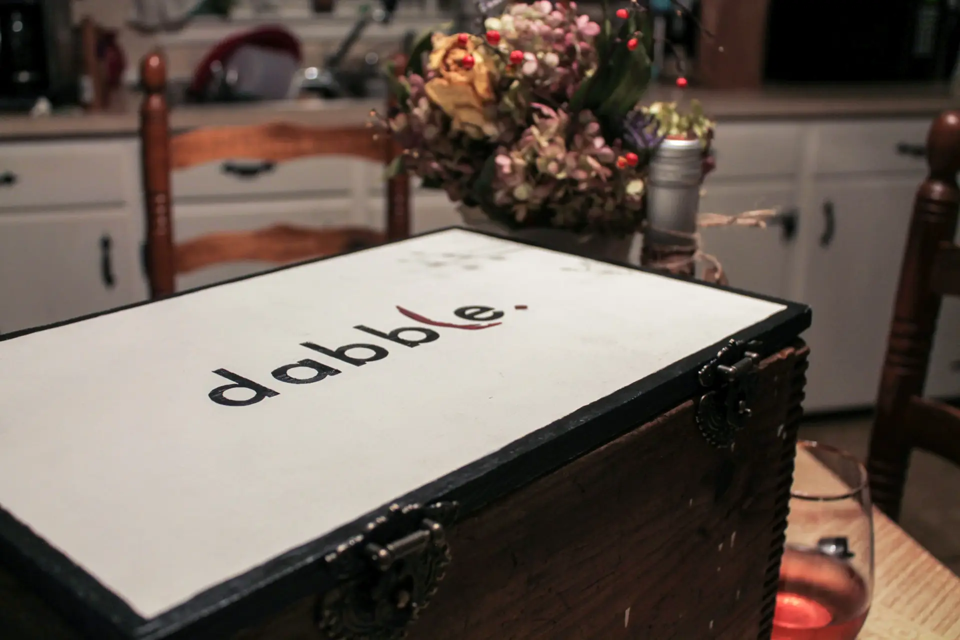
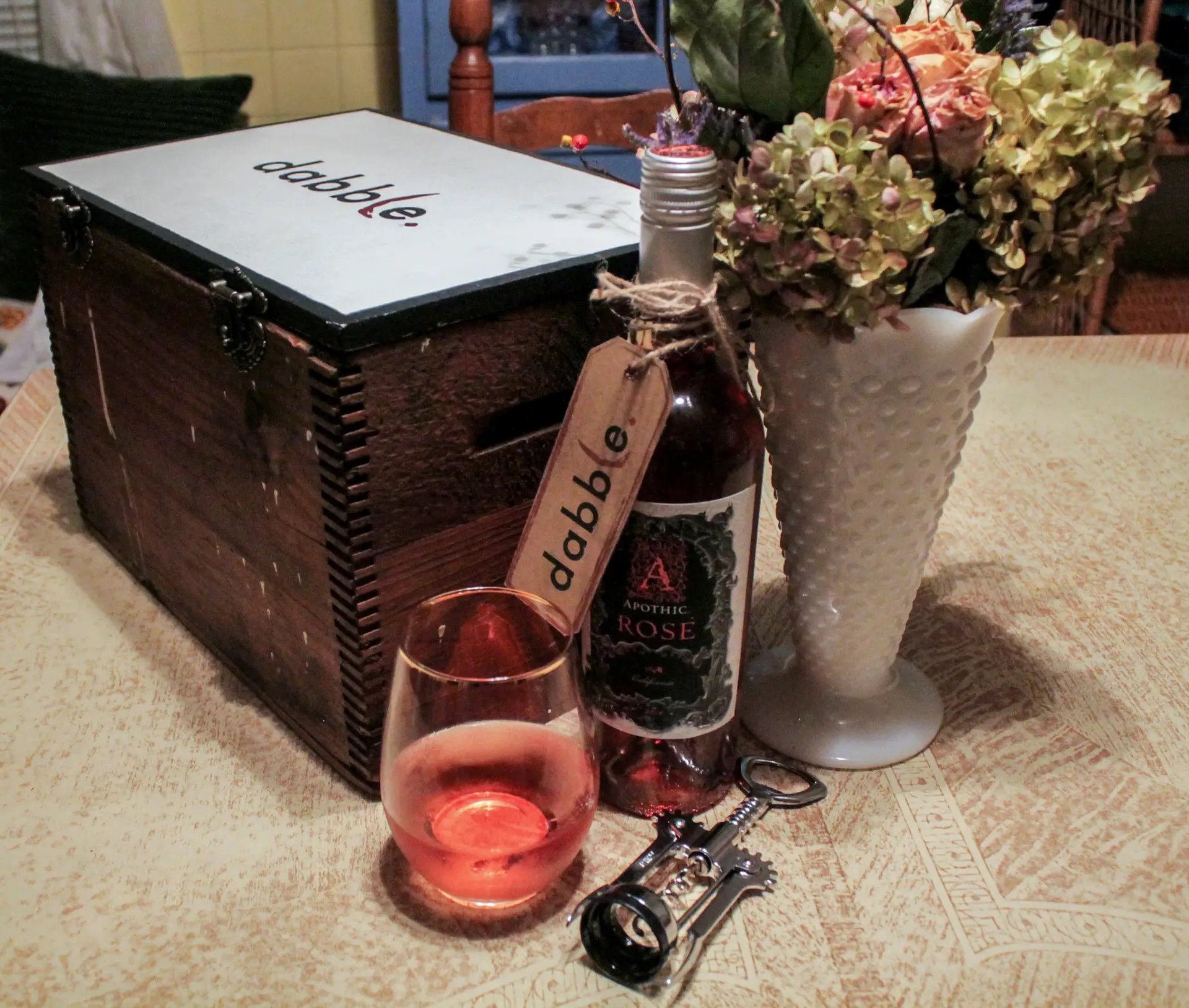
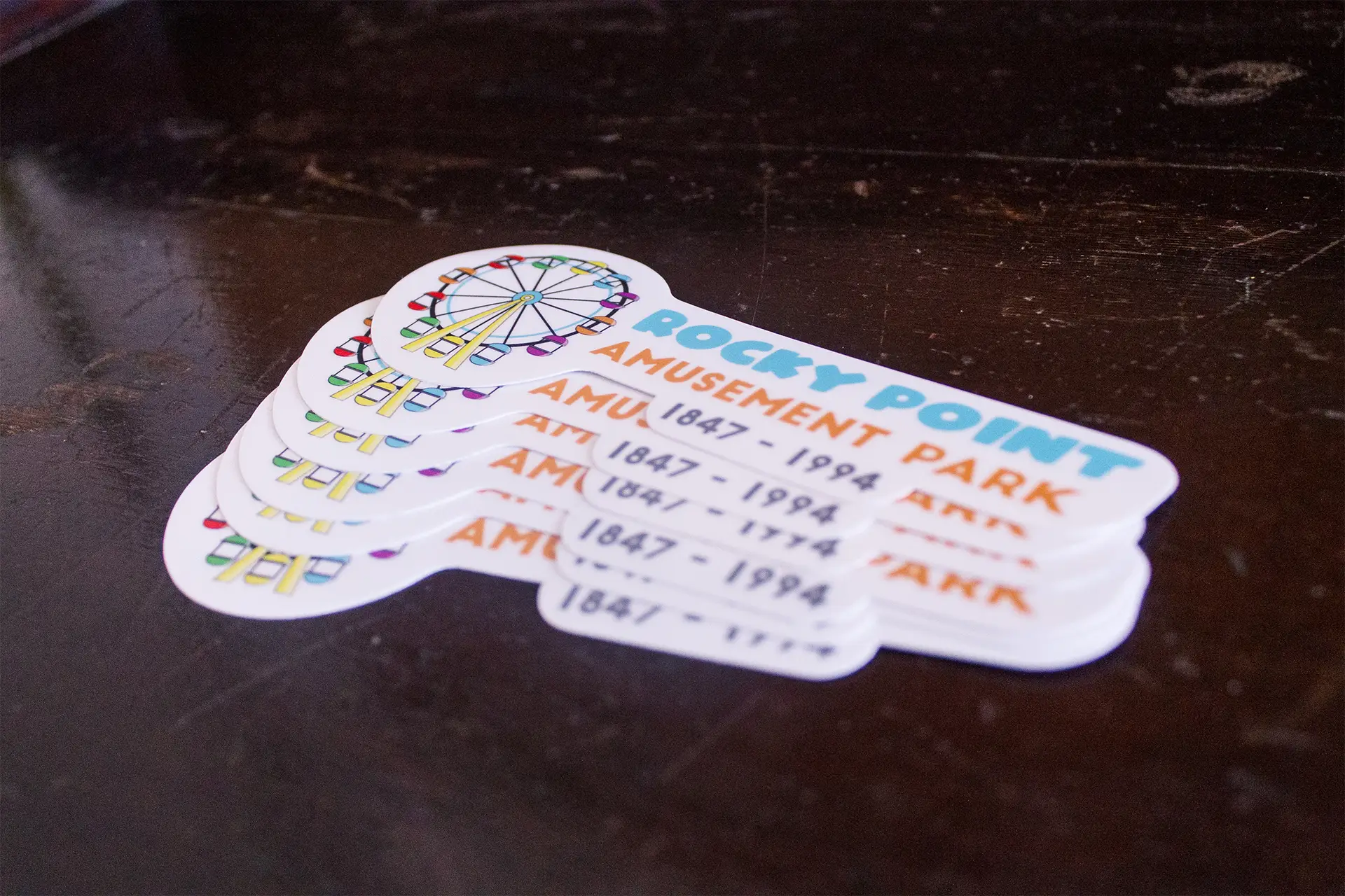
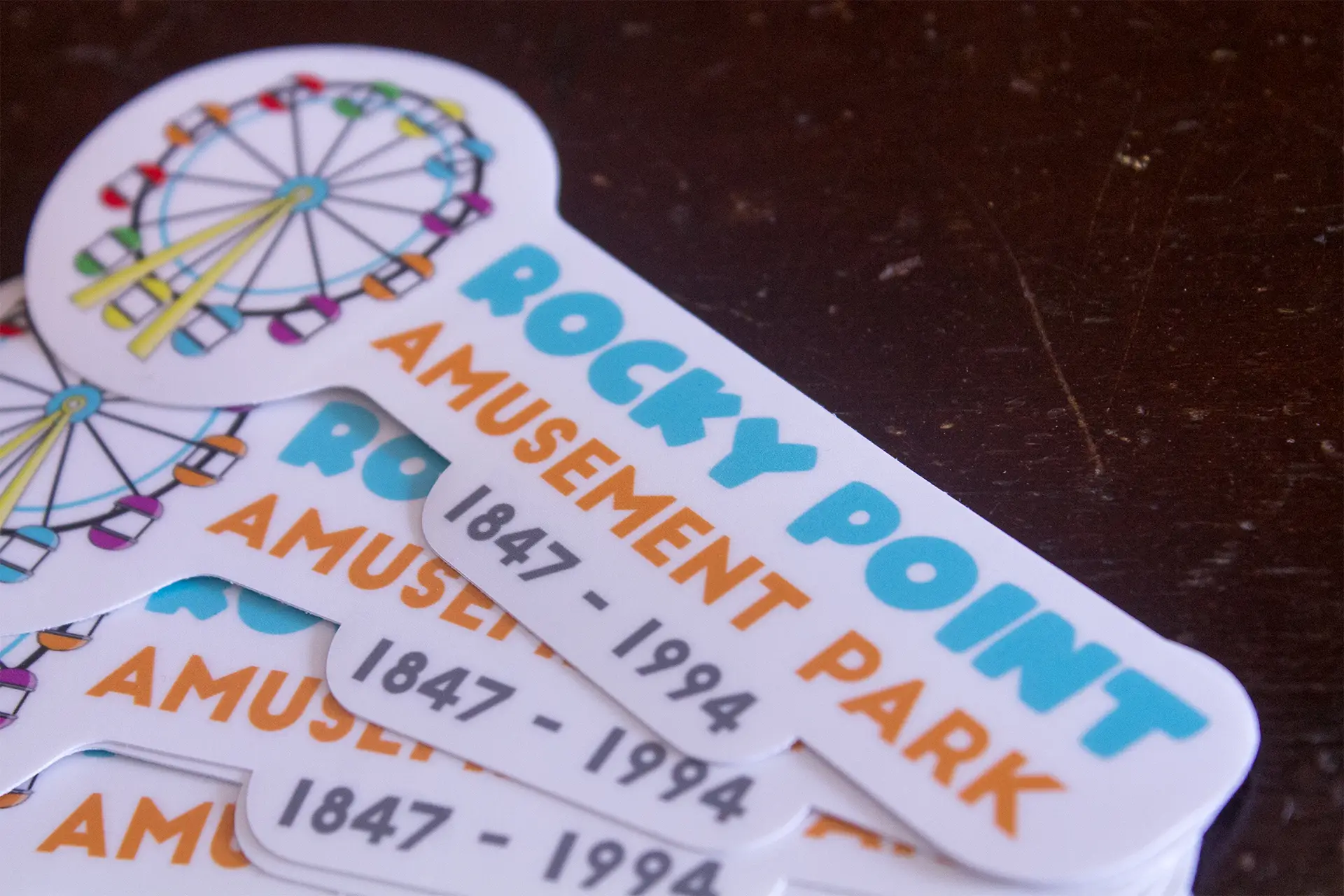
During the time I spent at my internship, I was given the responsibility of developing volume one of our VLOG series at Global View Communications. The goal was to put something out there that gets people talking about D & I, and gets them to form opinions and speak out. This included basic practices such as motion graphics animation, character design, and audio development. This particular volume revolves around inclusion within the LGBTQIA community, launched in alignment with Pride Month in June. Starting with the logo, we visualized a typographic concept to appeal to our corporate partners and followers on social media. My team and I found inspiration from various sources, such as the news segment “Do You Buy That?” by FiveThirtyEight, infographics, experiences, and more. 

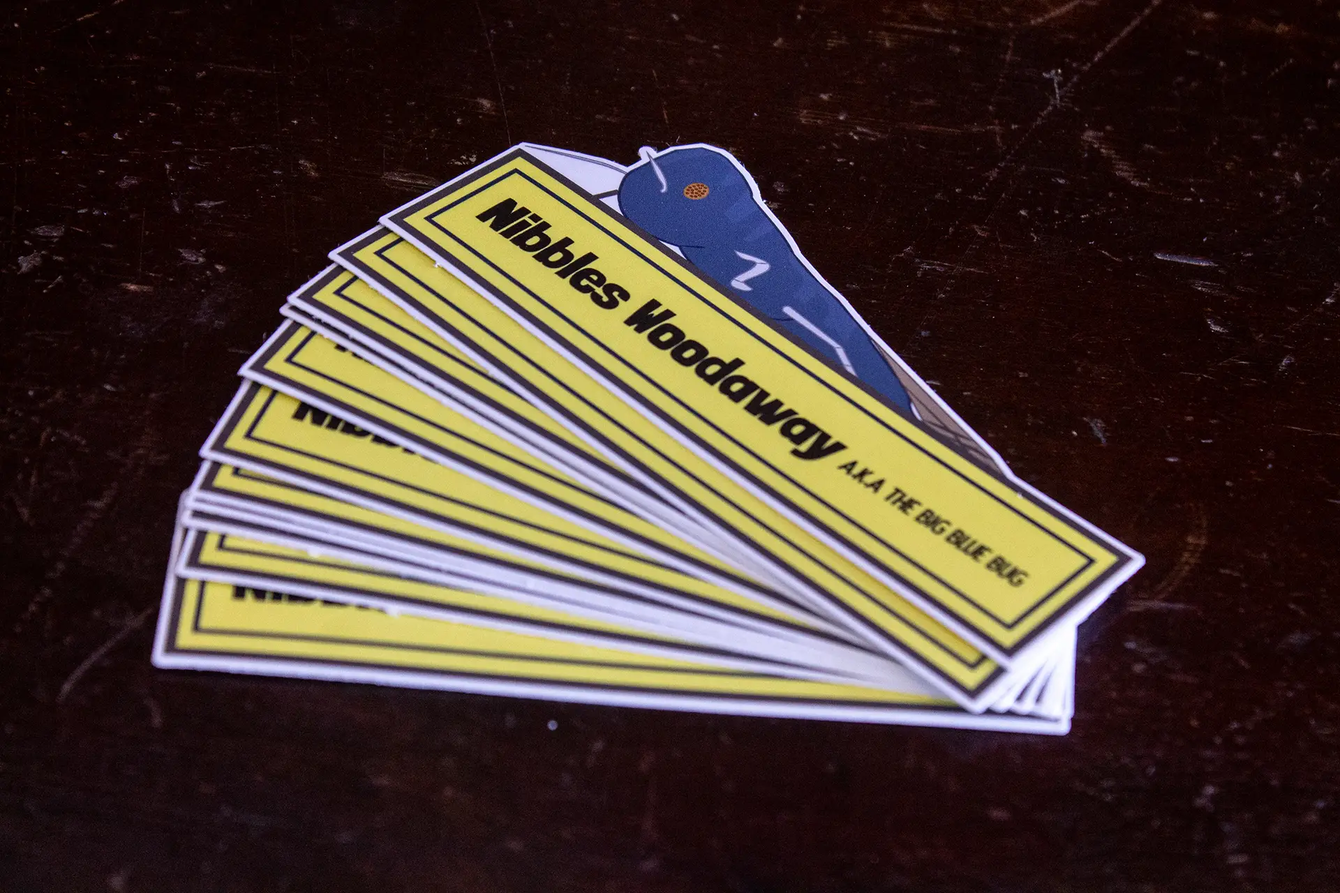
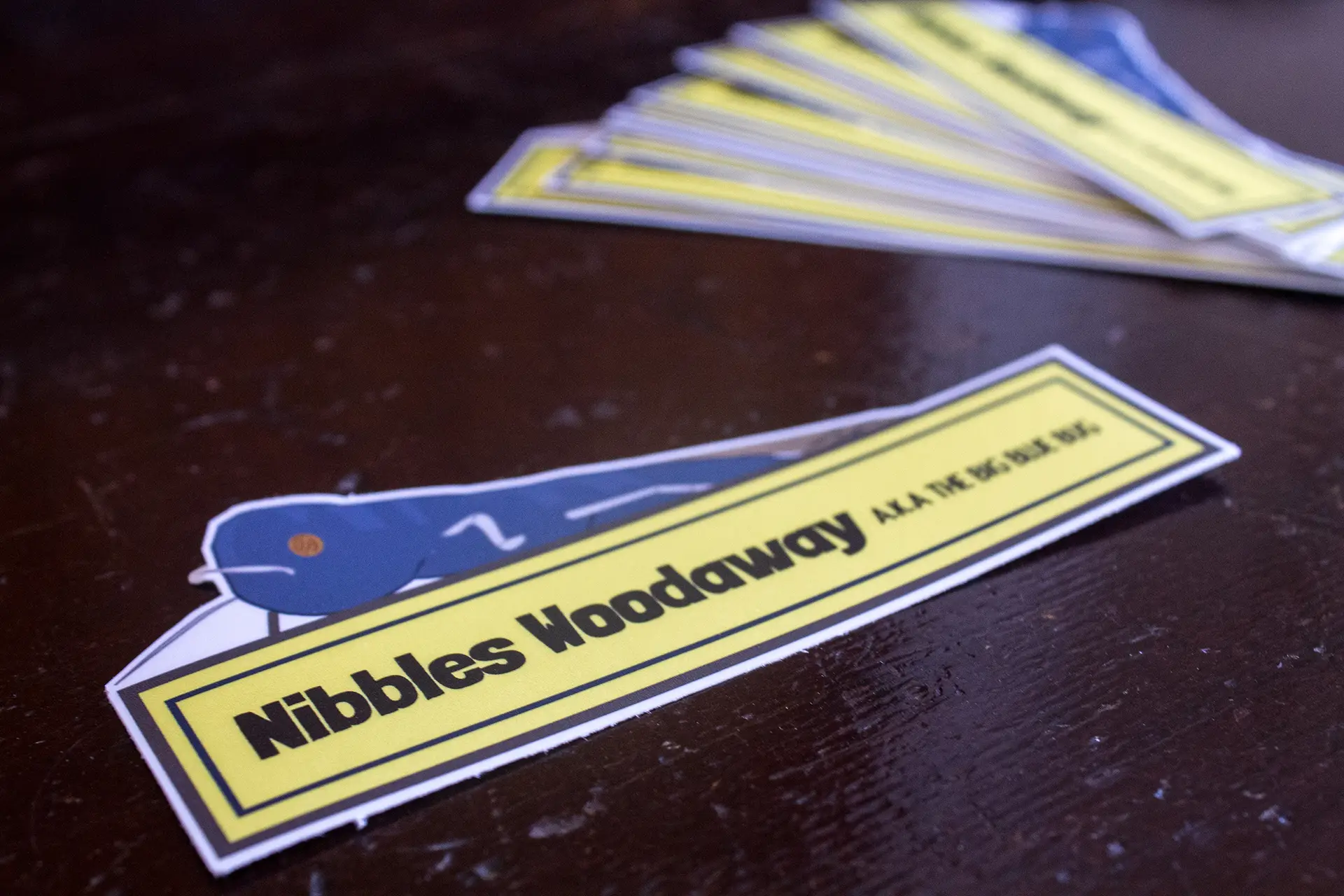
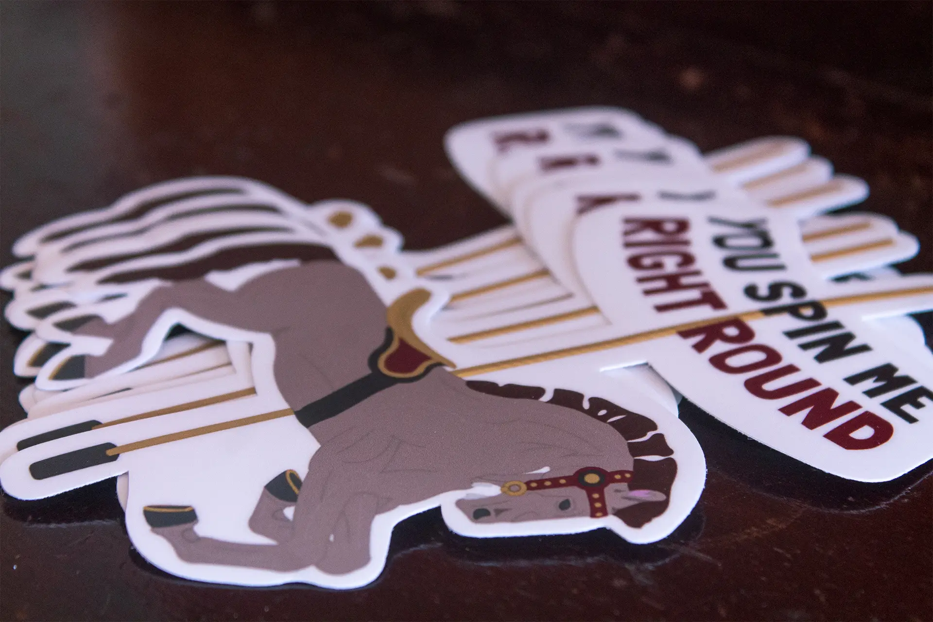
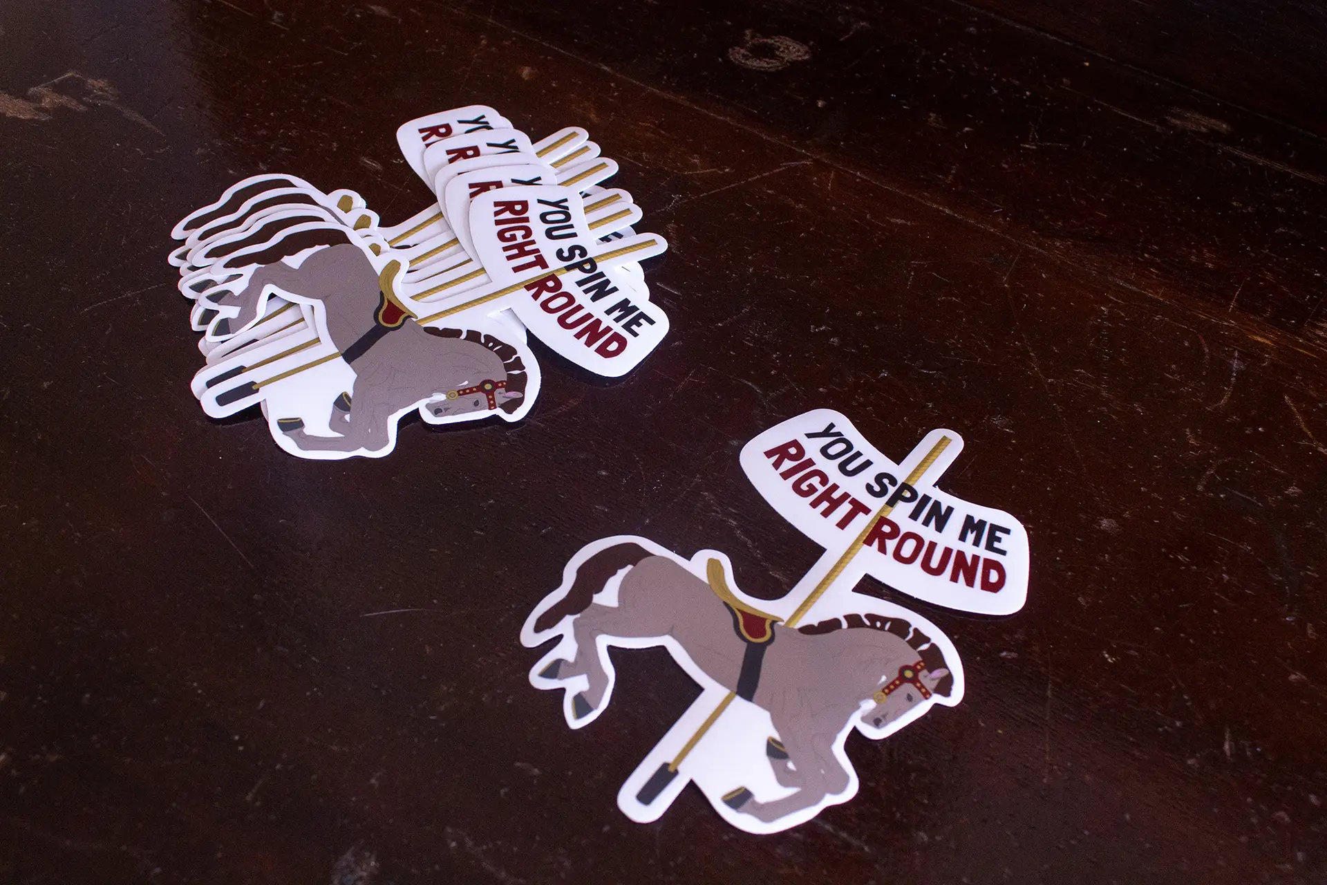
With creative assets of original design, the vlogs even include custom characters that you’ll see throughout the series. These characters are designed with their own personalities in mind.

Following my internship, I was asked to come back as a contract junior designer by the CEO, Greg Almeida. After creating several more vlogs for the series under GVC, our projections for social media engagement were met, and the design solution was deemed successful.

Self-Reflection:

This vlog project was definitely a learning curve at first. The first video in the series took a solid couple of months to complete, as I was doing all the animations from scratch the first time around. This impractical turnaround time prompted me search for a better way to streamline the animations, and introduced me to the wonderful world of AE Plugins! I was able to use plugins to animate my illustrations, and took the production time from 2 months to 2 weeks. And then one week. And then three days. I personally believe that this discovery was crucial to my time management skills as a designer, and without this project prompting me to search out an alternative, I might have never learned about the other ways I could improve as a designer by becoming faster. 

Interested in learning more about Global View Communications and their mission?

Follow them on social media to stay up to date on the latest and greatest in human resources, talent acquisition, company culture, and staying inclusive in the workplace.

subscription box package design

subscription box package design

branding | crafting | web design

Challenge:

Formulate a unique concept and design a monthly subscription box and website.

Design Solution:

For Digital Media Studio II, we developed a brand, corresponding website prototype, and subscription box on a topic of our choosing. Artistic expression was my main focus of this assignment, and this prompted my concept of an art and wine subscription box named Dabble; a brand that promotes dabbling in various arts. I’m sure that I am not the only one who prefers to drink and do my art at home, as opposed to in public. I used this common interest as inspiration for this project, and developed a wine and art box; similar to that of a “wine and paint” event. It was my intention to communicate artistic expression throughout all aspects of the brand (using brush strokes, homemade patterns, and more).

The monthly subscription box features a bottle of wine, an art project with supplies, and a cracker and cheese pairing, as well as offering several ways to get creative, even down to the lid of the complimentary supply box.

Self-Reflection:

This project encompassed an array of my skills, such as branding,  crafting physical prototypes, photography, and web layout design. I took this project as a new challenge, and used the opportunity to come up with a unique concept that was executed beautifully. From the box, to the contents, to the website; this brand and product screams “creative” in a way that is elegant and artistic. I would consider this project one of my strongest yet.

Click the button to view the working desktop prototype for Dabble Creative.

sneaker brand apparel design

sneaker brand apparel design

digital media | brand development | illustration

Challenge:

Develop a creative, innovative shoe brand or collaborative ection complete with brand assets and unique illustrations.

Design Solution:

When developing this concept for my Digital Media Studio class, it was at a time where I was really starting to take off in my vector art. Acknowledging that my skills were improving tremendously, I wanted to create a brand centered around vector art and icons. For a few projects, I had been toying with the concept of space, but it had usually been scrapped for a different concept. This time, I decided to take the theme of space and run with it. Finally trying my hand at a space themed design, I wanted to create a brand that could appeal to all ages, but still give off a high-end vibe, inspired by Vans and their famous skate shoes.

I accomplished this by using a thin, clean, unique typeface as the center of the logo, and kept it relatively minimal. The color palette was pulled straight from a photo of the solar system to ensure that the tones used were reflective of our galaxy itself.

Self-Reflection:

I had a ton of fun with this project! I feel like this really showcased where my illustration skills have come from, say, three years ago to now. Not only did it show off my vector icons, but I learned a lot about apparel design in itself, and how to really bring my work to life through the clothes we wear from head to toe.

sticker collection print design

sticker collection

RI Sticker Pack Collection

digital media | typography | illustration

Challenge: Utilizing illustrations designed for a previous project write-up, create a limited sticker collection of iconic Rhode Island heritage.

Design Solution: This sticker collection was actually  a complete reconceptualization of a previous project  write-up of a window cling series. Focusing on icons of  my home state, I developed a series of  stickers based off of places that help make Rhode Island what it is, and in turn, help make me who I am. The icons focused on in this project were: Del’s Frozen Lemonade, Narragansett Lager, the Big Blue Bug beside I-95,  Iggy’s Doughboys and Clam Shack, Rocky Point Amusement Park, and the Flying Horse Carousel in Watch Hill (the oldest operating carousel in the US). Since I was revisiting this project specifically for the graphics, I wanted to build a design around them and make them the main focal point. 

While the window series itself was not up to par, the illustrations were fantastic! I wanted to find a better medium to showcase them on. Putting on my thinking cap and doing some research, I came up with some catchy sayings to really bring these graphics to the next level.

Self-Reflection: As a designer, it never really occurs to me to reconceptualize and re-use project elements. I always initially think to create something brand new, but turning this sub-par window project into an awesome sticker collection was super fun, and not all that time consuming at all! The success of this project will influence me to try to revisit and rethink other projects in the future to really push myself and see what else I can come up with.

*Disclaimer: I do not own the rights to some of the existing logos used in these designs.

poster series print design

poster series print design

print production | illustration | layout design

Challenge:

Design a poster series for a fictional museum exhibit of your choosing.

Design Solution:

For my Print Production class, we developed a poster series, advertising for a fictional museum exhibit. I chose to pursue a pop-art concept on the topic of ice cream, paying homage to the end of the summer season. When prompted about my favorite part of summer, ice cream is the first thing that comes to mind. I used this personal (but common) interest as inspiration for this project, and developed a concept of an ice cream exhibit at MoMA. For the aesthetic of this series, I portrayed it in the style of pop-art.

Self-Reflection:

This project was a excellent example of my typography and layout skills. I decided to challenge myself with this project, using a common theme of pop-art style throughout the posters; a theme in which I had never tried before. These posters helped me experience a new style outside of my typical aesthetic, and did it beautifully.

kinetic typography motion graphics

kinetic typography motion graphics

motion graphics | typography | illustration

Challenge:

Create a motion graphics video to narrate choice audio utilizing kinetic typography techniques.

Design Solution:

For this project, I really wanted it to be centered around the type, and for the illustrations to therefore compliment it. Keeping up with the latest trend of flat vector design, I created cohesive illustrations to tell the story of the song. Regarding the color palette, who creates a project around the song ‘Avalanche’, and doesn’t use blue? It was just common sense. As for the other colors; the song is upbeat and happy, and I wanted the colors to communicate that as strongly as the song itself.

Self-Reflection:

This was literally my starter project for learning the basics of AfterEffects. It is also the project that sparked my love for motion graphics. After diving in headfirst into the program, Adobe makes it hard to want to come up for air. If I had to take anything away from this project aside from the amazing skills I learned, it would be to remember to take breaks, or next thing you know, the first light you see in hours outside of your screen will be the sunrise shining through your window.

university acceptance package

university acceptance package

print design | typography | crafting

Challenge:

Design an acceptance package for a university of your choosing, utilizing the five senses to create an incredible unboxing experience.

Design Solution:

This project utilized the skills I have learned in spatial design, print design, typography, and prototyping; alongside teaching me printer specifications. Aalto University, an engineering and design institute in Finland, was chosen as the muse of this project due to the modern-style, typography heavy elements that the university employs throughout their branding. The deliverables chosen for the package included the box itself, an interactive acceptance letter, a pack of colored pencils, a sketchbook, a laptop sticker, a Popsocket, and the applicant’s student ID that doubles as a portable flash drive.

I wanted to make this college acceptance package interactive but useful for the applicant to enhance the “package-opening experience”. Bearing this in mind, I made the decision to create an on-brand and fun geometric pattern to utilize throughout the package. This includes on the backside of the acceptance letter, which presents the pattern in black and white so that the applicant can use the included colored pencils to “color their future”. The Student ID/flash drive not only gets the student excited about their acceptance, seeing it “in real life”, but it’s also incredibly practical as a way to store their school documents.

Self-Reflection:

This project taught me how to follow established brand guidelines and still come out with impressive, cohesive deliverables. It also taught me how to think outside the box to create a truly immersive unboxing experience, and the importance of printer specifications in a project.

design for good brand development

design for good brand development

branding | publication | layout design

Challenge:

Design a branding campaign for a fictional charity, complete with a branding strategy, logo, and peripherals.

Design Solution:

As both a designer, and a compassionate individual, this campaign was right up my alley. Pawsible is a fictional organization that focuses on bettering the lives of shelter animals. I chose to create a brand that displays cohesion and creativity for a passionate subject. I developed a brand strategy to communicate a lighthearted approach to a serious issue.

The logo design intended to get the point across without being too busy. The color palette and font choices were chosen with hidden meanings in mind; how colors and fonts make us feel, and what they stand for. Print peripherals were based off of emotional movement; using headlines that hit home to convey our serious point of view. On the other hand, my apparel conveys the playful element of the brand.

Self-Reflection:

The end result of this project was integrating two themes to create a brand that is eye-catching and cohesive while spreading a message.