wayfinding brand revision

wayfinding brand revision

digital media | brand redesign | illustration

Challenge:

Develop a wayfinding system for an organization of your choosing, complete with icons, maps, and kiosks.

Design Solution:

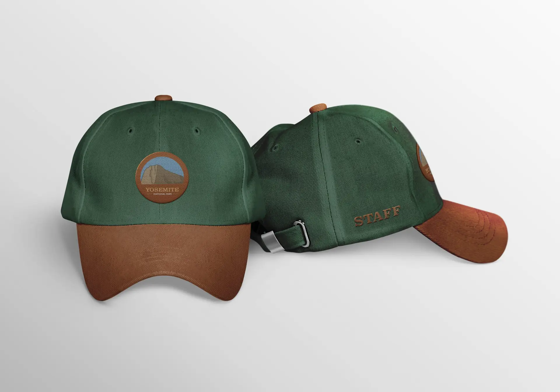
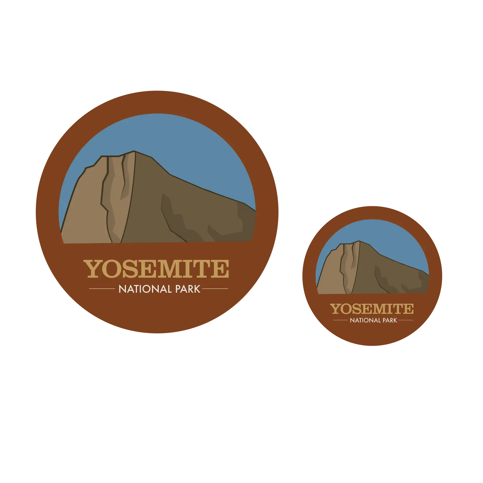
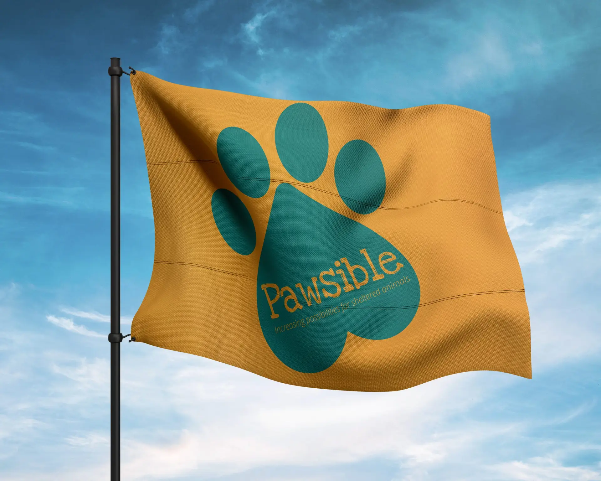
When developing this concept for a wayfinding system for Yosemite National Park, my first instinct was to keep the “nature” vibe they already had. National Parks are all about getting outside and enjoying the beauty the world has to offer, and to modernize that would be to diminish the entire feeling of the park. That being said, I decided to improve their logo to showcase their most popular attraction; El Capitan. The fonts and style I chose are reflective of the “natural” vibe I went with, adding just a tiny touch of modern by using Josefin Sans as a “secondary font” in the logo. As for the icons, I wanted to stay simple and minimal, but these are a work in progress. As they are right now, the restroom icon is far more detailed than the others; and I actually prefer them that way! I am in the process of revising these icons to fit more with the restroom icon.

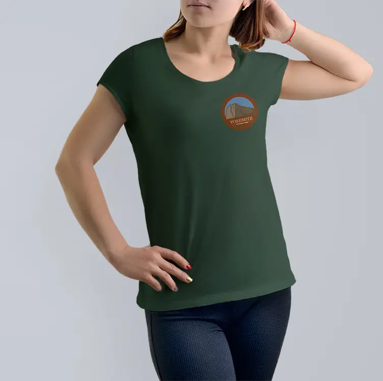
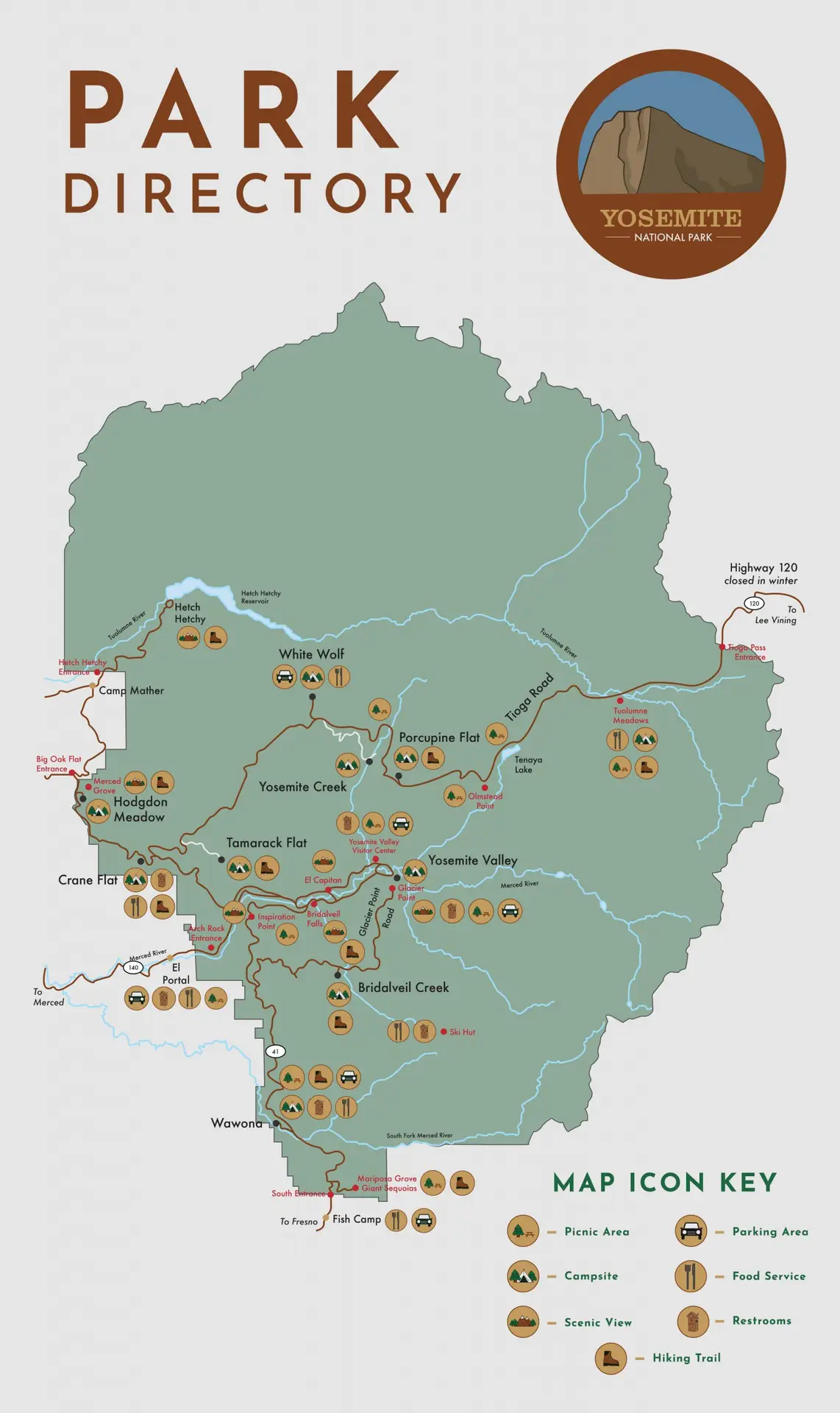
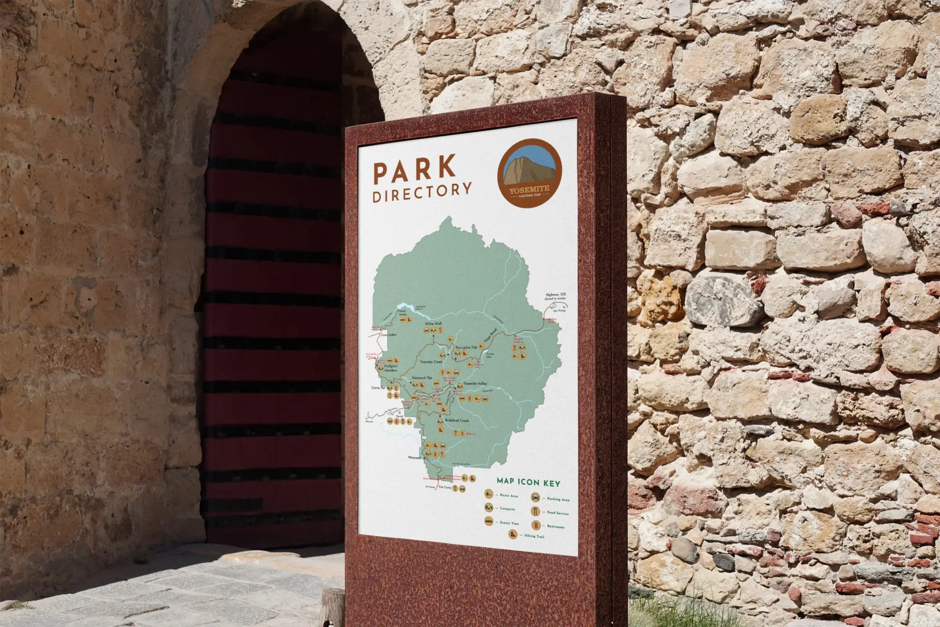
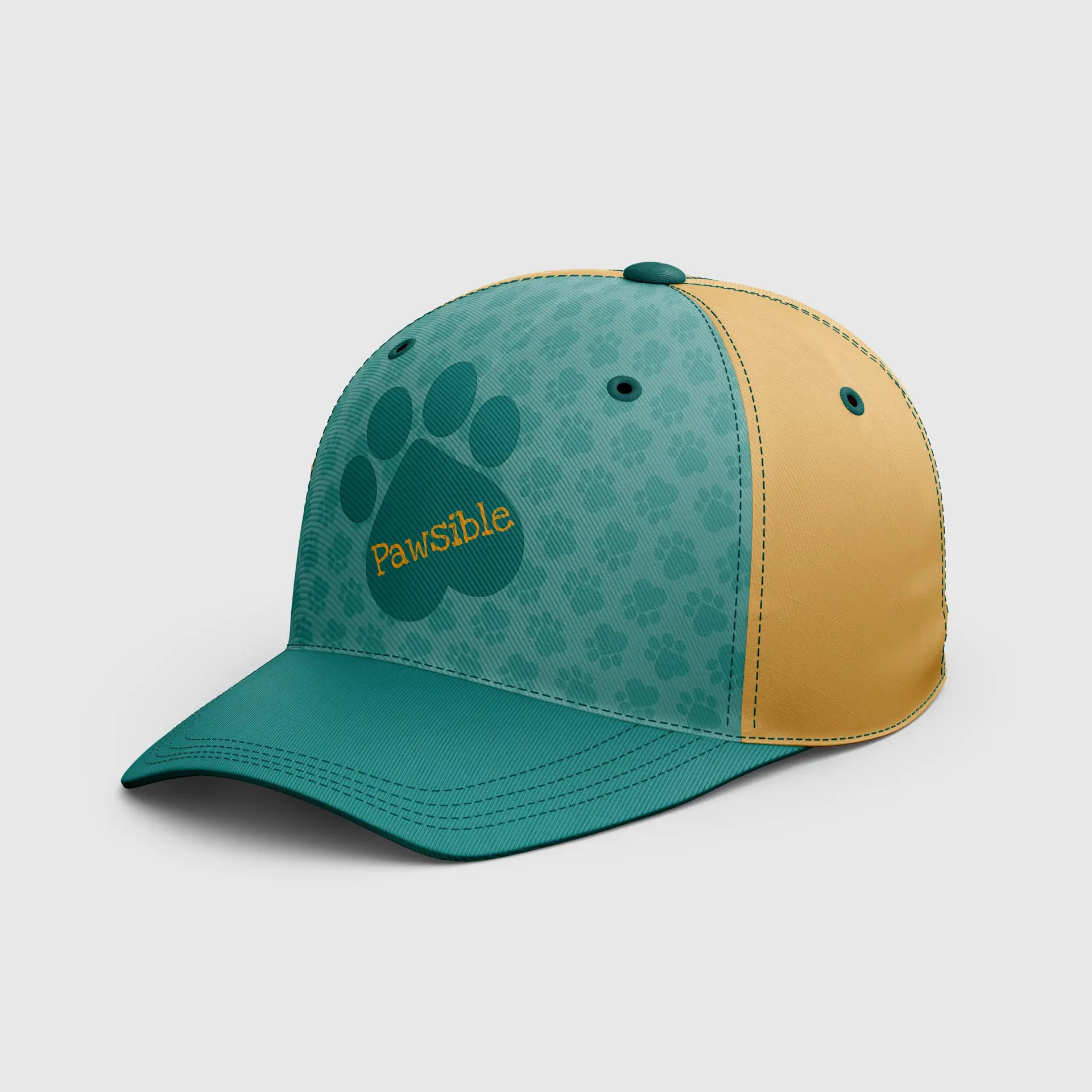
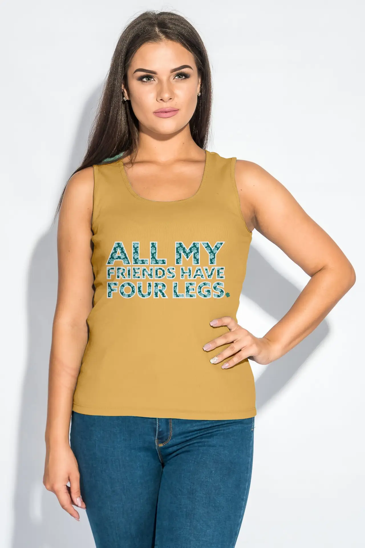
Additionally, I have created a wayfinding kiosk for visitors to use to map out their travels throughout the park. When designing this part of the project, I took a lot of inspiration from the appearance of wishing wells. The kiosk is also a work in progress, as I would like to refine the details in this more. Lastly, I developed a couple apparel items, consisting of a t-shirt and a baseball cap boasting the new logo. Ideally, this would be for park staff to wear so that visitors can pick them out easily.

Self-Reflection:

This project was definitely an interesting one, to say the least. I recall hitting a lot of roadblocks in the initial ideation of this work. I guess if I can take anything from this one, it’s that sometimes back to basics is best.

catalog publication design

catalog publication design

branding | publication | digital media

Challenge:

Develop a catalog based on a product of your choosing, complete with branding elements.

Design Solution:

For Digital Media Studio I, I created a brand centered around fresh, artisan preserves. Growing up, I always helped my Grandma (Fijak) pick fruits from her gardens, and tried my best, as a five year old with mediocre cooking knowledge, to help her create her fruit preserves. To this day, I drool over the thought of her jams in my Christmas baskets ever year. I took inspiration from these cherished family moments to develop the company Fijak Gardens. Since my inspiration came from the concept of homemade, preserved memories, I chose to go a rather “kitcshy” tone for the brand aesthetic. Fijak Gardens is all about farm to table, fresh ingredients and cooking with care. When these aspects come to mind, the first thing that always comes to mind is a “homemade-grandma” vibe, so I honed in on this tone in my packaging methods, logo design, and even photo composition. 

We are set out amongst the rest of our competitors, and I wanted the catalog to shout this from the rooftops, using high-end and kitschy elements to create an all-around successful farm-to-table brand.

Self-Reflection:

The passion I put into this project is definitely more than usual, but then again, not all of my projects have a personal connection behind them. Due to this, I feel like I could really pour my heart and soul into the copy, photos, packaging, and logo. I was even able to take this project above and beyond, creating real labels with my Cricut. Crafting my own labels and taking my own photos, rather than using jar mockups, really took this project to the next level.

poster series print design

poster series print design

print production | illustration | layout design

Challenge:

Design a poster series for a fictional museum exhibit of your choosing.

Design Solution:

For my Print Production class, we developed a poster series, advertising for a fictional museum exhibit. I chose to pursue a pop-art concept on the topic of ice cream, paying homage to the end of the summer season. When prompted about my favorite part of summer, ice cream is the first thing that comes to mind. I used this personal (but common) interest as inspiration for this project, and developed a concept of an ice cream exhibit at MoMA. For the aesthetic of this series, I portrayed it in the style of pop-art.

Self-Reflection:

This project was a excellent example of my typography and layout skills. I decided to challenge myself with this project, using a common theme of pop-art style throughout the posters; a theme in which I had never tried before. These posters helped me experience a new style outside of my typical aesthetic, and did it beautifully.

design for good brand development

design for good brand development

branding | publication | layout design

Challenge:

Design a branding campaign for a fictional charity, complete with a branding strategy, logo, and peripherals.

Design Solution:

As both a designer, and a compassionate individual, this campaign was right up my alley. Pawsible is a fictional organization that focuses on bettering the lives of shelter animals. I chose to create a brand that displays cohesion and creativity for a passionate subject. I developed a brand strategy to communicate a lighthearted approach to a serious issue.

The logo design intended to get the point across without being too busy. The color palette and font choices were chosen with hidden meanings in mind; how colors and fonts make us feel, and what they stand for. Print peripherals were based off of emotional movement; using headlines that hit home to convey our serious point of view. On the other hand, my apparel conveys the playful element of the brand.

Self-Reflection:

The end result of this project was integrating two themes to create a brand that is eye-catching and cohesive while spreading a message.