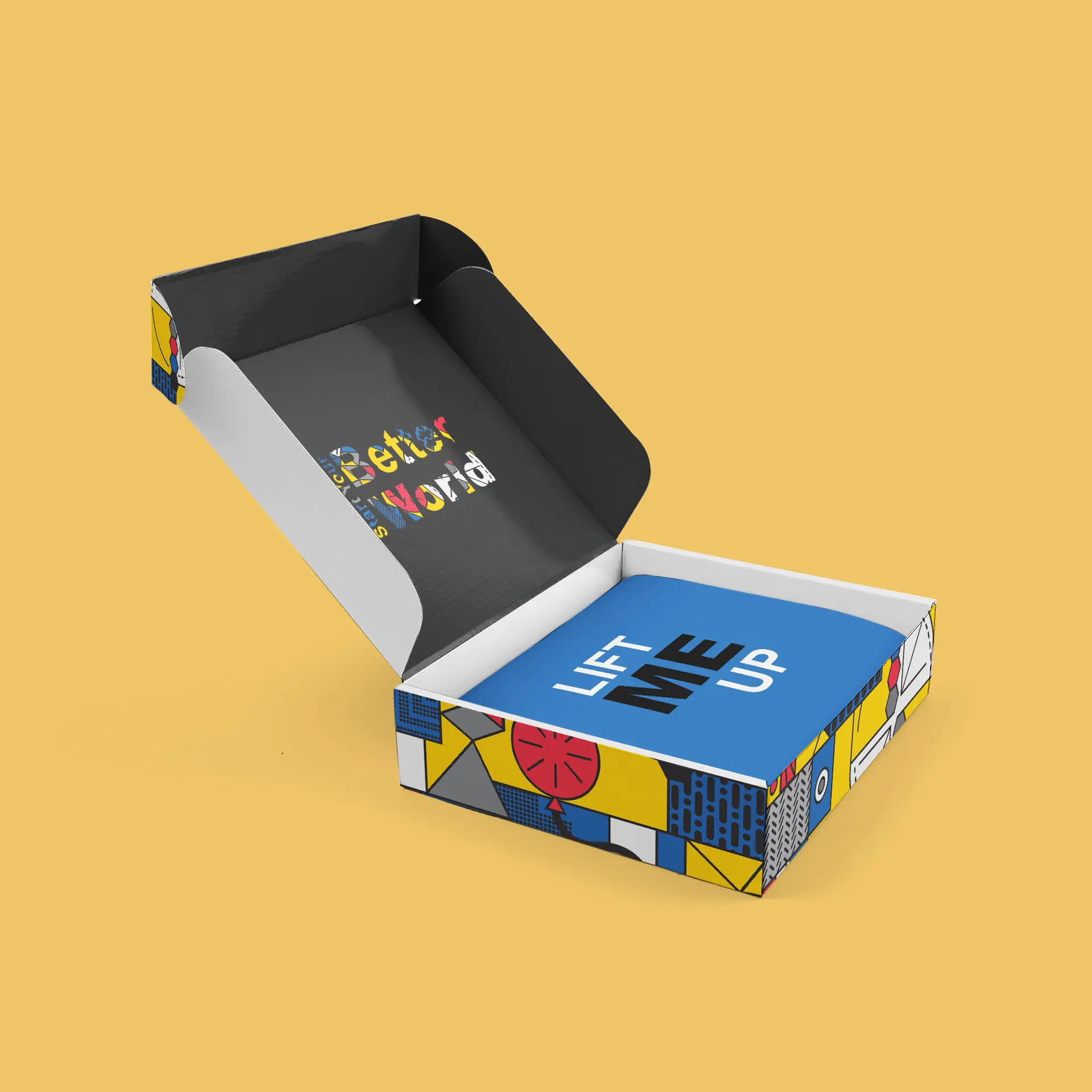
kids playhouse gender neutral package design

package design | illustration | crafting
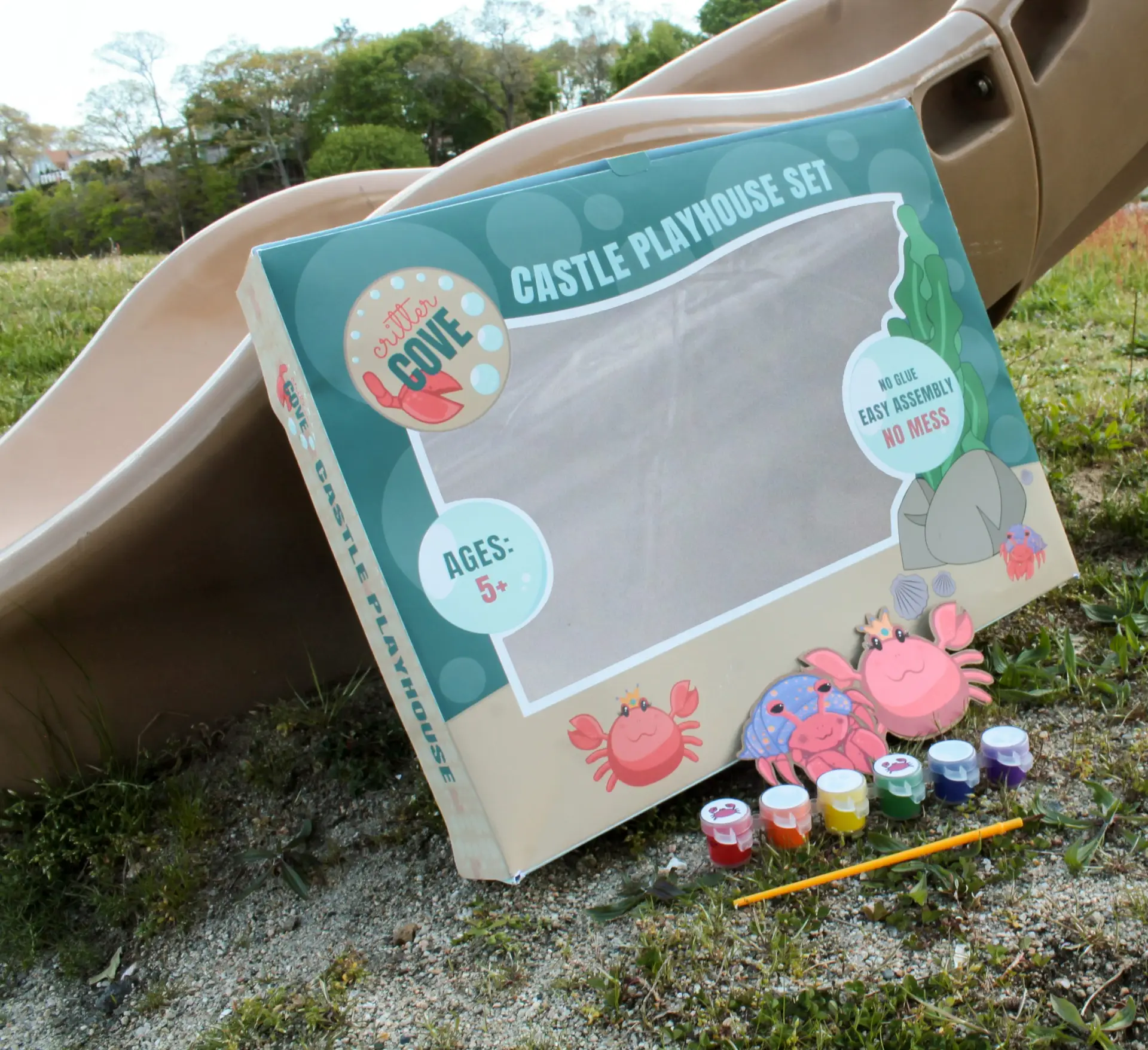
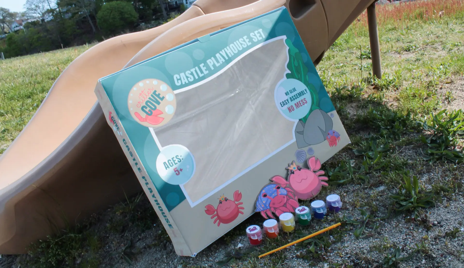
Challenge:
Design a gender neutral brand and product for an assigned kids playhouse.
Design Solution:
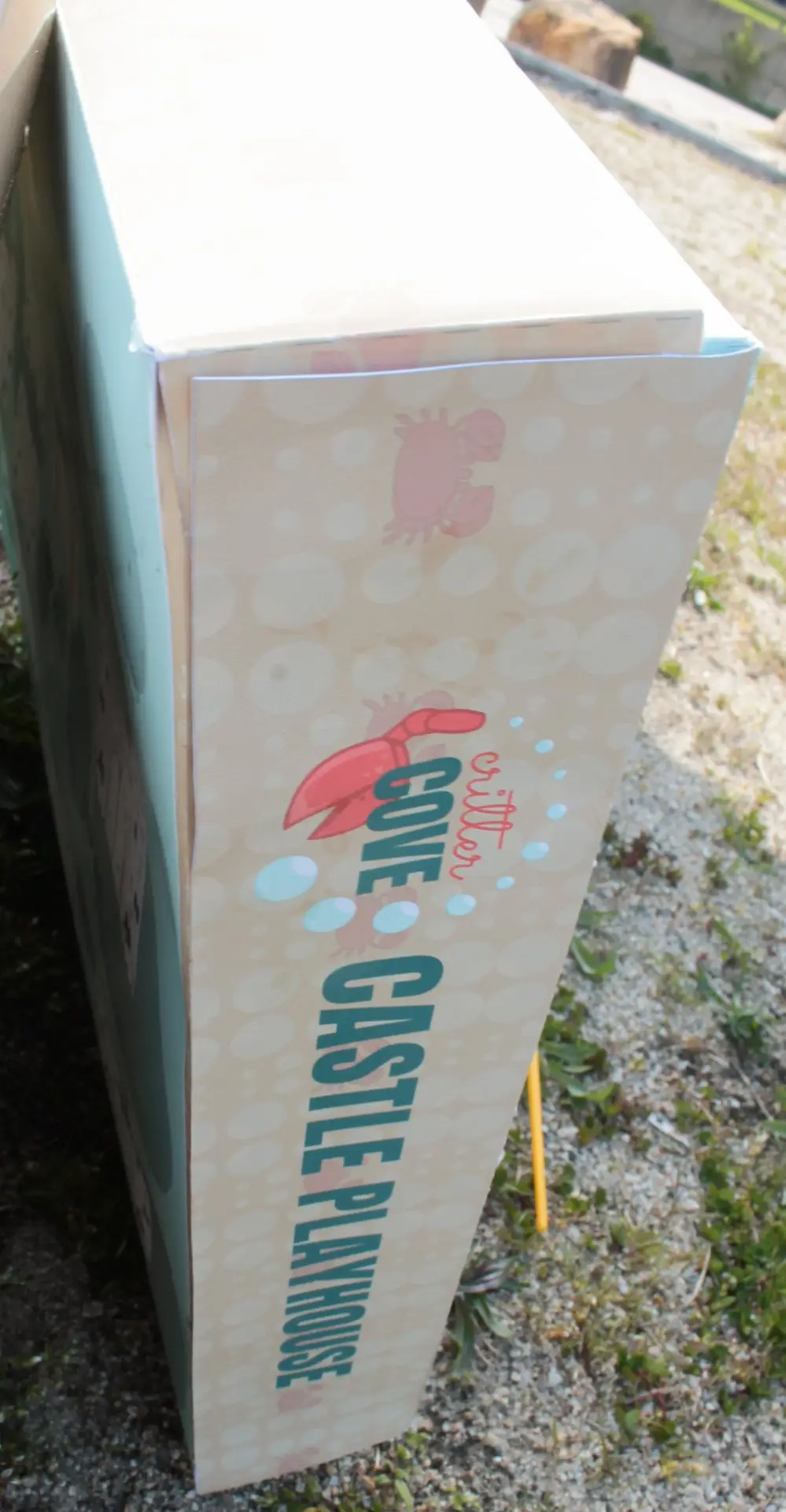
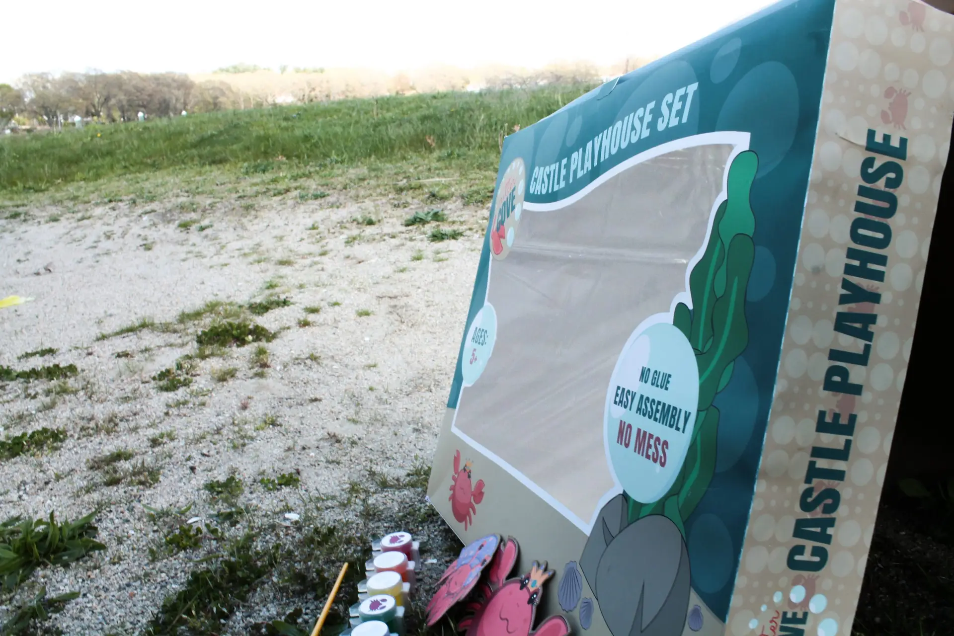
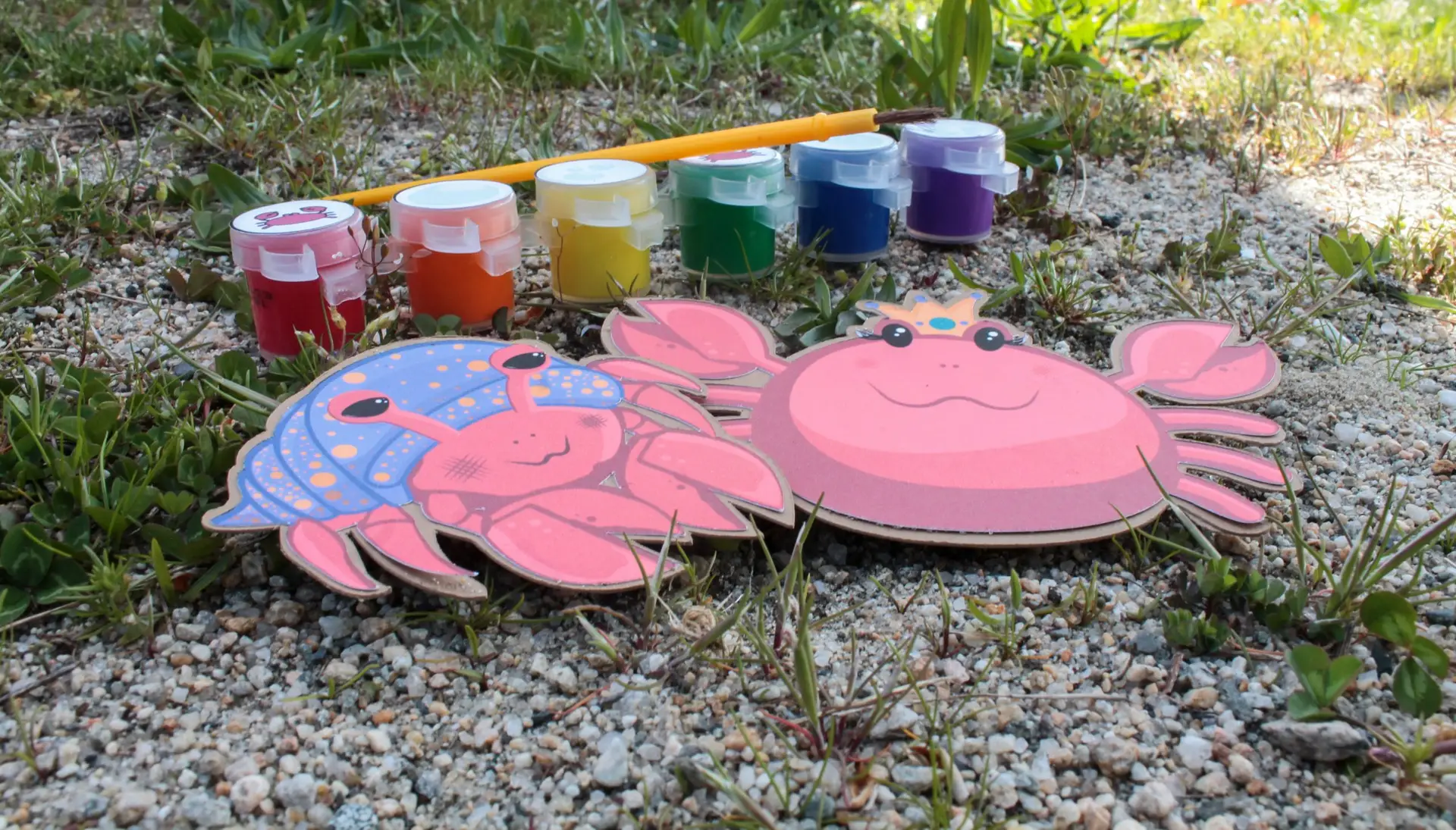
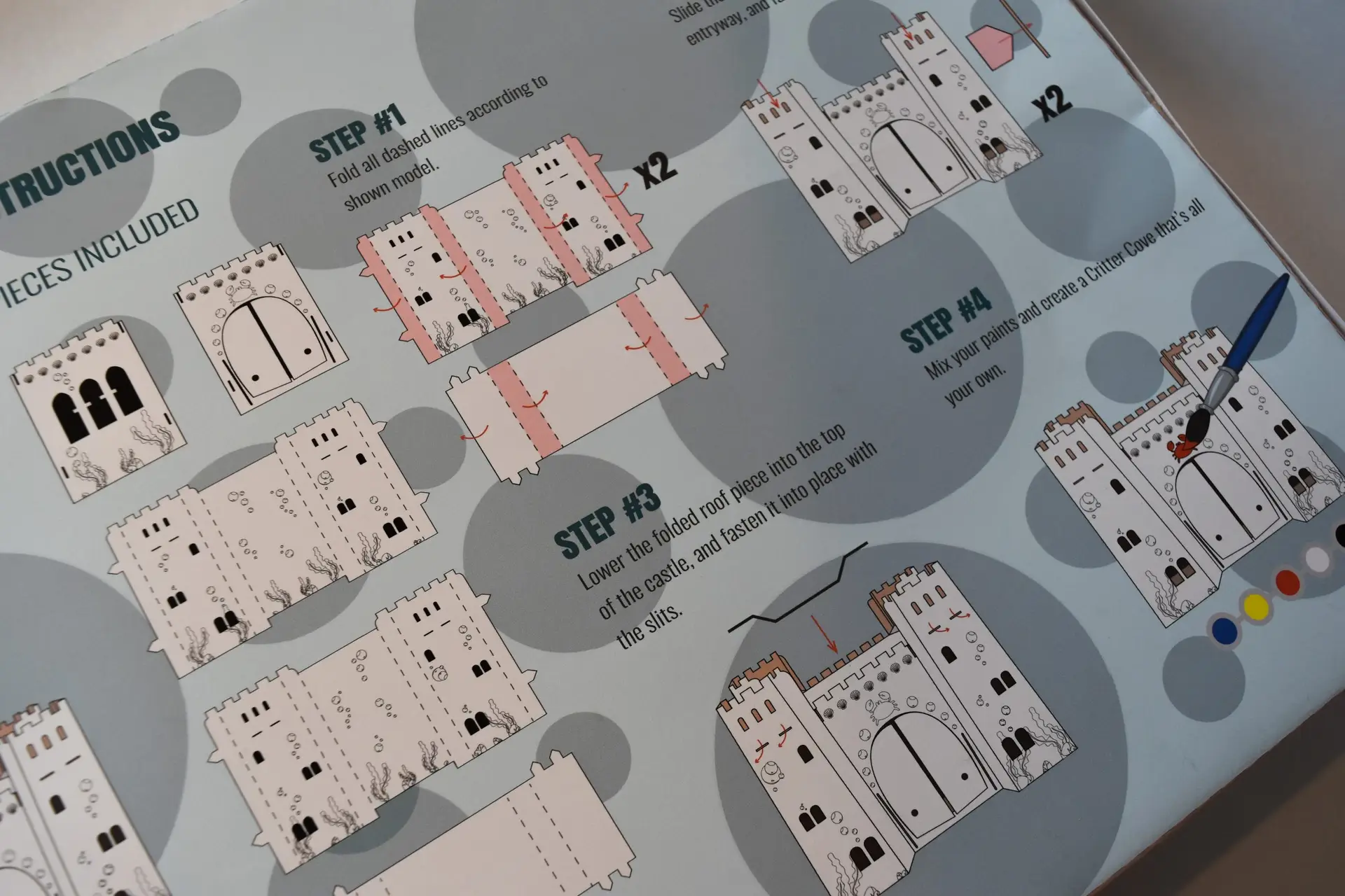
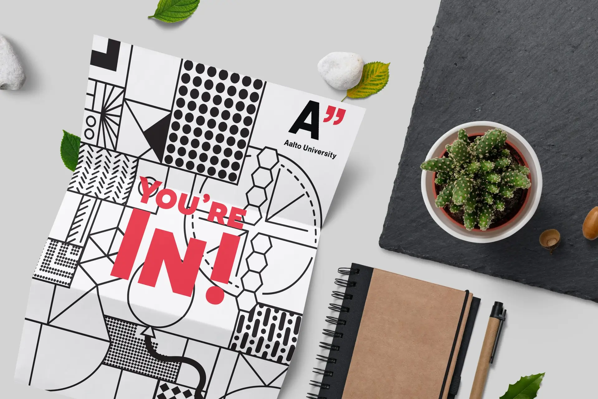
During my time in college, I was asked to develop a brand identity and package design for an existing architectural playhouse assigned. I chose to pursue a sandcastle concept that would appeal to children of both genders. Regardless of gender, everyone can agree that kids love sandcastles. I used this common interest as inspiration for this project, and developed a concept of a crab themed sandcastle. From the package design, to the pieces of the kids playhouse itself, the theme is communicated efficiently and cohesively throughout the brand. The playhouse set also features an on-theme paint set with a brush to customize the castle, washable, of course. Whether your kid colors inside the lines or out, the included paint is washable to make cleanup a breeze.
Self-Reflection:
This project combined my branding and crafting skills, and challenged me to build a brand and product that is cohesive throughout. It also challenged me to focus on a broader audience, being a gender neutral product for children. Knowing and being able to appeal to your audience is an important skill in the design world.